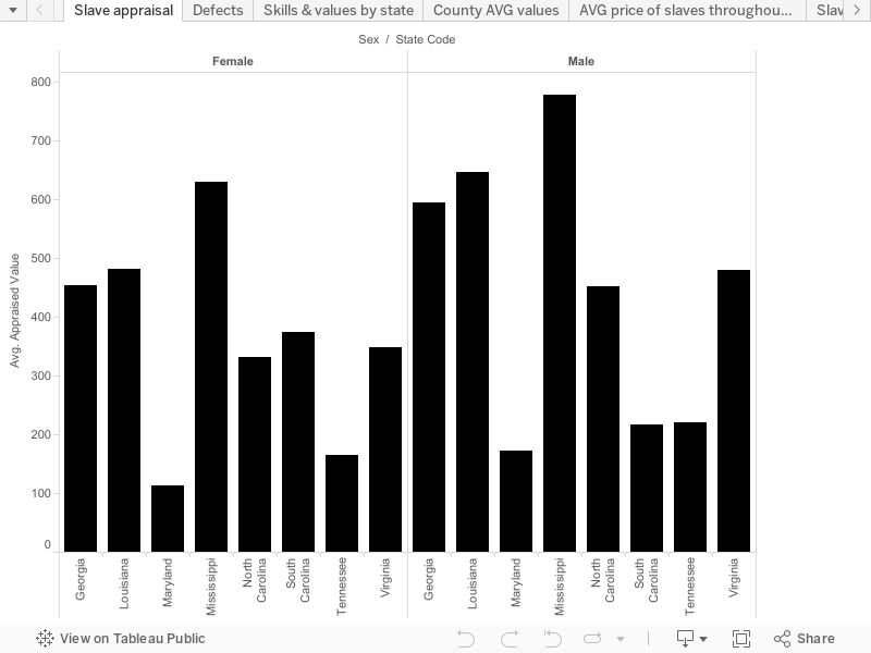
My final project is going to be the story of the slave trade from 1775 to 1865. I chose this topic because I feel it was an important part of American history that helped shape America into the super power that it is today. The visual that I chose was the appraisal value of slaves both male and female by state as well as county. I chose to go with the bar graph because I felt that it’ll be more easier to read than some of the other options that were available and is one of the most common ways to display data. By breaking down the value of slaves by counties and states it can pose several questions such as “why does this county have a higher appraisal value than another county within the same state” or “Why does this state appraise slaves at a higher value than the next state”. Each county has a different appraisal number for their slaves. The sex of each slave seems to be the only factor according to this visual as far as how much the price will be is concerned (although I’m sure age, skills, defects, etc are a factor as well). As most people would expect, the male slaves are appraised at a much higher average rate than the female slaves. One can only infer that this is due to the diversity of work that a male slave can do that a female slave simply cannot do. Male slaves aren’t hindered by the psychical barriers like the females may be subjected to. It appears that the slave states further down south have a higher value average than those that are located closer to the north. This can caused by several reasons. One of those reasons is that the slave states located more up North have a bigger liability in the fact that the slaves are more likely to be tempted to run away and succeed than the Southern counterparts. With this potential scenario occurring, it could be deterring the price of the slaves making them too high of a risk to be worth trying to get top dollar for them. Another possibility for the states further down south appraising the average values of slaves more than their Northern counter parts is because of the amount of labor that is center in the more Southern states. The slave states that are located more south have an abundance of work that the slave states further up North just don’t have. With the amount of work that a plantation for example requires it will be the only practical thing for a person with money to purchase some slaves to be able to sustain the plantation and lessen the workload and make life easier. Knowing this, the slave sellers are able to raise the price of the slaves because they are aware that the slaves are a very big asset to the people who buy them in the more Southern states. The demand for the slaves seems to be higher in the more Southern states than the demand for slaves in the states that are closer up North. Once purchased by the individuals in the Southern slave states they are valued more because they are viewed more of an asset than liability, which may not be entirely true for the slave states that are located more up North.
Really, really good observation about the difference that geography makes. You’re onto something really important with your observation about higher prices being paid in the deep south vs the more northern parts of the south (called the Upper South). If you put this observation together with your “value over time” sheet, you’ll have something really interesting–after the 1850 Fugitive Slave Act, slavery is 1. legal in the entire United States, not just the South/slave states, and 2. enslaved people no longer became free once they escaped to the North–so long as they were in the United States, they could be kidnapped and returned to slavery. What does this do to what you’re seeing re: the average value in different states changing over time? In the screenshot, I grouped some of the states by region to make the trend easier to see.
Be careful with over stating your evidence about why there’s such a big gender difference–what you have right now is correlation, but not causation. Just because something seems common sense doesn’t necessarily make it true–A. the difference you’re seeing could also be correlated to geography, time, skills, age, or some other factor, and B. you don’t have any direct statements within your data about why there’s a difference. I say this particularly because if you look at your first sheet and switch the order of sex and state code in columns (which determine whether your bars are grouped by state or by gender first), you’ve got a kumquat–in South Carolina, on average women were more valuable than men. You’ve also got big variation across states–in Mississippi, women were on average seen as valuable as men in Louisiana, and much more valuable than men in Maryland. If gender is what’s making the big difference, why is there such variety across states?
Re: your sheet Skills and Value by state, see my first comment and screenshot here: http://ahis290.maevekane.net/2016/04/14/draft-story/#comment-268 (switching to a side-by-side rather than a stacked bar will make your patterns clearer)
In your County AVG scatterplot, I’d suggest simplifying this one by removing county entirely, and moving state into the color pane–this will make your data easier to read.
In your AVG age by year sheet, what would your argument be in this one? You should consider filtering out the zeros in your Age Yrs, since zero just means that there’s no data entered, but it pulls down your average.
Your Defects by sex sheet is onto something interesting–I’d suggest putting some time in to group things together (ie, girl/boy/child, dead/deaf/deaf and dumb, unsound/unhealthy/sick) and do a side-by-side bar chart to see if the patterns become clearer.
Lastly, for thinking about your geography question, you might want to do a symbol map of the number or average value of enslaved people in each state, by sex, skill, or some other aspect. You’ve got some good observations with your bar charts already, but a map is a bit more visual and will help make your deep south/upper south point more clearly.