Argument Draft

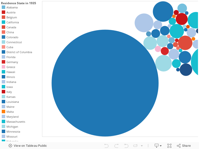
The first data visualization is about the average age and appraisal between male and female slaves in eight southern states. Before we can truly understand the way the slave trade works, we must first understand the slave trade processes. The information given in the data set tells the story of how different information can correlate, but does not imply causation. According to Historian Herbert Gutman, “once every 3.5 minutes, 10 hours a day, 300 days a year, for 40 years, a human being was bought and sold in the antebellum South.” Most slaves were primarily sold to work and maintain their white master’s plantation. Other times when a master experienced a decrease in profits they would sell their best slaves to help with their economic struggles. It also did not help that as America began moving westward the opportunity to own land increased. As a result, a higher demand was placed on slaves, which encouraged the slave sale.

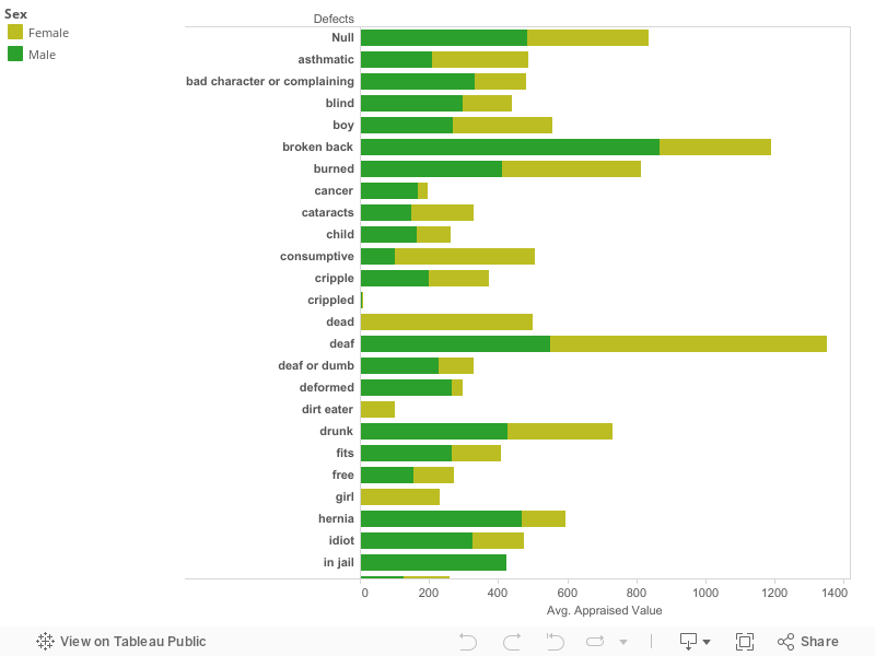
Based on the graph, there is a distinguished difference between male and female appraisal values. Whether a slave was sold into a big or a small plantation, a master’s goal was to acquire a slave who was able to work quickly, withstand gruesome hours, and carry heavy loads all for the sake of producing the most products. Most times male slaves were more appealing because of their physical ability to work on the fields which gave them an advantage over women. Even with a difference in gender value, both males and females shared a commonality when it came to average age. For example, if there were three males whose ages were 25, 15 and 35 and each had the same set of skills, the 25-year-old slave would be priced at a higher value. This meant that if a male or female slave were in their prime age (18-27) they would be priced at a higher value. However, some states show an average age of (4-12) which does not necessarily mean only children were sold, but a result from insufficient records. The masters as well as the slaves did not keep good records of their ages, some slaves’ names were barely acknowledged. This was a way for masters to keep their slaves oppressed, it was all about considering slaves as less than human beings and more about considering them as property. The better the master’s “property” the better the chances that he will make a greater profit.

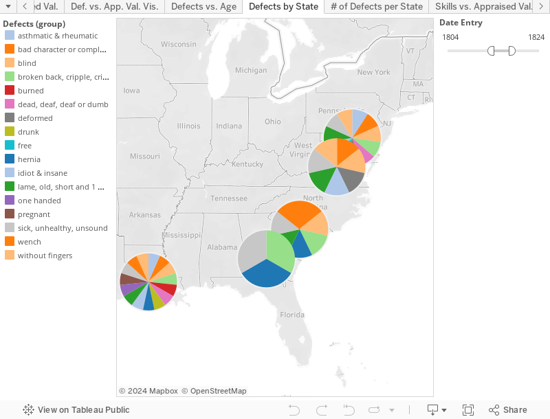
The final aspect of the graph is the different states that divide each column. Out of the seven states, Georgia, Louisiana, and Mississippi are the three dominate states. From a geographical aspect these three states were located further south, where slavery was more prominent. The cotton gin invention could also explain why many plantations increased in size. For example, in Georgia the slave population by 1800 doubled to 59,699, and by 1810 the number of slaves had grown to 105,218 meaning that more slaves were being sold into the state. In Louisiana, by 1840 – 1860 Louisiana’s annual cotton crop rose from about 375,000 bales to about 800,000 bales. By 1860 Louisiana produced about one-sixth of all cotton grown in the United States, creating a higher demand for slaves to work the fields in this area. As for Mississippi, it was the state with the highest appraised value for both male and female slaves. This is due to the fact that by the first half of the 19th century, Mississippi was one of the top producers of cotton in the United States. As the white settlers’ population  increased so did the slave population and by 1859 Mississippi made a name for itself, producing over a million pounds of cotton.


Argumentation Draft

The nineteen forty Albany census provides us predecessors to get a more statistical point of view of what society was like back then. Although it does not give us individual accounts of those who lived during this time period, it does tell us what age they were in nineteen forty, what state or foreign country they lived in five years prior to nineteen forty and even what level of education they completed. These numbers and data allows us to understand a lot of the city’s trends based off of what jobs people had, how much money they made at these jobs and what level of education was required to acquire those jobs and make a desirable salary within those jobs. It is tough to read all of these random words and letters, therefore we visual the data through program like Tableau to make the data easier to read and also not as boring or unappealing to read.
One of the data visualizations I have put together involve the resident’s home state or country as of the year nine thirty-five, which is only five years prior to nine forty. This visualization is a graph of circles that vary in size based upon the number of residents that resided in a specific state or foreign country five year prior to the census being taken. These circles also vary in color based on whether the entity is a state within the United States or if the circles represents a foreign country. Foreign countries are colored some shake of red while states are colored some shade of blue. This visualization depicts that a lot more of new residents to Albany came from neighboring states such as New England, New Jersey and Pennsylvania. The foreign countries take back seat to states that are further away from New York, meaning that foreign countries had the least amount of people migrating to the United States. I feel that this is a very likely trend due to the time period. The United States had just been recovering from the worst economic situation this country has ever seen; The Great Depression. Foreigners obviously heard about the news of the poor economic conditions of the United States and most of them decided to stay where they were. Immigration to the United States was wildly popular prior to the Great Depression because they wanted to be free and believe in their own religions without getting punished by the governing system. Also, immigrants were attracted to moving to the United States because they felt it was the best economic decision they could make. It is still a cliché phrase; “The American Dream”. Immigrants wanted to get a well-paying job, buy a house with a white fence all while raising a family. Once the idea of a well-paying job feel through the cracks, the large sum of potential immigrants did not see the appeal that was once there. With that being said, Albany might not be the most attractive spot for immigrants to relocate to in the first place, but the capital city of the state that most immigrants were arriving in might attract more of said immigrants once they arrived at Ellis Island. If such a small amount of immigrants were immigrating to the capital of the empire state, then it leads me to believe that the national trend stays consistent with the trend of Albany.
The census is a good source to investigate into what type of social and economic trends occurred during a specific time period. Based upon the information given within the nineteen forty census I was able to make the information given a little easier to read and understand through using a visualization and through this visualization it is much easier to make an assumption about the conditions of Albany during the year nineteen forty and the surrounding years as well.

Argumentation Draft

The visualization shows which types of “defects” different slaves possessed based on their geographic location in the United States of America between the years 1742 and 1865. The visualization is color coded by which defects appeared in the slave sales records for each state. It is broken down even further by the addition of a sliding filter that allows you to narrow down the data set in increments of 20 years. Without even looking at which types of defects were recorded in each state you can immediately begin to recognize a trend simply by moving the time slider up and down through the years. When it is at its earliest years you only notice defects in two states which reside primarily more north than south. However as you move the slider further along you begin to see more and more records of slaves with defects appearing in the southern region of the United States. This is most likely because as slave labor was more and more used by the southern states, more and more defects began to arise over time due to the severity and intensity of the labor that was required by slaves.

We can also begin to notice differences when we look at which types of defects appeared to be more common compared to defects in other states. For example, we are able to see that in the more northern states, the slaves that were listed as having defects appeared to be defects such as being old, or deaf, or as having bad character, or even being free. This is compared to a southern state such as Louisiana where not only does it contain all of the previously listed defects, but it also primarily contains physical defects that are most likely attributed to the intense labor and living conditions that they were forced to endure. These defects included things such as being burned, without fingers, one handed, hernia, broken back, and crippled. All of these types of defects appear to be far more common in the south than up north and are most likely due to the much more intensive plantation labor that is known for being located in the most southern states in the United States.

We are also able to note that some of the more northern states are not listed as having any slaves with defects until the early to mid 1800’s. This could be because the types of labor that slaves were forced to endure were not as difficult or intensive as the labor that was endured in the deep south. It is possible the punishments and the work its self was not as harsh, and because of this, slaves did not develop defects in the more northern slave states until later in the 19th century. It is also possible that perhaps slaves with defects began to appear more towards the north later in time because they were being sold with defects to the northern states. It is possible that they may have been sold simply because they possessed what some slave owners considered as a defect. It is possible that due to the nature of the work in the deep south, that slave owners in the deep south did not want to purchase slaves that already contained something that they thought was a defect, because they thought it would mean they would be less efficient at the work they would be forced to do. If this is the case, it could mean that slave owners in the deep south might not have had any choice but to sell their slaves to the more northern states because they would be willing to buy them for less money, because the defects that they possessed would not severely impede their ability to effectively complete their jobs. This theory is also supported by looking at the defects that appear in the states mentioned above such as Mississippi and Tennessee. The defects that do appear in these states are not anything that would be to physically debilitating. These are defects such as being unhealthy or sick, lame, old, or unsound. These are all “defects” that could either resolve themselves over time such as being sick, or defects that would not effect their ability to work in a serious way, given that the labor in these states were less intensive.

It is also important to note how many defects are located in each state over time. Every state contains a considerable amount more of defects when you move the slider all the way to the later dates as compared to when they first appear on the map. There is no state where the number of defects in slave records goes down or stays the same. Not only does the number of defects increase, the types of defects also becomes much more diverse. This could be because over time, the labor that the slaves endured caused more and more of them to suffer from physical injuries that took time to develop. It could also be because over time slave owners began to trade slaves as they became injured or grew older and may have had to settle for a lower price from another slave owner due to the defects.

Women had it just fine in the early 20th century no really

Speaking to the New York Factory Investigating Commission in 1914, Pauline Newman stated that “a working girl is a human being with a heart, with desires, with aspirations, with ideas and ideals and when we think of food and shelter we merely think of the…necessities…Have we thought of providing her with books, with money for…a good drama?…Have you thought about a girl providing herself with a good room that had plenty of air, proper ventilation in a somewhat decent neighborhood. Do you think of all these things when you think of a minimum wage? Let us not think of a piece of bread. Let us think of a working woman as a human being who has her desires to which she is entitled.”[1] With the Fight for $15 still on-going today, it can be easy to see how the struggle for a sustainable minimum wage is something that has been fought over for a century or more. However, more so, the quote highlights the plight of working girls, the wages they were allowed to earn, and, intersected with my data, the jobs that they were even allowed to work.
When one thinks of the jobs that women typically worked before the boom of equality that came in the 1960, very few and very gendered occupations come to mind, from telephone operators, to secretaries, to housemaids. If a woman left the house to work, it was because she was young, and helping her household by earning a wage for her father, or her brother, or her grandfather, or any male relative that she lived with. Women were thought of as existing in the private sphere, within their own homes and perhaps in the homes of their friends and relatives. Never did they venture into the public sphere for their own advantage, nor would they dare to venture out in the hopes of earning an education or a wage for their own advantage. If a woman left the house to earn a wage for her household, we typically think of gendered jobs such as secretarial work, house work, or school work. While the beginning of World War I saw a boom in the occupations that were acceptable for women to work in, this was mostly limited to European women- America didn’t join the fight until 1917, and as we all know, it was pretty pointless for us to join at that point.
However, the early 20th century was still a point of revolution for women in America, and the 1915 census shows the starting point of changes in gendered American society. The 19th Amendment was only a few years away, and the Seneca Falls Convention, over 60 years earlier, had produced numerous succeeding generations of supporters of women’s rights, the same way that today we would think that the hippie movement has led to a more liberal generation, having been parented and grand-parented by previous hippies. The 1915 census sees an increase in occupations employed by both male and female workers, from semi-“genderless” jobs such as song writer and painter, to surprisingly diverse jobs, such as horse dealer and ironworker. These latter occupations might typically be thought of as more male-orientated, being business-driven and more opt to physical labor. While there is an equal amount of male and female ironworkers (i.e., one of each), there are six female horse dealers in the data set, as opposed to only one male worker.
Going off of this surprising difference in expectations and reality, 69 males are listed as having an occupation at this point, while 60 females are listed as occupied- a surprising difference of only 9 out of a total of 129 employed. However, out of the 60 females that were listed as occupied, only 25 of them are listed in an occupation that isn’t listed as “housework.” What exactly does the census mean as housework? While it would be nice to think that these are women who were still occupied in some fashion, such as leaving the house to go clean someone else’s house, it was likely that “housework” within their own home was still considered the woman’s job- i.e., it was her full-time job to stay home, take care of the house, cook meals, and take care of her kids. So while more occupations were beginning to be available to women, we still had a long way to go, if it was considered the job of the woman- most likely the mother- to take care of the kids of the house.
While it’s all too easy to look at the differences in the preconceptions that we might have about this time period and the few dalliances that the data actually shows, women’s work was certainly cut out for them. While the spike in amount of women dealing with “housework” shows the expectations placed upon women in the private sphere, the majority of listed occupations in this dataset further speaks to the expectations placed upon women even in the public sphere, where, having proven that they were at least capable of stepping into sunlight and not bursting into flames, they were still given jobs that mostly would have subjected them to little to no physical labor, or spoke to the expectation that women were homebodies whose main purpose is to nurture and care for others. Jobs like school teacher and nurse played into this, with the expectation that, while a woman couldn’t handle the power of the headmaster of a school or (heaven forbid!) go to university to become a doctor, they could still subject themselves to lesser degrees of this workload.
So while the opportunities available to women were beginning to expand at this time, we still had a long way to go. European women were afforded opportunities that wouldn’t be available to American women until the beginning of World War Two, when American men left for the frontlines and women were left to take their places in factory jobs. The past few decades of women’s rights movements had led to a more open-minded approach for quite a few generations, and this likely led to a small opening in the types of jobs “appropriate” for women.

1 National Women’s History Museum. “Progressive Era (1880-1930).” NWHM Exhibit: A History of Women in Industry. 2007. Accessed April 25, 2016. https://www.nwhm.org/online-exhibits/industry/6.htm.

Argumentation

The causation of the of the appraisal for female and male slaves in the slave data is the high demand for slaves between 1775 and 1885 due to the economic opportunity that the southern states had at the time which was created through the means of producing goods such as cotton and tobacco. Slaves have fluctuated in value over that hundred year span, mostly increasing in value as the years went on. It has become an ordinary way of living for those in the south to own slaves and benefit from their free labor. As the popularity of owning slaves grew, so did their value. In the beginning of the years in which the data was recorded, having slaves was legal and a way of life for the white men which mainly were located in the south. It is a pretty known fact that tobacco plants as well as other jobs were located in the southern states and that they took a lot of labor to maintain. With the legality of slaves, those who were able to afford slaves bought as many as they could to do these jobs that required an abundance of labor. The appraisal value of male slaves are more than that of female slaves. This is caused due to the amount of labor as well as type of labor that male slaves can do that female slaves can’t physically do. Females don’t have the same body type or muscle mass that males do, therefore they are more limited to the work they can do. Male slaves also tend to be more skillful with their hands and can do jobs such as being a blacksmiths while women who are skillful will most likely do the jobs such as basket making and other simple jobs. While males are doing more physical labor out in the field or blacksmith work, female slaves can do less physical work such as watching children, making items such as baskets, and other activities. With that being said, their value isn’t going to be as high because that labor isn’t as intense or challenging and isn’t as profitable as the males line of work is overall. It is pretty standard that all male slaves will be worth more money than their female counterparts. The direct causation of the value difference between the male and female values seems to be due solely to their potential productivity and how much money they can bring in.


An argument that can be noted from the data set that may come as a surprise to some people is the average price of slaves throughout time. Most people will automatically assume that as the years go by that the value in slaves only increases until it is abolished in the 1860’s. According to the data however, the value trend with slaves throughout time haven’t been as consistent as some people may think. The trend of slave values started at a decent number and then proceeded to decrease in value before picking back up. It isn’t clear why the value of slaves decreased during this time but it can be argued that the causation for the slaves to steadily increase in value after it’s descent can be caused by the growing popularity of slaves. As the years went by, news of how effective the slaves were could have been spread throughout the south. The businesses started to thrive and become more successful than they may have been previously. It is noted that the value of slaves really started to get high in price in the 1800’s. The causation of this spike can be credited to the industrial revolution. The south was a big manufacturer of goods during this time period and provided these goods to the northern states; states in which slaves were outlawed. With the slaves providing free labor, the south was able to benefit exponentially. This of course made the south even more wealthy and this in turn caused the appraisal of slaves to increase since they were viewed as a great asset to the owner of the plantations and manufacturers of goods. Even though the value of slaves were at a higher average than it was previously, the value of slaves still drop in price certain years before increasing again. This trend of erratic values continues throughout the decades. The causation for this trend is unknown and there aren’t any signs that may explain why. The value of slaves however hits its peak in 1864 in which is a time in American history when the civil war was taking place. The average appraisal price for the slaves during this time period was over a staggering 1000 dollars. The price of slaves during the time of the civil war jumped up by over three hundred dollars.  The reason for this insanely high price can be argued to be a direct result of the civil war that was happening at this time. Since one of the main reasons of the civil war was over the liberation of slaves, this caused the value of the slaves to soar to new heights. This is the highest value that slaves have been since the data has been recorded. It can be inferred that slave owners were attempting to get top dollar for their slaves at this time since the possibility of slaves being outlawed all together was in the minds of the owners during the time of war if the south suffered defeat to the north. Slave owners figured that it was the best time to increase the value of their slaves in order to have some type of monetary gain in case the south lost the war. In the year 1885, the value of slaves appears to begin its plummet at a fast rate. This is a direct causation of the south losing the civil war to the north which resulted in the outlawing of laves. Since having slaves were illegal, there was no longer an appraisal value on the now former slaves.

Argumentation- 1940 Census

The 1940 census is made up of a variation numbers such as dates of birth and texts such as names and whether an individual owned their home or was educated. This information allows viewers of the census to piece together lives of the people in the census and to get a sense of what these people did daily back then. From the information provided, many conclusions can be drawn. One of the conclusions is that mostly men were the head of the household, most women did not work but some did, and men and women went to school but men received higher paying jobs then women. These conclusions are just some of many that can be gathered from the census by taking a quick glance. Although a once over of the census provides a great deal of information, there are some other relationships between the data that needs more looking into and requires past knowledge.

Education is always seen as an important aspect of how well of an individual will be, the type of job they will hold and if that job will be able to provide for the person and family members. The level of education someone is able to reach holds much value and the value of it directly correlates with many other aspects of someone’s life but often times, there are a group of people (usually a particular race or ethnicity) who receive a good education and are still unable to provide for their family or are working lower paying jobs than others. They are looked over when it comes to promotions, and often have their work ethic attributed to something other than them simply working hard. This can be seen in the 1940 census; the census shows that most of the people on it received some sort of education. The educational levels ranges from elementary school to a four year college degree or beyond. As previously stated, most of the men and women had an education but the men received higher paying jobs and this was also the case when it came to whites and blacks.

Looking at the census with all the different data, it is difficult to see what correlates with one another and what does not. Creating different visuals allows the viewer to see if there are causations, patterns or correlations between the information provided. The census divides into three races, Filipino, Negro and White. Upon taking an initial look, the division of the census into three races is unclear. The data shows that there are races but being that there are many names, it is hard to parse out the different races. The census itself also does not show the division of the educational level that each race has reached; the correlation between race, educational level, average income and the value of the homes they lived in is not clear until different visuals of presenting the data was created. In order to make these relationships clear a scatter plot was created. The educational levels are broken down into three groups with different colors so that the differentiation can be made; red is college or higher, purple is high school and green is elementary.

Carefully looking at the plot, the assumption that white privilege has its place in the relationships seen between the previous categories noted is made. The plot shows that there were a group of whites that received an elementary school education and the average value of their homes was about 2,074 dollars and average income was 238 dollars; there were also group of blacks that received a college education or higher and the average value of their homes and average income was less than that of the whites. The same conclusion is made pertaining to Filipinos and whites, the Filipinos highest educational level is college or higher and the average value of their homes and income is less than whites and less than the blacks as well. For years, other races have had to work twice as hard and if not harder to get decent paying jobs whereas whites are sometimes allocated the privilege of not having to go through as much hardships but still being able to reap the benefits.

To ensure that white privilege was indeed at play, the scatter plot was looked at again and a second set of information in the white section was provided. The highest level of education that whites received was a high school education; this means that both blacks and Filipinos went on to receive college degrees in different fields whereas whites did not. Based on previous information, the assumption that although the highest level of education reached by whites was high school, they would still have a higher income and their homes would be of a higher value was made and the assumption was correct. For a white person with a high school education, the average value of their home was 1,585 dollars and average income was 227 dollars. The scatter plot also provided an interesting find. A white person with just an elementary school education had a lower average income than one with a high school education, although not by much, but their homes were worth more than another white person with a high school education. The census does not make why that is clear but further research may be able to provide an answer to that. Although that interesting observation was there, the fact still remained that their homes were worth more and incomes were higher compared to the other two races despite of their minimal level of education.

The 1940 census shows a trend of white privilege that have been there since the beginning of time. Whites across the world have felt superior to others and their superiority complex has led them to acquire lands, wealth and even people. The census shows that these other two races although they have worked hard and have reached high levels of educational achievement, it means almost nothing in the end. They worked jobs such as cooks, and laundry personnel and are being passed on the jobs that they may be able to use their degrees in. Whites were able to acquire jobs such as administrators, treasurers and accounting clerks despite their educational shortcomings all because they were not black or Filipino.


Final Project Draft

Where a person is born defines a lot about them, especially a soldier. If a Soldier feels that his homeland is under threat, he will be willing to sacrifice himself in order to defend it. that is usually what separates Soldiers from people who get paid to fight. There is a sense of pride, country and a need to defend it.
A second part of the data set provided that I will be focusing on will where these soldiers come from. Whether they come from a foreign country, or they list that they come from one of the states, it tells a whole lot about them and their story. Where these soldiers come from and where they say they come from are very different and tells us a lot about themselves and their sense of nationalism. For example, if an individual says that they are from New York when they sign up, that person could be from another country however he has a strong sense of pride about his new-found home there for he is willing to fight for it. On the other hand, an individual who declares that he is from another country may not feel the same sense of pride. But it should go without being said that either way, any individual who signed up for the militia is brave.
As you can see in the image, a majority of individuals from this roster identified themselves as either coming from Ireland or Germany followed by England. This doesn’t come as a surprise because a majority of the people who came to New York in the first place were from Europe. All of the following militiamen come from New York and the surrounding areas. The huge difference between New York born troops and European born militiamen +has mostly to do with the age of the newly formed government and country. The younger population mostly make up the American born militiamen and on the other hand, the older are the majority and they are the first generation to colonies the new land. I would predict that in the following years as the war progressed, more and more New York born men would enlist because they would eventually be old enough to fight. Some people may ask why sign up to fight for a country and land where they aren’t even from? Surprisingly, 71 individuals were actually born in England and would be fighting their own homeland. Initially I would have thought that it would have been 2nd generation men signing up for the Militia to fight the British. I was pleasantly surprised when I saw that a majority of the soldiers were born in Europe. They all signed up to accomplish a common goal and were tired of being oppressed by an imperialist government governing them from across the Atlantic Ocean. I think that its very impressive that these people from all different backgrounds were able to come together in order to defend what they called their new homes.

Final Project Story Draft

For my final project I will focus on Slave Sales data-set between 1775 and 1865. The data of the slave sales paints a very clear picture of America at the time, making it a very important part in Americas history. For the visualization I chose to compare the defects and sex of a slave and its affect on its appraisal value. I chose a bar graph to display the information because of its clarity and user friendliness. Looking at the graph we can see many factors that predetermine a slaves value. For example when comparing the sex of the slave, the appraisal value most of the time was lower for women then men. Also serious defects can affect a slaves value more than others. On average a male slave in their prime was appraised at $734, pretty high compared to a male slave with cancer valued at $166. The colors in the graph were very important to me as well, I used different shades of green for the sex to symbolize money/value, so viewers would see the changes in appraisal value. When comparing skill sets of slaves men and women are often attached or designated to different fields. For example there were many male field workers but no male child takers, a job specified for females. Women showed most value when they were pregnant or very fertile, as slave masters like to breed other slaves for work. As far as defects men and women share many of the same. Some of the things listed as defects are blatantly racist. With defects listed like dumb, run away, and drunk its clear this data set represents a time where blacks were seen as less than whites. I also noticed children are priced significantly lower than a prime male slave, so much so being a child is listed as a defect. One problem I did have with this data set was the fact a male slave in his prime on average was valued at $100 lower than a male slave with a broken back. This issue makes me question some of the true values of slaves with defects. Another issue was the amount of defects listed; Some of the defects can easily be grouped together to fix some of the clutters. Others like dirt eater need more research to determine what exactly the defect is.

Text II

For this week’s readings, we are continuing to look at historical documents that use visualizations to help understand the content presented.

Mining the Dispatch is a website created by Robert Nelson to explore dramatic and traumatic changes in the social and political field of the Civil War era. The time frames of the information follow the same from the Richmond Daily Dispatch (November 1860 – April 1865). The site uses software such as MALLET, a generator that filters topics through documents. Some of the topics include: slaver, nationalism, military conflict, soldiers, economy, and politics. There’s the ability to adjust graphs/charts in each topic, showing the progression over time.

NYT Chronicle is a site that allows you to enter a word or phrase into the search engine. The line graph presented will show a percentage or raw number of the times the word/phrase has been features in an article.

Voyant is a database that allows you to upload a website and breaks it down into segment. Once broken down, it does look confusing to the eye because the site is moved into sections of frequencies, summaries, and numbers of terms. It is more statistical than helpful to understand the content.

With majority of us doing the census/visualization as our final project, looking at how these sites break down historical information is helpful. Mining the Dispatch is the most helpful in that it still includes information about all the topics in the Civil War era and you’re able to read, while assessing the graph. The New York Times Chronicle is a good way to get people interested in how frequent something has been said. It is however, not very exclusive if you were doing research on a particular topic. There are many times that a word can be featured in an article as just a word, while the article can have a different main idea. This can raise a question of is the information you want your audience to search meaningful or just a fun visual? The Chronicle is similar to another data visualization site, Twittearth which shows live tweets on a 3D globe. You’re able to see live tweets and suggestions on who to follow. This is an example of a visual that would fit to support any information presented about social media or Twitter statistics. It has more focus than The Chronicle because although it focuses on one newspaper, The New York Times covers several topics. Voyant is a database that seems necessary for when you need to assess a website that is difficult to understand and need to simplify it.

In comparison to Tableau, how can other data visualization sites work to your advantage for displaying information?

In what ways can visualizations help understand historical information?

Which visuals attract a certain audience? How do you decide how to use these visuals?