<script type=’text/javascript’ src=’https://public.tableau.com/javascripts/api/viz_v1.js’>
Second Data Vizualization/Story
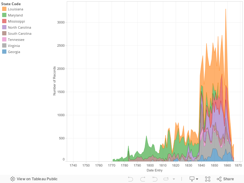
The story behind the second data visualization for the slave salves data set is that as the civil war was on the horizon, slavery grew for various reasons. The civil war wouldn’t have come into play if the southern states that seceded weren’t economically stable on their own. This is a consequence of the growth of slavery. Though the slave trade ended by the time the spike in slave sales occurred, slave records continued to increase in number. Why, you might ask? The international slave trade wasn’t in use anymore, but slaves were still in high demand because of the lucrative cotton kingdom. Northern states slowly illegalized slavery while southern states continued to collect capital from the institution.
In the 1800’s, more slaves states were admitted into the union, maintaining the balance between free and slave states which makes sense of the rise in the amount of slave records as legislations regarding slavery were passed.
Slave records also increased because slave labor became more profitable as a result of the cotton gin’s invention at the end of the 1700’s and it’s widespread use during the 1800’s. The cotton kingdom was the cash crop that emerged after tobacco crops started to dim in value. Cotton was not only valuable to southern states because it could be produced and in turn sold faster, but because European countries valued it too. Cotton was needed in countries such as Great Britain –since major countries depended on southern states they met the demand through buying more slaves (Quizlet). This is another reason that the south was not hesitant to secede from the union –they had connections with countries on other continents because they had business affairs with them beforehand. Not only did the south have its own connection internationally apart from the northern part of the union, the cotton kingdom mad it so that the south was also economically viable on its own –southern states didn’t depend on northern action to make the bulk of their profit.
The main point behind this visualization is that slavery was common in southern states, but it grew drastically as the latter half of the 19th century started and progressed as circumstances nationwide changed, as did international demands on the south of the union.
Bibliography
“Quizlet QWait(‘dom’,function(){document.getElementById(‘PrintLogo’).setAttribute(‘src’,”https://quizlet.com/a/i/global/logo_print.du83.png”)});.” History Unit Two Flashcards. Accessed May 12, 2016. https://quizlet.com/14327446/history-unit-two-flash-cards/.
Process Documentation
Naturally, people are visual beings. Even if something tastes good, a person wouldn’t be likely to explore it if it’s not appealing to the eye. For this reason, chefs pride themselves on presentation –once our eyes see something good, we assume that it is good and vice versa. If people didn’t see what went on in concentration camps during the holocaust, they might not have believed its severity. All of the above examples and analogies provide a peek into the reasoning for the visual choices that I made regarding my first data visualization.
In class, we saw a visualization that used color and inversion to portray Iraq death tolls (if I’m not mistaken). These tools made the death tolls come alive without even having to look at the numbers. Such a visualization played a major part in this visualization of the slave sales data set. Though there are several visual interpretations of the same data set, the data being portrayed can vary extensively.
For this visualization, I saw the stacked timeline format as best for what I wanted to portray. I wanted to portray the growth of slavery in the states over time, and the stacking method shows the states more so as a unit. Meanwhile, the states having different colors still allows viewers to distinguish between the states in the dataset.
I chose to evaluate slave sales over time in this visualization because I wanted to make sure that even though I was using one data set to make two visualization, both visualizations were unique. In my eyes, slavery is such a broad topic that can be stretched to fit into almost any area of American history. Cotton production played a part in both of my arguments, but they revealed different things. I made this plain not only verbally, but visually. The stacked timeline literally appears as a growth at first sight and thus, the main point comes across. In addition, the visual appeal also manages to dramatize the 1800’s as a period during which slaves were in high demand. Throughout most of the graph, there is consistently a higher than normal amount of slave records that we see through spikes in the visualization.
Another part of my reasoning for choosing this type of visualization was that when I tried the bar graph form, neither my story nor my argument came across. If they didn’t come across to me clearly, viewers wouldn’t remotely grasp the idea behind the visualization. The collection of small bars representing each record that was entered showed how many records were entered in different time periods, but the stacked graph boldly illustrated the variance or lack thereof in slave records that were entered.
All in all, my final visualization came together seamlessly, especially with Professor Kane’s assistance. The bright colors draw viewers’ attention and the variations in color from state to state help readers to make sense of what each states records of slaves was from year to year within the time span of a century.
Argument
The institution of slavery in the United States was in place for almost 250 years. However, slavery seems more popular as the slave sales data set progresses in sequence (PBS, 2004). With peaks in slave records from 1770-1870, slavery in southern states seems to have grown as years went on, with its highest cumulative peak being in 1859. However, why were slave records so inconsistent? This is the question that will be answered through the evaluation of historical circumstances surrounding the 100 years between 1770 and 1870.
In the 1770’s there was a push for the liberation of slaves. In 1773, slaves in Massachusetts petitioned for their liberty and were not successful. By the end of 1774, the First Continental Congress decided to discontinue the slave trade and Virginia also took action against the importation of slaves. Georgia did the same in 1775, and the first abolition society was founded in Pennsylvania. However, by the next year the slave population in the colonies continued to grow. In 1820, Missouri was admitted as a slave state through the Missouri .Compromise (Educational Broadcasting Corporation, 2004). The growth of slavery in the 1800’s can also be attributed in part to the Louisiana Purchase that doubled the size of the United States territory (Rapid Growth of Slavery).
The cotton gin’s invention towards the end of the 1700’s also led to a burst in the demand for slaves in the south. Slaves were now able to produce cotton at a much higher rate which meant that masters could make more capital in a shorter span of time, and clearly they took advantage of such an opportunity (Rapid Growth of Slavery). As the 1800’s progressed, so did the causational relationship between the amount of cotton produced, and the number of slaves in the cotton producing United States. As the number of slaves grew, so did the amount of cotton in the U.S. Consequently, plantation income increased as well (8-1 Chains, 2010). The data visualization shows this relationship in its entirety. As the years go on, the amount of slave records increase first in smaller increments, and then they drastically increase by the late 1850’s.
Though Louisiana has one of the most presently large clusters of slave records, before 1840 Maryland had the highest amount of slaves in comparison to the other states. Before the cotton gin became a major factor, tobacco was a cash crop. Tobacco was lucrative in relation to European markets and Maryland was one of the epicenters of its production. However, as more northern states abolished slavery, tobacco production came to a low and the future of slavery was uncertain (Dodson, 2010).
The United States’ economy depended on slavery, and the economy shifted upwards or downwards depending on what and how much slaves produced. When the cotton industry was revolutionized by the cotton gin, the country had no choice but to shift in that direction because it was economically savvy. On another note, the economic benefits of slavery was a driving force behind how the confederate states could even be sustainable on their own.
Bibliography
Corporation, Educational Broadcasting. “Slavery and the Making of America -Time and Place.” PBS. 2004. Accessed May 12, 2016. http://www.pbs.org/wnet/slavery/timeline/1773.html.
Corporation, Educational Broadcasting. PBS. 2004. Accessed May 12, 2016. http://www.pbs.org/wnet/slavery/teachers/lesson1c.html.
Dodson, Howard. “How Slavery Helped Build a World Economy.” National Geographic. October 28, 2010. Accessed May 12, 2016. http://news.nationalgeographic.com/news/2003/01/0131_030203_jubilee2_2.html.
“The Growth of Slavery in the 1800’s.” 8-1Chains -. January 12, 2010. Accessed May 12, 2016. https://8-1chains.wikispaces.com/The Growth of Slavery in the 1800’s.
“Rapid Growth of Slavery in the 1800’s.” Frederick Douglass Heritage. Accessed May 12, 2016. http://www.frederick-douglass-heritage.org/slavery-1800s/