Data Description:
The data set that I chose to work with is Slave Sales 1775-1865. This data set is very large, with a lot of information. There are three different types of data represented within the data set, including geographic, textual, and numerical data. The first two columns in the set are “state-code” and “county-code”. “State code” represents what state that the slave being sold was sold in. While there are large ranges of state that are listed, they are all located in the Mid-to-South East. All of the states that are listed include Georgia, Louisiana, Maryland, Mississippi, North Carolina, South Carolina, Tennessee, and Virginia. “County-code” represents the counties within those states that slaves were sold in. Each state listed has a different amount of counties listed as well. Georgia has 8 different counties where slaves were sold while Louisiana has 16, Maryland has 3, Mississippi has 4, North Carolina has 9, South Carolina has 2, Tennessee has 4, and Virginia has 8.

As for numerical data, there are 4 different latitudinal rows. The first numerical column is the third column in the data set, which is “date-entry”. This row contains the years in which each slave was sold. The years range from the earliest being 1742 to the latest being in 1865. The second numerical row (5th column in the overall set) in the data set is “age-yrs”. What this row represents is how old, in years, each slave was at the time that they were sold. While the data set begins with the age of 0, I didn’t include it in my visualizations because most of the zeros represent a null. The data set goes from 0 to the age of 99. The third numerical row in the data set (6th column in whole set) is “age-months”, which represents the age in months that the salve being sold was in months after years. For example, a slave could be 1 year and 5 months old. This row ranges from the lowest of 0 to the highest of 11 months old. This column in used predominantly for children under 1 year old, or very young children. The fourth numerical column (7th column in whole set) is “appraised-value”. This column represents how much each slave is appraised for when they are sold. Like the years column, there are many zeros in this column. Many of those zeros represent a null as well. The appraised value ranges from $0 all the way up to $525,00. I believe that the appraised value of $525,00 is possibly a mistake. If that were the case, the highest appraised value would be $6,000.
The last type of data that is listed in the dataset is textual data. The remaining three columns in the set are “sex”, “skills”, and “defects”. “Sex”, which is the 4th column in the set, represents what sex each slave being sold identifies with being. The two different options listed are male or female. “Skills”, the 8th column in the set, represents skills that each slave has. For this column, each slave isn’t listed as having a particular skill. The slaves who do have skills tend to be valued a little bit higher. Skills vary greatly, and many are listed. Some examples of skills listed are axman, blacksmith, carpenter, cook, driver, gardener, house servant, laborer, etc. Lastly, “defects” represent the defects that each slave being sold had. Just like the skills, not every slave had a defect. Slaves that had defects were more likely to sell for cheaper. Defects listed range from hernia, asthmatic, complaining, blind, cripple, drunk, idiot, lame, etc.
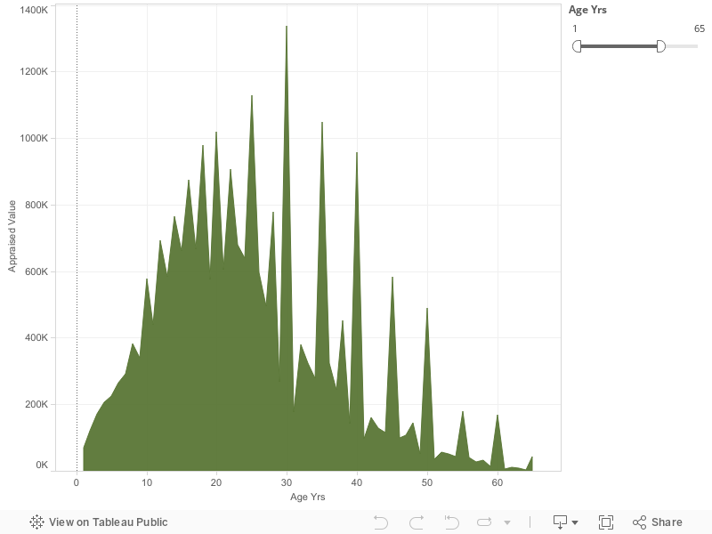
Visualization 1 Story:
My first visualization shows the comparison between different ages and the appraised values for those ages. The ages range from one-year old to sixty-five years old. As you can see, 1 year olds are valued particularly low. Due to the very young age, they are at a much higher risk of becoming ill. They are also a lot more responsibility to care for than the older ages are. Also, the low number accounts for the low number of 1 year olds being sold. From the ages of 1 to 22 there is a steady increase of value. Instead of the sum of appraised value growing with every year of age evenly, there are drastic peaks that get larger every two years, starting with 8 years of age. The first peak begins at 8 years old, then 10 years old, 14 years old, 16 years old, 18 years old, continuing every other year up until 22 years old. At the age of 22 a slow, gradual decrease in appraised value begins. Although there is a slow decline, there are very high peaks every 5 years, beginning at 25 years old, then 30 years, 35 years, etc., all the way up to the age of 65 years old. While there are very high peaks, after the peak at 30 years of age, the very high peaks represent a gradual lowering of value every 5 years as well. What I mean by this is that, the sum of appraised value for 25 year olds is $1,129,221, then reaches it’s highest for 30 year olds with the sum of appraised value being $1,337,584. From there, the sum of appraised value for 35 year olds shows a drastic decline with an average of $1,049,747. The sum of appraised value stays low, while slowly getting lower every year up until 35 where we see the extremely high peak again. This occurs over and over again until the peaks reach their lowest at 65 years old. In between the peaks from the ages of 30 to 65, every 5 years, the numbers are very low. After the highest peak at 30 years old, the sum of appraised value of 31 year olds drops down to $177,149. After 31 years old, at 32 the average sum of appraised value goes back up to the normal negative slope amount at $380,478 where the graph continues its gradual slow drop. At 33 years old, the drop continues with a sum of appraised value being %323,920, continuing to the sum being $278,147 at 34 years old. This continuous gradual downward slope, with high peaks every 5 years continues up until the age cut off at 65 years old. Throughout the entire visualization the highest sum of appraised value was at the age of 35 years old with the sum equaling $1,337,584. The lowest sum of appraised value is when the slaves were 64 years old, equaling $3547 all together. Over all, the visualization increases from the age of 1 up until the mid twenties. From there, there is a gradual decrease in appraised value up until the age of 65.
Visualization 1 Process Documentation:
When I first began to look at all of the data presented in the slave trade data set I had no idea what to work with. There is a lot of information presented, therefor I wasn’t quite sure where to go with my visualizations, stories, or even what historical data could be worked in with the data that was shown in the original set. I began to compare the appraised values with the different ages. When I realized that there was a pattern in the data that’s when I decided to make my first visualization the way that I did. I noticed that children were just as big of a part of the slave trade as adults. Therefor, this graph compares the sum of the appraised value that slaves were sold on in comparison to their ages. In this visualization I used the ages going from 1 year old up until 65 years old. I decided to start with the age of 1 year of age because at 0, most of the data was null. From there, I decided to end with the age of 65 years of age because once the graph got to 65 years old, the data kind of dwindled down to about nothing. I felt that this age group had the best representation for the entire data set that was presented to me. Once I had my age group to work with, I decided on what kind of graph to use. This was tricky for me because I wasn’t sure whether to stick with using a bar graph or a line graph to better represent my data. For bar type graphs, I had the option to use either a horizontal bars graph or a histogram. For line type graphs I had the option to use either a normal line graph, or an area chart. After trying all four options, I chose the area chart. I did so because I liked how the color I chose filled the entire bottom half of the data points. This graph gave my information a more dramatic feel, showing how significant the differences in appraised value actually are. As for the color, I tried a few different options. I started off with the color red because it is a very dramatic, and attention grabbing color. Once I had the graph in red, I didn’t like it because I didn’t feel like it actually represented the feeling that I was trying to give off from the data I was presenting. From there, I chose green. I chose green because it’s the color of money. When I looked at the color after I tried it out I really liked the way that it looked, and felt that it’s easier to grasp that its comparing different values pertaining to money. The way that I chose to make my visualization is representative of my argument as well. In my argument I discuss the difference in values of different age groups, and why the values may be different for different ages.
Visualization 1 Argument:
The data that is represented in this visualization shows how the appraised value of slaves rises from the age of 1 to the age of 20, but then slowly decreases with peaks every 5 years. The reason why the values increase and decrease is because of what that slave can do for their owner. First, I believe that the very high peaks are due to the fact that that most of these slaved didn’t have birth certificates. Furthermore, slave traders that would sell these slaves would estimate the slaves’ ages. While many people would believe that the slaves themselves would keep track of their age, it was very hard to do so when all of the days seem to just melt together. From birth to around 7 years of age the appraised value is particularly low. The reason for this is because the amount of children being sold at those very young ages is a lot less than the amount of 20 year olds being sold. Another reason for the low sum of appraised value could be because if a mother, who was a slave, had a baby then they would usually be able to care for their baby until it’s a little older. It was common that if a mother was a slave, the baby then became property of that same owner as well. This would mean that many young children weren’t being sold. While staying in the same plantation as the mother was the norm, sometimes they were sold to near by plantations, or even worse, to “speculators”. What “speculators” did was go around and buy slaves, and then sell them at a higher cost to make a profit. When this happened, the child was usually taken far away from the mother. Those would be the young children that are accounted for in the visualization. As children grew old enough to work they became more valuable to plantation owners. This can account for the gradual increase in appraised value from the ages of 10 to about 20 years old. The data set represents slave sales from the years 1775 to 1865. Children weren’t big in slave sales until around the 1830’s when the abolitionist movement started to begin. The movement threatened slave supply to those living in the south, so more and more slave owners began buying the slaves at much younger ages. They believed that if they got the slaves while they were younger, they would live a lot longer and therefor be able to work for them a lot longer (Vasconcellos.2016). As you can tell, adults were worth the most to slave traders. This was because unless they had a disability, they were the strongest and able to do the most work. Adult ages ranges from early twenties to around early to mid thirties. The extreme decline after the mid thirties was due to the fact that life expectancy of U.S. slaves was about 36 years old in 1850 (Wallace.2012). Also, elders became to be considered burdensome and unsalable for their owners. So while there probably were a lot of elders in slavery, the average appraisal value declines because they weren’t really being sold, but made to do tasks that they were capable of doing. The elders that were sold were sold for very cheap because they weren’t really a use to their owners anymore. The data set actually represents some elders that were sold for negative amounts. This means that they would pay people to take them.
Visualization 2 Story:
My second visualization is a map of the United States. On this map are different states that were listed in the data set that were responsible of slave sales from 1775 o 1865. Starting in the most northern states listed on this map that were responsible for slave sales are Maryland, Virginia, North Carolina, South Carolina, Tennessee, Georgia, Mississippi, and Louisiana. Within each state there are counties listed. The counties in Maryland are Baltimore County, Queen Anne County and Anna Arundel County. The counties listed in Virginia are Essex County, Henrico County, Albemarie County, Lynchburg County, Prince George County, Sussex County, Greensville County, and Southampton County. The countries that were responsible for slave sales in North Carolina on the map are Halifax County, Franklin County, Nash County, Edgecombe County, Johnstone County, Greene County, Duplin County, Anson County, and Mecklenburg County. As for South Carolina, the state that sold slaves during this time period represented on the map is Charleston county and Edgefield county. Georgia has listed 8 counties, including Oglethorpe County, Gwinnett County, DeKalb County, Troupe County, Taliaferro County, Richmond County, Jefferson County, and Chatham County. Tennessee’s counties that sold slaves were Ruth County, Madison County, and Williamson County. Mississippi only had three counties with sales at the time, which were Wilkinson County, Adams County, Hinds County, and Rankins County. The last state, Louisiana, had the most listed counties responsible for slave sales during that time period. These counties include, Union County, East Carroll County, Ouchita County, De Soto County, Natchitoches County, Tensas County, Concordia County, Avoyelles County, West Feliciana County, St. Helena County, Iberville County, St. Mary County, St. Charles County, Jefferson County, Orleans County, and Plaquemines County. Each different county is outlines on the map and range from a shade of very light res, to a prominent red. The more slaves that were sold in that county, the darker the shade of red is. Furthermore, the less slaves that were sold in that county, the lighter the shade of red is. As you can see by the map, the darkest shades of red are shown in Anne Arundel County, Maryland and Queen Anna County, Maryland. From there, Charleston County, South Carolina is the third brightest shade of red. North Carolina as well as Louisiana have some counties with brighter shades of red as well. As for Tennessee and Georgia, the shades of red in the counties tend to be very dull. This represents that not as many slave sales were made in those states. South Carolina has the least amount of counties in which sell slaves, with only two. Meanwhile, Louisiana has the most amounts of counties that were responsible of slave sales, with a total of 18 counties. On the map, there are no sales listed in some of the in-between states. These states include Alabama, Florida, Delaware, West Virginia and Arkansas. Also, the states that have slave sales, which have states that are not selling slaves, have fewer counties that were responsible for selling slaves. For example, Georgia and Mississippi have fewer counties that sold slaves, and Alabama, a state that sold no slaves, sits right in-between them.
Visualization 2 Process Documentation:
Just like the first visualization that I had created, I got stuck on what I should do while starting this one as well. For the whole beginning of this project I was convinced that I wanted to compare the differences in value between children that were sold during slave sales and the difference in value between adults sold during slave sales. I was going to compare them in a few different aspects, including value, defects, skills and value. I did research on the differences and couldn’t really find much. One I realized that there wasn’t too much that I could have worked off ofI lined up all of the states and counties in which slaves were being sold in, I realized that there were not too many states being listed. I found this interesting because slavery was such a huge deal all over the entire country during that time. I was curious as to why the slaves in this data set were mostly representing counties in the East Coast and South Coast. I tried to represent the data in a couple different ways. I started with a stacked bar graph, which included each state, with the counties stacked on top of one another. I didn’t like how that looked because it was a lot to take in. I thought of how I could make my information easy to visualize. I wanted the person looking at my visualization to easily be able to tell what information was being represented just within ten seconds of looking at it. From there, I chose a map. As soon as you look at the map you realize that the information that you need is within a handful of states. From there you see the outlined counties, which are really easily distinguishable from each other. After I decided that a map was the best way to go, I needed to decide how the person looking at my visualization would be able to tell which county had the most slave sales, comparable to the counties which had the least slave sales. First I tried out using filled circles to determine the size of sales. The circles went from very small to pretty large. I didn’t like that because it didn’t show the outline of the counties. I then decided to go with the county being highlighted by one color, and to have that color fade to almost transparent when there were low amount of sales, to bright when there were a lot of sales made in that county. After I tried that idea, I liked it because it made it so much easier to realize what was going on, fairly quick. When it came down to choosing color I wanted to use a color that would really stand out. I chose red for this one because it is a very dramatic color. It is also easy to distinguish between the nearly transparent counties that have fewer slave sales, and the bright counties, which have a lot of slave sales. This visualization relates to my argument because I’m going over what areas had the most concentrated slave sales, and why those regions may have had such a large number of sales.
Visualization 2 Argumentation:
As you look at my second visualization, you notice that there are an abundance of slave sales in some areas, while there are nearly half in other regions. First, Maryland has two different counties that have the most sales on the entire map. After Maryland, Charleston County, South Carolina had the most sales. After doing research on Maryland during the time period of 1775 to 1865, I found that the second most important port was located in Baltimore County. This was very important because at this time, ports were the fastest means of transportation of goods, as well as slaves. The port was founded in 1706 as a port to transport tobacco to England. By 1729, the port was incorporated into Baltimore Town. Once slave trade was established, slaved were shipped in to this port. Many of the slaves stayed in Maryland from this port in Baltimore due to the vast amount of tobacco plantations in that region (History of Slavery in Maryland). This accounts for the large number of slave trade in Queen Anne County, Anne Arundel County, as well as Baltimore County. One of the largest plantations in Maryland, Roedown Plantation, was located in located in Anne Arundel County. A man who was once a soldier in the American Revolution owner this plantation. By the time he dies in 1824, the plantation had over 80 slaves. The plantation produced cotton, poultry, corn, and cattle. As the plantations grew more popular in Maryland, the number of slaves increased dramatically. Between 1619 and 1697, there were less than 1,000 slaves in the state, while in 1755 there were over 100,000 slaves in the state, nearly 1/3 of the entire population (Maryland State Archives).
While Baltimore County had the 2nd most important port in the United States the most important port was located in Charleston, South Carolina. Charleston County was the slave trade capital in the U.S. due to the fact that because of this port, a majority of slaves coming into the U.S were brought to this port first. By 1860, there were 4 million slaves in the U.S., and 400,000 of them lived in South Carolina. That’s about 10% of all of the slaves in the entire country. Enslaved and free slaves accounted for 57% of the South Carolina population. It’s said that most of the city was predominately built by slaves alone (Hicks.2011). Not only did the slaves in South Carolina were forced to work in the city, but in the country as well. The greatest amount of slaves worked on plantations throughout South Carolina, and because their most predominant cash drop was rice. Rice required ten times the labor as other crops, such as cotton, so the amount of slaves per plantation was also a lot higher than other states as well. While slavery was all over the state, sales were mostly all done in Charleston. This accounts for Charleston County being bright red on the map visualization.
The third state that ill be talking about is Louisiana due the large numbers of counties representing slave sales on the map. In Louisiana cotton was a huge cash crop with more than 2 million acres producing cotton. Due to the fact that so much cotton was being produced in Louisiana, they imported very large numbers of slaves across the state. By the end of the Civil War, Louisiana had over 1,600 plantations that were large enough to have 50, or more, slaves per plantation (LOUISIANA SLAVERY: An Introduction). On the map, the county in Louisiana that is the brightest red is Natchitoches County. In that county alone, there are three very large plantations that are listed online, which are still available to go visit as historical landmarks. The most important historical plantation, Oakland Plantation, started in 1789, and by the time he died, he owned 104 slaves, being the one of the largest plantations in the state (National Park Service).
Further Research Questions:
I found this data set to be very interesting. There was a lot of data available to do research on, from value of slaves being sold compared to their sex, defects they had, skills that they had, where they were from, etc. I’m glad that I chose this data set because I learned a lot from the research that I had done on the information that was given to me. While there was ample information given in the data set, I still have some questions that could be further researched. My first question would be in regard to there not being any slave sales listed in the surrounding states. Slavery was a huge deal in all of the U.S, especially the South. I did research on states that didn’t have any listed in the set, such as Alabama, and found that there were sales in those states. Also, in previous classes, I have learned that NYC had a lot to do with the slave trade. Further research that could be done on my question would be why slave sales were only listed from the states of Maryland, Virginia, North Carolina, South Carolina, Georgia, Tennessee, Mississippi, and Louisiana, and states like Alabama, Arkansas, and Florida were not. I could go about answering this question by comparing the amount of salves being sold during this time period between the states that are listed, and the ones that are not listed. Perhaps, they were listed because they had a lot more sales compared to the other states. Another further research question that I have that was prompted by my first visualization, would be what was the reasoning behind the prices that were chosen for each slave. Slaves had very different appraised values, from $1 to thousands of dollars. I would like to see how they calculated the amount that they wanted for each individual slave. I could research this further by comparing skills and defects to age and appraised value. While skills and defects have a little bit to do with how much they were sold for, there were still some slaves with out skills that were sold for a lot of money. There were also slaves that had defects that were sold for a lot of money, and slaves that had skills that were sold for only a little bit of money. I also would like to know how they determine which skills are worth more than other skills. I could research this question by looking up the area that each slave that had a skill was from and comparing it to other areas. Maybe from there I could research what type of work was being done in each area. From there I could see which disabilities were more affluent in each area as well and why they paid more, or less, for each skill or defect. My last research question that I have would be why the average life span for slaves was only around 36 years old. This makes me wonder about living conditions and if they slept in homes, or outside, etc. I could further research this by looking up illnesses that were popular in different areas, as well s living conditions.
References
Colleen A. Vasconcellos, “Children in the Slave Trade,” in Children and Youth in History, Item #141, http://chnm.gmu.edu/cyh/case-studies/141 (accessed May 11, 2016)
Wallace, Hunter. “Slavery Myths: Life Expectancy.” October 15, 2102. Accessed May 9, 2016. http://www.occidentaldissent.com/2012/10/15/slavery-myths-life-expectancy/.
“History of Slavery in Maryland.” Wikipedia. Accessed May 12, 2016. https://en.wikipedia.org/wiki/History_of_slavery_in_Maryland.
Maryland State Archives. “A Guide to the History of Slavery in Maryland.” Accessed May 9, 2016. http://msa.maryland.gov/msa/intromsa/pdf/slavery_pamphlet.pdf.
Hicks, Brian. “Slavery in Charleston: A Chronicle of Human Bondage in the Holy City.” Post and Courier. 2011. Accessed May 12, 2016. http://www.postandcourier.com/article/20110410/PC1602/304109945.
“LOUISIANA SLAVERY: An Introduction.” Times Union. Accessed May 12, 2016. http://www.timesunion.com/living/article/Building-a-new-kind-of-Motown-5765204.php.
United States. National Park Service. “Oakland Plantation–Cane River National Heritage Area: A National Register of Historic Places Travel Itinerary.” National Parks Service. Accessed May 12, 2016. https://www.nps.gov/nr/travel/caneriver/oak.HTM.

