Description of the Data
The data that is included in the data set Slave Sales 1775 – 1865 contains numeric, textual, and geographic data. The first piece of numeric data that is included in this data set is the year in which the data for the sale of the slave was collected. The range of the data for the column “date_entry” is from the year 1742 to 1865. The next piece of numeric data that can be found in the data set is the age in years of the slave that was sold at auction. The range of age in years for this data set is 0 – 99. After the slaves age in years, the next column of numeric data includes the slaves’ age in months at the time of the sale. The range for the column containing the slaves age in months is 0 – 11. The next column containing numeric data for this data set provides the appraised value of the slave that is being sold at the auction. This descriptive data has the biggest range and is also influenced by many factors as opposed to the rest of the numeric data that has already been previously described. The range of values for the appraised value of the slaves being sold at auction is 0 – 7000.
The first textual data that you see in this data set provides us with the sex of the slave that is being sold at auction. The data for this column can either be male or female. There are some cases where this column has been left blank. There is also textual data for the column labeled “skills”. This column provides us with information about what special skills the slave in question might have possessed that could make them more valuable to potential buyers at the auction. A few examples of what might be contained in this columns are skills such as “driver, mechanic, blacksmith, and fisherman”. Next to the “skills” column is the next set of textual data which is the column labeled “defects”. This column informs us of any defects, or perceived defects, that a slave might have possessed while it was being sold at auction. These defects may have had an impact on the slaves’ appraised value, usually slightly lowering the appraised value for the slave in question. Some of the defects described include things such as “blind, old, insane, cripple, and sick”.
The geographic data that’s provided provides us with which state the sale of the slave occurred in. This information is provided in the column labeled “state_code”. The potential different states that could be listed in this column are “Georgia, Louisiana, Maryland, Mississippi, North Carolina, South Carolina, Tennessee, and Virginia”. There is also one more column that provides geographic information for the slave sales. This data is provided in the column labeled “county_code”. This column breaks down the location of the slave sales farther than just by state. It tells you in which county in each state that the sale occurred. This gives us much more precise information about what might have been happening in each state by looking at where the majority of sales in each state occurred and where certain slaves with particular skills might have been sold more often.
Visualization 1: Skill Comparisons Between Males and Females
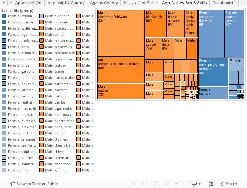
The data set that includes information on the slave sales from 1775 to 1865 contains valuable insight into the slave trade in the United States that many people may not immediately think of when they think of the history of slavery in America. It provides insights into information such as how much slaves would be sold for when they possess a particular skill set compared to slaves that possess other skills as well as no skills at all. It also allows you to compare the types of skills that female slaves possessed as opposed to the skills that were possessed by male slaves. In the visualization shown for example, you can see that female slaves that were sold possessed more domestic based skills such as “hair dresser, house servant, pastry cook, laundry, etc.” In terms of these skills women that possessed hair dressing skills were appraised to have the highest value, being appraised at around $1,000, as compared to a female spinner that was given an average appraised value of $203.
The skills that are possessed by the male slaves appear to be more skilled labor types of jobs. These jobs include skill sets such as “mechanic, brass molder, painter, cigar maker, blacksmith, construction, etc.” By looking at the visualization we are able to see that the mechanic skill is valued the highest among the male slaves with the average slaves with skills as a mechanic were appraised to be worth around $1,258. This would be compared to a male slave possessing the skills of a pusher which was appraised at a value of $150. The visualization also allows us to compare the appraisal values of male slaves compared to the value of female slaves during the slave trade in the United States. By looking at the graph we are able to see that on average, male slaves were valued at a higher rate than female slaves. This included times when they possessed the same set of skills. For example, a male mechanic was valued at an average rate of $1,258, while a female mechanic was on average appraised at a value of $600.
One last point that we can conclude by looking at a comparison between the males and the females is that the male slaves appear to have had wider number of skills that they could have possessed in comparison to the female slaves. The males that possessed a skill in the data set collectively possessed 67 different skills. This is a much higher number than the number of skills possessed by the females in the dataset which possessed 27 different skills.
Visualization 1: Process Documentation
When I was first presented with the dataset I was not sure at all which comparisons I should make between the different rows and columns. Looking at a set of data that is filled with so much information that covers so many different areas can make you feel over whelmed at first. The only way that I decided that I would be able to see which data would make the most interesting comparisons was to look at different visualizations of comparisons side by side. To do this I began taking as many columns and rows as I could and made different visualizations that helped to comprehend exactly what it was that the information was telling me. After I did this I was much more able to make a decision about which data it was that I wanted to refine for my final visualizations and analyzations.
The first visualization that I decided to use for my final project compares the different sets of skills that were listed as the slaves having possessed, organized between males and females and as compared to the appraised value of the slave at auction. I thought that this data would be an interesting comparison because it helps to show what skills were valued higher in this time period. It also allows us to see the differences in what skills were possessed by male and female slaves during this time period. The first decision that I had to make was which type of visualization to make. In the end I ended up deciding on the tree map visualization. I made this decision because I feel that it does the best job of showing how much each skill was valued at in the time period when compared to the other skills that were compared with other slaves at the time. After deciding on using the tree map the next step was to decide how I wanted to go about organizing the data. The first decision that I made was to organize the data by the appraised value of each slave with that particular skill. The next decision that I made was to also separate the data between male and female slaves that possessed skills. I thought that it would be interesting to visually see the different types of skills that males and females would have possessed, as well as if males or females possessed a higher number of skills. In order to see which sex had a higher number of skills overall, I also had to organize the data by the total number of slaves that possessed each skill.
In order to best visualize this data it has been organized so that the biggest box in the visualization is the skill that was possessed by the highest number of slaves. Likewise, the smallest box in the visualization is the skill that was possessed by the least number of slaves overall. The next decision that I made to make this chart easier to read was to visually separate the male slaves from the female slaves. In order to do this as easily as possible I made the decision to make the skills that were possessed by male slaves orange, while the skills that were possessed by female slaves have been highlighted blue. Along with being separated by color, the sexes are different shades of color depending on the average appraised value for a slave with that skill. The darker the box is, the higher the average appraised value was for a slave of that sex that possessed that particular skill. An example of this is that the male laborer box is a lighter shade of orange than the male blacksmith box, because the average appraised value of a male laborer was 634 dollars, while the average appraised value for a male blacksmith was 903 dollars.
Visualization 1: Argumentation
When looking at the visualization there are some things that will begin to standout almost immediately given the nature of the graph. Certain colors and sizes of objects will immediately capture your attention and draw your focus to them. After noticing these parts of the data I began to see for some potential explanations for why the data may have ended up this way.
When looking at the data the first thing that jumped out to me was that on both the male side of the chart and the female side of the chart the skill with the highest number of slaves possessing it was the laborer or fieldworker skill. I think that this is because the demand for slaves that could work in the fields in the south was very high during this period of time. This most likely created a very high supply of slaves that were skilled in working the fields that were then sold farther down south. I think it is also important to note that on the female side of the chart you can clearly see that there was almost exactly as high of an amount of female slaves that possessed the skill of being a house servant as there were female laborer or fieldworkers. I think that this is because during this period in time females were most often thought of as being very domestic in nature and were often thought of as being in the house. I think that this is something that was very typical for this time period and speaks to the sexism that existed in America during this time period, some of which can still be seen in America today to a lesser degree. You should also note that female slaves were also appraised at a much lesser value than male slaves that possessed the same skills. An example of this is that the average appraised value for a male mechanic was 1,258 dollars and the average appraised value for a female with skills as a mechanic was only 600 dollars. This is another example of the high levels of sexism that were circulating in the United States at this point in time.
I think it is also important to note that the some of the highest valued skills that are represented in this data were the skills that had the least number of slaves that possessed the skill. For example, there was only one male slave that was recorded as being skilled in construction. This particular slave had an appraised value of 1,000 dollars. This can also be seen for the male mechanics; where there were only 45 male slaves recorded as having this skill, but the average appraised value for male slaves with this skill was 1,258 dollars. This would suggest that these skills were hard to come by in this time period and that slave owners would be lucky to have slaves that were skilled in these areas.
Visualization 2: Comparison of Defects by State
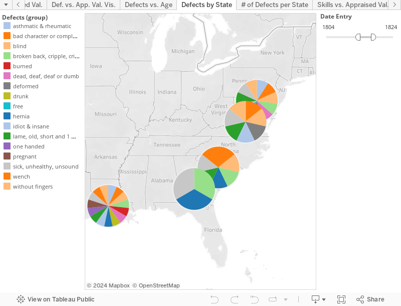
This data visualization is a map of the United States that displays which defects were located in which state. Beyond this, there is also an interactive sliding filter that allows the person viewing the visualization to shift the time period and look at the data 20 years at a time. The addition of this filter allows people to see the shift in trends over time throughout the history of the United States. The visualization shows the data for slaves with defects from as far north as Maryland, and as far south as Louisiana.
As one would expect, the earlier that you go in the history of the map, there are fewer defects in every state. In the early years of the visualization the only states that are listed as selling slaves with defects were Maryland, and South Carolina. As you begin to move the filter later and later you can see how the number of defects begins to increase. Along with an increase in the number of defects in these two states, you will notice how defects begin to appear in states farther and farther south until you eventually reach Louisiana. As you would expect, the later and later that you move the slider the number of defects, the more defects will begin to appear in every state. It is also important to note that the defects that begin to appear start to make more physically debilitating than the defects that were listed in the earlier years. These are injuries that are things such as missing a hand and crippled. As opposed to injuries in the earlier years that were mostly defects such as short, sick, and wench. It is also interesting to note that the defects in the Deep South are also much more physically debilitating than the defects that were recorded in the more northern states.
The visualization shows that as the use of slaves in the United States progressed, their use began to be used more and more intensely in the Deep South of the United States. The work became much more physically demanding and the injuries that resulted from the labor began to rise dramatically as the years went by.
Visualization 2: Process Documentation
Coming up with how to best represent this data in a visual way was a little bit of a challenge. The first step was to place all of the data on the map. This was done by taking only the slaves that were listed as having defects and placing them on the map in comparison to their state code. Tableau automatically placed them on the map and broke them up based on which state was associated with that particular slave. The next step that was taken was to tell tableau how to visually represent the data on the map. In order to best represent the data I decided that a pie graph would be the best way to show which states contained which defects. After determining that a pie graph would be used, I had to determine how to distinguish between the different defects in each pie. I did this by choosing a color template that associated each listed defect with a unique color that would be shown on the pie chart in states that contained the sale of slaves with that defect. One difficulty that I ran into with this was that tableau has a limit to how many different colors can be used at once. In order to try to get around this I decided to try to group together some of the defects that were similar in nature in order to limit the repeat of colors. An example of defects that ended up being grouped together were defects such as sick, unhealthy, and unsound. I also decided that the sizes of the pie charts needed to be adjusted. Originally, the graphs were so small that it was very difficult to distinguish between which defects were in each state. To correct this I simply adjusted the size with a slider that was provided by tableau and resolved the problem very quickly and easily.
The next step was to try to find a way that would limit the amount of data that would be displayed at once, since the charts were filled with almost every defect with all of the information being displayed at this. The solution to this was to add an interactive filter that would allow the person viewing the visualization to view the data by 20 years at a time. This limits the amount of information that can be viewed at one time and makes it much easier to identify which defects are found in each state. I discovered that by doing this it also allows the viewer to see the progression of the data over time, and it helps to tell the story of how slavery evolved in the United States over time.
Visualization 2: Argumentation
The visualization shows which types of “defects” different slaves possessed based on their geographic location in the United States of America between the years 1742 and 1865. The visualization is color coded by which defects appeared in the slave sales records for each state. It is broken down even further by the addition of a sliding filter that allows you to narrow down the data set in increments of 20 years. Without even looking at which types of defects were recorded in each state you can immediately begin to recognize a trend simply by moving the time slider up and down through the years. When it is at its earliest years you only notice defects in two states which reside primarily more north than south. However as you move the slider further along you begin to see more and more records of slaves with defects appearing in the southern region of the United States. This is most likely because as slave labor was more and more used by the southern states; more and more defects began to arise over time due to the severity and intensity of the labor that was required by slaves.
We can also begin to notice differences when we look at which types of defects appeared to be more common compared to defects in other states. For example, we are able to see that in the more northern states, the slaves that were listed as having defects appeared to be defects such as being old, or deaf, or as having bad character or even being free. This is compared to a southern state such as Louisiana where not only does it contain all of the previously listed defects, but it also primarily contains physical defects that are most likely attributed to the intense labor and living conditions that they were forced to endure. These defects included things such as being burned, without fingers, one handed, hernia, broken back, and crippled. All of these types of defects appear to be far more common in the south than up north and are most likely due to the much more intensive plantation labor that is known for being located in the most southern states in the United States.
We are also able to note that some of the more northern states are not listed as having any slaves with defects until the early to mid-1800’s. This could be because the types of labor that slaves were forced to endure were not as difficult or intensive as the labor that was endured in the Deep South. It is possible the punishments and the work its self was not as harsh, and because of this, slaves did not develop defects in the more northern slave states until later in the 19th century. It is also possible that perhaps slaves with defects began to appear more towards the north later in time because they were being sold with defects to the northern states. It is possible that they may have been sold simply because they possessed what some slave owners considered as a defect. It is possible that due to the nature of the work in the Deep South, that slave owners in the Deep South did not want to purchase slaves that already contained something that they thought was a defect, because they thought it would mean they would be less efficient at the work they would be forced to do. If this is the case, it could mean that slave owners in the Deep South might not have had any choice but to sell their slaves to the more northern states because they would be willing to buy them for less money, because the defects that they possessed would not severely impede their ability to effectively complete their jobs. This theory is also supported by looking at the defects that appear in the states mentioned above such as Mississippi and Tennessee. The defects that do appear in these states are not anything that would be to physically debilitating. These are defects such as being unhealthy or sick, lame, old, or unsound. These are all “defects” that could either resolve themselves over time such as being sick, or defects that would not affect their ability to work in a serious way, given that the labor in these states were less intensive.
It is also important to note how many defects are located in each state over time. Every state contains a considerable amount more of defects when you move the slider all the way to the later dates as compared to when they first appear on the map. There is no state where the number of defects in slave records goes down or stays the same. Not only does the number of defects increase, the types of defects also become much more diverse. This could be because over time, the labor that the slaves endured caused more and more of them to suffer from physical injuries that took time to develop. It could also be because over time slave owners began to trade slaves as they became injured or grew older and may have had to settle for a lower price from another slave owner due to the defects.
Further Research Questions
When looking at the data set and while making the visualizations previously discussed, there were some potential new research questions that I thought of. While looking at the visualization containing information about the defects of slaves, I began to wonder if there was a difference in the defects that were received by men as compared to the defects that may have been suffered by women. This question also led to me to wonder if the healthcare that was provided for slaves was different depending on the sex of the slave. Based on the previous sexism that I was able to see when looking at the differences in appraised value between males and females, I get the idea that male slaves were most likely to receive better medical attention than female slaves. In order to try to answer this question I would try to do research on the medical attention that was given to slaves during this time period and attempt to specifically locate scholarly peer reviewed articles about this type of information.
While looking at the visualization that was concerning the different skills between males and females, I began to wonder if the same differences would have been seen between the male and female salves in the Northern states. Given that the north was a more industrialized section of the United States than the south, I began to wonder if the skills of the females would be less domesticated and be more similar to the skills possessed than the males. I also wonder if the appraised value of these slaves would be similar to those of the males as opposed to the difference in appraised value in the south. In order to find this information I think that the first thing I would try to find would a census from several industrialized cities in the north and use this information to gather information on slaves living there. I would then try to find information on the sale of slaves in the northern states, similar to the dataset used in these visualizations.
