Final

Slave Sales 1775-1865.

Data Description

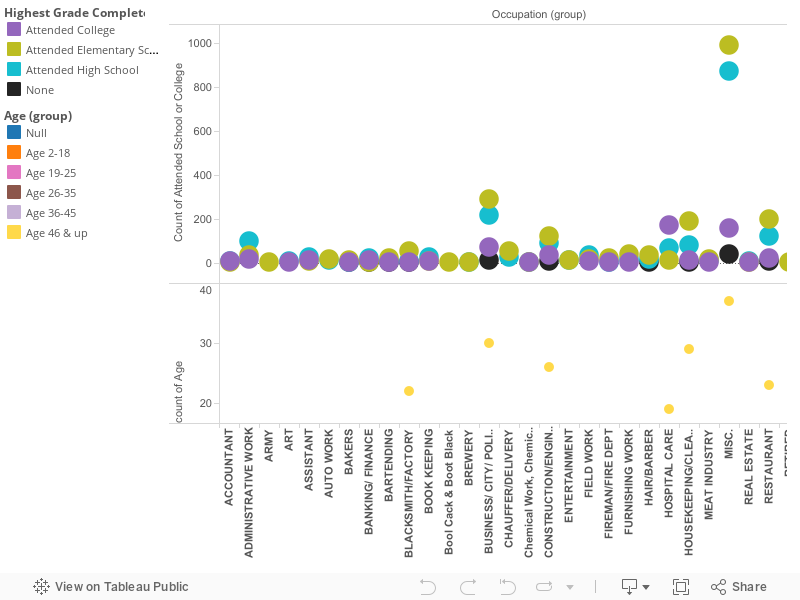
The data set for the Slaves sales from 1775 to 1865 holds the information of individual slaves, their gender, and information considered important for potential slave buyers. The data can be considered numerical, textual, and geographically information. The numeric information for the data set is columned by the age of slave in years and month, the date of the entry of the slave, and the slaves appraised value. The two columns that describe the slaves age in years, the youngest being 0 years old, to the oldest being ninety nine. The column for age in months is empty throughout the entire data set. I can argue that the months column is completely empty because infants were rarely bought, and sold with in the slave trade itself. For the date of entry column the beginning date is 1775 and continue through 1865, although the data set itself is all over the place with which particular year a slave was sold. The column regarding the appraised value of a specific slave has variation based on the age, skill sets and defect of the slave. I can also argue from studying the data set that gender also played a major role in the appraised value for a specif slave, as well as the geographical location that a particular slave was sold in. The textual information for the data has text data with in the columns that include any defects that each particular slave may or may not have, and any skill set that some of the particular slaves may or may not acquire. The defects column of the data set included terms such as “runs away” or “deaf”, and the columns for skill sets include terms such as “house servant” and Laundry”. The textual information tends to be historical accurate in proving how real racism was, not just between the years of 1775 and 1865, but through out American history. The geographical information only has two columns; State and county. The states include Georgia, Louisiana, North Carolina, South Carolina, Tennessee, Virginia, Maryland, and Mississippi. The columns for county include all the counties with in the specific state. All the areas associated with this data set are southern states, some of which would succeed at the beginning of the Civil War to protect their institution of slavery, that they strongly believed was a given right.

Visualization one

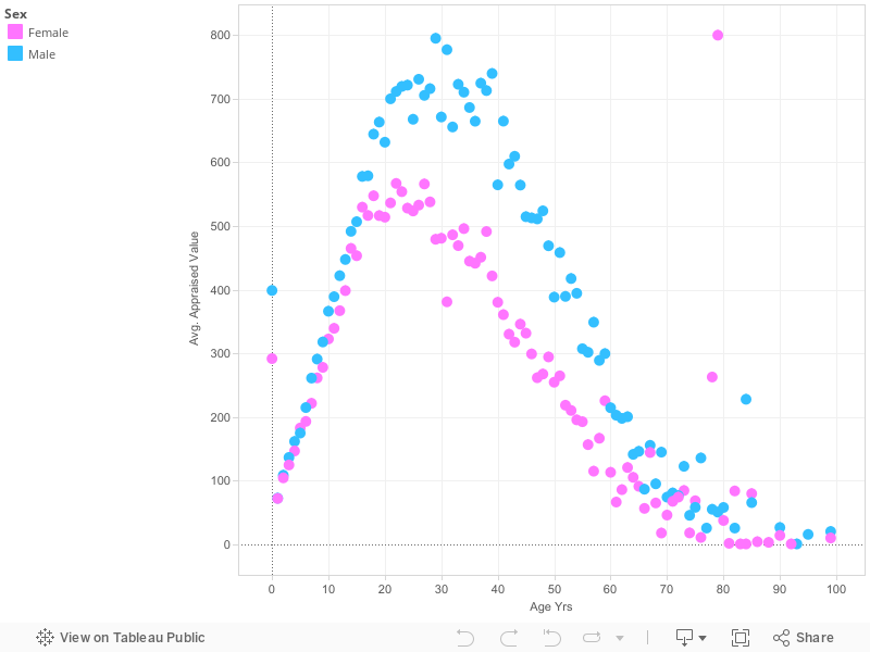
The first of my data visualization is meant to show the correlation between the age, and gender of a slave, and their average appraisal price. This visualization makes me question not only the institution of slavery, but also sexism with in slavery. The varying prices between age can be, although horrifying, expected, but the variation between the genders of a particular slave seem unjustified.
The average peaking value for a female slave from the years of 1775 to 1865 was at the prime age of twenty two, with the average price of $566.9. The value of a female slave drastically declines after the age of twenty nine, and again at the age of thirty nine, although there are a few unexplained outliers. The lowest average value for a female slave from the years of 1775 to 1865 was at the old age of ninety, with the average price of $9.4, females at the age of one were valued more then elderly females at the average price of $71, although one elderly female slave was appraised at the average value of $800.0 at the age of 79. I can argue from reviewing the data set of the Slave sales that females slaves were ideally in their prime at the age of twenty two until thirty nine for work purposes, and more likely breeding purposes. Women were not value as high as men though, for obvious reasons such as labor, and strength.
The average peaking value for a male slave from the years of 1775 to 1865 was at the prime age of twenty nine at the average price of $795.1. The value of a male slave begins to drastically decline after the age of forty three with the average appraised value at 609.6, although like the female data, there are a few outliers within the data sets. For example, eighty four year old man was appraised at the average value of $227.5. The lowest average appraised value for a male slave was a ninety nine year old whose appraisal value was $19.6.
The data set of the Slave Sales from 1775 to 1865 shows the range of values for a set of slaves sold in the states of Georgia, Louisiana, Maryland, Mississippi, North Carolina, South Carolina, Virginia, and Tennessee. A closer study of the Slave Sale data set from 1775 to 1865 revealed a pattern between the value of a slave, their gender, and their age, only after I excluded the unknown ages of specific male, and female slaves within the data set. I found the average value for specific slaves varying on their gender, male or female, and their age ranging from age one to age ninety nine.

Process documentation

For my first visualization I created I decided to use a dot graph to show the variations between the price of a gender, and the age when slaves were being bought and sold in the years of 1775-1865. I chose the dot graph because it clearly shows the decline in average appraisal price as a slave in the slave trade aged. I chose the color blue to represent the male slaves, and the color pink to represent the female slave because these specific colors are always associated with the genders. I thought the colors would intensify my argumentation of how racism, and sexism went hand and hand in the years prior, and after 1775 to 1865.

Visualization two

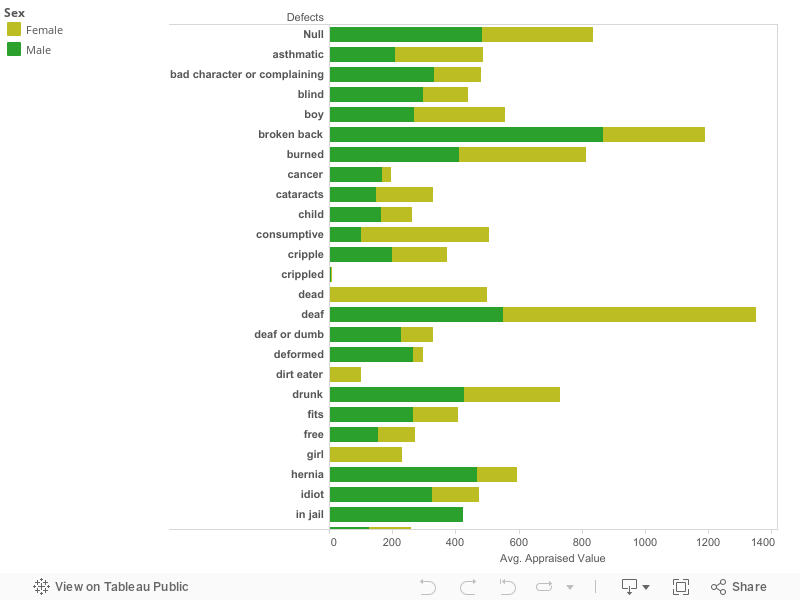
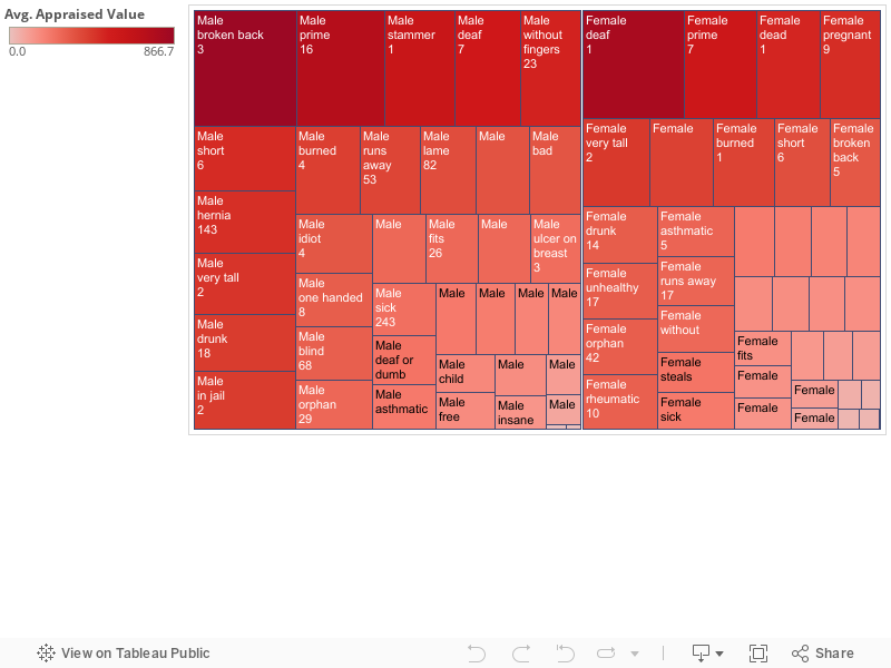
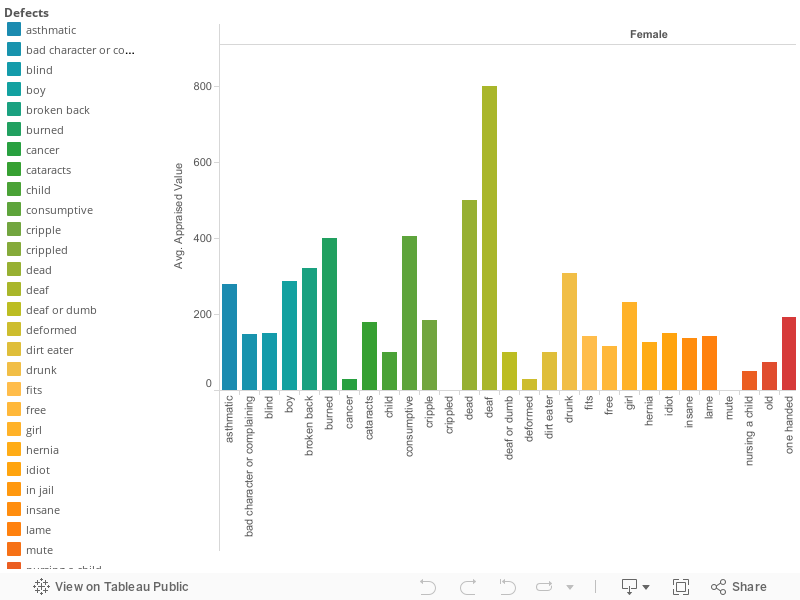
For my second visualization is meant to show the “defects”, the gender of the slave with the “defect”, and the average appraisal value for this specific “defect.” I am using quotations around the word defect in this sense because certain “defects” in this visualization are not considered defects by today definition. The range of “defects” in this data set include thing such as: very tall, short, crippled, one handed, missing fingers, broken back, and etc. Other “defects” include things such as: lame, idiot, dirt eater, dumb, deaf, drunk, nursing a child, and etc. The highest appraisal value for a female in this data set is $800.00 with the “defect” of being deaf. The highest appraisal value for a male in this data set is $866.70 with the “defect” of having a broken back. The lowest appraised value for a female in this data set is $30.00 with the “defect” of being sick with cancer. The lowest appraised value for a male is $5.00 with the “defect” of being deaf. I can only argue that the female with the defect of being deaf is appraised at a higher value because she is either younger then the male, or is still able to communicate while being deaf because typically throughout the data set male slaves are always value higher then females. I chose to show the “defects” with in the range of genders to reiterate my first visualization of how sexism, and racism went hand and hand prior, during, and after the years of 1775 to 1865.

Process documentation

For my second visualization I created a bar graph that is brightly colored. The bar graph is again separated into the genders of male, and female to shows the difference in appraised value between “defects” and genders. The brightly colored bars within the graph are meant to show the wide range of varying “defects” that the slaves being sold were labeled with. The bars also show the appraised value of each slave with the “defect” and how each “defect” was compared prices wise to another.

Argumentation

The argument for my first visualization, as well as my second visualization is centered around how sexism, and racism went hand and hand in the years of 1775 to 1865. For both male, and female slaves slavery was an absolutely devastating experience, but the circumstance of enslavement were different for both the male, and female slaves. Although most planters in colonial North America favored robust young men as slaves, the bulk of these were shipped to the West Indies, so early on, slave buyers turned to purchasing female field hands, who were not only more readily available, but also cheaper. In fact, because skilled labor, such as carpentry and blacksmiths, was assigned only to male slaves, who were also more expensive because of the skill set, so the pool of black men available for agricultural work was further reduced. During the time period of 1775-1865 Women slaves were considerably cheaper, than a man that was their exact same age for what I believe to be attributed to strength, and after further research different types of work. One thing the data set does not tell me is what specifically each slave was being brought for whether it be plantation work, a house maid, or a stable hand. Appraisal value could have most likely varied between the job each slave would be doing, and the geographical location of that job. No matter the circumstances sexism was embedded into the context of slavery, and racism. Whether a female was considered less appealing for a job because of strength reasons, or job details in my opinion in that era even if a woman was equal to a male, the male would still have been sold for a more considerable profit simply based on his gender.

The argument for my second visualization again revolves around sexism, and more so for this data set the historical racism that it presents to use. The “defects” column of the data set ranges from what would be considered disabilities in today’s world such as: deaf, blind, broken back, one hand, cancer, or crippled. The “defects” with in the data set that show the historical racism that was involved in the slave trade include: dirt eater, dumb, idiot, complaining, bad character, runs away, steals, and insane. These “defects” show how lowly the slave trades thought of their slaves, but shows me that during an excruciating time some still had the urge to fight for their independence. In today’s time the idea that slave had a “defect” because they run away, steal, complain, or have a bad character means that specific slave had the will to stand up against their owner. In the years between 1775 and 1865 the slaver traders did not see things so positively though, these “defects” seriously declined the price of a slave. Along with the first data set, females with “defects” were considerably less costly then a male with the same or more extensive “defect.” Again showing how in the years prior, during, and after 1775-1865 that sexism, and racism were two institutions that coexisted together.

Further Questions:

The first question prompted by my data visualization is what time of work each slave was going into. I would like to further research this so I can properly compare the appraised price of each slave, and further learn why two of the same aged, and skilled slaves could be appraised for different values. In my opinion this would help my complete understanding of the slave trade, and how in the years of 1775 to 1865 it worked. The second question prompted by my data visualization is if a “defect” such as a dirt eater was racially driven, or there is a historical explanation behind why a slave would be actually be eating dirt. I would like to know if it was a religious exercise, or something culturally driven. The third question prompted by my data set is why specifically some elderly slaves were valued higher than some slaves considered to be in their prime of life. Is it because a slave at the age of eighty has been a slave for a long time and was setting an example for the younger slaves, or simply for educational purposes for the other slaves? The final question prompted by my data set would be why in specific geographical locations did the appraised value of slaves vary so much? Were slaves valued higher in different states in the United States because of different work loads, or during this time period was one state booming more then another?

1940 Census Argument Draft

When looking at any historical information, you may see a pattern regarding disparities based on societal factors. The 1940s census provides information on a select number of people living on neighboring streets, their marital status, income, gender, education level, occupation, age, and more. Demographic data is a good way to track populations, but requires good observation to find correlations within the data. The patterns we see today are presented in the census once we create visualizations. There is a distinct trend in the societal differences based on class, gender, and race. Three main points within this argument are that men make more money than women, the higher education obtained, the better the occupation is, and the presence of white privilege/lack of representation for people of color in any data.
The first trend within the argument is education levels influence occupations. The census data lists the number of people who have either attended elementary school to college. Although several names have no information regarding the highest level of education received, a pattern is still present. There is a subset of data that shows people who have only completed elementary school with an occupation as an unpaid family worker, wage or salary worker, janitor, or laborer. Those with only high school education had similar jobs, or some more advanced such as beautician, attendant, and typist. College education residents in Albany were lawyers, civil engineers, stenographers, and accountants. Those job titles/careers advance as the education level increases, showing the value society has always places on receiving a higher education. The 1940s census does however, lack a large amount of occupations for residents. People in Albany overall did not attend college. You also see that many people that have an elementary school education hold the same positions of those who attended college. Today, that same issue applies, where people attend college and do not always immediately find work in their desired career. Also ten years prior to 1940, the United States went through economic turmoil. This can have an effect on people who worked in state, local, and financial offices that may have lost their jobs during that time.
The second correlation found within the census is the difference in income based on gender. It is already a known fact that men make more than women today. History has shown us that society has trained women to be comfortable in the household. They are created to be wives, mothers, and attend to duties in the home. All of this work fulfilled and even when doing so, that work is still not measurable to work for pay. When visualized in a bar chart, you can see men made more than women. The census does lack information on occupations for women. The marital status also plays a role, as you can see who is married versus who is the head of the household. Typically, the relation to head of household for women is wife, mother, or daughter. The men would be the head of the household or the son. Both the head and the son still would have occupations listed in the census more frequently than women during this time.
The last pattern within the argument is racial disparities that continue to exist. With a simple glance at the census, it is clear that over ninety percent of the population in Albany was white. It is uncertain if people of color were undocumented purposely, or they simply did not reside in Albany. Three other races were present in the census: Chinese, Filipino, and Black. Based on their demographic information, they all lived on Fleetwood Avenue or Vanschoick Avenue. Their education levels, occupations, and income varied. The data alone does not show if one minority was more established financially than others. It is however a small sample of information to make any major conclusions. By assessing the information, you can question whether the area in which people of color lived was worse financially, safe or unsafe, encouraged or lacked opportunity for growth in comparison to the neighborhoods where white people resided. Those factors are a part of the present struggle of equal opportunities for all races today.
There are other correlations that can be made with the census data. You can compare martial status to head of household, immigrant status and occupation, home ownership and income, gender and employed for pay/non-pay. The census is simply surface material, yet can unveil many trends about populations in specific areas. These patterns are not new findings to how society is run today. They give additional information for how these patterns came to life.

Argument for Visualization Number One

Slavery –the practice or system of owning slaves (Random House Inc., 2016). Such a system served as a pillar of the U.S. economy and social structure. By 1850, slaves in the U.S. were worth 1.3 billion dollars. Or in other words, American slaves were worth one fifth of the entire nation’s wealth (Goyette, 2014). Such information makes sense of the data that is displayed in the slave sales data set. It’s easy for people to think about how rich America’s history is, but how often do these people think about the hands that made it great? From the Caribbean to the mainland slaves hands were goldmines. Cotton wouldn’t have boomed without people to grow, harvest, and pick it. Tobacco would be a delicacy if lives weren’t stolen and then bought in order to harvest it. These statements ring true for many of the goods produced by slaves. This may be contrary to popular belief, but the American Economy must have depended on slavery for the better part of its history before the start of the 20th century. As a result, slaves were in high demand. But the question is –which slaves were in high demand and why?
According to measuring worth, a slave’s value was truly the value of the how much they’re expected to produce (Williamson and Cain, 2011). In other words the value of a slave was not really the slave’s value per say, but the value of the service that they could provide. For example, an elderly woman wouldn’t be expected to produce much, especially if she has any outstanding physical condition (or “defects”) such a missing finger or cataracts. As we see in this data visualization, males were clearly expected to produce more because generally, more money was spent on males. In Louisiana, males that were between the ages of 15 and 44 had the highest values and men within the 24-35 age-range held the peak values. As for females, those in the approximate age range of 14-33 years old held the highest value. This is no surprise, since these are typically a female’s peak child-bearing years (Williamson and Cain, 2011). Slaves weren’t only valued for what they could produce in the fields, but for their skills as well. Premiums were paid for slaves that had artisan skills such as cooking, carpentry, and blacksmithing, among other domestic skills. On the other hand, a slave’s value was depleted if they had characteristics or deformities that would inhibit their production such as drinking, being crippled, or being a frequent runaway (Williamson and Cain, 2011).
The spreadsheet itself uses appraised values that are generally under one thousand dollars. However, if we were to convert these prices to what they’d be today, the average range for which a slave would be sold would be 12 thousand to 176 thousand dollars. In other words, a slave was worth anywhere between the price of buying a used car and a mortgage. For example, a slave that would be sold for $400 in 1850 would be worth about $82,000 today. (Williamson and Cain, 2011). For slave owners, perhaps foregoing purchasing a home or another luxury item was worth investing in a few decades worth of slave services that would have a major return in the long run.
Though all states in the slave sales data set purchased slaves to some degree, the massive amount of capital spent on both female and male slaves by Louisiana is strikingly higher than the other states. Louisiana was most likely subject to the other factors such as the cotton boom that justified the desire across the country for slaves in their prime. If this is the case, why was Louisiana so much more passionate (according the data visualization) in the buying of slaves? At the top of the 18th century, Louisiana was the resting ground for only ten people of color. However, the French imported about six thousand slaves in Louisiana (Whitney Plantation). After the Seven Years War that concluded in 1763, Louisiana was occupied partly by Britain and partly by Spain. Subsequently the territory was reopened to large scale imports of slaves. By 1795, about thirty years later, the amount of slaves ballooned to almost 20,000. A few years later in 1807, the Atlantic slave trade was prohibited. However, this didn’t stop those that were persistent about sustaining slavery. Thousands of slaves were smuggled into the territory from Africa and the Caribbean illegally in addition to the domestic slave trade in the upper southern part of the U.S. If we fast-forward towards the end of the data visualization in 1860, there were over three hundred thousand slaves in Louisiana and nearly 20,000 free people of color.
In the time period that the slave sales data set spanned, Louisiana had avid reasoning for demanding so much slave labor. While the territory was under French rule, the services that slaves provided varied and the territory was highly dependent on slave labor. Such tasks included cooking, hulling rice with mortars and pestles, carpentry, and raising cattle (oxen, sheep, cows, and poultry among other animals). Female slaves also took care of their master’s personal task of caring for their children. Though aiding in raising their children mad a masters life easier, the mass importation of slaves gave masters a new lease on life. Wealth was easily in a master’s reach with the slave trade (Whitney Plantation).
Coupled with indigo production, the mass importation of slaves gave masters a more prestigious standard of living. Another reason for Louisiana’s higher dispensed capital for slaves is indigo production under Spanish rule. Females were a main part in raising indigo crops and males extracted them –which makes sense of why the territory spend large amounts of capital on both females and males (Whitney Plantation).
Slaves were a part of American culture for centuries, and part of that time is covered in the slave sales data set. The U.S. depended on slaves for their free services in order to make capital. So much so, that they were willing to shell out what would now be thousands upon thousands of dollars on slave labor because of its returns. Where would the U.S. be on a global scale without slave labor? –A question that can answer itself.

Bibliography

Slavery. Dictionary.com. Dictionary.com Unabridged. Random House, Inc. http://www.dictionary.com/browse/slavery (accessed: April 25, 2016).

Goyette, Braden. “5 Things About Slavery You Probably Didn’t Learn In Social Studies: A Short Guide To ‘The Half Has Never Been Told'” The Huffington Post. October 23, 2014. Accessed April 26, 2016. http://www.huffingtonpost.com/2014/10/23/the-half-has-never-been-told_n_6036840.html.

Whitney Plantation. “Slavery In Louisiana.” Slavery In Louisiana. Accessed April 26, 2016. http://www.whitneyplantation.com/slavery-in-louisiana.html.

Williamson, Samuel H., and Louis P. Cain. “Measuring Worth – Measuring the Value of a Slave.” Measuring Worth – Measuring the Value of a Slave. 2011. Accessed April 26, 2016. https://www.measuringworth.com/slavery.php.

Argumentation Draft

The nineteen forty Albany census provides us predecessors to get a more statistical point of view of what society was like back then. Although it does not give us individual accounts of those who lived during this time period, it does tell us what age they were in nineteen forty, what state or foreign country they lived in five years prior to nineteen forty and even what level of education they completed. These numbers and data allows us to understand a lot of the city’s trends based off of what jobs people had, how much money they made at these jobs and what level of education was required to acquire those jobs and make a desirable salary within those jobs. It is tough to read all of these random words and letters, therefore we visual the data through program like Tableau to make the data easier to read and also not as boring or unappealing to read.
One of the data visualizations I have put together involve the resident’s home state or country as of the year nine thirty-five, which is only five years prior to nine forty. This visualization is a graph of circles that vary in size based upon the number of residents that resided in a specific state or foreign country five year prior to the census being taken. These circles also vary in color based on whether the entity is a state within the United States or if the circles represents a foreign country. Foreign countries are colored some shake of red while states are colored some shade of blue. This visualization depicts that a lot more of new residents to Albany came from neighboring states such as New England, New Jersey and Pennsylvania. The foreign countries take back seat to states that are further away from New York, meaning that foreign countries had the least amount of people migrating to the United States. I feel that this is a very likely trend due to the time period. The United States had just been recovering from the worst economic situation this country has ever seen; The Great Depression. Foreigners obviously heard about the news of the poor economic conditions of the United States and most of them decided to stay where they were. Immigration to the United States was wildly popular prior to the Great Depression because they wanted to be free and believe in their own religions without getting punished by the governing system. Also, immigrants were attracted to moving to the United States because they felt it was the best economic decision they could make. It is still a cliché phrase; “The American Dream”. Immigrants wanted to get a well-paying job, buy a house with a white fence all while raising a family. Once the idea of a well-paying job feel through the cracks, the large sum of potential immigrants did not see the appeal that was once there. With that being said, Albany might not be the most attractive spot for immigrants to relocate to in the first place, but the capital city of the state that most immigrants were arriving in might attract more of said immigrants once they arrived at Ellis Island. If such a small amount of immigrants were immigrating to the capital of the empire state, then it leads me to believe that the national trend stays consistent with the trend of Albany.
The census is a good source to investigate into what type of social and economic trends occurred during a specific time period. Based upon the information given within the nineteen forty census I was able to make the information given a little easier to read and understand through using a visualization and through this visualization it is much easier to make an assumption about the conditions of Albany during the year nineteen forty and the surrounding years as well.

Women had it just fine in the early 20th century no really

Speaking to the New York Factory Investigating Commission in 1914, Pauline Newman stated that “a working girl is a human being with a heart, with desires, with aspirations, with ideas and ideals and when we think of food and shelter we merely think of the…necessities…Have we thought of providing her with books, with money for…a good drama?…Have you thought about a girl providing herself with a good room that had plenty of air, proper ventilation in a somewhat decent neighborhood. Do you think of all these things when you think of a minimum wage? Let us not think of a piece of bread. Let us think of a working woman as a human being who has her desires to which she is entitled.”[1] With the Fight for $15 still on-going today, it can be easy to see how the struggle for a sustainable minimum wage is something that has been fought over for a century or more. However, more so, the quote highlights the plight of working girls, the wages they were allowed to earn, and, intersected with my data, the jobs that they were even allowed to work.
When one thinks of the jobs that women typically worked before the boom of equality that came in the 1960, very few and very gendered occupations come to mind, from telephone operators, to secretaries, to housemaids. If a woman left the house to work, it was because she was young, and helping her household by earning a wage for her father, or her brother, or her grandfather, or any male relative that she lived with. Women were thought of as existing in the private sphere, within their own homes and perhaps in the homes of their friends and relatives. Never did they venture into the public sphere for their own advantage, nor would they dare to venture out in the hopes of earning an education or a wage for their own advantage. If a woman left the house to earn a wage for her household, we typically think of gendered jobs such as secretarial work, house work, or school work. While the beginning of World War I saw a boom in the occupations that were acceptable for women to work in, this was mostly limited to European women- America didn’t join the fight until 1917, and as we all know, it was pretty pointless for us to join at that point.
However, the early 20th century was still a point of revolution for women in America, and the 1915 census shows the starting point of changes in gendered American society. The 19th Amendment was only a few years away, and the Seneca Falls Convention, over 60 years earlier, had produced numerous succeeding generations of supporters of women’s rights, the same way that today we would think that the hippie movement has led to a more liberal generation, having been parented and grand-parented by previous hippies. The 1915 census sees an increase in occupations employed by both male and female workers, from semi-“genderless” jobs such as song writer and painter, to surprisingly diverse jobs, such as horse dealer and ironworker. These latter occupations might typically be thought of as more male-orientated, being business-driven and more opt to physical labor. While there is an equal amount of male and female ironworkers (i.e., one of each), there are six female horse dealers in the data set, as opposed to only one male worker.
Going off of this surprising difference in expectations and reality, 69 males are listed as having an occupation at this point, while 60 females are listed as occupied- a surprising difference of only 9 out of a total of 129 employed. However, out of the 60 females that were listed as occupied, only 25 of them are listed in an occupation that isn’t listed as “housework.” What exactly does the census mean as housework? While it would be nice to think that these are women who were still occupied in some fashion, such as leaving the house to go clean someone else’s house, it was likely that “housework” within their own home was still considered the woman’s job- i.e., it was her full-time job to stay home, take care of the house, cook meals, and take care of her kids. So while more occupations were beginning to be available to women, we still had a long way to go, if it was considered the job of the woman- most likely the mother- to take care of the kids of the house.
While it’s all too easy to look at the differences in the preconceptions that we might have about this time period and the few dalliances that the data actually shows, women’s work was certainly cut out for them. While the spike in amount of women dealing with “housework” shows the expectations placed upon women in the private sphere, the majority of listed occupations in this dataset further speaks to the expectations placed upon women even in the public sphere, where, having proven that they were at least capable of stepping into sunlight and not bursting into flames, they were still given jobs that mostly would have subjected them to little to no physical labor, or spoke to the expectation that women were homebodies whose main purpose is to nurture and care for others. Jobs like school teacher and nurse played into this, with the expectation that, while a woman couldn’t handle the power of the headmaster of a school or (heaven forbid!) go to university to become a doctor, they could still subject themselves to lesser degrees of this workload.
So while the opportunities available to women were beginning to expand at this time, we still had a long way to go. European women were afforded opportunities that wouldn’t be available to American women until the beginning of World War Two, when American men left for the frontlines and women were left to take their places in factory jobs. The past few decades of women’s rights movements had led to a more open-minded approach for quite a few generations, and this likely led to a small opening in the types of jobs “appropriate” for women.

1 National Women’s History Museum. “Progressive Era (1880-1930).” NWHM Exhibit: A History of Women in Industry. 2007. Accessed April 25, 2016. https://www.nwhm.org/online-exhibits/industry/6.htm.

Final Project Story Draft

For my final project I will focus on Slave Sales data-set between 1775 and 1865. The data of the slave sales paints a very clear picture of America at the time, making it a very important part in Americas history. For the visualization I chose to compare the defects and sex of a slave and its affect on its appraisal value. I chose a bar graph to display the information because of its clarity and user friendliness. Looking at the graph we can see many factors that predetermine a slaves value. For example when comparing the sex of the slave, the appraisal value most of the time was lower for women then men. Also serious defects can affect a slaves value more than others. On average a male slave in their prime was appraised at $734, pretty high compared to a male slave with cancer valued at $166. The colors in the graph were very important to me as well, I used different shades of green for the sex to symbolize money/value, so viewers would see the changes in appraisal value. When comparing skill sets of slaves men and women are often attached or designated to different fields. For example there were many male field workers but no male child takers, a job specified for females. Women showed most value when they were pregnant or very fertile, as slave masters like to breed other slaves for work. As far as defects men and women share many of the same. Some of the things listed as defects are blatantly racist. With defects listed like dumb, run away, and drunk its clear this data set represents a time where blacks were seen as less than whites. I also noticed children are priced significantly lower than a prime male slave, so much so being a child is listed as a defect. One problem I did have with this data set was the fact a male slave in his prime on average was valued at $100 lower than a male slave with a broken back. This issue makes me question some of the true values of slaves with defects. Another issue was the amount of defects listed; Some of the defects can easily be grouped together to fix some of the clutters. Others like dirt eater need more research to determine what exactly the defect is.

Final Draft Religion in NY

For my final project of this class, the visual data that I have chosen to use provide insight on the number of churches within a denomination within a county in New York. This data was collected every ten years starting in 1850 going through 1890 but did not include 1880. To depict these number I used geograph graph of New York  and bar chart to show to show the data set. The vibrant colors of each graph appeals the eye’s, as you look at the information presented, you can see that some of the information correlates with one another to tell a story. A bar graphs create distinctions when look at the bar chart a person’s eyes will focus colors but another factor will be the length of the bars is helps the viewer understand what is going on. I chose to use the bar graph as my visual because its gives the audience the sheer number of churches that were in New York during 1850-1890. Unfortentual by using this bar chart it shows the total number of churches in a denomination, it doesn’t break down even further by showing in which counties these churches were located. This bar chart is not a standard graph with one set of bars, rather four small bar charts because of years the data set was collect put into one massive bar chart. Though I believe  that it gets the point across visually without having the audience look at spreadsheet prior in order to analyze the data that is being presented to them. I chose the palette colors because it was aesthetically pleasing to the eye. For my bar chart I would rather have the lengthen of the bars tell a story than the colors. In context during the course of fifty years the promett denomination that thrived in New York was the Methodist and the Baptist and Congregational. Almost double in size by the start in 1850-1890. I believe that this increase of church correlates with Immigration that was going during this data set was collected. The first waves of immigration to the United States happen in 1840-1860. These immigrants were mostly Irish and German. The second wave develop in 1880-1940 around where are data set stopped. The immigrants that were arriving to the United States were mostly eastern and southern europeans. During the first wave on average about 2.4 million came to the land of opportunity. For the second wave on average about 5.2 million came to America. This example the sudden increase Judaism at the end during the 1890. Because Judaism is a promett religion is the eastern and southern parts of europe. Further research question I have is why is the Quaker churches slowing decreasing in number? Because of this influx of immigrants why did the Dutch Reform stay close to the same number through the fifty years?

Draft Story

For my final project I will taking a look at the Slave Sales from 1775 to 1865 data set. Specifically the values of slaves in regards to a skill they possess or a defect they might have. When looking closely at the data set it contains information detailing what you’d expect to find; like age, gender and appraised value of a slave. What I find to be interesting about the data set is it includes skills and defects something I would not have considered. With this information there are more factors that are incorporated into the sale of a particular slave. I believe there are connections regarding the prices of slaves within a particular state possessing a particular skill and which gender the slave happens to be. The females and males tend to have gender specific roles in terms of skills they were labeled with. The men have skills like mechanic, and field laborer and with that their appraised value shows, women have skills such as cooking and baking as well as housework and hairdressing and their appraised value shows as well. While some of the men and women have share skills there are differences that find it harder to compare value based on the skill. However, the defects tend to run along more similar lines. Both men and women share similar defects like, height whether it is too short or too tall, loss of hearing, loss of sight, and any type of sickness including hernias, cancer or just a general label of “sick”. There is also common trends of labeling defects as run away, drunk or fits meaning they are difficult to deal with. From these defective labels you see a shift in appraised value. A drunk man is appraised around $425 where an appraised drunk female has and average value of $300. Maybe not such a shocking revelation seeing as today there is a gender wage gap, however, it became interesting with such defects like, without fingers, a male without fingers is appraised nearly twice as much as woman without fingers, same as a man with cancer compared to a female with cancer.
What I found most interesting or should I say troubling with this data set is the way I read it. At first glance it was troubling to see. These are people and these are children given a price and given a skill or defect and then sold. We all know the horrors of slavery but when you are asked to put it in a bar graph or pie chart you become removed from the fact that these were people and not just numbers on a page. That’s why it’s so important to remember what the numbers really are, and tell the stories of what the numbers are telling us.

1940s Story Draft

The 1940s was a time where the U.S slowly recovered from the Great Depression. New York specifically since then has maintained the number one spot for highest population since the early 1900s. Looking at demographic information of residents in Albany, New York in 1940 can tell various stories. The addresses, marital status, race, and education are the few parts of the census that raise questions regarding the lifestyles of people in this particular year. Was the residential area rural or urban? Were people financially stable? How did levels of education effect future endeavors? This visualization focuses on how education levels effect occupation decisions.

Initially looking at the data, it is unclear in figuring out who was enrolled in school for that year, and the kinds of occupations at the time. You must take into consideration age, and filter which jobs have different spelling, but are the same title. After making those changes, the visualization shows the variations in occupations and the education background one possessed in that field. The information is represented through a bar graph with a colored key to indicate whether the person attended college, high school, or elementary school. For each occupation there are numerical distinctions for how many people in 1940 worked in the same occupation.

Before looking at the occupations, the census does provide addresses of people in Albany. With some research, I found that Fleetwood Avenue and Cardinal Avenue were in the Whitehall area of Albany. This shows that these residents lived in close proximity of each other, yet obtained various jobs. For example, two people that live on Fleetwood Avenue both in their late 30s/ early 40s white, male, and highest education level is high school. One has a career in sales, while the other is an electrician. You can then compare those two people to a woman in her early 40s, married, with the highest education received in elementary school. Her occupation is not listed in the census.

The comparisons stated show us that creating one story can then lead to others. Were women still suggested to stay in the home in 1940? If she obtained higher education, would she be working?

Looking back at the visualization, something interesting within the story is the placement for those with no educational background. Most work in the same field as those that have went to high school and/or college (housekeeping, inspector, etc..). The highest number of jobs with varying educations obtained were wage/salary workers in government and private businesses, proprietors, owners, laborers, and inspectors. These occupations are closely related to either working for the government or working for themselves. We can build the assumption that this area of Albany is more suburban with many small businesses. Albany today is assumed to be very government orientated because it is the capital, yet many parts in the downtown region do support this assumption created from the data. A final observation following the census is the wide range of jobs that were surprisingly held at the time, especially following the economic downtown a few years before.

Visualization due 4/14

The dataset that I chose was Slave Sales from 1775 to 1865. I decided to focus more on the sale of children during that time period. I decided to do so because I want to learn more about what it was like being a child growing up during slavery, or being born into slavery. It is estimated that approximately 1/4 of slaves that crossed the Atlantic into slavery were children. Many were forced to move, unwillingly, from plantation to plantation, never truly having a home after being taken from their mothers at a very young age. When learning about slavery in many classes that I have taken, there has never been an emphasis on the children that were involved. My objective is to use this dataset, as well as research, to put an emphasis on children and their experiences during this time period. I took the dataset and condensed it to what I’m more interested in and found some very interesting facts. The first thing I found was that while many children of different ages came from the same states, each individual age tends to come from a specific county in that state. For example, 8, 9, and 10 year olds in this dataset all originate from the county of Anne Arundel, Louisiana. Meanwhile, most of the 15 year olds on the dataset come specifically from the county of Edgecombe, North Carolina. I’m not sure as to why this is, but am interested in finding out more. I would think that every age would originate  from every county.

The second interesting finding was that from the ages of 2 years old to 17 years old the prices vary. I thought that the older that the child was, the more valuable that the child would be, and therefor buyers would pay more money. You would believe that the more work that can be done by the child, the more expensive they would be and have more value. Matter of fact, the children that were valued the most were from the ages of 2 years old to 7 years old. After that, 14 and 15 year olds were valued the highest. At the age of 14 many of the children  had picked up useful skills, like being a laborer or fieldworker. With skills that were useful to buyers, the age group of 14yrs old was the highest valued, at an average rate of being sold for $540.23. By the age of 16, the average value of children went back down to $199 based on the dataset. The county of Charlestown, South Carolina doesn’t have any listed prices, so that may add to why the average is so low. The visualization below shows all of the average values of different ages of children from the age of 1 to 17 years of age.

All of this information came from the dataset alone. What’s very sad is that many children are at risk for becoming very ill when they’re made to work in terrible conditions. At first, many people avoided having children slaves because they felt at risk because they didn’t want them to become ill. When the demand for more slaves in the Unites States increased, so the beginning of child slavery. The dramatic increase in the need for children slaves didn’t happen until the late 17th/ early 18th century.