The story behind the second data visualization for the slave salves data set is that as the civil war was on the horizon, slavery grew for various reasons. The civil war wouldn’t have come into play if the southern states that seceded weren’t economically stable on their own. This is a consequence of the growth of slavery. Though the slave trade ended by the time the spike in slave sales occurred, slave records continued to increase in number. Why, you might ask? The international slave trade wasn’t in use anymore, but slaves were still in high demand because of the lucrative cotton kingdom. Northern states slowly illegalized slavery while southern states continued to collect capital from the institution.
In the 1800’s, more slaves states were admitted into the union, maintaining the balance between free and slave states which makes sense of the rise in the amount of slave records as legislations regarding slavery were passed.
Slave records also increased because slave labor became more profitable as a result of the cotton gin’s invention at the end of the 1700’s and it’s widespread use during the 1800’s. The cotton kingdom was the cash crop that emerged after tobacco crops started to dim in value. Cotton was not only valuable to southern states because it could be produced and in turn sold faster, but because European countries valued it too. Cotton was needed in countries such as Great Britain –since major countries depended on southern states they met the demand through buying more slaves (Quizlet). This is another reason that the south was not hesitant to secede from the union –they had connections with countries on other continents because they had business affairs with them beforehand. Not only did the south have its own connection internationally apart from the northern part of the union, the cotton kingdom mad it so that the south was also economically viable on its own –southern states didn’t depend on northern action to make the bulk of their profit.
The main point behind this visualization is that slavery was common in southern states, but it grew drastically as the latter half of the 19th century started and progressed as circumstances nationwide changed, as did international demands on the south of the union.
Bibliography
“Quizlet QWait(‘dom’,function(){document.getElementById(‘PrintLogo’).setAttribute(‘src’,”https://quizlet.com/a/i/global/logo_print.du83.png”)});.” History Unit Two Flashcards. Accessed May 12, 2016. https://quizlet.com/14327446/history-unit-two-flash-cards/.
Process Documentation
Naturally, people are visual beings. Even if something tastes good, a person wouldn’t be likely to explore it if it’s not appealing to the eye. For this reason, chefs pride themselves on presentation –once our eyes see something good, we assume that it is good and vice versa. If people didn’t see what went on in concentration camps during the holocaust, they might not have believed its severity. All of the above examples and analogies provide a peek into the reasoning for the visual choices that I made regarding my first data visualization.
In class, we saw a visualization that used color and inversion to portray Iraq death tolls (if I’m not mistaken). These tools made the death tolls come alive without even having to look at the numbers. Such a visualization played a major part in this visualization of the slave sales data set. Though there are several visual interpretations of the same data set, the data being portrayed can vary extensively.
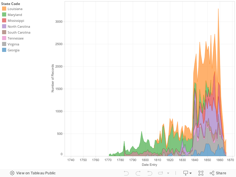
For this visualization, I saw the stacked timeline format as best for what I wanted to portray. I wanted to portray the growth of slavery in the states over time, and the stacking method shows the states more so as a unit. Meanwhile, the states having different colors still allows viewers to distinguish between the states in the dataset.
I chose to evaluate slave sales over time in this visualization because I wanted to make sure that even though I was using one data set to make two visualization, both visualizations were unique. In my eyes, slavery is such a broad topic that can be stretched to fit into almost any area of American history. Cotton production played a part in both of my arguments, but they revealed different things. I made this plain not only verbally, but visually. The stacked timeline literally appears as a growth at first sight and thus, the main point comes across. In addition, the visual appeal also manages to dramatize the 1800’s as a period during which slaves were in high demand. Throughout most of the graph, there is consistently a higher than normal amount of slave records that we see through spikes in the visualization.
Another part of my reasoning for choosing this type of visualization was that when I tried the bar graph form, neither my story nor my argument came across. If they didn’t come across to me clearly, viewers wouldn’t remotely grasp the idea behind the visualization. The collection of small bars representing each record that was entered showed how many records were entered in different time periods, but the stacked graph boldly illustrated the variance or lack thereof in slave records that were entered.
All in all, my final visualization came together seamlessly, especially with Professor Kane’s assistance. The bright colors draw viewers’ attention and the variations in color from state to state help readers to make sense of what each states records of slaves was from year to year within the time span of a century.
Argument
The institution of slavery in the United States was in place for almost 250 years. However, slavery seems more popular as the slave sales data set progresses in sequence (PBS, 2004). With peaks in slave records from 1770-1870, slavery in southern states seems to have grown as years went on, with its highest cumulative peak being in 1859. However, why were slave records so inconsistent? This is the question that will be answered through the evaluation of historical circumstances surrounding the 100 years between 1770 and 1870.
In the 1770’s there was a push for the liberation of slaves. In 1773, slaves in Massachusetts petitioned for their liberty and were not successful. By the end of 1774, the First Continental Congress decided to discontinue the slave trade and Virginia also took action against the importation of slaves. Georgia did the same in 1775, and the first abolition society was founded in Pennsylvania. However, by the next year the slave population in the colonies continued to grow. In 1820, Missouri was admitted as a slave state through the Missouri .Compromise (Educational Broadcasting Corporation, 2004). The growth of slavery in the 1800’s can also be attributed in part to the Louisiana Purchase that doubled the size of the United States territory (Rapid Growth of Slavery).
The cotton gin’s invention towards the end of the 1700’s also led to a burst in the demand for slaves in the south. Slaves were now able to produce cotton at a much higher rate which meant that masters could make more capital in a shorter span of time, and clearly they took advantage of such an opportunity (Rapid Growth of Slavery). As the 1800’s progressed, so did the causational relationship between the amount of cotton produced, and the number of slaves in the cotton producing United States. As the number of slaves grew, so did the amount of cotton in the U.S. Consequently, plantation income increased as well (8-1 Chains, 2010). The data visualization shows this relationship in its entirety. As the years go on, the amount of slave records increase first in smaller increments, and then they drastically increase by the late 1850’s.
Though Louisiana has one of the most presently large clusters of slave records, before 1840 Maryland had the highest amount of slaves in comparison to the other states. Before the cotton gin became a major factor, tobacco was a cash crop. Tobacco was lucrative in relation to European markets and Maryland was one of the epicenters of its production. However, as more northern states abolished slavery, tobacco production came to a low and the future of slavery was uncertain (Dodson, 2010).
The United States’ economy depended on slavery, and the economy shifted upwards or downwards depending on what and how much slaves produced. When the cotton industry was revolutionized by the cotton gin, the country had no choice but to shift in that direction because it was economically savvy. On another note, the economic benefits of slavery was a driving force behind how the confederate states could even be sustainable on their own.
Bibliography
Corporation, Educational Broadcasting. “Slavery and the Making of America -Time and Place.” PBS. 2004. Accessed May 12, 2016. http://www.pbs.org/wnet/slavery/timeline/1773.html.
“The Growth of Slavery in the 1800’s.” 8-1Chains -. January 12, 2010. Accessed May 12, 2016. https://8-1chains.wikispaces.com/The Growth of Slavery in the 1800’s.
Dataset Description
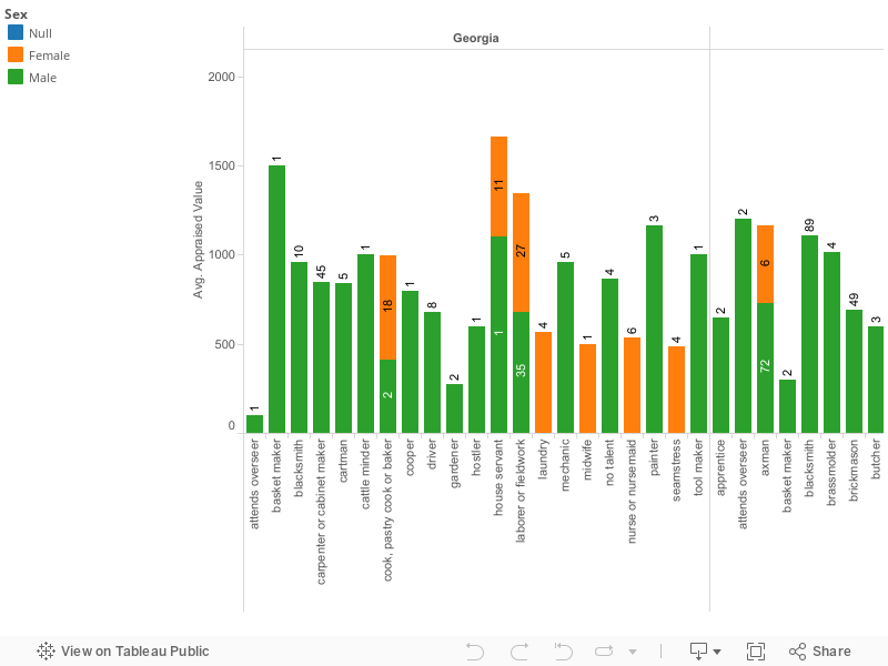
The dataset that I’ve chosen to analyze and evaluate is entitled “Slave Sales 1775-1865”. It includes geographic, time range, as well as numeric data. The geographic data that the slave sales dataset includes is the location from which the slaves’ information was recorded –Chatham, Georgia. The better part of slave sales consists of numerical data, but there is some revealing textual data. The columns are labeled date entry (anywhere from 1790’s to about 1863), sex, age in years, age in months, appraised (the price they can be sold for), skills, and defects. One of the most revealing/astonishing columns is the defects column. The simple use of the word defect reveals how the person that recorded this data set feels about and views slaves. Defect is a word use in the context of things being made in a massive quantity in which one of them has a glitch that affects their function, for example. People are not things that are produced in mass quantities that are classified as normal or not, but the general mentality at this point (geographically and sequentially) in history is revealed simple by the title of this column. If a slave master of another white person had a hernia which was considered a defect of slaves, they’d be considered ill, or otherwise because they were classified as what they are –people and not objects, or property. The numbers describe the ages and prices of male and female slaves. Whereas, the text describes what skills some slaves had, and on the other hand, what “defects” slaves had. These rows directly describe slaves in the year range of 1775-1865. The ages of these slaves range from birth/a few months old to about 79 years old or so. Slave masters probably didn’t figure to place senior citizens in the market for slave trade after a certain age, because input into keeping the person alive most likely is more or equal to the output they’d receive from them.
The data presented in Slave Sales 1175-1865 are all related. For example, males are priced higher than females. Males usually have more years in which they can work before their bodies start to decline, and they ate not restricted to just one type of work. In addition, males are best at things that bring in the most revenue –such as field work, for example. A woman’s body declines quicker than a man’s body. In addition, there may be a few days in which a woman can’t work because of child bearing. Women may not work as long hours as men because they’re the ones that cook for their families. In another sense, both women and men that are “in their prime” so to speak are also worth more. For example, a female slave age sixty is worth $50, while a female that is sixteen years old is worth $500, as is a 30 year old woman. A woman that is 60 years old is post-menopausal most likely, can’t breastfeed, and has fragile bones, among other things. Surprisingly, the 16 year old and 30 year old are worth exactly the same and neither has any skills or defects listed. Both of these women, and women in their age range in general are of age to be child-bearers, which slave masters may see as a skill. In terms of slavery, child bearing brings forth more slaves and in some instances, children from the slave master. Slave masters can also add these women to their list of mistresses. Women that are of age to have children age are most likely expected to breastfeed the slave masters children as well. These abilities are exclusive to women of age to bear children. Therefore, these women are worth more monetarily.
A man that is 50 years old with no defects or skills is also priced highly (generally speaking) at around $550 –more than a woman that is in her prime. Men are probably more valuable to slave owners because they can produce the higher amounts of product for longer periods of time because of their stamina. A 50 year old slave in 1848 is probably a lot or active than your average 50 year old today. These men can still have children with younger women (increasing the slave population) and do field work for most of their lives. They serve a dual purpose for a longer period of time. Historically, at that point in time the 50 year old could have very well been born into slavery and as a result is accustomed to slave labor, its excruciating pain, extended hours, and mental and physical abuse.
Data Visualization/Story
The visual data that I chose to use to describe the slave sales data set is a graph. Graphs with entities separated by color are more appealing to a person’s eye in general, and their mind automatically notices the difference in volume of each color, or lack thereof. For example, if a person sees a pie chart that is 75 percent red and the remainder is green, they’ll automatically wonder what the red area represents and why it’s so plentiful. On the other hand, colors in bar graphs create distinctions, but the length of the bars is what tells all. Where the z-axis is placed (on the bottom, side, or top of the graph) also has an impact on what viewers’ perception. An x-axis that’s on top as oppose to on the bottom typically has an adverse effect at the first glance compared to if it was on the bottom because it looks as if numbers are decreasing as the bars decrease in length.
I chose the bar graph lay out because it makes it seem as if certain states were forging ahead of others. Essentially, leaving them in the dust of the money they spent on slaves. This scale isn’t the typical graph, but I do think that it gets the point across visually without having to see the prior spread sheet to analyze the data. I chose the deep burgundy color because it wasn’t alarmingly red, but the burgundy resembles blood and this tugs on views heart strings –especially in the context of slave sales.
The context surrounding the slave sales data set is the rise of the cotton kingdom. The spike in Louisiana slave purchases may be due to the expansion of slavery and cotton production, which makes sense. The raw data set itself shows that men in their prime are bought for higher prices (keep in mind that man’s prime is longer than a woman’s). Women, on the other hand, are of more value when they are of age to bear children and their value probably depreciates so in a time when the goal is to increase production, men are probably the more ideal choice. Though child bearing and reproduction is important, this timeline probably seems longer to a person that wants to capitalize off of cotton production high while it’s hot –wait nine to ten months for a mother to give birth and a few more years for that baby to be mature enough to pick cotton themselves. Women were still being bought at an increasing rate, while men, as we see in Louisiana, were in higher demand.
In terms of sequence, the range of the slave sales data set covers the rise of the cotton kingdom which was vaguely 1830-1861. Therefore, the increase in millions spent by the states is associated with the rise in cotton demand. Aside from natural reasons, the cotton revolution is the main reason that states in that time period spent hundred off dollars to buy quality slaves because they’d prove vital in capitalizing off of the cotton kingdom.
First Visualization Process Documentation
The first visualization that I created to represent the slave sales data set described the amount of females versus males that southern states purchased in the approximately 100 year time frame that the data covered. My choices in color and design reflected what I aimed for the visualization to portray.
In terms of my color choices, I used a deep red color because slavery in the U.S. wasn’t a cheerful time for African Americans, and its main purpose was to highlight how states valued specifically male and female slaves. In class, I saw another graph that used inversion to portray the creator’s point of view on the data –death tools in Iraq. This tactic caught my eye because the creator didn’t change the data, they changed the way it was presented. Though I didn’t use inversion, I rotated the bar graph so that the bars stemmed from the left side as oppose to growing from the bottom as in conventional bar graphs. With this format, it looks as if the bars are racing each other in a sense, and Louisiana is surpassing them all.
I chose to compare how the states valued males versus females to expound upon a broader idea –male slaves often had higher value from a slaver master’s perspective. Through my research that is expounded upon in my argument, gender wasn’t the only thing that effected a slave’s appraised value –age played a part as well. Young women that of age to bear children were valued as high as men in their physical prime.
A slave’s value wasn’t only what they were worth at the time, but what services they could provide for the slave master in the long run. For example, a 19 year old man would be valued more than a 19 year old woman because after the young woman’s child bearing years are over, her value decreases. On the other hand, a man’s body had more longevity in terms of field work and things of that nature that were of value to slave owners. This was displayed through the bar graph because all of bars representing the sum each state spent on either gender were higher for males. Slave masters made an investment in both male and female slaves because of obvious reasons such a reproduction, but females also has value outside of child bearing. Women often worked inside of the slave masters homes tending to his children in addition to her own children, cooking, cleaning, and things of the like. Slave masters also took female slaves as their concubines to satisfy their sexual desires.
All in all, this visualization for the slave sales data set provides a stepping stone for all that my argument encompasses. The position of the bars gives readers insight into my argument because males are clearly valued more than females, but women don’t fall too far behind men for most states except for Louisiana. Viewers see that Louisiana doesn’t follow the common trend and it leaves them wondering why that is so.
Bibliography
“Quizlet QWait(‘dom’,function(){document.getElementById(‘PrintLogo’).setAttribute(‘src’,”https://quizlet.com/a/i/global/logo_print.du83.png”)});.” History Unit Two Flashcards. Accessed May 12, 2016. https://quizlet.com/14327446/history-unit-two-flash-cards/.
Slavery –the practice or system of owning slaves (Random House Inc., 2016). Such a system served as a pillar of the U.S. economy and social structure. By 1850, slaves in the U.S. were worth 1.3 billion dollars. Or in other words, American slaves were worth one fifth of the entire nation’s wealth (Goyette, 2014). Such information makes sense of the data that is displayed in the slave sales data set. It’s easy for people to think about how rich America’s history is, but how often do these people think about the hands that made it great? From the Caribbean to the mainland slaves hands were goldmines. Cotton wouldn’t have boomed without people to grow, harvest, and pick it. Tobacco would be a delicacy if lives weren’t stolen and then bought in order to harvest it. These statements ring true for many of the goods produced by slaves. This may be contrary to popular belief, but the American Economy must have depended on slavery for the better part of its history before the start of the 20th century. As a result, slaves were in high demand. But the question is –which slaves were in high demand and why?
According to measuring worth, a slave’s value was truly the value of the how much they’re expected to produce (Williamson and Cain, 2011). In other words the value of a slave was not really the slave’s value per say, but the value of the service that they could provide. For example, an elderly woman wouldn’t be expected to produce much, especially if she has any outstanding physical condition (or “defects”) such a missing finger or cataracts. As we see in this data visualization, males were clearly expected to produce more because generally, more money was spent on males. In Louisiana, males that were between the ages of 15 and 44 had the highest values and men within the 24-35 age-range held the peak values. As for females, those in the approximate age range of 14-33 years old held the highest value. This is no surprise, since these are typically a female’s peak child-bearing years (Williamson and Cain, 2011). Slaves weren’t only valued for what they could produce in the fields, but for their skills as well. Premiums were paid for slaves that had artisan skills such as cooking, carpentry, and blacksmithing, among other domestic skills. On the other hand, a slave’s value was depleted if they had characteristics or deformities that would inhibit their production such as drinking, being crippled, or being a frequent runaway (Williamson and Cain, 2011).
The spreadsheet itself uses appraised values that are generally under one thousand dollars. However, if we were to convert these prices to what they’d be today, the average range for which a slave would be sold would be 12 thousand to 176 thousand dollars. In other words, a slave was worth anywhere between the price of buying a used car and a mortgage. For example, a slave that would be sold for $400 in 1850 would be worth about $82,000 today. (Williamson and Cain, 2011). For slave owners, perhaps foregoing purchasing a home or another luxury item was worth investing in a few decades worth of slave services that would have a major return in the long run.
Though all states in the slave sales data set purchased slaves to some degree, the massive amount of capital spent on both female and male slaves by Louisiana is strikingly higher than the other states. Louisiana was most likely subject to the other factors such as the cotton boom that justified the desire across the country for slaves in their prime. If this is the case, why was Louisiana so much more passionate (according the data visualization) in the buying of slaves? At the top of the 18th century, Louisiana was the resting ground for only ten people of color. However, the French imported about six thousand slaves in Louisiana (Whitney Plantation). After the Seven Years War that concluded in 1763, Louisiana was occupied partly by Britain and partly by Spain. Subsequently the territory was reopened to large scale imports of slaves. By 1795, about thirty years later, the amount of slaves ballooned to almost 20,000. A few years later in 1807, the Atlantic slave trade was prohibited. However, this didn’t stop those that were persistent about sustaining slavery. Thousands of slaves were smuggled into the territory from Africa and the Caribbean illegally in addition to the domestic slave trade in the upper southern part of the U.S. If we fast-forward towards the end of the data visualization in 1860, there were over three hundred thousand slaves in Louisiana and nearly 20,000 free people of color.
In the time period that the slave sales data set spanned, Louisiana had avid reasoning for demanding so much slave labor. While the territory was under French rule, the services that slaves provided varied and the territory was highly dependent on slave labor. Such tasks included cooking, hulling rice with mortars and pestles, carpentry, and raising cattle (oxen, sheep, cows, and poultry among other animals). Female slaves also took care of their master’s personal task of caring for their children. Though aiding in raising their children mad a masters life easier, the mass importation of slaves gave masters a new lease on life. Wealth was easily in a master’s reach with the slave trade (Whitney Plantation).
Coupled with indigo production, the mass importation of slaves gave masters a more prestigious standard of living. Another reason for Louisiana’s higher dispensed capital for slaves is indigo production under Spanish rule. Females were a main part in raising indigo crops and males extracted them –which makes sense of why the territory spend large amounts of capital on both females and males (Whitney Plantation).
Slaves were a part of American culture for centuries, and part of that time is covered in the slave sales data set. The U.S. depended on slaves for their free services in order to make capital. So much so, that they were willing to shell out what would now be thousands upon thousands of dollars on slave labor because of its returns. Where would the U.S. be on a global scale without slave labor? –A question that can answer itself.
Bibliography
Slavery. Dictionary.com. Dictionary.com Unabridged. Random House, Inc. http://www.dictionary.com/browse/slavery (accessed: April 25, 2016).
Goyette, Braden. “5 Things About Slavery You Probably Didn’t Learn In Social Studies: A Short Guide To ‘The Half Has Never Been Told'” The Huffington Post. October 23, 2014. Accessed April 26, 2016. http://www.huffingtonpost.com/2014/10/23/the-half-has-never-been-told_n_6036840.html.
Whitney Plantation. “Slavery In Louisiana.” Slavery In Louisiana. Accessed April 26, 2016. http://www.whitneyplantation.com/slavery-in-louisiana.html.
Williamson, Samuel H., and Louis P. Cain. “Measuring Worth – Measuring the Value of a Slave.” Measuring Worth – Measuring the Value of a Slave. 2011. Accessed April 26, 2016. https://www.measuringworth.com/slavery.php.
The data set that I chose to work with is Slave Sales 1775-1865. This data set is very large, with a lot of information. There are three different types of data represented within the data set, including geographic, textual, and numerical data. The first two columns in the set are “state-code” and “county-code”. “State code” represents what state that the slave being sold was sold in. While there are large ranges of state that are listed, they are all located in the Mid-to-South East. All of the states that are listed include Georgia, Louisiana, Maryland, Mississippi, North Carolina, South Carolina, Tennessee, and Virginia. “County-code” represents the counties within those states that slaves were sold in. Each state listed has a different amount of counties listed as well. Georgia has 8 different counties where slaves were sold while Louisiana has 16, Maryland has 3, Mississippi has 4, North Carolina has 9, South Carolina has 2, Tennessee has 4, and Virginia has 8.
As for numerical data, there are 4 different latitudinal rows. The first numerical column is the third column in the data set, which is “date-entry”. This row contains the years in which each slave was sold. The years range from the earliest being 1742 to the latest being in 1865. The second numerical row (5th column in the overall set) in the data set is “age-yrs”. What this row represents is how old, in years, each slave was at the time that they were sold. While the data set begins with the age of 0, I didn’t include it in my visualizations because most of the zeros represent a null. The data set goes from 0 to the age of 99. The third numerical row in the data set (6th column in whole set) is “age-months”, which represents the age in months that the salve being sold was in months after years. For example, a slave could be 1 year and 5 months old. This row ranges from the lowest of 0 to the highest of 11 months old. This column in used predominantly for children under 1 year old, or very young children. The fourth numerical column (7th column in whole set) is “appraised-value”. This column represents how much each slave is appraised for when they are sold. Like the years column, there are many zeros in this column. Many of those zeros represent a null as well. The appraised value ranges from $0 all the way up to $525,00. I believe that the appraised value of $525,00 is possibly a mistake. If that were the case, the highest appraised value would be $6,000.
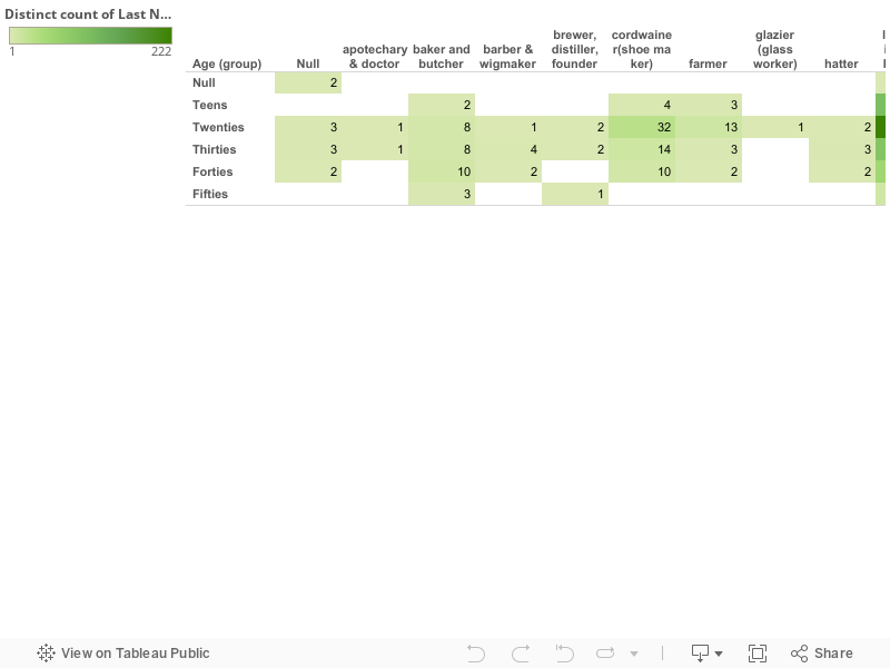
The last type of data that is listed in the dataset is textual data. The remaining three columns in the set are “sex”, “skills”, and “defects”. “Sex”, which is the 4th column in the set, represents what sex each slave being sold identifies with being. The two different options listed are male or female. “Skills”, the 8th column in the set, represents skills that each slave has. For this column, each slave isn’t listed as having a particular skill. The slaves who do have skills tend to be valued a little bit higher. Skills vary greatly, and many are listed. Some examples of skills listed are axman, blacksmith, carpenter, cook, driver, gardener, house servant, laborer, etc. Lastly, “defects” represent the defects that each slave being sold had. Just like the skills, not every slave had a defect. Slaves that had defects were more likely to sell for cheaper. Defects listed range from hernia, asthmatic, complaining, blind, cripple, drunk, idiot, lame, etc.
Visualization 1 Story:
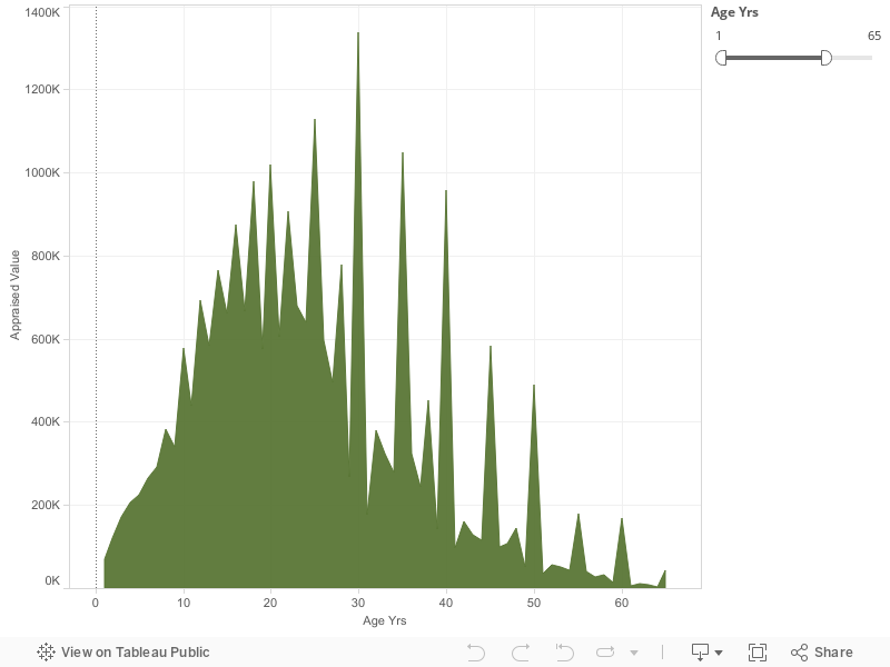
My first visualization shows the comparison between different ages and the appraised values for those ages. The ages range from one-year old to sixty-five years old. As you can see, 1 year olds are valued particularly low. Due to the very young age, they are at a much higher risk of becoming ill. They are also a lot more responsibility to care for than the older ages are. Also, the low number accounts for the low number of 1 year olds being sold. From the ages of 1 to 22 there is a steady increase of value. Instead of the sum of appraised value growing with every year of age evenly, there are drastic peaks that get larger every two years, starting with 8 years of age. The first peak begins at 8 years old, then 10 years old, 14 years old, 16 years old, 18 years old, continuing every other year up until 22 years old. At the age of 22 a slow, gradual decrease in appraised value begins. Although there is a slow decline, there are very high peaks every 5 years, beginning at 25 years old, then 30 years, 35 years, etc., all the way up to the age of 65 years old. While there are very high peaks, after the peak at 30 years of age, the very high peaks represent a gradual lowering of value every 5 years as well. What I mean by this is that, the sum of appraised value for 25 year olds is $1,129,221, then reaches it’s highest for 30 year olds with the sum of appraised value being $1,337,584. From there, the sum of appraised value for 35 year olds shows a drastic decline with an average of $1,049,747. The sum of appraised value stays low, while slowly getting lower every year up until 35 where we see the extremely high peak again. This occurs over and over again until the peaks reach their lowest at 65 years old. In between the peaks from the ages of 30 to 65, every 5 years, the numbers are very low. After the highest peak at 30 years old, the sum of appraised value of 31 year olds drops down to $177,149. After 31 years old, at 32 the average sum of appraised value goes back up to the normal negative slope amount at $380,478 where the graph continues its gradual slow drop. At 33 years old, the drop continues with a sum of appraised value being %323,920, continuing to the sum being $278,147 at 34 years old. This continuous gradual downward slope, with high peaks every 5 years continues up until the age cut off at 65 years old. Throughout the entire visualization the highest sum of appraised value was at the age of 35 years old with the sum equaling $1,337,584. The lowest sum of appraised value is when the slaves were 64 years old, equaling $3547 all together. Over all, the visualization increases from the age of 1 up until the mid twenties. From there, there is a gradual decrease in appraised value up until the age of 65.
Visualization 1 Process Documentation:
When I first began to look at all of the data presented in the slave trade data set I had no idea what to work with. There is a lot of information presented, therefor I wasn’t quite sure where to go with my visualizations, stories, or even what historical data could be worked in with the data that was shown in the original set. I began to compare the appraised values with the different ages. When I realized that there was a pattern in the data that’s when I decided to make my first visualization the way that I did. I noticed that children were just as big of a part of the slave trade as adults. Therefor, this graph compares the sum of the appraised value that slaves were sold on in comparison to their ages. In this visualization I used the ages going from 1 year old up until 65 years old. I decided to start with the age of 1 year of age because at 0, most of the data was null. From there, I decided to end with the age of 65 years of age because once the graph got to 65 years old, the data kind of dwindled down to about nothing. I felt that this age group had the best representation for the entire data set that was presented to me. Once I had my age group to work with, I decided on what kind of graph to use. This was tricky for me because I wasn’t sure whether to stick with using a bar graph or a line graph to better represent my data. For bar type graphs, I had the option to use either a horizontal bars graph or a histogram. For line type graphs I had the option to use either a normal line graph, or an area chart. After trying all four options, I chose the area chart. I did so because I liked how the color I chose filled the entire bottom half of the data points. This graph gave my information a more dramatic feel, showing how significant the differences in appraised value actually are. As for the color, I tried a few different options. I started off with the color red because it is a very dramatic, and attention grabbing color. Once I had the graph in red, I didn’t like it because I didn’t feel like it actually represented the feeling that I was trying to give off from the data I was presenting. From there, I chose green. I chose green because it’s the color of money. When I looked at the color after I tried it out I really liked the way that it looked, and felt that it’s easier to grasp that its comparing different values pertaining to money. The way that I chose to make my visualization is representative of my argument as well. In my argument I discuss the difference in values of different age groups, and why the values may be different for different ages.
Visualization 1 Argument:
The data that is represented in this visualization shows how the appraised value of slaves rises from the age of 1 to the age of 20, but then slowly decreases with peaks every 5 years. The reason why the values increase and decrease is because of what that slave can do for their owner. First, I believe that the very high peaks are due to the fact that that most of these slaved didn’t have birth certificates. Furthermore, slave traders that would sell these slaves would estimate the slaves’ ages. While many people would believe that the slaves themselves would keep track of their age, it was very hard to do so when all of the days seem to just melt together. From birth to around 7 years of age the appraised value is particularly low. The reason for this is because the amount of children being sold at those very young ages is a lot less than the amount of 20 year olds being sold. Another reason for the low sum of appraised value could be because if a mother, who was a slave, had a baby then they would usually be able to care for their baby until it’s a little older. It was common that if a mother was a slave, the baby then became property of that same owner as well. This would mean that many young children weren’t being sold. While staying in the same plantation as the mother was the norm, sometimes they were sold to near by plantations, or even worse, to “speculators”. What “speculators” did was go around and buy slaves, and then sell them at a higher cost to make a profit. When this happened, the child was usually taken far away from the mother. Those would be the young children that are accounted for in the visualization. As children grew old enough to work they became more valuable to plantation owners. This can account for the gradual increase in appraised value from the ages of 10 to about 20 years old. The data set represents slave sales from the years 1775 to 1865. Children weren’t big in slave sales until around the 1830’s when the abolitionist movement started to begin. The movement threatened slave supply to those living in the south, so more and more slave owners began buying the slaves at much younger ages. They believed that if they got the slaves while they were younger, they would live a lot longer and therefor be able to work for them a lot longer (Vasconcellos.2016). As you can tell, adults were worth the most to slave traders. This was because unless they had a disability, they were the strongest and able to do the most work. Adult ages ranges from early twenties to around early to mid thirties. The extreme decline after the mid thirties was due to the fact that life expectancy of U.S. slaves was about 36 years old in 1850 (Wallace.2012). Also, elders became to be considered burdensome and unsalable for their owners. So while there probably were a lot of elders in slavery, the average appraisal value declines because they weren’t really being sold, but made to do tasks that they were capable of doing. The elders that were sold were sold for very cheap because they weren’t really a use to their owners anymore. The data set actually represents some elders that were sold for negative amounts. This means that they would pay people to take them.
Visualization 2 Story:
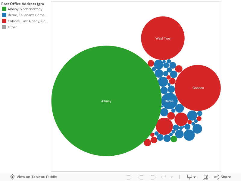
My second visualization is a map of the United States. On this map are different states that were listed in the data set that were responsible of slave sales from 1775 o 1865. Starting in the most northern states listed on this map that were responsible for slave sales are Maryland, Virginia, North Carolina, South Carolina, Tennessee, Georgia, Mississippi, and Louisiana. Within each state there are counties listed. The counties in Maryland are Baltimore County, Queen Anne County and Anna Arundel County. The counties listed in Virginia are Essex County, Henrico County, Albemarie County, Lynchburg County, Prince George County, Sussex County, Greensville County, and Southampton County. The countries that were responsible for slave sales in North Carolina on the map are Halifax County, Franklin County, Nash County, Edgecombe County, Johnstone County, Greene County, Duplin County, Anson County, and Mecklenburg County. As for South Carolina, the state that sold slaves during this time period represented on the map is Charleston county and Edgefield county. Georgia has listed 8 counties, including Oglethorpe County, Gwinnett County, DeKalb County, Troupe County, Taliaferro County, Richmond County, Jefferson County, and Chatham County. Tennessee’s counties that sold slaves were Ruth County, Madison County, and Williamson County. Mississippi only had three counties with sales at the time, which were Wilkinson County, Adams County, Hinds County, and Rankins County. The last state, Louisiana, had the most listed counties responsible for slave sales during that time period. These counties include, Union County, East Carroll County, Ouchita County, De Soto County, Natchitoches County, Tensas County, Concordia County, Avoyelles County, West Feliciana County, St. Helena County, Iberville County, St. Mary County, St. Charles County, Jefferson County, Orleans County, and Plaquemines County. Each different county is outlines on the map and range from a shade of very light res, to a prominent red. The more slaves that were sold in that county, the darker the shade of red is. Furthermore, the less slaves that were sold in that county, the lighter the shade of red is. As you can see by the map, the darkest shades of red are shown in Anne Arundel County, Maryland and Queen Anna County, Maryland. From there, Charleston County, South Carolina is the third brightest shade of red. North Carolina as well as Louisiana have some counties with brighter shades of red as well. As for Tennessee and Georgia, the shades of red in the counties tend to be very dull. This represents that not as many slave sales were made in those states. South Carolina has the least amount of counties in which sell slaves, with only two. Meanwhile, Louisiana has the most amounts of counties that were responsible of slave sales, with a total of 18 counties. On the map, there are no sales listed in some of the in-between states. These states include Alabama, Florida, Delaware, West Virginia and Arkansas. Also, the states that have slave sales, which have states that are not selling slaves, have fewer counties that were responsible for selling slaves. For example, Georgia and Mississippi have fewer counties that sold slaves, and Alabama, a state that sold no slaves, sits right in-between them.
Visualization 2 Process Documentation:
Just like the first visualization that I had created, I got stuck on what I should do while starting this one as well. For the whole beginning of this project I was convinced that I wanted to compare the differences in value between children that were sold during slave sales and the difference in value between adults sold during slave sales. I was going to compare them in a few different aspects, including value, defects, skills and value. I did research on the differences and couldn’t really find much. One I realized that there wasn’t too much that I could have worked off ofI lined up all of the states and counties in which slaves were being sold in, I realized that there were not too many states being listed. I found this interesting because slavery was such a huge deal all over the entire country during that time. I was curious as to why the slaves in this data set were mostly representing counties in the East Coast and South Coast. I tried to represent the data in a couple different ways. I started with a stacked bar graph, which included each state, with the counties stacked on top of one another. I didn’t like how that looked because it was a lot to take in. I thought of how I could make my information easy to visualize. I wanted the person looking at my visualization to easily be able to tell what information was being represented just within ten seconds of looking at it. From there, I chose a map. As soon as you look at the map you realize that the information that you need is within a handful of states. From there you see the outlined counties, which are really easily distinguishable from each other. After I decided that a map was the best way to go, I needed to decide how the person looking at my visualization would be able to tell which county had the most slave sales, comparable to the counties which had the least slave sales. First I tried out using filled circles to determine the size of sales. The circles went from very small to pretty large. I didn’t like that because it didn’t show the outline of the counties. I then decided to go with the county being highlighted by one color, and to have that color fade to almost transparent when there were low amount of sales, to bright when there were a lot of sales made in that county. After I tried that idea, I liked it because it made it so much easier to realize what was going on, fairly quick. When it came down to choosing color I wanted to use a color that would really stand out. I chose red for this one because it is a very dramatic color. It is also easy to distinguish between the nearly transparent counties that have fewer slave sales, and the bright counties, which have a lot of slave sales. This visualization relates to my argument because I’m going over what areas had the most concentrated slave sales, and why those regions may have had such a large number of sales.
Visualization 2 Argumentation:
As you look at my second visualization, you notice that there are an abundance of slave sales in some areas, while there are nearly half in other regions. First, Maryland has two different counties that have the most sales on the entire map. After Maryland, Charleston County, South Carolina had the most sales. After doing research on Maryland during the time period of 1775 to 1865, I found that the second most important port was located in Baltimore County. This was very important because at this time, ports were the fastest means of transportation of goods, as well as slaves. The port was founded in 1706 as a port to transport tobacco to England. By 1729, the port was incorporated into Baltimore Town. Once slave trade was established, slaved were shipped in to this port. Many of the slaves stayed in Maryland from this port in Baltimore due to the vast amount of tobacco plantations in that region (History of Slavery in Maryland). This accounts for the large number of slave trade in Queen Anne County, Anne Arundel County, as well as Baltimore County. One of the largest plantations in Maryland, Roedown Plantation, was located in located in Anne Arundel County. A man who was once a soldier in the American Revolution owner this plantation. By the time he dies in 1824, the plantation had over 80 slaves. The plantation produced cotton, poultry, corn, and cattle. As the plantations grew more popular in Maryland, the number of slaves increased dramatically. Between 1619 and 1697, there were less than 1,000 slaves in the state, while in 1755 there were over 100,000 slaves in the state, nearly 1/3 of the entire population (Maryland State Archives).
While Baltimore County had the 2nd most important port in the United States the most important port was located in Charleston, South Carolina. Charleston County was the slave trade capital in the U.S. due to the fact that because of this port, a majority of slaves coming into the U.S were brought to this port first. By 1860, there were 4 million slaves in the U.S., and 400,000 of them lived in South Carolina. That’s about 10% of all of the slaves in the entire country. Enslaved and free slaves accounted for 57% of the South Carolina population. It’s said that most of the city was predominately built by slaves alone (Hicks.2011). Not only did the slaves in South Carolina were forced to work in the city, but in the country as well. The greatest amount of slaves worked on plantations throughout South Carolina, and because their most predominant cash drop was rice. Rice required ten times the labor as other crops, such as cotton, so the amount of slaves per plantation was also a lot higher than other states as well. While slavery was all over the state, sales were mostly all done in Charleston. This accounts for Charleston County being bright red on the map visualization.
The third state that ill be talking about is Louisiana due the large numbers of counties representing slave sales on the map. In Louisiana cotton was a huge cash crop with more than 2 million acres producing cotton. Due to the fact that so much cotton was being produced in Louisiana, they imported very large numbers of slaves across the state. By the end of the Civil War, Louisiana had over 1,600 plantations that were large enough to have 50, or more, slaves per plantation (LOUISIANA SLAVERY: An Introduction). On the map, the county in Louisiana that is the brightest red is Natchitoches County. In that county alone, there are three very large plantations that are listed online, which are still available to go visit as historical landmarks. The most important historical plantation, Oakland Plantation, started in 1789, and by the time he died, he owned 104 slaves, being the one of the largest plantations in the state (National Park Service).
Further Research Questions:
I found this data set to be very interesting. There was a lot of data available to do research on, from value of slaves being sold compared to their sex, defects they had, skills that they had, where they were from, etc. I’m glad that I chose this data set because I learned a lot from the research that I had done on the information that was given to me. While there was ample information given in the data set, I still have some questions that could be further researched. My first question would be in regard to there not being any slave sales listed in the surrounding states. Slavery was a huge deal in all of the U.S, especially the South. I did research on states that didn’t have any listed in the set, such as Alabama, and found that there were sales in those states. Also, in previous classes, I have learned that NYC had a lot to do with the slave trade. Further research that could be done on my question would be why slave sales were only listed from the states of Maryland, Virginia, North Carolina, South Carolina, Georgia, Tennessee, Mississippi, and Louisiana, and states like Alabama, Arkansas, and Florida were not. I could go about answering this question by comparing the amount of salves being sold during this time period between the states that are listed, and the ones that are not listed. Perhaps, they were listed because they had a lot more sales compared to the other states. Another further research question that I have that was prompted by my first visualization, would be what was the reasoning behind the prices that were chosen for each slave. Slaves had very different appraised values, from $1 to thousands of dollars. I would like to see how they calculated the amount that they wanted for each individual slave. I could research this further by comparing skills and defects to age and appraised value. While skills and defects have a little bit to do with how much they were sold for, there were still some slaves with out skills that were sold for a lot of money. There were also slaves that had defects that were sold for a lot of money, and slaves that had skills that were sold for only a little bit of money. I also would like to know how they determine which skills are worth more than other skills. I could research this question by looking up the area that each slave that had a skill was from and comparing it to other areas. Maybe from there I could research what type of work was being done in each area. From there I could see which disabilities were more affluent in each area as well and why they paid more, or less, for each skill or defect. My last research question that I have would be why the average life span for slaves was only around 36 years old. This makes me wonder about living conditions and if they slept in homes, or outside, etc. I could further research this by looking up illnesses that were popular in different areas, as well s living conditions.
References
Colleen A. Vasconcellos, “Children in the Slave Trade,” in Children and Youth in History, Item #141, http://chnm.gmu.edu/cyh/case-studies/141 (accessed May 11, 2016)
Hicks, Brian. “Slavery in Charleston: A Chronicle of Human Bondage in the Holy City.” Post and Courier. 2011. Accessed May 12, 2016. http://www.postandcourier.com/article/20110410/PC1602/304109945.
“LOUISIANA SLAVERY: An Introduction.” Times Union. Accessed May 12, 2016. http://www.timesunion.com/living/article/Building-a-new-kind-of-Motown-5765204.php.
United States. National Park Service. “Oakland Plantation–Cane River National Heritage Area: A National Register of Historic Places Travel Itinerary.” National Parks Service. Accessed May 12, 2016. https://www.nps.gov/nr/travel/caneriver/oak.HTM.
The data set for the Slaves sales from 1775 to 1865 holds the information of individual slaves, their gender, and information considered important for potential slave buyers. The data can be considered numerical, textual, and geographically information. The numeric information for the data set is columned by the age of slave in years and month, the date of the entry of the slave, and the slaves appraised value. The two columns that describe the slaves age in years, the youngest being 0 years old, to the oldest being ninety nine. The column for age in months is empty throughout the entire data set. I can argue that the months column is completely empty because infants were rarely bought, and sold with in the slave trade itself. For the date of entry column the beginning date is 1775 and continue through 1865, although the data set itself is all over the place with which particular year a slave was sold. The column regarding the appraised value of a specific slave has variation based on the age, skill sets and defect of the slave. I can also argue from studying the data set that gender also played a major role in the appraised value for a specif slave, as well as the geographical location that a particular slave was sold in. The textual information for the data has text data with in the columns that include any defects that each particular slave may or may not have, and any skill set that some of the particular slaves may or may not acquire. The defects column of the data set included terms such as “runs away” or “deaf”, and the columns for skill sets include terms such as “house servant” and Laundry”. The textual information tends to be historical accurate in proving how real racism was, not just between the years of 1775 and 1865, but through out American history. The geographical information only has two columns; State and county. The states include Georgia, Louisiana, North Carolina, South Carolina, Tennessee, Virginia, Maryland, and Mississippi. The columns for county include all the counties with in the specific state. All the areas associated with this data set are southern states, some of which would succeed at the beginning of the Civil War to protect their institution of slavery, that they strongly believed was a given right.
Visualization one
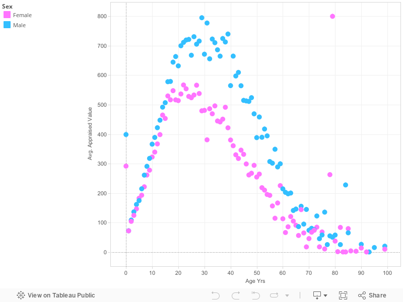
The first of my data visualization is meant to show the correlation between the age, and gender of a slave, and their average appraisal price. This visualization makes me question not only the institution of slavery, but also sexism with in slavery. The varying prices between age can be, although horrifying, expected, but the variation between the genders of a particular slave seem unjustified.
The average peaking value for a female slave from the years of 1775 to 1865 was at the prime age of twenty two, with the average price of $566.9. The value of a female slave drastically declines after the age of twenty nine, and again at the age of thirty nine, although there are a few unexplained outliers. The lowest average value for a female slave from the years of 1775 to 1865 was at the old age of ninety, with the average price of $9.4, females at the age of one were valued more then elderly females at the average price of $71, although one elderly female slave was appraised at the average value of $800.0 at the age of 79. I can argue from reviewing the data set of the Slave sales that females slaves were ideally in their prime at the age of twenty two until thirty nine for work purposes, and more likely breeding purposes. Women were not value as high as men though, for obvious reasons such as labor, and strength.
The average peaking value for a male slave from the years of 1775 to 1865 was at the prime age of twenty nine at the average price of $795.1. The value of a male slave begins to drastically decline after the age of forty three with the average appraised value at 609.6, although like the female data, there are a few outliers within the data sets. For example, eighty four year old man was appraised at the average value of $227.5. The lowest average appraised value for a male slave was a ninety nine year old whose appraisal value was $19.6.
The data set of the Slave Sales from 1775 to 1865 shows the range of values for a set of slaves sold in the states of Georgia, Louisiana, Maryland, Mississippi, North Carolina, South Carolina, Virginia, and Tennessee. A closer study of the Slave Sale data set from 1775 to 1865 revealed a pattern between the value of a slave, their gender, and their age, only after I excluded the unknown ages of specific male, and female slaves within the data set. I found the average value for specific slaves varying on their gender, male or female, and their age ranging from age one to age ninety nine.
Process documentation
For my first visualization I created I decided to use a dot graph to show the variations between the price of a gender, and the age when slaves were being bought and sold in the years of 1775-1865. I chose the dot graph because it clearly shows the decline in average appraisal price as a slave in the slave trade aged. I chose the color blue to represent the male slaves, and the color pink to represent the female slave because these specific colors are always associated with the genders. I thought the colors would intensify my argumentation of how racism, and sexism went hand and hand in the years prior, and after 1775 to 1865.
Visualization two
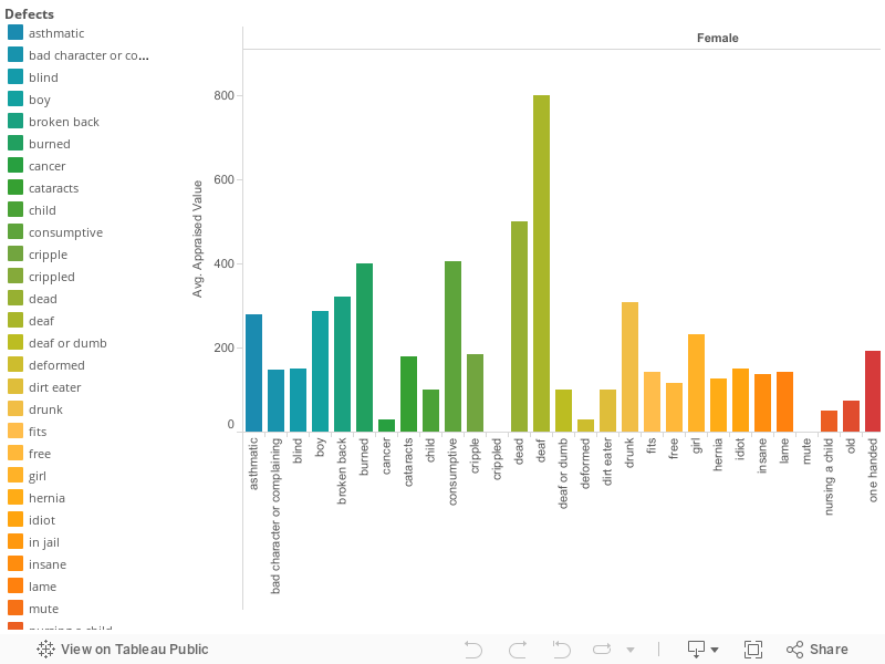
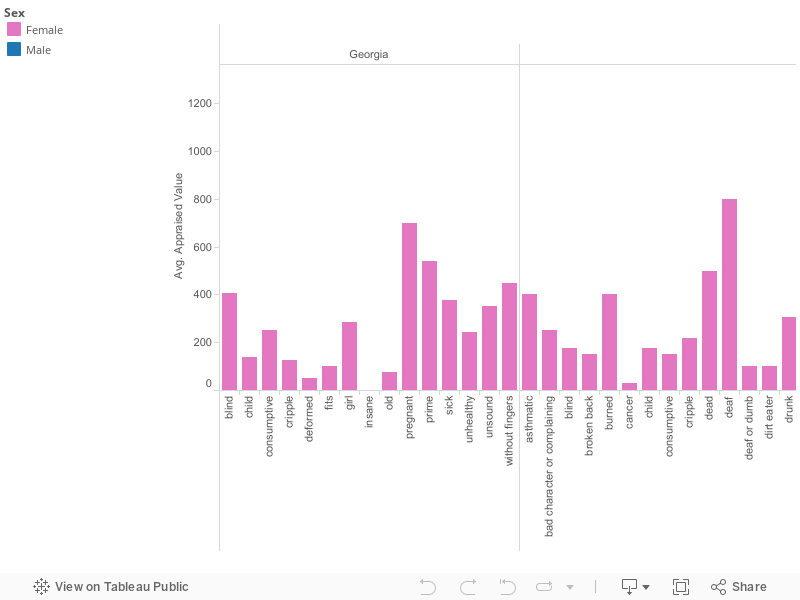
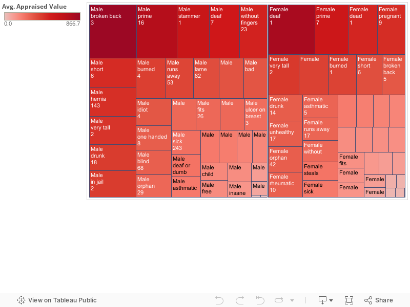
For my second visualization is meant to show the “defects”, the gender of the slave with the “defect”, and the average appraisal value for this specific “defect.” I am using quotations around the word defect in this sense because certain “defects” in this visualization are not considered defects by today definition. The range of “defects” in this data set include thing such as: very tall, short, crippled, one handed, missing fingers, broken back, and etc. Other “defects” include things such as: lame, idiot, dirt eater, dumb, deaf, drunk, nursing a child, and etc. The highest appraisal value for a female in this data set is $800.00 with the “defect” of being deaf. The highest appraisal value for a male in this data set is $866.70 with the “defect” of having a broken back. The lowest appraised value for a female in this data set is $30.00 with the “defect” of being sick with cancer. The lowest appraised value for a male is $5.00 with the “defect” of being deaf. I can only argue that the female with the defect of being deaf is appraised at a higher value because she is either younger then the male, or is still able to communicate while being deaf because typically throughout the data set male slaves are always value higher then females. I chose to show the “defects” with in the range of genders to reiterate my first visualization of how sexism, and racism went hand and hand prior, during, and after the years of 1775 to 1865.
Process documentation
For my second visualization I created a bar graph that is brightly colored. The bar graph is again separated into the genders of male, and female to shows the difference in appraised value between “defects” and genders. The brightly colored bars within the graph are meant to show the wide range of varying “defects” that the slaves being sold were labeled with. The bars also show the appraised value of each slave with the “defect” and how each “defect” was compared prices wise to another.
Argumentation
The argument for my first visualization, as well as my second visualization is centered around how sexism, and racism went hand and hand in the years of 1775 to 1865. For both male, and female slaves slavery was an absolutely devastating experience, but the circumstance of enslavement were different for both the male, and female slaves. Although most planters in colonial North America favored robust young men as slaves, the bulk of these were shipped to the West Indies, so early on, slave buyers turned to purchasing female field hands, who were not only more readily available, but also cheaper. In fact, because skilled labor, such as carpentry and blacksmiths, was assigned only to male slaves, who were also more expensive because of the skill set, so the pool of black men available for agricultural work was further reduced. During the time period of 1775-1865 Women slaves were considerably cheaper, than a man that was their exact same age for what I believe to be attributed to strength, and after further research different types of work. One thing the data set does not tell me is what specifically each slave was being brought for whether it be plantation work, a house maid, or a stable hand. Appraisal value could have most likely varied between the job each slave would be doing, and the geographical location of that job. No matter the circumstances sexism was embedded into the context of slavery, and racism. Whether a female was considered less appealing for a job because of strength reasons, or job details in my opinion in that era even if a woman was equal to a male, the male would still have been sold for a more considerable profit simply based on his gender.
The argument for my second visualization again revolves around sexism, and more so for this data set the historical racism that it presents to use. The “defects” column of the data set ranges from what would be considered disabilities in today’s world such as: deaf, blind, broken back, one hand, cancer, or crippled. The “defects” with in the data set that show the historical racism that was involved in the slave trade include: dirt eater, dumb, idiot, complaining, bad character, runs away, steals, and insane. These “defects” show how lowly the slave trades thought of their slaves, but shows me that during an excruciating time some still had the urge to fight for their independence. In today’s time the idea that slave had a “defect” because they run away, steal, complain, or have a bad character means that specific slave had the will to stand up against their owner. In the years between 1775 and 1865 the slaver traders did not see things so positively though, these “defects” seriously declined the price of a slave. Along with the first data set, females with “defects” were considerably less costly then a male with the same or more extensive “defect.” Again showing how in the years prior, during, and after 1775-1865 that sexism, and racism were two institutions that coexisted together.
Further Questions:
The first question prompted by my data visualization is what time of work each slave was going into. I would like to further research this so I can properly compare the appraised price of each slave, and further learn why two of the same aged, and skilled slaves could be appraised for different values. In my opinion this would help my complete understanding of the slave trade, and how in the years of 1775 to 1865 it worked. The second question prompted by my data visualization is if a “defect” such as a dirt eater was racially driven, or there is a historical explanation behind why a slave would be actually be eating dirt. I would like to know if it was a religious exercise, or something culturally driven. The third question prompted by my data set is why specifically some elderly slaves were valued higher than some slaves considered to be in their prime of life. Is it because a slave at the age of eighty has been a slave for a long time and was setting an example for the younger slaves, or simply for educational purposes for the other slaves? The final question prompted by my data set would be why in specific geographical locations did the appraised value of slaves vary so much? Were slaves valued higher in different states in the United States because of different work loads, or during this time period was one state booming more then another?
DATA DESCRIPTION
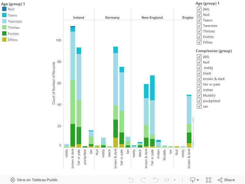
I chose to analyze the 1940 census data set, which categorizes data for over 10,000 people. The demographics include numerical, text, and geographic data. The categories for the information include: addresses, value of purchased homes, head of households, gender, race, age, marital status, birth year, highest education level, birthplace, residence city, employment, income, parental birth place, and native language. If we were to look at the range of data from the first hundred people, we would see that there are large ranges of numerical and descriptive data. For numerical data, the value of homes ranged from 55 to 10,000 in New York. The age range varied from 1 to 81 years old. Income of people in the 1940s ranged from 0 to 5,000. For geographic and descriptive data, the household ownership had two categories (rented or owned). Marital status ranged from widowed, single and the most common status, married. The relation to the head of household varied from wife and husband to sister-in-law and grandson. Occupations ranged from lawyers, librarians, electricians, maids, in paid family workers, and salary workers in government or private work. School attendance ranged from no educational background to attending college for over 5 years. Over 90% of the dataset consisted of white men and women, with very few black people living in these areas. There was a limited range of street names, for example the first 200 people lived on three blocks: Fleetwood Avenue, Vanschoik Avenue, and Cardinal Avenue. Majority of the residence were born in New York and continued in the same residence.
If we were to compare categories within the 1940 data set, analyzing two columns can raise questions and conclusion about the type of living situations. The first comparison is between the highest level of education and occupation. Those that have only completed some elementary or high school education up until the second year are unemployed. Several people from Vanschoik Avenue that completed the 8th grade were not employed for pay or salary workers in private or government work. Those that have a college education show occupations of Feler Booker and Dental Doctors. Those with no education showed the clear distinction of no occupation. A second comparison is between income and house ownership. It is clear to see those that rented their homes are forced to work harder since they’re making payments more frequently. The income of renters was nearly twice as the income of a home owner ($4,800 vs. $2,200). The census is skewed in showing more people owning homes in the 40s than renting. Another comparison in the data set is between gender and attendance in school or college. The census is unclear in confirming the difference between “attended school or college” and “highest graded completed”. Most of the responses in “attended school or college” said no, but had some sort of educational level in “highest grade completed”. Surprisingly, there was an even amount of males and females that have yes in the category for completing school. Majority of the ones that say “yes” only have elementary or high school education, while very few have attended college. Overall, the census does uncover some patterns in the demographics within certain areas in New York. The downfall to gathering information is the areas that are left black in the data set. It makes it harder to have a detailed account of what happened in the 1940s.
STORIES-VISUALIZATION
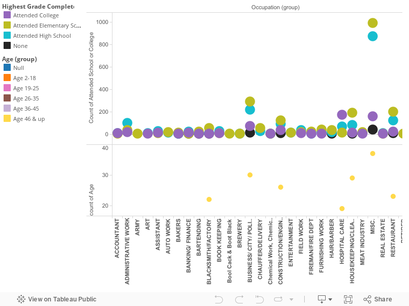
The 1940s was a time where the U.S slowly recovered from the Great Depression. New York specifically since then has maintained the number one spot for highest population since the early 1900s. Looking at demographic information of residents in Albany, New York in 1940 can tell various stories. The addresses, marital status, race, and education are the few parts of the census that raise questions regarding the lifestyles of people in this particular year. Was the residential area rural or urban? Were people financially stable? How did levels of education effect future endeavors? This visualization focuses on how education levels effect occupation decisions.
Initially looking at the data, it is unclear in figuring out who was enrolled in school for that year, and the kinds of occupations at the time. You must take into consideration age, and filter which jobs have different spelling, but are the same title. After making those changes, the visualization shows the variations in occupations and the education background one possessed in that field. The information is represented through a bar graph with a colored key to indicate whether the person attended college, high school, or elementary school. For each occupation there are numerical distinctions for how many people in 1940 worked in the same occupation.
Before looking at the occupations, the census does provide addresses of people in Albany. With some research, I found that Fleetwood Avenue and Cardinal Avenue were in the Whitehall area of Albany. This shows that these residents lived in close proximity of each other, yet obtained various jobs. For example, two people that live on Fleetwood Avenue both in their late 30s/ early 40s white, male, and highest education level is high school. One has a career in sales, while the other is an electrician. You can then compare those two people to a woman in her early 40s, married, with the highest education received in elementary school. Her occupation is not listed in the census.
The comparisons stated show us that creating one story can then lead to others. Were women still suggested to stay in the home in 1940? If she obtained higher education, would she be working?
Looking back at the visualization, something interesting within the story is the placement for those with no educational background. Most work in the same field as those that have went to high school and/or college (housekeeping, inspector, etc…). The highest number of jobs with varying educations obtained were wage/salary workers in government and private businesses, proprietors, owners, laborers, and inspectors. These occupations are closely related to either working for the government or working for themselves. We can build the assumption that this area of Albany is more suburban with many small businesses. Albany today is assumed to be very government orientated because it is the capital, yet many parts in the downtown region do support this assumption created from the data. A final observation following the census is the wide range of jobs that were surprisingly held at the time, especially following the economic downtown a few years before.
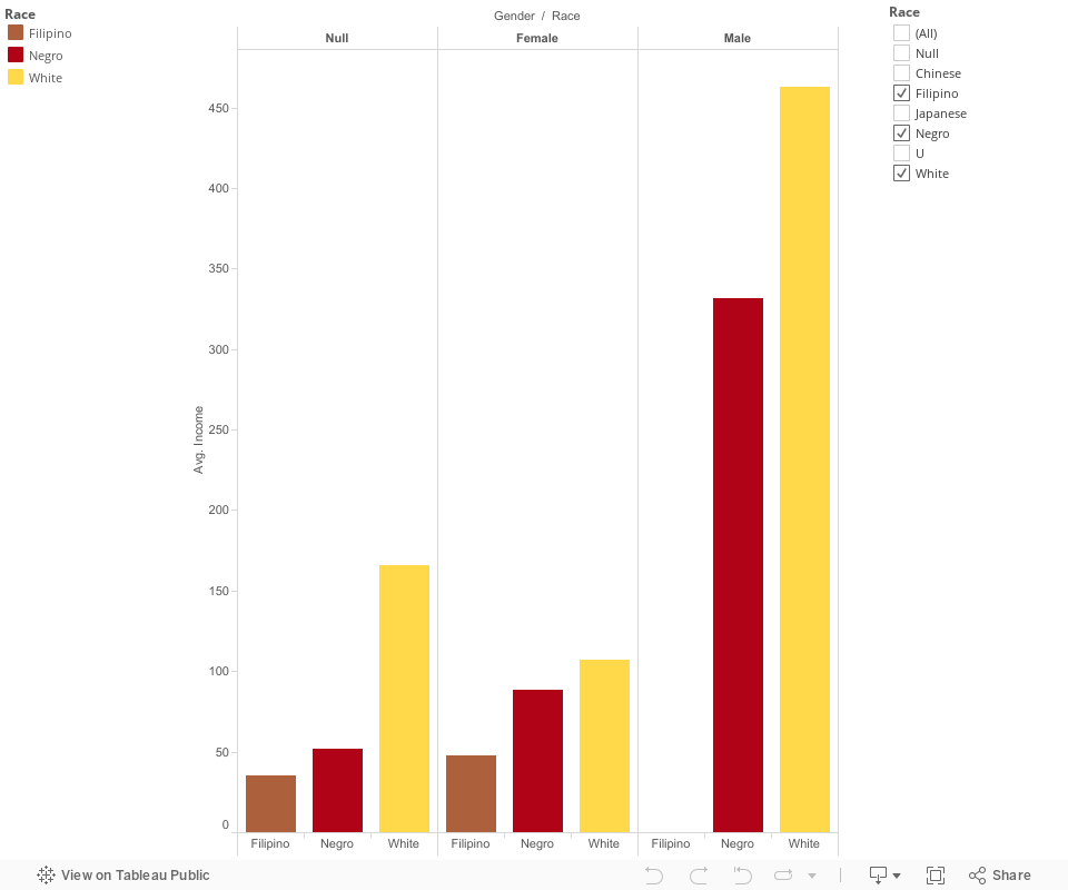
Drawing upon the trends shown between race, gender, and income, the census uncovers distinct disparities. There are 128 residents listed in the census that are non-white citizens in Albany, New York. There were Chinese, Filipino, one Japanese, and Negro population. The reference to “negro” alone, and the year 1940 can suggest that racial tensions still existed in the Albany region.
The context of the second visualization connects with the first based on the education levels of races and genders. The group of Chinese residents have a range of education from none to one that attended high school. Filipino residents all attended college except one, whose highest level of education was high school. Only one Japanese resident was listed who attended high school. Majority of the non-white population consisted of Negro residents, with majority of their education levels stopped at elementary school. When comparing these findings to income, the highest income listed between all non-white races was $2,250. The white residents’ education levels varied, however the incomes were at substantially higher levels. If we look at the correlation between gender and education the differences between men and women are surprisingly different than the differences in income. For Chinese men and women, more women were in school or completed higher education levels than men. All Filipino residents listed in the census went to college, with the exception of one woman. However, there were only two males listed in the census, whereas there were eight females. For the Negro population, there was an approximately even distribution of educational levels and listings of men and women. When examining the relationship between gender and income, there are two immediate trends found. Within the Negro population, you see that males makes more money than females.
Other factors such as head of household contribute to this finding. Providing for a family will have affects on income levels for anyone despite gender. In regards to race, the Negro population were systematically disadvantaged. Being a woman and Negro creates a larger disadvantage to make money, especially in the 1940s. The only women that were head of the household in Albany were widowed. If they were married, the chances of receiving any form on income were smaller than single Negro women. The occupations held by women also play into the stereotypes of how society depicts women. They held positions of housework or waitresses, despite their education levels. When looking at white men and women, the incomes of women rarely exceeded $1000. The occupations listed for women who didn’t obtain income were either unpaid family worker or housework. For women that did work, their occupations varied as opposed to non-white women in 1940s Albany. They held positions in medical fields, clerical work, sales, and restaurants. The trend found not only in the census, but in our lives today is the fact that white men hold the highest income. The census itself has less gaps in demographic information than any other gender and race. The variety of incomes, occupations, and education levels can conclude the fact that white men are more privileged that anyone else. It is clear that the stories made from each visualization intersect to show trends that are similar to ones seen today.
PROCESS
The demographic information displayed in the census, can provide a clearer demonstration of trends if visualized. Before creating these visualizations, it is important to know what information you plan on comparing in order to show significant changes in the data. Tableau was recommended as the software to help us further understand our census.
For my first story, I needed to asses whether education levels or occupations would be in rows or columns. There about three graphs that could be used to visualize the data: circle, line, or scatter plot. A scatter plot shows the clearest distinction in the number of people that completed a particular education level and its relation to their occupation. When finalizing that step, I realized there were an exceeding amount of items in each section. Without any categorization, you cannot see any trends or patterns. The range of data for educational levels were specific starting from no educational background to college 5th year or higher. I knew I didn’t want each grade in its own category so I grouped education by none, elementary school, middle school, high school, and college. I decided to filter out null information because it would then complicate the filtering process for occupations. The range of occupations were extremely long, therefore required multiple groupings. I initially based the groupings by related job descriptions, but realized I had to continue to condense and place similar occupations together. For example, I had restaurant related occupations as on group. Bartending was placed in its own group, but can be categorized with restaurant as well. I finalized the visualization with 32 categories of occupations that ranged from accounting to yard work. Factoring age into the visualization helped understand who held these positions at what point in time. There were people that were not of working age, therefore their education levels would not have relevance to the correlation between education and occupations. Once adding this category, my graph changed into a combination of scatter and stacked graph.
My second visualization showing the correlation between race, gender, and income was a simpler process. I made gender and race the columns and income placed in the row section. There were complications in representing the five race categories mentioned earlier. When creating the visualization, the Filipino average income would not show on the graph. The Chinese and Japanese population did not have any numerical income displayed in the census, therefore was removed from the visualization. I chose to use a bar graph so that you can see differences in income based on race and gender. Income was the only dimension that needed to be filtered to show a range in numbers, versus counting each persons’ income.
For both visualizations, it was best to choose colors that were appealing to the eye and made it easy to see the trends that were described in my argument.
ARGUMENT
When looking at any historical information, you may see a pattern regarding disparities based on societal factors. The 1940s census provides information on a select number of people living on neighboring streets, their marital status, income, gender, education level, occupation, age, and more. Demographic data is a good way to track populations, but requires good observation to find correlations within the data. The patterns we see today are presented in the census once we create visualizations. There is a distinct trend in the societal differences based on class, gender, and race. Three main points will be made within this argument:
1. The higher education obtained by people in society, the better their occupation is.
2. Men make more than women in nearly every profession.
3. There is a presence of white privilege and lack of representation for people of color in any given data set.
The first trend within the argument is education levels influence occupations. The census data lists the number of people who have either attended elementary school to college. Although several names have no information regarding the highest level of education received, a pattern is still present. There is a subset of data that shows people who have only completed elementary school with an occupation as an unpaid family worker, wage or salary worker, janitor, or laborer. Those with only high school education had similar jobs, or some more advanced such as beautician, attendant, and typist. College education residents in Albany were lawyers, civil engineers, stenographers, and accountants. Those job titles/careers advance as the education level increases, showing the value society has always placed on receiving a higher education. The 1940s census does however, lack a large amount of occupations for residents. People in Albany overall did not attend college. You also see that many people that have an elementary school education hold the same positions of those who attended college. After categorizing jobs into the category “Business/City/Police”, there are more people that have an elementary school education than college. I noticed a potential reason for this is my placement of business or private owners into the category. Entrepreneurs don’t necessarily need higher education to be successful. There were also information in the data that assumes college attendees do not always immediately find work in their desired career. There were twelve residents listed in the “housekeeping/cleaning” field who more than likely did not intent to work there. Also ten years prior to 1940, the United States went through economic turmoil. This can have an effect on people who worked in state, local, and financial offices that may have lost their jobs during that time.
The second correlation found within the census is the difference in income based on gender. It is already a known fact that men make more than women today. History has shown us that society has trained women to be comfortable in the household. They are created to be wives, mothers, and attend to duties in the home. All of this work fulfilled and even when doing so, that work is still not measurable to work for pay. When visualized in a bar chart, you can see men made more than women. The census does lack information on occupations for women. The marital status also plays a role, as you can see who is married versus who is the head of the household. Typically, the relation to head of household for women is wife, mother, or daughter. The men would be the head of the household or the son. Both the head and the son still would have occupations listed in the census more frequently than women during this time.
The last pattern within the argument is racial disparities that continue to exist. With a simple glance at the census, it is clear that over ninety percent of the population in Albany was white. It is uncertain if people of color were undocumented purposely, or they simply did not reside in Albany. Four other races were present in the census: Chinese, Filipino, Japanese, and Black. Based on their demographic information, they all lived on Fleetwood Avenue or Vanschoick Avenue. Their education levels, occupations, and incomes varied. The data alone does not show if one minority was more established financially than others. In comparison to white residents, the financial difference is drastically skewed. The sample of information on the minority population is somewhat too small to make any major conclusions. By assessing the information, you can question whether the area in which people of color lived was worse financially, safe or unsafe, encouraged or lacked opportunity for growth in comparison to the neighborhoods where white people resided. Those factors are a part of the present struggle of equal opportunities for all races today.
There are other correlations that can be made with the census data. You can compare martial status to head of household, immigrant status and occupation, home ownership and income, gender and employed for pay/non-pay. The census is simply surface material, yet can unveil many trends about populations in specific areas. These patterns are not new findings to how society is run today. They give additional information for how these patterns came to life.
RESEARCH QUESTIONS
The following questions presented for research were considered before and during the visualization of the census data.
1. What was the population like 10-20 years prior to 1940?
• There were nearly 15,000 people listed in the census. It would be good to learn how many people lives in Albany in the years prior to compare changes in residency. Was there anything happening in the city that increased or decreased population rates? Albany is the capital of New York, was there something economically attracting people to the city.
2. What brought Chinese, Filipino, and Japanese people to Albany?
• Between the late 1800s and 1920s, Chinese people migrated to Albany, NY and started business. The Chinese Exclusion Act, however, kept their population to a small amount. As late as 2010, the Chinese only makes up nearly 2% of Albany’s population. The percentage of Filipinos and Japanese in Albany has been less than 1% of the population.
3. Why are more women listed in the census than men?
• Initial thoughts behind this question were based on whether men were active in World War II at the time. What did these women do collectively in the city? Where there any places or programs where they came together?
4. Where areas in Albany segregated by race?
• The census provides streets of residence, but further research or visualization of where the streets were in relation to who lived there could show how Albany was form a social standpoint. What jobs were present on the listed streets? How was transportation? Were the areas safe or unsafe?
Overall, the questions and visualizations presented show the need for further research to fully understand life in Albany, NY. Some trends were shown immediately, while others were found through creation of comparisons with the data presented.
The dataset I selected was the census of NY religion by County. It consisted a lot of fundamental information as well as more detailed pieces of information. Looking at the row of data collects; it shows that the years 1850-1890, state (New York), counties, denomination and the number of churches that had been collected over the course of four decades. The geographic data refers to the data that looks at the number of church within a demonization and which county these churches are located in. The geographic data is the set of counties, which this dataset focus on state of New York. The numeric data is the year the data was collected, in addition to the number of churches. All three descriptions are vital in breaking down the number and words that were given in the census.
As I explore the various columns and rows of the dataset its hard not to notice the different ranges of trends, with these trends forming it natural develops a story. The first column is a section of number (years). Its numeric column ranges from the year 1850 and goes to 1890. It resets the year every time it switches to a new demonization it is calculating. This column provides us with the information needed to know which years the data was collected. The next column is the state in which this data was collected. It is consistently focused on the state of New York. The next column is the county in New York. The counties are arranged in alphabetical order and restart as well, every year that the data was collected. This keeps the data extra organized. This column is geographical, because it depicts where all the churches from each religion was local a crossed the state of New York. The counties were being counted starts with Albany and ends with the county of Yates. When this data was being collected there was sixty-two counties that contributed to this census. The next column looks at the demonization that was being established in New York during the census. This is a textual column because it is starting with the Baptist and Congregation denomination; it also looks various denominations such as Judaism, African Methodist Episcopal Church (AEM) etc. The final column the census looks at is the number of churches in a particular denominations within the previous counties discussed. This is a numerical column; the number of churches ranges from zero churches established in a county up to eighty counted in one denomination and in one particular county. With this sample of the New York Religion by county we can gather a great deal of information. It allows the viewer to piece together a story just by examining the finer details within the rows and column of the census.
Data Visualizations: (Map of New York)
With the dataset collects a story develops out of the number and text that is provided. The story of how throughout the four decade that data was collected the United States, more specifically New York became more and more of a melting pot of religions. People believed that migrating here whole heartily hope that this was a land of opportunity. When this data was being gathered. The nation was transitioning into a working class society. Where wage labor and having a boss was becoming the norm. Rather than years prior when individual shaped this country and farming was a major dynamic of this nation. Immigration will play a big role in the years to come. In these next decades urbanization will also be playing a role.
The dataset it includes information about religions that we being established in the state of New York. Every ten years apart from the year of 1880, it was kept track the amount of churches and what denomination it belonged too. This contains valuable insight into the rapid spread of religion in the New York. It provides insights as to how many churches in each demonization were being used and in which county were these churches being worshiped. This visualization allows the viewers to compare the different types of denomination, which ones were popular, when and where they were located in New York. With the visualization of the map you can see which religions were promenade throughout the curse of the dataset. It maps out all of the different counties giving the viewers a better visual to see why certain place may have higher church counts and why other may have lows counts. The visualization enables us to show the progression or digression of every denomination that was collected in the census. The map of New York shows the progression of most of the demonization and the down fail of others. It shows religions that were previous not existent such as AME. Its shows the immigration patterned of each religion. Most of them start in the cities because that is where the immigrant ships first dropped them off. As times goes on and the cities get filled with corruption and filth. People started to move to the outer counties, taking with them their religious beliefs. Immigrant could have started creating their homes in the Queens, Kings, Suffolk and Richmond County. Later in the 1890 the viewer can see the progression of churches being established in counties such as Erie and Genesee. By looking at the map you can also see the out of ordinary the number of churches will jump. For example in the county of Oneida, the denomination of Presbyterian was consistently around twenty churches up until the 1870s but my 1890 the number of churches shoot up to fifty-four in that county. Same goes for the Erie county the number of churches on the Lutherans, Moravian and German Reform church prior to the 1870 was about twenty and it too by the end of the last data collected in 1890 the amount of churches double with fifty-four in Erie county as well.
Process Documentation:
I started my quest to better understand the census by using Tableau. Incorporating different combination of rows and columns to see what kind of results I would get make things interesting but also complicating because the design on the computer looked like it would make a complying point but in reality I would make the viewer extremely confused or not understand the story I was trying to make them understand. Before creating my graphs the census was just number and words to me, they had no significant. But once I started to play around with Tableau and familiarize myself with it. I could see how vital it could be.
Once I started putting the pieces together I started to notice trends. I made my data into a geographical graph, I made this decision because I believed that it would show the ample difference between the denomination and which counties they were located in. This aloud me to sort out the number of denomination in each county by color to make show the differences of each county but year I used complementary colors like orange and blue. A dark orange symbolizing the largest amount of churches in one denomination and a dark navy blue to repent the lowest or zero churches in said county. Once I had my graph made trends started to appear on the computer screen. I was looking to keep the graph easy to navigate through. It became too much information over load even for myself, to look at all at once so I decided to use filters in my graph. With a click of the mouse the viewer could now just look at one denomination and its raise or fall over the four decades that the data was collected in each county of New York.
For my second graph I decide to go the route of making a bar graph it was actually the first graph I made using Tableau. By using the bar graph it enabled the viewer to see the total amount of churches in each denomination for the state of New York. I believe with the bar graph you could make out a better story than with the geography map. With the bar chart each denomination was give a different pastel colors. A part from the hideous brown color bestowed to Quakers. Within the large bar chart each year that the data was collected was given their own dataset. With the bar chart it help show the progression over time of when religions some doubling in the number so churches. It also brought to my attention some outliers or missed data. For example it data claims that in 1870 there were not Jewish, Quaker or Other denomination accounted for in that year. Then when by 1890 results appear for all of those denominations. I decide that this bar chart should also have a quick filter just so the viewer want to look at one denomination is one county they could have that option. Even though if you hoover the mouse over one of the bars it tells you in alphabetical order which county it is and how many churches were there.
Argumentation (Map of New York):
When looking at the visualization there are something’s that drew my attention. The color contrast of the orange and navy blue caught my eye while I was clicking around with my quick filters. While clicking from one denomination to the next, started to see a elucidation as to why the dataset may look this way. The first thing that grabbed my attention was the increase number of churches.
When doing research for my data I was intrigued to find many different connections for all aspects of the data. The New York State religion census is categorized in a variety of number classification such as the location, the county of the church within New York State and what denominations the church is affiliated with. The information that is given to the viewers allows them to piece together the lives of the citizens who lived during this time and to get a better sense of what religion theses citizens practiced. In the data shown, 1850-1890, the viewer can see the steady growth of most all of the various religious denominations that were established in New York State. Additionally, using my first bar chart, featuring the different dimensions over time, it can be concluded that the most dominant religion sect establishing itself throughout New York State were the Methodist, Baptist and Congregational. Presbyterians however, shown by the data, did not see dramatic increases its church presence throughout New York State. Through the time period of 1850-70, the number of churches remained constant at about seven hundred every time the data was collected. The data also concluded that the Quaker churches in New York were the only denomination experiencing a decrease in numbers. By 1870 the data that was collect suggests that no Quaker churches were present in any New York county. Finally by 1890 they reappear, with only ninety-two churches. I believe the influx of churches correlates what was going on in American history, the first and second wave of immigrants and the urbanization of America. The first waves of immigration to the United States happen in 1840-1860. At this time immigrants that were coming to the land of opportunity were mostly Irish and German. As the second wave approached in 1880-1940, is where the data set stopped in 1890. The immigrants that were arriving to the United States were mostly Eastern and Southern Europeans. During the first wave, on average, about 2.4 million came to the land of opportunity. For the second wave on average about 5.2 million came to America, more than double the previous wave, this shows the sudden increase in Judaism at the end of the 1890. Judaism is a prominent religion in the Eastern and Southern parts of Europe. With America’s rise of immigration grew a concept know as Urbanization, a process by which towns and cities are formed and become larger due to increase people living and working in those areas. Once the immigrants got off the boat many of them had very little money to travel out of the city where their ship had ported. These people stayed and correlation with the immigration increase, lead to Industrial growth in those pockets of newly arrived immigrants seeking work. In my map data set of New York, the number of churches and the variety of religions found in the county of Queens, Kings, New York, Richmond and even Suffolk doubled in size. During these times America develops into working class, where wage labor replace an agrarian work concept that was prior, a nation of farms. Going from someone that controls your own wages and the amount of food you can provide for family to one that was dictated for you is a huge shift from farming and being independent, to someone (Boss) controlling your wages.
Further Research Question:
When I was examining my dataset and as I was creating my visualizations, different question popped up that with further research might lead to something. While look at my geographical map I notice that the county of Schuyler was not counted for in the first year of the dataset, 1850? Was it not considered to be a county, and during the ten years of waiting to make the next set of data did it become a county. Looking at the same visual during the years of 1850 and 1860 Suffolk county Methodist church was counting to raise but then by the next year they collected the data 1870, the number of churches in that drop dramatically to nine churches. What cause the sudden down fall? Was it an error on the collector of data? I claimed in my argumentation that immigrant had to deal with the influx of churches and the more increase variety of denomination with further research that question could be answered. A trend you see with the visualization is the Quaker religion is one of the few denominations that decrease throughout the dataset. What caused the pushing away people from the Quaker denomination?
With my bar chart visualization it aloud me to see different flaws or kumquats that dataset had collect. Only with further research could these questions be answered. The First to note is by 1870; the denominations of African Methodist Episcopal Church (AEM), Jewish, Quaker and other were not calculated in that year’s census. I have mention before that the year 1880 census was not collected. There is not data found on that particular year. What happened in 1880 that people made the decision to not collect the sense? Look at the visualization something that surprised we was that the Dutch Reform denomination have one of the lowest number of churches established in New York. Now living in Albany I know that the Dutch were one of the first people to settle in the state of New York and more predominantly Albany County. Whoever this dataset shows that was only had the second highest amount of churches established in There County. What took the led was Ulster County. In addition by the 1890 is fell to third falling behind Kings County. Why is that a county know for being settled by the Dutch had so few churches established? The Methodist religion was the predominate religion is the state of New York, I would be interested to see why and how did it become so popular is the span of four decades.
In this visualization I decided to research the differences in the payment of pensions for people that had the same injuries but started receiving pensions at different time. From this visualization I organized the data into years and injuries and then went from there. My original question for this visualization was to find the differences in amounts of pay for each individual. As you would guess many of the payments are equal, however I had also thought about how there would be differences in pay, and I was right about that as well. When you look at this data the person who created it did not include how severe certain injuries were, like there are labels for various gunshot wounds but the severity is not specified. This was the basis of my question. Why was there discrepancies? If there wasn’t a reason for there to be a difference in classification why is there different pay? The amounts also fluctuated by time of issuance. It wasn’t like there was a correlation going up or down the numbers were just random, again, a reason to include the severity of the injury that each person had received. This could’ve all been cleared up by a couple extra words on the sheet.
There are some very different stories that come from this chart as well. Like the many people who are affected by gunshot wounds, presumably from the Civil War. This shows the variety of injury that come from having such a bloody war. There appears to be a a gunshot would for every appendage possible. I suppose that there is the possibility that the injury happen during some incident outside of the war but I think it’s reasonable to say that the most of injuries occurred as a result of the war. When you look at some of the other ailments You see some injuries like an axe to a particular appendage and see that they only see that they receive like $4 a month. That number is very surprising to me,even in those days where four dollars was a nice amount to have for some income but I feel like that wouldn’t be enough to support someone who was severely hobbled by an injury. There were some cases like a dependent mother who might have multiple kids and use that as their only income and the pension was eight dollars Again that seems incredibly low. The pension for women, especially in those times would most likely be the only opportunity for women to make money so this seems low in the sense that these women could have multiple kids. Conversely, there were a couple people who were blind who received $70, this was interesting to me because that seems like it would be a reasonable amount for people who probably don’t have a lot of expenses.
Overall I feel like that given these circumstances, in my opinion people could’ve been paid more, but I don’t know what a good salary per month was for the time, so this could’ve been fair.
Data Visualizations:
The first of my data visualizations is actually meant to be a pair. The two charts being used are titled “Box and Whisker” and “Changes”. With these two visualizations you are able to see the differences in pay for the same or similar injury or other reason for pension. The question that I thought that these graphs could answer were why were there differences in pay grade. In the box and whisker chart the idea was to a more statistic approach to the data. You look at the raw data and notice some differences right from the start. In this chart you see various statistical points such as median, quartiles, the whiskers. For this the larger the box is the larger the disparity between people with the same reason for being pensioned. From a quick glance you can see that it is about fifty-fifty on reasons that have no difference and reason that have some difference. And then when you look only at the reasons that a difference, and you once again realize a fifty-fifty split with small difference and a large difference. The differences were what were driving me to dig deeper and deeper. Then I decided to create an accompanying chart. This chart shows the differences again, however the data is grouped. I grouped the data based on similar reason for pensioning. Some examples include by right arm or leg, or being a dependent mother. This further shows the differences in pay for a certain reason. In creating these graphs, I set out to find why there were these differences. One would assume that if you have the same reason for receiving a pension as someone else you would get the same amount as them. And even without the visualizations you can see this is not the case. And then you think it must be because it must be one person has a worse injury or other reason than another person, wrong again. After some light digging I found out that it wasn’t that simple. It turns out it was completely out of the hands of the pensioners. In those days you got what you got, forever. Then, as time went on and pension laws evolved, the government adjusted for inflation and also changed who could get a pension in the first place. The second part makes sense, the first part is where it gets tricky. As I said before pay rates were adjusted, and you got what forever, so in essence on one day you could not be eligible for a pension, and the next you could receive a pension and also at a higher rate than a person who came before you with the same injury. This is something you can see in the visualization, with the later dates generally being the higher of the pays where there is a difference. Overall, for this set it took some digging to find out why the data had such weird breakdowns. (ElderWeb)
For my second visualization I decided to use a packed bubble chart. The story for this chart is literally nothing like what the first was. With this chart I set out to find demographic data about Albany pensioners. The process for this visualization was a little more tedious, because with this you can only do so much. When I first chose the packed bubble I knew by the way that I formatted that the largest bubble that I was going to have was Albany, that was a given. I knew that by sheer volume Albany would vastly out number the smaller neighboring towns. I then grouped the towns by type. If you look at the chart, the green bubbles are urban, the suburban red, and the rural blue. You see that while larger, the green circles are far outnumbered by the blue circles. You understand that in cities there is significantly more people so there’s going to be a good number of pensioners. My question came from the lack of pensioners in the smaller towns. Small towns are generally older people so how is there often times one or two people receiving pensions in a town. In this time shortly after the Civil War everybody that was able bodied would’ve fought in the war and by the law of averages people are going to get hurt. From that fact alone you’d guess that there would be at least two people per town to receive a pension. Add that to your everyday ailments and you’d suspect at least a handful of people per town regardless of size. Some of the reasons were not even bad reasons to get some money to live on either.Looking at the amount of people in Albany get pensions I wouldn’t say that it was particularly difficult to obtain a pension. Perhaps it was just the proximity to an office or something that was stopping the outer towns from receiving a pension. This is the interesting part of this chart because these questions can never really be answered. You can think of a million different reasons for why this would happen and you may never be able to guess right. So while I was not able to find any concrete results for this visualization, it opens up some of the fun parts of history that are unwritten, where you can speculate and think about what might have happened and maybe if you find a good enough theory or dig deep enough you may some day find out.
Process Documentation:
Doing this part of the assignment is completely new to me so I don’t really know how to start. I’ve never worked with Tableau either, so in all aspect this process is completely new. I’ll start at the beginning I guess. When I first looked at all the choices for possible data this was the only one that really stood out to me. I always like to work with things that I know how to use so when I saw that there was a choice for monetary data to be used and the fact that I’m a business admin. major the choice was almost automatic. So after the choosing process, I started to look at the data and look for any type of difference in similar data and went from there, this first reaction eventually became the main ideas for visualization. Like I said before, I really had no idea how to use any of the programs so I again with what I know how to use and worked on graphs that I knew could show the story I was trying to tell. First, I went with the box and whisker. I knew this would show exactly wanted to show so I went with it. This type of visualization draws the eye to the differences in value, similar to what happens when you use different color or size, so this worked. I also thought that this wouldn’t make the visualization too simple. Meaning that it takes a little investigating to fully understand what was being said. This visualization is meant to be paired with the graph titled “Changes” where I grouped similar ailments based on body part or otherwise. On that graph it is easy to see the varied pay rates, the main story of this project. By doing this it was easier to see the correlation of the data then trying to remember what the rates of similar injuries were. Another visualization that I created had a little more of real process to it. I chose the packed bubble chart to show the distribution of payments in two different ways. Showing the differences in payments per town and where the money was all going. I’d be lying if I had a reason about the color choice, but I do know why I wanted them to be grouped. The green bubbles are urban areas, and the red and blue are suburban and rural respectively. By grouping them like this I was able to show that most of the money was being given to those in the City of Albany but rural areas there are more suburban and rural towns receiving money. Overall I found this to be an interesting task. The fact that I really had no idea what I was doing probably added to that but I look forward to using this program in the future.
Argumentation:
When doing research for my data I was intrigued to find many different connections for all aspects of the data. When looking I found that many of my question were answered to a certain extent. Within minutes of searching for how pensions were paid out I found a few fast facts that really applied across the board for this data set. The main idea of the first article that I came across was specifically how Civil War pensions were paid. In this data set many of the pensioners were likely receiving such pensions from injuries suffered from the Civil War so I thought this would be a good place to start. The main question that I had from the first visualization was how there were so many differences in pensions paid and this article was very helpful. Almost instantly my question was answered, it turns out that those who applied for pensions earlier were likely to receive lower pensions. Using today’s logic that seems like it would be really unfair and it was, and it only got worse. Due to pension laws evolving over time a person would receive more for the same injuries on different types of technicalities. So, if someone who was certain about their ailments significantly effecting their lives to receive a pension would in fact be paid lower than someone who would try to work or survive without a pension. And the pay wouldn’t change over time for those earlier applicants either, someone would just get paid more based on whichever technicality was passed before they applied. I found this to be particularly disturbing because as I said before, people who were certain that they would need a pension to keep going who benefit less by applying than someone who thought that they could at least make ends meet for a while without a pension. Similarly, in regards to different pieces of pension qualifications being passed your ability to be pensioned changed as well. So if you weren’t eligible to be pensioned one day the next day you could be eligible. So overall, one day you would not be eligible to receive a pension and then the next day, you could not only receive a pension but have a higher monthly payout that someone who has been receiving one for years. From these two statements alone my data started to make so much sense. Perhaps it was that people knew that they could receive more if they waited, but for those who really needed the pensions, who couldn’t wait, were not to benefit. This is kind of disappointing, how most of these people, veterans, or widows from the war, had a portion of there income governed by dates on a page possibly missing a potential meal by a day or two. (ElderWeb)
I’ve also learned that the whole pensions system was kind of weird. Just for the sake of taking a look I Googled the 1886 census and looked at some data from a county in Illinois, and shockingly the data was almost exactly the same. Many of the pensions were in the same area and some were exactly the same for a certain field. In the mother category most people received $8, this was the same in this county in Illinois as we’ll as Albany. Also many of the abbreviations for the certain injuries. So somewhere along the way they made some sort of rigid system that was adopted by every census taker in the country. If this kind of communication was out there why couldn’t as system be to create some sort of uniformity for the payments? It was like they made all these new rules, let new people in, adjusted a little for inflation but forgot about the people who filed for pension earlier on. The weirdest part of all of this was that there was no federal government action at this time. Civil War veterans did not start receiving pensions from the federal government until 1930. After all this I look at the relative similarities as nothing short of a miracle. Especially in those times where there was no form of really efficient communication, this would’ve been ridiculously hard. So since there was no federal structure the whole payment of pensions was based on state or county rules. It would’ve been up to the counties that the people lived in to keep track and maintain the records for the pensioners, another tall task, so I can see where the temptation to cut corners comes in. One thing I thought that was interesting about how states and counties paid pensions was that some counties would have a competitive rate compared to another county that could have a greater ability to pay a higher pension. I would think a county like Albany who at that time was fairly prosperous would presumably have higher pensions then say a smaller county in a lesser state or especially the South. The fact that almost across the board pension rates are similar is simply astounding.
Overall I find that the this dataset’s true story is lost in history somewhere. It’s not one of the more glorious parts of history but it’s in there. For this set the main factor that drove the pay scale was when you applied to be pensioned. This is something that you wouldn’t guess from first glance. And that is something that I experienced first hand. At first I looked at this data and thought why would there be a difference at all? Even though injuries ranged from challenging to life altering it was basically all left up to a date. That is something in today’s times could never happen. To think of something that could change the ability to feed your family left up to a chance date, especially set by the government would not fly. By today’s standard that is borderline unfathomable.Though most logic would go against the actual truth of how the pension was paid it’s still interesting to find it.
Further Questions:
For further research questions I will be basing them off of some of the questions that I had coming into the assignment and then had answered throughout the project. Many of the questions that I had coming in were due to the idea of being fair in pensions paid. When I went into further investigation with the project I found that the pensions were originally based on need, severity of injury, etc. but as time went on it became that pensions were paid based on time, and were adjusted for rate of inflation or other unknown reasons. After doing all this research and still considering the fairness of all of this, this issue particularly struck me. I always thought that everything would just work because everything would be considered. Then to have all this unravel basically because of carelessness or laziness, that bothered me. So from this fact my first question is how this kind of carelessness just be allowed to happen. I understand that certain things just kind of get forgotten about. But those are little laws that don’t really matter anymore or something to that effect. After all, these laws were constantly being adjusted, and frequently at that. In a time immediately following the Civil War new pensioners were being added every day. So in this case it wasn’t a matter of neglect. The government just didn’t update the records of the people that were already enrolled in the pension program. I guess that this wouldn’t happen today thanks to advancements in technology. Also, this isn’t something that could really be checked either. Unless you knew someone with all the same ailments you would have no idea that you would be shorted. For my second question, I looked at the where the pensions were actually being allocated. For the most part it was people in the areas further away from Albany that were being paid. Though most of the money was going to the people living in Albany, there were far more small towns receiving pensions. This was the visualization that yielded more questions than answers. What was intriguing was the fact that in these towns or postal areas that there would only be one or two people that would get pensions in this specific town. That of all the crazy ailment that people had in this data set there would only be one person that could possibly receive a pension. There are some ailments that just affect the average person like arthritis or back problems and only one person qualified? Also, many of the people that live in those periphery towns are older, I just know that from living in the country growing up. So it would be a good guess that a few people in each community would have general ailments. Overall, I found that the start of this project had questions and that the answers gave me more questions to answer at the end of the project. I don’t know if I’ll ever figure them out but it’ll be interesting to see if I do.
“1890: Civil War Veterans Pensions.” ElderWeb. Accessed May 12, 2016. http://www.elderweb.com/book/appendix/1890-civil-war-veterans-pensions.
Slavery is one of the most important eras in American History. Not only was slavery a catalyst for the building of the American economy but also the root of racism in America. The dataset of Slave Sales between 1775 and 1865 focuses on slave sales in 7 southern states. In the data set there are several categories that give information on each slave. The data contains numeric, textual, and geographic data. To start off the data set includes the year the slave was “collected”. Age of the slave at the time of sale is also an important numeric category in the dataset. The age in years for this data set is 0 – 99 but the youngest slave sold was 3 and oldest 99 on the data set. The years added to the dataset range from the year 1742 to 1865. The next column containing numeric data for this data set provides the appraised value of the slave that is being sold at the auction. Due to a number of factors the range of values for the appraised value of the slaves being sold at auction is $0 – $1000 (0-50k in todays cash)
There are several examples of textual data in this data set. The first gives the gender of the slave up for auction which generally affect a slave’s appraisal value. Another form of contextual data is “defects” listed for slaves. This column provides us with information about what defects a slave may have that hurt their production rate. Generally, defects have a negative affect on the appraisal value of a slave. Defects can range from blindness, old age, and being a run away. The slave in question might have skills that could make them more valuable to potential buyers at the auction. The next important textual data is “skills” a slave possess. Skill sets can very from being a blacksmith or mechanic to being a nanny. Depending on the skill set the value of a slave can rise at auction.
There are 2 examples of geographic data in the Slave Sales dataset. One is the state the sale of the slave occurred in. This information is provided in the column labeled “state code”. The potential different states that could be listed in this column are “Tennessee, Virginia, Georgia, Louisiana, Maryland, Mississippi, North Carolina and South Carolina”. To be more precise as to where a slave was sold the data set also features the county a slave was sold in. This is very important when comparing slave sales between each state listed.
Visualization 1
This data set includes information on the slave sales from 1775 to 1865. It gives detail to the the different skills set and how slave owners evaluated them. The different skill sets of slaves is amazing in range given the circumstances slavery placed the enslaved from properly learning a trade. Some of the skills that were dominated by male slaves that seem to be a very hard trade to learn include skills as “mechanic, cigar maker, blacksmith, construction, etc.” This data also allows you to compare the types of skills that female slaves had as opposed to the skills that were possessed by male slaves. It is clear in the dataset that females had domesticated jobs directly translating to their skill set. The skill that seemed to be most valuable for women was hair dressing skills which were appraised at around $1,000, as compared to a male hair dresser valued around $275, one of the few skills women dominate.
The data in visualization states the mechanic as the most valuable skill for a male. Slaves with mechanical skills were worth around one thousand on average. By comparing the appraisal values, skill sets, and gender we can see different connections. The graph displays, on average male slaves and their skill sets were appraised higher that females and their skill sets. To test this theory, I compared the appraised value of a male blacksmith to a female and the value was noticeably lower for the female. The range of skills listed for men is much greater than women as men are responsible for more work on a plantation. In total there are almost 70 different skills listed for men to a mere 27 most “domestic” skills for women clearly showing the importance gender had on determining worth to a slave master. Looking at the tree map it is evident that skills were dominated by males.
Visualization 2
For the visualization I chose to compare the defects and sex of a slave and its affect on its appraisal value. I chose a bar graph to display the information because of its clarity and user friendliness. Looking at the graph we can see many factors that predetermine a slave’s value. For example, when comparing the sex of the slave, the appraisal value most of the time was lower for women then men. Also serious defects can affect a slave’s value more than others. On average a male slave in their prime was appraised at $734, pretty high compared to a male slave with cancer valued at $166. Most slaves were primarily sold to work and produce for growing plantations. Other times, when a master experienced a decrease in profits they would sell their best slaves to help with their economic struggles. It also did not help that as America began expanding the country, the opportunity to own land increased leading to the need for more slaves.
Based on the bar graph, there is a distinguished difference between male and female appraisal values and defects. The colors in the graph were very important to me as well, I used gender centered colors blue and pink to clearly represent male and females respectively, so viewers would see the changes in appraisal value. When comparing defects of slave’s men and women often had a broad range for what could account for a defect. For example, there were defects that include dirt eater, runaway, and idiot, all “defects” that can carry a different representation to others. Women showed most value when they were pregnant or very fertile, as slave masters like to impregnate females as a form of production. As far as comparing defects men and women share many of the same. Some of the things listed as defects are blatantly racist. With defects listed like dumb, run away, and drunk its clear this data set represents a time where blacks were seen as less than whites. The state a slave was sold in also seemed to affect what defect they had. This indicates that the geographic location had some type of effect on how slaves became defected. I also noticed children are priced significantly lower than a prime male slave, so much so being a child is listed as a defect. One problem I did have with this data set was the fact a male slave in his prime on average was valued at $100 lower than a male slave with a broken back. This issue makes me question some of the true values of slaves with defects. Another issue was the amount of defects listed; Some of the defects can easily be grouped together to fix some of the clutters. Others like dirt eater need more research to determine what exactly the defect is.
Argumentation 1
The visualization shows which types of defects different slaves had across the map of the several different states listed in the data set. The visualization is color coded by the different sexes that appear in the slave sales records for each of the listed states. You can make the case that since some states were more labor intensive then others, defects varied for slaves at different geographic locations.
When looking at the graph you can see differences in types of defects that appear to be more common compared to defects in other states. For example, we are able to see that in the more northern states, the slaves that were listed as having defects appeared to be defects such as being lame, blind, or having a bad attitude. This is compared to a southern state such as the booming cotton kingdom in Louisiana where not only does it contain all of the previously listed defects, but it also primarily contains physical defects that are most likely attributed to the intense labor and living conditions that they were forced to endure. Some defects included conditions such as being crippled, broken back, or a hernia, broken back. These labor conclusive defects/injuries seem to be more prominent in the further down south states then the further up states. This could be because over time, the labor the slaves endured wore them down and ultimately led to physical injuries that caused them to be listed as defected.
Also in this dataset a variety of defects do not become listed till the start of the 1800s. This could be because the types of labor that slaves were forced to endure were not as dehumanizing as further north states. Slaves with a less workload did not develop defects in the more northern slave states until later in the 19th century. It seems as time proceeded and the slavery industry began to expand more and more, slaves with defects began to appear more towards the north later in time because they were being sold with defects at a faster rate then ever. With the importance of a “prime” enslaved person in the south many slaves with defects were being auctioned to states further up north. This conclusion is supported in the dataset by looking at the defects that appear in the states mentioned above such as Mississippi. Most of the defects that do appear in further north states like Mississippi are not anything that would be too physically dependent. Some defects include being sick, “lame”, old, or run away. These are all debatable “defects” that could easily be fixed with proper care and time, but since slaves were not treated as humans but as property that can gain and lose value, small “defects” can determine what part of the country a slave lands in America.
Process Documentation
With a dataset like Slave Sales, interpretation is important so when going about visualization, the proper message had to be relayed. My use of a couple different kinds of graphs and maps for the dataset was meant not to be too uniform and pop to the viewer. The two visualizations that I have focused on are the bar graphs and tree maps. The first visualization type that I chose to use was the bar graph. I believe the bar graph is one of the simplest and best methods to display data visualization. It’s simple to understand and very user friendly. I use the bar graph to compare several categories involved in slave trade such as the state the slave was sold in, such as differences in sexes between the slaves in the data set, the appraisal value of the slaves, and defects a slave possessed.
Another visualization I used was the tree maps. Very different compared to the other graphs available, the tree map turned out to be very effective. With this graph I was able to compare the skills of each slaves and determine if the sex had any effect on the skillset. The tree map made it much easier to display this information to the viewer with a clear message. As the sex of the gender started to change the boxes in the tree maps skill sets progressively got smaller, concluding that female skills were generally valued less than males. In regards to the color chosen for the bar graphs, it was easiest and clearest to chose gender based colors blue and pink to compare defects and sex of different slaves. As far as the tree map data that displayed the skill sets and sex of the dataset, I chose the color red simply because that is what I associate slavery with; also red relays the message I would like viewers to visualize, the gruesome history behind slavery. The bar graph overall may be the best method for comparing the data that I have used for this dataset. The bar graph helps argue that slaves defects and sex effected what they were appraised for and in most case where they were purchased.
I also tried to create a symbol map to try to compare the relationship between states a slave was sold at and a defect carried. I noticed more and more states further north had defects that wouldn’t produce in plantations. For example, a blind slave can be of no value to a plantation owner but someone further up north, the slave can assist in other things. The symbol map with more information on slave sales of different states would also serve as a great way to visualize where different slaves with different defects were being sold to; as run away slaves and physically defected slaves by hard labor are more likely to be sold up north.
Argumentation 2
The Data set of the Slave Sales from 1775 to 1865 contain different columns that identify a slave and which one of seven southern states they were sold in. Looking at the graph there is a clear sequence in the data set. Comparing the gender, age, and value, it is possible to pin point how each of these categories effect appraisal value of a slave.
A male slave at his prime is usually around the age of 18-30 and on average pulls in almost $800 at auction, around $20,000 in todays cash. Age also plays a major factor in appraisal value, around the age of 40 the appraised value of a male drops sharply with the average appraised value being around $600. The decline in price can most likely be associated with growing health concerns and inability to produce hard labor as an enslaved person gets older and older. Essentially slaves old age become a liability rather than aid, it is evident in the fact a 99-year-old male slave was appraised at $19.
For comparison the average value for a “prime/fertile” female slave in the data set was around $567, almost $21,000 in todays cash. Unlike a male, a females peak ages are cut shorter. After the age of twenty-nine the value of a female slave drastically drops. The lowest average value for a female slave is an elderly just like a male. Children are also sold for cheap too but generally more than elderly. It is arguable through the dataset that women had gender specified roles that typically centered around child bearing and house chores. The labor roles of the enslaved men were a huge part in the South’s economics, making them more valuable then women.
Further Questions
Looking at this dataset we can get a glimpse of a horrible time that helped shaped America’s history. Reading the information in the dataset and seeing what constitutes as a defect for a slave brings the history to life for me. In every way whites tried to dehumanize African Americans even on record. I didn’t consider the fact that no names were attached to the skill sets and defects of the enslaved, rather treated as a form of property. The fact that being a child was listed as a defect indicate how the slave trade tore families apart.
Looking at all the different factors in the dataset, it became easier to see the correlate certain things with others. For example, the records show how slaves were being appraised and what might have influenced the increase or decrease in value. One thing I would like to understand better would be a better insight to the process slaves were sold. Where were the auctions held? How would one be able to evaluate a slave past someone’s word? Were the best slaves advertised or “praised”?
How slaves acquired some of their skills were astonishing to me. Given that slaves weren’t allowed to read and write they still were taught some very hard trades including blacksmith and mechanics. What predetermines what skill set will be taught to a specified slave?
With this dataset there are only so many questions answered about slavery. To find answers to some of my questions further research would be required. I would start by looking at more northern states for comparison to the seven southern states of this dataset. Based on geographic location looking at slave datasets for states like Maryland and Pennsylvania, we can view similarities and differences in things like skill sets. We can see where on the map most skills sets were increased and were on the map certain skills were nonexistent. Given that the north was more industrialized in the United States than the south, I was curios to if the skill sets of women would change in different datasets from the “domestic” centered skill sets of the south. I also wonder if the appraised value of these slaves was affected by industrialization just as much as the cotton boom affect value of a slave in southern states. Some ways to go about researching this information would be to look at a census and see how the slave sale categories compared to the more industrialized states up north. Personal slave accounts would probably reassure the question of How slaves felt working as a form of property. Letters from slaves either from the north or south can determine what hardships, if they faced and if they were dehumanized in any facet. Focusing on defects in the visualization, what affect does gender have on treatment of defects, if any? Is there any health coverage a master would put on his most productive slaves, which in most cases are men or is the value of every slave important to an owner? Based on the previous examples of sexism faced by slaves by looking at differences in appraised value between males and females, it would make more common sense to conclude that top notch male slaves receive more medical attention than a female with a defect. To prove this theory, further research on the medical attention that was given to slaves during this time period and attempt to specifically locate scholarly reviewed sources and recorded history about treatment of defects.
Visualization #1
My first visualization looks at the relationship between the Albany 8th County Militia, their place of birth, their age and the “complexion” that each man is marked as. The use of complexion in this graph is not to examine any person in the militia based off of looks or bias, but rather to understand better the racial identity of the men in the militia. The graph itself is a stacked bar graph that’s a mix of textual and visual data. In order to fit all these categories into one graph, I not only had to use both of these types of data, but I also required the graph to be broken down into sections. Initially the graph separates the men from each place of origin. Origins other than the United States are specifically labelled by their country. In comparison births in the United States are broken down into states in which they were born. This is further broken down if the birth was in New York, due to the majority of births in the United states being in New York. The New York births are divided into county or area, since the counties of New York have changed considerably since the American Revolution. From within the category of the location of birth, the graph is further broken down by complexion. These categories are divided by broad skin based or racial complexions. Indians, blacks and mulattos are labelled by race while the rest merely state generally skin tone. Also, e more than unlikely to make more than an educated guess exactly where he came from. Which is a shame, such an interesting addIn the case of dark and brown, it’s to point out hair color, not skin tone. It’s from this category that the bars on the graph are representative of, visually showing the number of men of each complexion. These bars break down into the last category of age. They are broken into color coded sections, each representative of an age range. These ranges are each roughly ten years, except for teens, as one had to be 16 to join a militia. A filter to the right edge of the graph allows the viewer of the graph to see specifically whatever specific category they want in terms of age and complexion.
Data Visualization
My story of the men of the 8th Albany Militia in this graph reveals some data that I wasn’t expecting. In the country of origin section I think we see the most interesting piece of the story. That being that a majority of the men fighting were not born in America, but rather Ireland, Germany and England. Three countries, that in one way or another, the patriots fought in the revolution. Although the Germans fighting on the British side were mostly from Hanover and the Irish were more utilized by the British rather than willingly fought us. Still it’s fascinating to see that the men fighting for the patriots were from the same places that they fought against. These men were generally not blue blooded American born patriots but recent immigrants. I cant vouch for there motives in fighting but I cant say its for freedom from tyranny.
The complexion section tells a different but equally interesting story. While many men were from these North-Western European countries, those men were generally same in their complexion. Essentially they were mostly fair and pale, brown and dark(again in this case meaning hair color, not skin tone). What I find more interesting is that when we look at American locations of birth, we now see the diversity. Indians, blacks and mulattos pepper the categories. While not in high numbers, the presence of minorities shows two things. One the willingness of minorities to fight and die for the patriot cause, and two the beginnings of the boiling pot culture America is known for. Even so early in America’s history, this country shows its blending of peoples together for a single vision.
The age category shows a trend that while not too shocking, is interesting. A majority of the men who are in the militia are young, with twenties being the highest age range. Also surprising is that teenagers are the third highest age range, surpassing forties and fifties. These two points of information may say something about the willingness of young people to fight for a cause they believe, but probably just points to the greater numbers of young people that are able to actually fight.
Finally there are a few interesting points on the graph that are much more difficult to answer. First off, there is only one lone black soldier that stated his origin of birth as being in Europe, and that’s in Germany. It most definitely is different than our image of people who where born in Germany, especially in 1762, when there were much fewer opportunities for cultures to intertwine. Second there is one lone soldier, also black, in his twenties, who comes from Guinea. Modern day Guinea, located in West Africa, was not even an official colony until 1891. So I cannot say he was from there but I can only guess he was from the area, somewhere in West Africa. This most likely means he came to America as slave in the slave trade, which brings into question how and why a slave from West Africa became a freedman so quickly and then decided to fight in the American Revolution. Then there is one more lone man, this time an Indian, with his point of birth being written down as Portugal. It is unlikely to say the least, that an Indian would have been born in Portugal, so I can only guess that when they say Portugal on the muster roll, they really mean Brazil. For Brazil is the location of Portugal’s sole major colony in the Americas and would be the only place an indian in Portugal could likely be from. I can’t be certain but it would be a surprise if it was something else.
Process
I chose these three major categories of age, complexion and place of birth because as I said earlier, I wanted to show a broad picture of the men who were fighting for the patriot cause. While one city’s data can’t speak for a whole nation, I think it can at least show some interesting views of Albany’s Revolutionary history. It’s also a good starting point for further research on the war. I felt that based on the information given on the muster role, that these three categories not only best showed that picture of Albany’s fighting men, but could also all work together on one graph. My original plan was to use a map to show visually the locations of the company’s births, but I ran into some problems. Mainly that the geo-dimensions in Tableau made you pick either county/region, state/province or country. With my data including all three of those and feeling that none of them could or should be compromised for the sake of a map, I scraped that idea and tested the other visualizations. None of the other visualizations I felt could fit all this information I wanted to put in very clearly, so I chose the stacked bar graph. For all three categories I had to group together certain similar categories to make the graph actually readable. Location of birth was the hardest one to create groups for since there were so many different locations and I had to combine so many of them together just to make the graph a relatively readable length. There were a number of specific locations I wanted to include but I couldn’t because there were still too many locations. The graph would not have been easily understandable. Plus sometimes there were limits to how specific I could be. Most notably, many men were listed as being born in “New England,” which since I couldn’t accurately know where that was specifically, I had to leave it as New England. It also meant that I couldn’t include specific New England colonies as locations, such as Connecticut and Rhode Island, since it would probably be too confusing to have both New England and specific locations in New England. While easier than the numerous locations of birth, for complexion I had to group similar tones or hair colors. For age, I decided to divide it into ten year intervals. From there I decided that since the locations were the most numerous category, that it should be the first to be divided. This allowed the less dividing complexion and age to both share the bars on the bar graph. With age having the fewest possibilities I decided to divide each bar by age to make it easily readable. Choosing the colors for the age divisions, I decided to make each division one color interval separate from the last. That way it would be easy to know what age range your looking at. The older you were going, the closer to green (and then finally yellow) from blue you were going.
Argumentation
The story or point of this graph was to show the general story of the men of the 8th Albany Militia. Specifically to answer who were these people who decided to answer the patriot call to arms for their ideas of freedom and rule. My biggest hope was to find data showing a dissenting idea of the Revolution. Since from what I’ve read on the Revolution I know it was not the grand, united, nationalist, patriotic fight against tyranny that we are generally lead to believe. Or better put by E. Wayne Carp of Pacific Lutheran University, “In this nationalist version of history, a united, freedom-loving people rose up in righteous anger at the King’s tyrannical actions, grabbed their trusty flintlocks, hid behind trees and walls, defeated the dull British soldiers who were sitting ducks in their scarlet uniforms, and established the United States of America.” Instead the ideas and acts of the Revolution were widely contested across the Colonies and estimations hold that as high as 20 percent of Americans joined the Loyalist cause. Combined with Native American tribes that were pulled in and forced to pick a side, a certain civil war over the question of how the colonies should be run and who will run it was created. Contemporary historians of the Revolution, such as David Ramsay and Mercy Otis Warren, even agree with that sentiment, declaring the Revolution “Originally a Civil War in the estimation of both parties.” This sentiment has only grown in recent times and the view of the Revolution as America’s first Civil War is widely debated among historians. Continually increasing numbers of modern historians, such as Alan Taylor agree the the Revolution was America’s first civil war. Writers like Thomas B Allen write about the extensive and underestimated Tory contributions to the British Cause. Others like Richard Berth tell the stories of the frontier, where communities and families amongst whites and Indians were broken up to decide the answer. Some historians, such as Thad Tate and Peter Albert, argue that during the war, some places devolved into violent anarchy reminiscent of what Thomas Hobbs wrote about. It’s a hard question to answer, if it can be accurately described as a Civil War, with the idea of what a Civil War is changing since the time of the Revolution. Either side you chose, generally it was about normal people, many with little to no opinion on the matter, caught in the ideas and fights of who could run this land better. This visualization I believe goes a long way in showing a story of the men who fought in the Revolution. It’s not quite the initial image of Civil War I was intending to portray, as it rather depicts England’s own people fighting against them. Still it makes a certain amount sense. With America and England extensively linked at this point, one could imagine that if Americans’ were fighting each other over who could rule it best, then England and its holdings would be fighting each other over the same idea. Also this only shows the patriot side, not telling us how many citizens of Albany disagreed and fought against the Patriot cause. With so many of Albany’s fighters being from these european countries, its not hard to imagine that others born in England or Ireland may have joined the other side.
Further Research Questions
There are a number of further questions I would ask after examining the graph. First there are the several outlying pieces of data that I described earlier. Where was the Indian from Portugal really from? Same goes for the Black soldier from Guinea? and why was there one (or only one) black soldier born in Germany? I think two of these questions are fairly easy to answer. Looking back at maps or writings of the area at the time, one could find out what place or area was called Guinea at or around the time of the Revolution. One could also look into Germany’s history in the slave trade and in Africa to see the prevalence of slaves or black workers in Germany in order to see how common black immigrants from Germany really were. As for the Portuguese Indian, I feel it’ll be harder to find out where exactly he came from. Unless they referred to Brazil as Portugal at the time or there is specific writings about that man, it’ll bition to the Militia and his story I can only guess is fascinating. Beyond that It would be great to look into the number of Loyalists that came from Albany to compare to the Patriot Militia. It would be tough to find this out, but possible. One would have to look into various loyalist companies in New York and possibly beyond. Also one would have to look into writings in Albany to see who left and who was suspected or known to be a loyalist to find those who fought with the British but didn’t join a loyalist company. Finally I would like to know how similar the place of birth was for other cities and militias in comparison to Albany’s. Were most Patriot militia’s made up of manly immigrants, or was Albany’s an outlier? It’s easy enough to say you would look in to the other muster roles to check this data, but I don’t know for certain if other muster roles would contain the same information as Albany’s.
Works Cited
Allen, Thomas B. Tories: Fighting for the King in America’s First Civil War. New York: Harper, 2010.
“Guinea Country Profile.” BBC News. December 15, 2015. Accessed May 2016. http://www.bbc.com/news/world-africa-13442051.
Berleth, Richard J. Bloody Mohawk: The French and Indian War & American Revolution on New York’s Frontier. Hensonville, NY: Black Dome Press, 2009.
Carp, E. Wayne. “The Wars of the American Revolution.” Am Rev Essays–Carp. Accessed May 2016. http://revolution.h-net.msu.edu/essays/carp.html.
Cutter Ham, Tom. “Was the American Revolution a Civil War?” The Junto. 2014. Accessed May 2016. https://earlyamericanists.com/2014/02/18/was-the-american-revolution-a-civil-war/
Minty, Christopher. “Seriously, Though, Was the American Revolution a Civil War?” The Junto. 2015. Accessed May 2016. https://earlyamericanists.com/2015/06/29/amrev_civil_war/.
Visualization #2
The second visual I created based around the Albany 8th Militia centers around the occupations of the men of the militia and relating it back to their age. The graph itself is a highlighted table graph, and is largely textual and numeric, with added visual elements to help display all the information present. The vertical axis of the graph presents the relative ages of the men of the company. Much like the first visual, the ages are grouped together by decades. The horizontal axis presents the relative occupations that were listed on the muster role. Some occupations that are similar in nature have been grouped together. In each table in-between these axis are numbers designating how many within an age group were listed as a certain occupation. To better show those numbers in a way that’s more visual and immediately understandable, the tables are also color coded. Each table on the graph is shaded in a hue of green depending on how many people in an age group perform a certain occupation. The more people that perform that occupation, the more green the table is shaded. The color scale is from 0 to 222, with that being the highest number in the graph. At 0 the table will have no green and be almost tan in color, while at 222 the table is a solid olive green. This is so the viewer can have a generally idea of which occupations or age groups (or both) were higher without having to read the number of each table.
Data Visualization
This graph isn’t initially groundbreaking in its revealing of the story of the city of Albany through the lives of the Albany 8th Militia, but none the less it presents some interesting points of data. First of all, by and large the biggest occupation amongst the men of the Albany 8th Militia is laborer. Not only do we see the highest single table on the graph at 222 for laborers in their twenties, but at each age group laborers are the highest by a wide margin. On one level that’s not too unexpected, most people can’t be specialized labor and there must be people to do the hard manual labor. On the other hand this may say something about the growth of Albany. Such a large amount of laborers would only be necessary if there was enough work in the city for that many laborers to be needed. Combined with such a small amount of men in other occupations, with further research it could be argued that this is showing signs of growth in the city of Albany. The high number of laborers would then be indicative of doing the immense amount of manual labor required to expand a city.
Also particularly fascinating about the graph are the types of occupations some of the men of the militia performed. For specialized work, it’s largely delegated to the making of clothes and materials. Following up laborers in number of men are wood workers, cordwainers(shoemakers) and tailors. These jobs make sense, as the people of Albany would have needed these commodities before the days of manufactured goods. Today though, technology and corporations have made these goods sought by the citizens of Albany easily available, making these jobs much less necessary. While these occupations do exist in cities to this day, they are by no means high employing jobs.
A number of jobs show how far removed from the days of the American Revolution the city of Albany and the World have become, since these jobs have long since become obsolete. Specifically the job of apothecary, which could only exist in a world were modern medicine and science have yet to accurately cure diseases and ailments. Also that of a hatter, which of the time meant making top hats from beaver pelts. This not only is extinct due to the decline in top hat sales, but also due to the health and mental effects making the hats gave to the hatter(“mad as a hatter”).
Other jobs, while they exist today, would be uncommon to find in any major urban area due to the proximity of the jobs to a city. Specifically farmers, which while there are not a lot in the militia, is enough to make it an obvious way of living in 18th century Albany. Today the immense size of cities as well as suburban sprawl would make the job of a farmer near impossible in a city. Also the job of a miner, as there are two in this militia. It’s not known what they mine for but any place that could’ve been mined in Albany would have long since been built over to make way for city expansion. Finally there are a rather high number of sailors among the militia. While Albany indeed was built on the Hudson River for the advantages of traveling up and down the river, river traffic on the Hudson has long since been relegated to recreational boating. Technologies like planes and cars, and the development of highways has made the occupation of sailor obsolete in Albany at least.
Lastly of note are the 10 men with a null occupation. Im not sure if this means they didn’t want to put down their occupation for some reason, or that they had no job to put down. It would be interesting if there were 10 unemployed or even homeless men signing up for the militia.
Process
When making this visual, I wanted to make sure I didn’t repeat my first one and create a bar graph. After exploring the various other graph and visual options, the highlighted table graph seemed to work the best. Not only is it a visually unique graph, in comparison to the graphs that I’m familiar with, but I particularly enjoyed the gradient shading of the individual tables. It made it a more visually appealing graph while presenting the information I wanted in way that made it quickly understandable. You didn’t have to specifically read the numbers presented, the green shaded tables immediately show you what was common and what wasn’t.
The hardest part of making this visual was condensing the immense number of jobs so that the graph could actually be readable. There were so many occupations listed that keeping all of them would’ve taken a viewer far too long to take in all the information. Deciding which jobs to group together was tough, as deciding which jobs were technically close enough to be the same category was a decision I didn’t feel qualified to make. I chose to include a couple “and this” labels in the categories because I felt the occupations were unique enough to be included. Each grouping I made weakened the overall view of Albany so I wanted to keep as much unique information in the graph that I could while still being visually readable. There was at least one occupation that for the life of me I couldn’t find anything about. I’m not sure if they spelled it wrong or if I didn’t look in the right places, but I have no clue what a “bellis maker” is, so I was forced to include it in the null category. Fortunately it was only one job so it didn’t askew my story too much.
Argumentation
I had expected the data to present a very different image of Albany than it ended up presenting. Albany had initially been established by the Dutch as a trading post, and while that was in 1621, the city had long after been a place that attracted fur traders and other merchants. On the edge of the frontier, even as the Revolution arrived, the thought was that the men of the militia would represent this image of a wilderness trading hub. It was much to my surprise when only one merchant was on the muster roll. Now its very true that this does not give a definitive look at the occupations of the people of Albany. It may be that the merchants did not sign up for the militia, perhaps in fear of losing goods or money. At the same time though, its a rather large sample size of Albany’s men, one would expect at least a few would enlist. After some quick research to show if this trend was in fact true, one source claimed that the fur trade did decline around this time in Albany, but wood and grain were then traded in Albany. While that would make it still expected for merchants to be present, the trading in lumber would go a long way in explaining the larger number of woodworkers in the city. Woodworkers did make up the second highest category, so perhaps these men were engaging in trading as Albany shifted its source of wealth.
As for the incredibly large numbers of laborers, I had earlier guessed that based on supply and demand, they were needed for jobs required to keep up and create an rapidly expanding city. It could also be that low income laborers merely made up the militia since they had the least to lose by going to war. When looking at the history of Albany though, the idea of an expanding Albany seems less farfetched. The end of the French and Indian War in 1763(1761 for North America) brought peace to the frontier and allowed Albany to grow without fear of raids. George Baker Anderson’s Landmarks of Rensselaer County, New York, claims that after Burgoyne’s failed invasion of Albany, the loss of a serious threat brought in a large influx of settlers from New England.The growth became so great that by 1786, Albany was the 6th largest city in America. Albany’s safety on the frontier brought it growth in the Revolution and it’s more than likely the same occurred after the French and Indian War. So it seems more than possible that the exorbitant numbers of laborers are in Albany to meet the influx of settlers to Albany and the growth to the city that such an influx entails. If that’s not the real reason for such numbers of laborers, it most likely became the reason, as such an expansion to a city could not be accomplished without a strong labor force. It may even be that the militia shows inadvertently the city of Albany on the precipice of its emergence as an important urban center that would in time be large enough to become New York’s Capital.
Further Research Questions
There are a number of small questions about the data that I think would require further research to answer. I personally would like to know what a “bellis maker” is, and I guess it could be done by looking into records of Albany to see if such an occupation existed. Or perhaps by doing better searches online to see if anyone actually knows that answer. Also I would like to know what the nulls in occupation mean. Do they really mean that they’re unemployed or is there another reason behind it. That could be answered by one looking at other Albany censuses or records to see if they tell what these men did. Finally I would like to see if there were more merchants in Albany than the muster rolls shows, and if their were, why they didn’t join the militia. Again you’d have to look into Albany censuses or Albany records to see if they have other merchants in the city. As for why they didn’t join the militia, save for a personal journal from a merchant or from another Albany resident that explains why, it would unfortunately be very difficult, maybe impossible to find the answer to that question.
Works Cited
Anderson, George Baker. Landmarks of Rensselaer County, New York. Syracuse, NY: D. Mason &, 1897.
“The Meaning and Origin of the Expression: As Mad as a Hatter.” As Mad as a Hatter. Accessed May 2016. http://www.phrases.org.uk/meanings/mad-as-a-hatter.html.
“The Official Site of the City of Albany, NY.” City History. Accessed May 2016. http://www.albanyny.org/Government/CityHistory.aspx.
Olpalka, Anthony. “Albany: One of America’s First Cities.” One of America’s First Cities: Colonial Albany – Oldest US Museums. Accessed May 2016. http://www.albanyinstitute.org/albany-one-of-americas-first-cities.html.
“History of Albany New York.” Wikipedia. Accessed May 2016. https://en.wikipedia.org/wiki/History_of_Albany,_New_York#cite_note-mceneny56-34.
The data set includes information about each individual slave, information useful for their upcoming sale. The data has numeric information, text and geographic information. The spreadsheet consists of nine columns. The geographic information is the state and county column, the states shown are Georgia, Louisiana, Virginia, North/South Carolina, Mississippi, and Maryland. The county column lists a variety of counties within each state where a slave was sold to give a more accurate account of where in the state the slave was sold. The numeric information is split up in the date of the entry of slave information column, the age of the slave in years and month’s column and the appraised value column. For the year column the dates start at 1775 and continue to 1865 but the spreadsheet doesn’t go in order by date so the numbers jump around quite a bit. The other two columns describe the slaves age in years which tends to vary from old to young but more often doesn’t have any information at all and months column is completely empty I believe due to the fact that very few infants were sold. The last numeric information is regarding the appraised value of the slave which is varied based on the age and skill and defect of the slave. The final text information is in three columns that include the slave’s sex, skills and defects. The sex of the slave is broken into male and female. The next text column is the skills column, in which the men had skills listed as cabinet makers or gardeners and women would be cooks or midwives. The final column is the defects column. This column shows slaves that were noted with flaws. These could be as simple as too old or too young, any type of sickness they might have or if they were disruptive.
Relationships:
This information draws a lot of connections between the rows and columns. Many can be found and expanded upon. I believe the most notable relationship is the appraised value and the rest of the columns. The amount of money willing to be paid on a particular slave is changes often depending on the other columns information; gender, age, skill and defect can alter the price in any given state or county. A young male with a skill would be much higher price than an older female with a defect. Another relationship found is the one between the date in which the slave was sold and the location. Possibly revealing that in certain states and specific counties experienced a much later or earlier slave trade. Could be from slavery expanding to other states more aggressively or slowing down much later in other states. Maryland and South Carolina have some of the earliest dates on the spreadsheet, then every other state tends to pick up during the 19th century. Could be due to policy changes that America was facing that effected slave trade. The next relationship found is an obvious one between the male skills and the female skills. The males had skills that were using their hands like cabinet maker and gardener while the women had more domestic jobs like cooks or caring for children. A relationship I would be interested in discovering is one that would relate defects to either age or gender, specifically a defect that dealt with disobedience.
Process documentation:
When choosing which visualization to do I wanted to have almost all of the data set represented as best as I could for my argument. The first graph I used was a bar graph. This was to show the different skills used by male and female in each state.
First the states were split up with the state name at the top of the graph, there were seven states represented in the data set. Showing each state starting with Georgia moving forward alphabetically ending with Virginia. At the bottom of the graph each skill set is included based on which state there were records in. Some states like Louisiana have numerous skills listed fifty nine in total. The state with the least amount on skills on record is Tennessee only have two skills listed and only three records, cartman with two male enslaved occupants and one male blacksmith enslaved person, the appraised value for those records wasn’t listed. Once each skill was listed the number of records each skill had is placed inside the bar graph. Knowing the number of records helps with the appraised value averages within the state. After they are given recorded numbers for each skill that number is further split by male and female. The skill is listed at the bottom the male bar is labeled with a green color, and the female bar is placed directly on top of it labeled with an orange bar. The then number of records for each skill is placed inside or just outside the bar. It was important to split male and female records for my argument that is based on how males and female enslaved peoples values are varied based upon skill, especially when males and females have the same skill set.
The second visual I chose was a tree graph based on appraised value for enslaved persons based on gender and defect. To start the graph I split up the enslaved persons by gender men, then added the defects they were labeled with excluding the records that had no defect mentioned. Then I added appraised value as an average instead of a count. This made the tree graph to get rid of the outliers that were taking up big spaces. The color was then chosen from dark red to light pink to show a decrease in appraised value. When choosing to how to label the graph I wanted to keep it similar to the first graph. The first label is the gender of the enslaved person, the next is the defect they were given and finally the number of records that were given for that specific enslaved persons defect. In the first box it is labeled male, broken back and the number three, all those are then used to determine the appraised value that can be shown once the cursor is over the box. The dark red indicates that is the highest average appraised value, in this case having a broken back was the labeled defect for enslaved males and being deaf for females. While the light pink shows the lowest appraised average value, enslaved males and females both show being crippled as the defect.
Both graphs show the best visualization for my argument. From the design of each to labeling and color. My argument becomes more clear with these distinct visualizations.
Story for Visualization:
Comprising the Slave Sales data set, I found the visuals that best represented my arguments by using a tree and bar graph.
The first bar graph shows the break up of each state. By splitting the data into separate states you get a better understanding of the differences that occurred in each state. Although all states mentioned partook in the buying and selling of enslaved people there were clearly differences in each. The differences were shown in the appraised value how much each state valued and enslaved male or female with a particular skill. Then the graph is split into each specific skill within the state. Some states had multiple skills, Louisiana had fifty nine skills that an enslaved person could have, among those skills were brick mason or carpenter usually occupied by men or cook and house servant usually occupied by women however, those skills did see it’s fair share of men. Then other states had very few skills. North Carolina had only six skills listen among those skills there were only sixteen records shown, that wasn’t even the lowest state with skills recorded. Tennessee only had two skills listed and three records of enslaved males with those skills. The story you get from this bar graph is how enslaved males and females were valued. During this barbaric time in American history the data set showed how men and women were bought and sold. My first graph explored the differences of the value of enslaved males and females when they were given a particular skill. By adding skills and gender I sought to give more human traits to just numbers on a paper. When listed on the excel sheet you see price but no mention of a name. Gender and age was listed but when adding a skill there is a more human trait added. This person was capable of doing something. Some of the enslaved males and one enslaved female were mechanics. That’s not a skill just anyone can pick up, it has to be taught and understood and then to be given that skill and it effect a value you must be decent at the job. For enslaved females across the listed states a common skill that affected their appraised value was that of a midwife. Again this is another skill that comes with a great deal of responsibility certainly more than working with machines these women worked to care for other pregnant women and then care for the mother and the child post pregnancy. A highly valued skill and very human trait.
The first graph I wanted to show optimism in a dark place. By showing the skills you see the human traits instead of just numbers. With the second graph the story becomes much harder to understand. In the second graph again there is split between male and female enslaved people. This time it isn’t the skills that are highlighted but the defects an enslaved person might have been given. Unlike the first graph there is no mention of states. An average appraised value is then given to the defect mentioned and the number of records are shown for each defect. The highest appraised value for an enslaved male to have is $870 with a defect of a broken back, the lowest is $5 with a defect of being crippled. For enslaved females the highest appraised value is $800 with the defect being deaf, the lowest appraised value is $.50 wit the defect also being crippled. The story of this shows more of the cruelty of slavery. Enslaved males and females were given defects and still bought and sold. Some of the defects mentioned were just the mere fact of being a child. Enslaved boys and girls were not able to escape the cruelty of being bought and sold. Other defects that were especially painful to come across were talking back, one can only imagine the suffering that was imposed upon a male or female in slavery when they disobeyed orders given. There was also a defect of pregnancy, the thought of being moved around while carrying a child isn’t easy. There were other defects that one couldn’t help, like having cancer or being blind. What these enslaved people had to endure must have been harsh and I cannot imagine having a sickness on top of living the life of an enslaved person. I highly doubt they were treated kindly. The second graph shows more of the cruelty given during these times. How these people that were just look at like property suffered more than we can imagine.
When deciding the two graphs it wasn’t enough to just highlight what the data set showed. The story that I was hoping to express was the people behind the numbers. When the data was converted to an excel sheet the story of the individual was still not mentioned. Forming the data to show more human traits shows more than the numbers could. Seeing a person being appraised for $500 is one thing but to know that the enslaved person listed was deaf adds a deeper component. The same goes for skills shown. Seeing an enslaved woman being appraised at $460 might not make anyone think twice about who she was, but giving her a character trait that she was a tailor puts more humanity to her. These aren’t just numbers they are people that suffered with things we still suffer from today and had skills that we still value.
Argument:
Slavery plagued America like so many other countries in the past. Today slavery still isn’t completely eradicated from the world however, we are still examining the troubles that occurred on our own soil. With the help of the data set of slave sales used you can get a clearer idea of what happened during the times of 1742 to 1865. Arguments can be made based on the way one chooses to construct the given numbers, dates and text shown. Although it hardly paints a full picture some conclusions can be discovered. The way I choose to arrange the data set was split between male and female and their value based on skills and defects.
The data shown in the two tree graphs labels each enslaved person with a particular skill on one and a defect in the other. From there the data is then broken down into male and female showing each skill men have and on the other side women this is also shown in the defects chart as well. Next the tree graphs shows the appraised value a male or female enslaved person would receive upon having a particular skill or defect. Although values for enslaved people rises during the years there is a connection between having a particular skill or defect that can also affect the value. Skills are shown to commonly be separated by gender; this might make sense in a southern society that believes in gender roles even when it comes to enslaved people.
Males tend to have more of the common masculine skills, from mechanic, blacksmith, shipbuilder and cartman or someone who drives a horse carriage. Based on these skills their values varied accordingly, the average appraised value for a mechanic was around $1,200 which is the highest appraised value for a male enslaved person with a skill. The lowest appraised value for a male enslaved person with a skill was $250 as a rope maker. Both the highest and lowest appraised valued skill tends to be a more male oriented occupation.
The females had skills that varied in more of the famine roles and occupations. There were skills in hairdressing and seamstress. As well as cooking, baking and other household skills including raising children and laundry. The highest appraised value for a female with a skill was $1,000 as a hairdresser, the lowest appraised value was a spinner at $200.
Already there is a pattern where the men enslaved persons are getting a higher appraised value then the women enslaved persons the argument can be made that the skills were different from male to female but that isn’t always the case. There are particular jobs that both men and female enslaved people share that aren’t distinct between male and female gender roles as well as certain skills that are shared among the two genders that do cross gender roles. Jobs that have no gender role for an enslaved person in the south would be that of a labor or field worker. When thinking of slavery in the south the image that appears in the mind is that of both men and women doing hard labor on a plantation. Labor work has no gender role and the male enslaved are valued at $630, while women enslaved have an average appraised value of $550. There were also skills that crossed across gender roles. Enslaved females also worked as mechanics. There was one recorded record of an enslaved female during the data set timed period in the small number of states listed that had the mechanic skill. Her appraised value was $600 in the state of Louisiana where there were thirty five male mechanics all valued at twice her rate.
Looking at skills there is a pattern of women enslaved people being appraised higher than male enslaved people. Of course there are some outliers like in the case of South Carolina, a more male gender role skill of a driver, the enslaved male tends to be appraised higher. This is due to the fact in the other states mentioned there isn’t a female enslaved skilled driver. However, in South Carolina there is one recorded of an enslaved female skilled driver and she was appraised at a much higher value of $1000 than the enslaved males appraised at $600. The same goes for enslaved males in female gender roled skills. In most other states labeled the female enslaved person with skill of baker or cook they are appraised at a higher rate than the enslaved males with the same skill. Again in South Carolina you see a different pattern where the enslaved males with the baker or cook skill are appraised higher than the females. In this case the male enslaved person has the average appraised value of $300 while the enslaved female is appraised at $125.
Although there are peculiar cases when the gender role skill has the opposite effect on the average appraised value enslaved males still tend to be appraised higher. When you take out skills completely and focus on the tree graph you see the effect that defects had on the appraised value of enslaved people.
The second tree graph shows the effect of average appraised value when it comes to defects that enslaved males and females were given during the time period. For almost all defects labeled, it is shared between male and female, the only difference being enslaved females being pregnant with nine records shown and the average appraised value of $475. This would be impossible to compare to an enslaved male defect. But for the rest of the defects there is a record for both male and female enslaved persons. The highest average appraised value for an enslaved male with a defect is a broken back, with three records shown the appraised value is $870, while the enslaved female with the same defect is appraised at $320 with five records shown. That pattern of enslaved males being appraised higher with defects continues for almost all defect labeled. The only difference being enslaved females with the defect of being deaf are appraised much higher than the enslaved males with the females being appraised at $800 and the males appraised at $550.
Today there is still a gap in equality among men and women and appraised value. The case shown in the graphs below are just a more barbaric viewing of still present inequality. But the argument remains the same and the data set further proved a point of how men and women are still not equal and how much work we still need to do.
Research Questions:
When diving into this particular data set it was hard to comprehend exactly what I was looking at. Shown nameless it was often forgotten that the numbers on the excel sheet were actually people that were bought and sold in the same country I call home, and a practice that just ended a few hundred years ago. The data set had to be take apart and manipulated to give these numbers traits that went beyond an appraised value. However further questions still remain when trying to get more human traits out of these numbers.
When the information was put into excel I have doubt that the original data set had names. That would have been a useful tool. Giving more humanity to the numbers and values and skills would have brought more meaning to the data set. It would have been interesting to know where these enslaved individuals moved to and where their linage ended up. By gaining names along with the skills it would have been interesting to see how far a particular skill lasted in the linage or if the skill was a helpful tool when slavery had ended. Same can be said for given names to follow along with the defects. If the pregnant women had successful child births and did the children have to suffer like the parents did.
When looking at skills I wondered how the skills were obtained. If it was taught from enslaved person to person or from another source. And then how useful that skill was in helping that enslaved person from day to day. If it meant they were given a less harsh treatment or if they were given a harsher treatment because having a skill meant they could do more work. I’d also be interesting in knowing how the enslaved people with defects managed their day to day life. Some had cases of missing fingers, that’s not easy to deal with but it is not as bad as being enslaved with cancer or being blind. I wonder If they were able to see doctors or if they died was family given bereavement time, did they have family at all.
Finally my question would be of skills and defects in northern states. The data set shown is only the southern states which already has the awful slavery reputation but the north still partook in the terrible act. I’d wonder if the skills were the same or if there were skills not needed for the south. I’d like to know how skills and defects affected appraised value in the north and if the enslaved people with a sickness were even considered a defect or was life for an enslaved person in the north more humane.
Adding more information to the data set would have helped my argument especially when comparing and contrasting the differences between the males and females. It would also help when giving more human traits to the enslaves people.