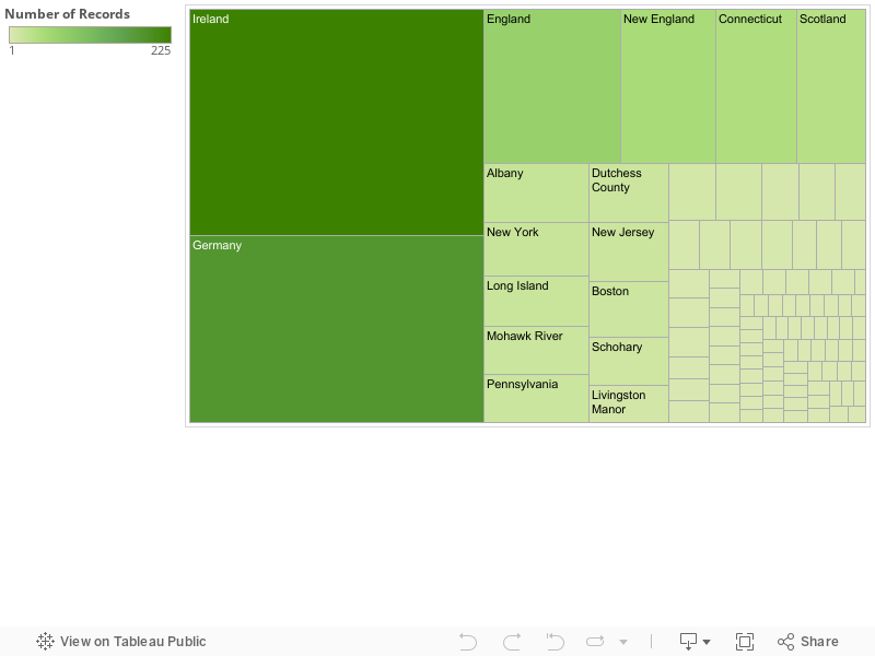
For my final project I decided to look at the 8th Albany County Milita. My first of too graphs is going to explore locations, places of origin and races of the men of the militia. My hope is to be able to show where around the world each man on the militia is from and from the complexions described in the muster roll understand better who the people were who formed this militia. While a majority of the men on the muster role hail from England and Germany and their racial backgrounds and appearances will be mostly indicative of western Europe, Im more interested in the number and the backgrounds of the men from the rest of the world. Places like the Caribbean and the Colonies, places that have been heavily colonized and mixed i’d especially like to see and explore their backgrounds. For example, how many indians made up the Albany Militia and where are they all from? From there i’d like to explore the possibilities of adding the other descriptive factors into the graph such as age and height to get an even better picture of the militia. In the end the point of this first graph is to understand who the men are that make up Albany’s defense during the American Revolution. Not only what races they were and their location of origin but also information like the general age of the militia. My second graph intends to look at the various trades of the men in the militia. My thought is to see what kinds of trades are being done by the men of Albany but also why trades are being conducted most. In this sense i hope to explore and create an idea of what the City of Albany (and its surrounding area since more than likely Albany itself had nowhere near this many men.) may have looked like at the time of the Revolution. Unfortunately my view of Albany will be flawed, or at the lest incomplete since this will only detail the men and their occupations in the city, and will be lacking what the women in city were doing at the time. At the same time though, this will at the very least give a solid idea of the general trades and lives of Albany’s citizens. As to how I’m going to visualize these graphs I currently only have bar graphs fro both but there is still more exploring to do to provide the best visuals for the information I hope to present. For the first graph I think a geo-dimensional graph would be the best way to present the information as location is central. My second graph currently isn’t bad as a general histogram but there are plenty of other visual I haven’t had a chance to fully explore (or understand). At its core though i want to show the larger picture of Albany during the American Revolution and the lives of those who lived and died for it.
pre-1800
Final Draft Religion in NY
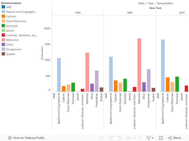
For my final project of this class, the visual data that I have chosen to use provide insight on the number of churches within a denomination within a county in New York. This data was collected every ten years starting in 1850 going through 1890 but did not include 1880. To depict these number I used geograph graph of New York and bar chart to show to show the data set. The vibrant colors of each graph appeals the eye’s, as you look at the information presented, you can see that some of the information correlates with one another to tell a story. A bar graphs create distinctions when look at the bar chart a person’s eyes will focus colors but another factor will be the length of the bars is helps the viewer understand what is going on. I chose to use the bar graph as my visual because its gives the audience the sheer number of churches that were in New York during 1850-1890. Unfortentual by using this bar chart it shows the total number of churches in a denomination, it doesn’t break down even further by showing in which counties these churches were located. This bar chart is not a standard graph with one set of bars, rather four small bar charts because of years the data set was collect put into one massive bar chart. Though I believe that it gets the point across visually without having the audience look at spreadsheet prior in order to analyze the data that is being presented to them. I chose the palette colors because it was aesthetically pleasing to the eye. For my bar chart I would rather have the lengthen of the bars tell a story than the colors. In context during the course of fifty years the promett denomination that thrived in New York was the Methodist and the Baptist and Congregational. Almost double in size by the start in 1850-1890. I believe that this increase of church correlates with Immigration that was going during this data set was collected. The first waves of immigration to the United States happen in 1840-1860. These immigrants were mostly Irish and German. The second wave develop in 1880-1940 around where are data set stopped. The immigrants that were arriving to the United States were mostly eastern and southern europeans. During the first wave on average about 2.4 million came to the land of opportunity. For the second wave on average about 5.2 million came to America. This example the sudden increase Judaism at the end during the 1890. Because Judaism is a promett religion is the eastern and southern parts of europe. Further research question I have is why is the Quaker churches slowing decreasing in number? Because of this influx of immigrants why did the Dutch Reform stay close to the same number through the fifty years?
Final Story Rough Draft
There are several stories that can be told from the Albany Militia Muster Roster. From how the small militia looked, to the jobs that they had in their normal lives. It’s very interesting to see where the individuals come from and how old they were when they originally enlisted. There is certainly a lot of personal information provided in the roster that paints a very descriptive story. The story that one of my visual focuses on are the racial backgrounds where these soldiers come from. I sorted and grouped the different complexions provided and assumed the description of the competition is correlated with their race. For example I grouped “Black, Brown, Negro, Dark and Swarthy” assuming that they are all African Americans. A also grouped “Fair, Pale, Ready, Reddy, Ruddy, and Sandy” with the assumption that they all are Caucasian. And then I left Indians alone because they are Native to the land. I also excluded “Freckled” and “Pockpitted” because they both can be used to describe Indians, Blacks and Whites. I thought that this would be an interesting way to sort this data because all of these individuals made the voluntary decision to sign up for this Militia, and they come from all walks of life. Especially during this time period, there was a very large gap in social equality between blacks, whites and Indians. One would assume that a majority of the soldiers on this muster roster would be White because they have a whole lot more to lose and they were treated a whole lot better by society. I would have thought that since society has been so oppressive towards African Americans, there would be a tremendous dividend between the two with the Whites in the majority. Much to my surprise, the African Americans were in the majority leading by well over 100. I found this very interesting and once I saw this, I had to ask myself was this all voluntary? Maybe it was and they just had a love for the country and a desire to defend it. Another interesting fact is that there was only individuals that fell under the category of “Indian”. However I will admit that I was not entirely surprised. Foreign powers were coming into their land and trying to control it. Why would they want to sign up for a fight that really has nothing to do with them because either way, there will be a foreign country controlling their way of life.