When looking at all of the data from the Albany census of 1860 a few stories begin to emerge. I think the most immediate story that jumps out is the racial diversity of Albany in 1860 according to this census. The race column uses a one-letter label and when scrolling through the hundreds of names you see the letter W, for white, almost exclusively. When you take a magnifying glass to the census and search for more you are able to find some small diversity. The letter B, as in black, and M, as in mulatto, are also listed on this census, but only for a total of eight records between the two races. There are three recorded black members of the community and eight-recorded mulatto members of the community. Due to the time period we are looking at this may not sound too surprising, but when you consider that all slaves living in New York were freed in 1827 it becomes slightly more surprising. When removing the scope of Albany, New York from our data you can see that the number of white persons in the United States still greatly outweighs the number of free persons of color. Slaves make up thirteen percent of the population while freed persons of color make up only one percent of the population. So while it is not surprising that only a few persons of color lived in Albany in the grand scheme of America in 1860 it is slightly interesting due to New York’s dense population of almost four million and the abolition of slavery years earlier. When comparing the totals of the United States to New York’s totals in population, New York has about one percent of freed persons making up their population similarly to the entire country. Out of all of the free persons in the United States about ten percent were living in New York during 1860. That is a lot considering many states still were under slavery during this time. Out of all of these free people living in New York at this time only 0.01 percent of them were living in Albany. A majority that were had presumably been here for a long time because the average age of a black person living in Albany in 1860 was seventy years old. Presuming that not many people would travel to a new location after being freed at seventy years old and I would also take into account that both black males living in Albany during this time both were working jobs that were both also worked by white males during this time, one as a preacher and one as a waiter. When you consider that Albany is the capital of New York I might have guessed that more freed persons would be living there, but you have to take New York City into account. Out of the forty-nine thousand free persons of color in New York during this time period twelve thousand people, or twenty four percent, were living in New York City during this time. These numbers had been on the decline though and continued through the 1863 Draft Riots in New York. From 1870 on the numbers showed a steady increase.
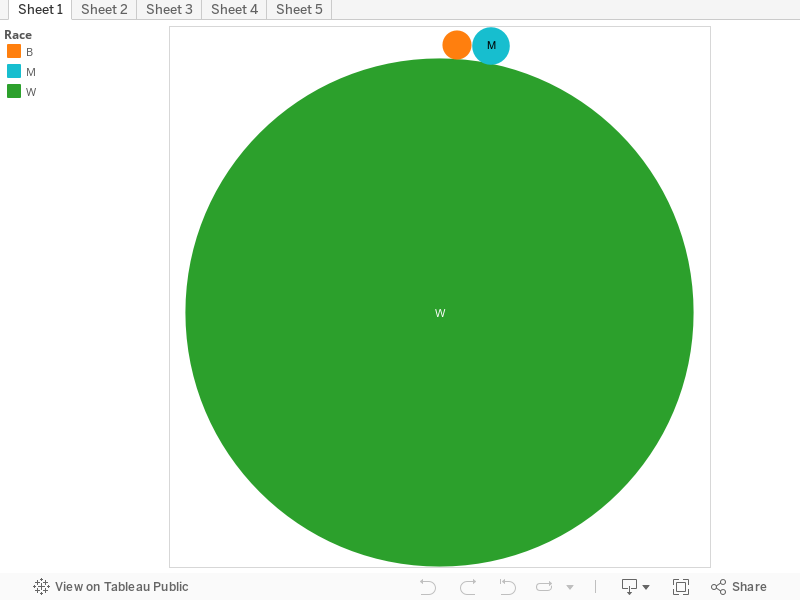
That is a pretty stark difference between the white and non-white population! Keep in mind, though, that you’re working with a tiny slice of the city’s total population–you’ve got just under 1000 records for a city with a population of about 30,000 in 1860. So, yes, a huge segment of your sample is white, but because your sample data isn’t the entire city, that’s not quite the same as saying there were only eight people of color in all of Albany.
What do you mean by “When removing the scope of Albany, New York from our data you can see that the number of white persons in the United States still greatly outweighs the number of free persons of color,” and where are you getting your numbers for the US population? Even in drafts, make sure to cite your sources, and especially make sure to cite your sources if you plan on using this information for the final post.
In Sheet 2, you’ll want to do some grouping–“Attended” and “Attended School” are the same, and for your purposes “dress” and “sewing” are likely also the same. Likewise spelling errors–“segar maker” and “cigar maker” are probably the same. If you’d like to differentiate your boxes in a little more detail, see my comment for Nick on a similar visualization: http://ahis290.maevekane.net/2016/04/14/story-draft/#comment-252 You could do the same color scaling within categories for Sheet 3 as well, maybe with gender and race as your color categories.
For Sheet 4, it looks like you’re trying to figure out the average age in certain occupations–try a histogram instead. You’ll need to remove everything except for age, and it will look like you’ve just got a bar chart, but a histogram counts how many of a thing are in a range category (in the case of age, the number of people between x age and x age) and then you can break this down further by race or occupation.
Pingback: Intro to Text Mining II – Intro to Digital History