Before you jump into work on your final project today, please take the time to fill out the online evaluation through MyUAlbany, and the evaluation below on specific parts of the course. Your feedback will help improve this class for future students!
reference
Tableau workshop
Tableau walkthrough
- Open Tableau and select Connect>Text File. Find your .csv file where you downloaded it (desktop or downloads, probably)
Various types of Visualization methods
Remember the good ‘ole days of sitting in your third grade classroom and drawing bar graphs and pie chart? The information that we were recording were fun things such as the number of boys versus girls in the class or the various hair colors. Since then, the amount of information we have learned to work with and analyze has expanded exponentially. We literally have a world of information available with a simple Google search. But with all this wild and crazy information that we are so fortunate to look at, a problem arises when there is simply too much. Who wants to sift through pages and pages of surveys to find relationships when you could simply graph them. Maybe a pie chart or a bar graph will be sufficient enough. What if I was to tell you that there are hundreds and thousands of various graphing models available, each specializing in certain fields?
First thing’s first, why do we like to graph information? Research has shown that humans are more keen to identify patterns and relationships visually through color, shape and style, to name a few. This is why graphs play such an important function of data analysis. Unfortunately, not all graphing techniques are ideal for every field of study. While a pie chart and bar graph work great for finding relationships between the population of Albany, a stem-and-leaf plot might not be a good choice. Jeffrey Heer, Michael Bostock, and Vadim Ogievetsky of Stanford University conveniently compiled a list of the more interesting and complex graphing styles. I won’t explore each graph but will instead discuss the few we are all familiar with and a couple of the wild ones.
let us first look at the stock market! We can all recognize that iconic rising and plunging chart that displays the growth and decline of various stocks. This particular chart allows the user to scroll through time and watch how various stocks saw immense growth or loss periods. For example we can see that Apple, in a single month, from June to July in 2006 had a loss factor of over one hundred percent. Protovis is one such program that allows a user to create an interactive, “live”, graph. Unfortunately, it is no longer in development as of 2011, shortly after this article was written.
Out of all the various types of graphs and charts, maps are probably what most of us feel the most comfortable with. If you have ever watched your local six o’clock news you probably have seen Choropleth Maps. These are useful to display the various temperatures across a country using light and dark colors. In this particular map we can look at the obesity rates in the United States. Flow Maps are useful in visualizing a number of important statistics on a map. In this case we are looking at Napoleon’s march on Moscow in 1812. Not only can a large visual be created to overlap the map to depict the route used to travel, but also troop sizes, temperatures, latitudes and longitudes and recurring lesson of never to invade Russia during the winter.
I would like to pose the following questions for us to consider:
1.) Which type of visualization represented in this article, or others not mentioned, do you feel is ideal for historians?
2.) How can we effectively use any of the visualizations mentioned to expand our Walking Tour projects?
3.) As a follow-up question to the previous one: Thinking of our intended audience, how would one particular graph be clearer than another?
Example map embed
To create a map with Google Maps:
- Include five potential locations for your walking tour. Make sure your locations are arranged in a logical order so that your visitor doesn’t need to double back or walk over highways (hint: use the “Walking” option instead of “Driving”!)
- Your tour must be walkable in an hour or less according to Google’s estimate
- Once you have a route, click Details and look for an icon of three connected dots in the upper right (the Share icon)
- In the popup, select Embed Map and copy the iframe code in the box.
- On the course website, create a new Post (you’ll need to log in to the course site and find “Add new post” on the right side of the dashboard)
- In the editor for your post, select the Text option on the upper right
- Paste in your iframe text
- Switch back into the Visual side—your map is a gray box, this is ok! It will display properly after you publish.
Putting Humanities Data to Work
Today’s readings (minus the video):
- So You Want to Reuse Digital Heritage Content
- Some Tips for WordPress Beginners
- Putting Big Data to Good Use
How to manage all this data?
Images for reuse?
- New York Public Library Digital Collections
- Albany Public Library Digital Collections
- Flickr “Albany the Way It Was” group
Where’s the print screen/screenshot button?

Post Guidelines
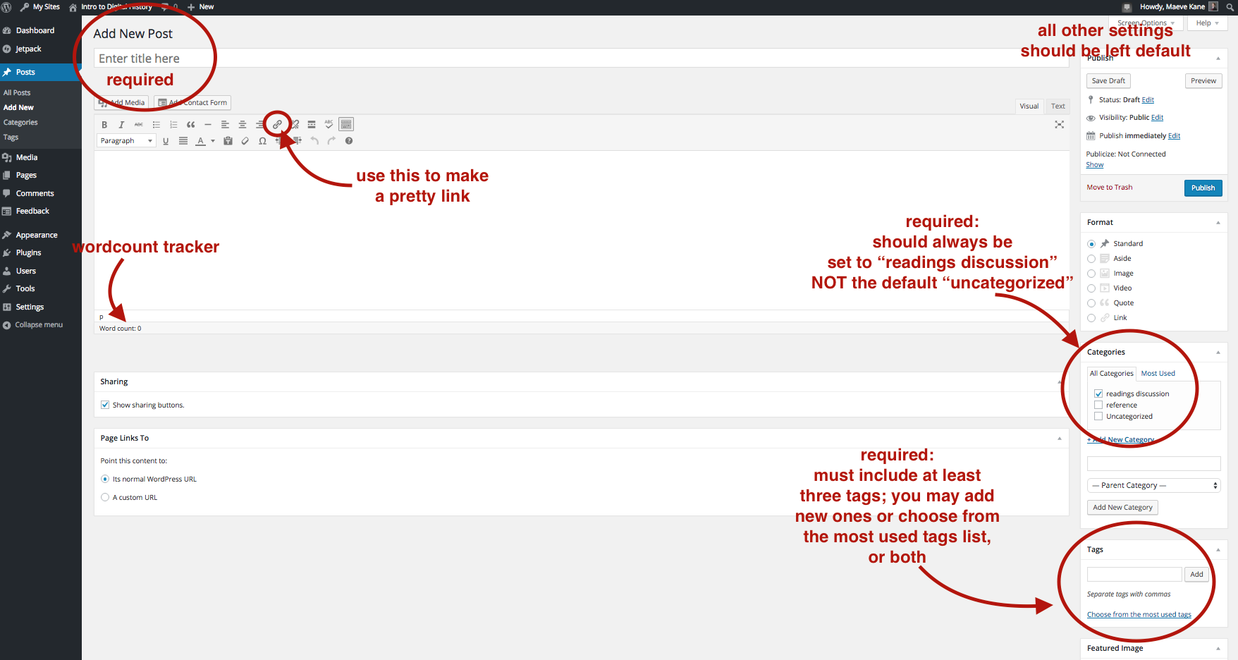
To post on your assigned day, you must be logged in to the course site; posting options are available on the far left of the dashboard space under “Add New.” The posting schedule is available as a PDF on Blackboard. You may also start a post and save it as a draft to finish later without publishing; you are the only one who can edit your posts. You don’t need to include your name or “by XYZ” in the text of your post, as your username will appear under the title once it’s published.
Posts should be about 500-800 words long (longer is ok too) and must be posted by noon the day before the assigned class meeting. Posts must be in complete sentences and you will be graded on correct punctuation and grammar. There is a word count tally at the bottom of the post box if you’re unsure about length. Your post should synthesize for the class the major points of the assigned readings and assume that the audience (your classmates) have already read the assigned readings. On days that we have how to readings assigned, summarize the purpose of the tools. Be sure to think about your post as a very small essay; it should have an introduction, conclusion and paragraph breaks to indicate topic shifts as well as transition language between points so that your change of topic is clear to the reader.
The assigned readings should be linked in the text as you discuss them with “pretty links.” Merely dropping in a url address like this: http://ahis290.maevekane.net/ instead of making a pretty link like this will lose one point. To make a pretty link, type the text you wish to link, highlight it with your cursor, and click the little link icon in the formatting options bar.
Posts must include three discussion questions about the assigned readings and have a title–try to choose a title that is descriptive and ties together the thematic points of your summary. Posts should also be set to the “readings discussion” category so that the course site stays easy to navigate as we add more things to it throughout the semester. You must also add at least three tags (think of this as the metadata for your post). What are your readings about? Are your questions about the technical aspects or the thematic aspects (ie, wordpress vs. economic history).
For your discussion questions, do NOT pose yes/no questions. Think big with how and why questions–why did a historic event happen, how does displaying information in certain ways affect the viewer’s understanding of it, why would someone use a tool, how is the tool limited, etc. You’re also welcome to post clarification questions–how does a tool work, how do I make it do X? Think about the discussion questions as a way of guiding what you want to talk about and cover in class that day.
You may, but you are not required to, include images in your posts. You can do this with the “Add Media” button on the upper left, which will let you upload an image from your computer and then position it in the text.
When finished, hit the blue Publish button on the top right. If you’re not finished, you can hit the “Save Draft” button above publish, in which case your saved post will appear in the list of “All Posts” on the far left of the dashboard when you want to come back to it.
You may compose the text of your post in an offline writing program, but be aware that software like Word sometimes includes strange formatting when you copy and paste in the post field. To avoid this, right click in the post field and select “Paste and Match Style.”
Posts will be graded on a 10 point scale based on your organization, grammar, links to readings, synthesis of the readings, and mechanics like pretty links, tags, categories and questions.
Embedding a Tableau Viz
To embed one of your tableau visualizations in a WordPress post, go into your Tableau profile and view the visualization you’d like to embed. Find the “Share” button at the bottom of the visualization and click it to bring up the embed code. Copy the text in the “Embed Code” box, not the “Link” box.
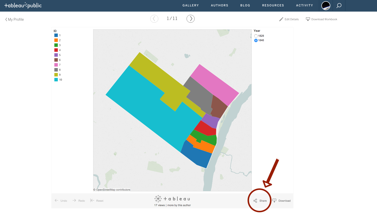
In your WP post, go into the text editor and paste the embed code where you would like it to appear. (Embedding is easier if you already have your text written.)
Still in the text editor, look for two places where the embed code says “width=”. The number following “width=” is a number in pixels–the width that your visualization will appear in the published post. Delete the number and “px” in both the width measures, and replace these with “100%”. This will ensure that your visualization does not over run the sides of the post.
Note: If you switch back into the visual editor, you will not see your visualization! This is ok and normal, it will still appear and be interactive when published or previewed.
Adding footnotes to web pages
To insert a footnote in web text, we need to insert internal links, which work just like regular links, but link within one page rather than out to other pages.
In both WordPress and Omeka, type your body text, and then go into the text editor (in WordPress, “Text” in the upper right corner of the editor bar, in Omeka, click “Use HTML” and then click the “HTML” box in the upper right.
To link the footnote and the citation, we need to tell the link where to point, and then identify another place in the page with that name. In the example below, name tells the website what the designation of that place in the page is called, and href tells the website where to take the reader when they click on that link. The href must include a hashtag (#) at the beginning to tell the website that this is an internal and not external link.
Notice that each name has a corresponding href in the matching footnote or citation–this is to link your footnote in the text to the citation below. The numbers (bolded in the example) should all correspond for a footnote/citation combo, and will need to be changed for each new footnote. (For example, body1/fn1; body2/fn2, etc).
<a name="body1" href="#fn1">[1]</a>
<a name="fn1" href="#body1">1</a> citation text
You’ll need to manually move the citation block to the end of the body text.
This is an example of what a functional web footnote should look like:
Lorem ipsum dolor sit amet, consectetur adipiscing elit. Nam facilisis augue nec tristique molestie. Maecenas ac lectus risus. Aenean vel dapibus est. In ut ullamcorper nisl. Aenean ut dignissim magna, sed suscipit elit. Ut arcu lacus, consectetur a dolor eu, pellentesque varius sapien. Sed mattis urna sit amet ex dictum venenatis.[1]
Bibliography:
1 Citation Text, “Lorem ipsum.” Dolor Sit Amet. (Albany: SUNY Press, 2015): 215-230.
Do not just paste the footnote code snippet into the visual editor! It will not work as a link and it will appear as messy code in the page like this:
<a name=”body1” href=”#fn1“>[1]</a>
<a name=”fn1” href=”#body1“>1</a> citation text
You will always be graded on whether your citations are correct, if your footnotes work as links, and if you have clean links in your text.