Month: April 2016
Final Project Proposal
For my final project I decided to look at the 8th Albany County Milita. My first of too graphs is going to explore locations, places of origin and races of the men of the militia. My hope is to be able to show where around the world each man on the militia is from and from the complexions described in the muster roll understand better who the people were who formed this militia. While a majority of the men on the muster role hail from England and Germany and their racial backgrounds and appearances will be mostly indicative of western Europe, Im more interested in the number and the backgrounds of the men from the rest of the world. Places like the Caribbean and the Colonies, places that have been heavily colonized and mixed i’d especially like to see and explore their backgrounds. For example, how many indians made up the Albany Militia and where are they all from? From there i’d like to explore the possibilities of adding the other descriptive factors into the graph such as age and height to get an even better picture of the militia. In the end the point of this first graph is to understand who the men are that make up Albany’s defense during the American Revolution. Not only what races they were and their location of origin but also information like the general age of the militia. My second graph intends to look at the various trades of the men in the militia. My thought is to see what kinds of trades are being done by the men of Albany but also why trades are being conducted most. In this sense i hope to explore and create an idea of what the City of Albany (and its surrounding area since more than likely Albany itself had nowhere near this many men.) may have looked like at the time of the Revolution. Unfortunately my view of Albany will be flawed, or at the lest incomplete since this will only detail the men and their occupations in the city, and will be lacking what the women in city were doing at the time. At the same time though, this will at the very least give a solid idea of the general trades and lives of Albany’s citizens. As to how I’m going to visualize these graphs I currently only have bar graphs fro both but there is still more exploring to do to provide the best visuals for the information I hope to present. For the first graph I think a geo-dimensional graph would be the best way to present the information as location is central. My second graph currently isn’t bad as a general histogram but there are plenty of other visual I haven’t had a chance to fully explore (or understand). At its core though i want to show the larger picture of Albany during the American Revolution and the lives of those who lived and died for it.
Story Draft
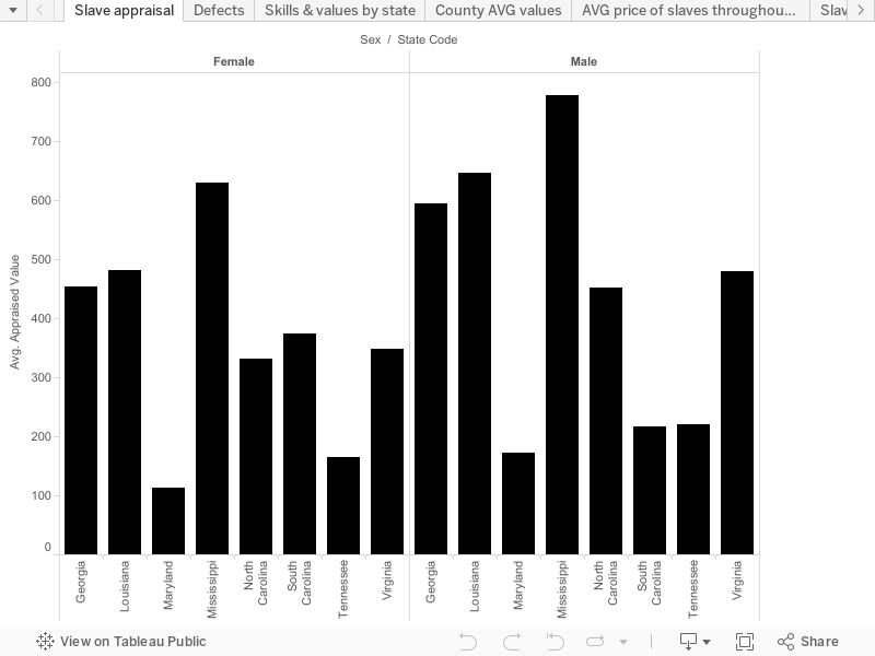
My final project is going to be the story of the slave trade from 1775 to 1865. I chose this topic because I feel it was an important part of American history that helped shape America into the super power that it is today. The visual that I chose was the appraisal value of slaves both male and female by state as well as county. I chose to go with the bar graph because I felt that it’ll be more easier to read than some of the other options that were available and is one of the most common ways to display data. By breaking down the value of slaves by counties and states it can pose several questions such as “why does this county have a higher appraisal value than another county within the same state” or “Why does this state appraise slaves at a higher value than the next state”. Each county has a different appraisal number for their slaves. The sex of each slave seems to be the only factor according to this visual as far as how much the price will be is concerned (although I’m sure age, skills, defects, etc are a factor as well). As most people would expect, the male slaves are appraised at a much higher average rate than the female slaves. One can only infer that this is due to the diversity of work that a male slave can do that a female slave simply cannot do. Male slaves aren’t hindered by the psychical barriers like the females may be subjected to. It appears that the slave states further down south have a higher value average than those that are located closer to the north. This can caused by several reasons. One of those reasons is that the slave states located more up North have a bigger liability in the fact that the slaves are more likely to be tempted to run away and succeed than the Southern counterparts. With this potential scenario occurring, it could be deterring the price of the slaves making them too high of a risk to be worth trying to get top dollar for them. Another possibility for the states further down south appraising the average values of slaves more than their Northern counter parts is because of the amount of labor that is center in the more Southern states. The slave states that are located more south have an abundance of work that the slave states further up North just don’t have. With the amount of work that a plantation for example requires it will be the only practical thing for a person with money to purchase some slaves to be able to sustain the plantation and lessen the workload and make life easier. Knowing this, the slave sellers are able to raise the price of the slaves because they are aware that the slaves are a very big asset to the people who buy them in the more Southern states. The demand for the slaves seems to be higher in the more Southern states than the demand for slaves in the states that are closer up North. Once purchased by the individuals in the Southern slave states they are valued more because they are viewed more of an asset than liability, which may not be entirely true for the slave states that are located more up North.
Final Draft Religion in NY
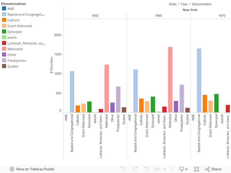
For my final project of this class, the visual data that I have chosen to use provide insight on the number of churches within a denomination within a county in New York. This data was collected every ten years starting in 1850 going through 1890 but did not include 1880. To depict these number I used geograph graph of New York and bar chart to show to show the data set. The vibrant colors of each graph appeals the eye’s, as you look at the information presented, you can see that some of the information correlates with one another to tell a story. A bar graphs create distinctions when look at the bar chart a person’s eyes will focus colors but another factor will be the length of the bars is helps the viewer understand what is going on. I chose to use the bar graph as my visual because its gives the audience the sheer number of churches that were in New York during 1850-1890. Unfortentual by using this bar chart it shows the total number of churches in a denomination, it doesn’t break down even further by showing in which counties these churches were located. This bar chart is not a standard graph with one set of bars, rather four small bar charts because of years the data set was collect put into one massive bar chart. Though I believe that it gets the point across visually without having the audience look at spreadsheet prior in order to analyze the data that is being presented to them. I chose the palette colors because it was aesthetically pleasing to the eye. For my bar chart I would rather have the lengthen of the bars tell a story than the colors. In context during the course of fifty years the promett denomination that thrived in New York was the Methodist and the Baptist and Congregational. Almost double in size by the start in 1850-1890. I believe that this increase of church correlates with Immigration that was going during this data set was collected. The first waves of immigration to the United States happen in 1840-1860. These immigrants were mostly Irish and German. The second wave develop in 1880-1940 around where are data set stopped. The immigrants that were arriving to the United States were mostly eastern and southern europeans. During the first wave on average about 2.4 million came to the land of opportunity. For the second wave on average about 5.2 million came to America. This example the sudden increase Judaism at the end during the 1890. Because Judaism is a promett religion is the eastern and southern parts of europe. Further research question I have is why is the Quaker churches slowing decreasing in number? Because of this influx of immigrants why did the Dutch Reform stay close to the same number through the fifty years?
Draft Story
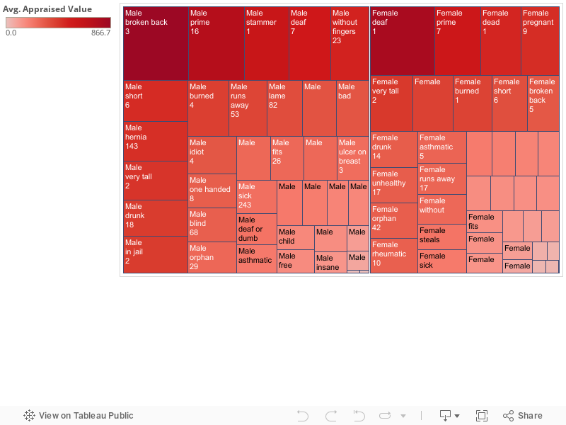
For my final project I will taking a look at the Slave Sales from 1775 to 1865 data set. Specifically the values of slaves in regards to a skill they possess or a defect they might have. When looking closely at the data set it contains information detailing what you’d expect to find; like age, gender and appraised value of a slave. What I find to be interesting about the data set is it includes skills and defects something I would not have considered. With this information there are more factors that are incorporated into the sale of a particular slave. I believe there are connections regarding the prices of slaves within a particular state possessing a particular skill and which gender the slave happens to be. The females and males tend to have gender specific roles in terms of skills they were labeled with. The men have skills like mechanic, and field laborer and with that their appraised value shows, women have skills such as cooking and baking as well as housework and hairdressing and their appraised value shows as well. While some of the men and women have share skills there are differences that find it harder to compare value based on the skill. However, the defects tend to run along more similar lines. Both men and women share similar defects like, height whether it is too short or too tall, loss of hearing, loss of sight, and any type of sickness including hernias, cancer or just a general label of “sick”. There is also common trends of labeling defects as run away, drunk or fits meaning they are difficult to deal with. From these defective labels you see a shift in appraised value. A drunk man is appraised around $425 where an appraised drunk female has and average value of $300. Maybe not such a shocking revelation seeing as today there is a gender wage gap, however, it became interesting with such defects like, without fingers, a male without fingers is appraised nearly twice as much as woman without fingers, same as a man with cancer compared to a female with cancer.
What I found most interesting or should I say troubling with this data set is the way I read it. At first glance it was troubling to see. These are people and these are children given a price and given a skill or defect and then sold. We all know the horrors of slavery but when you are asked to put it in a bar graph or pie chart you become removed from the fact that these were people and not just numbers on a page. That’s why it’s so important to remember what the numbers really are, and tell the stories of what the numbers are telling us.
1940s Story Draft
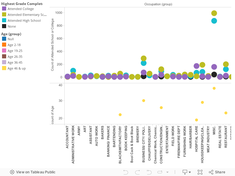
The 1940s was a time where the U.S slowly recovered from the Great Depression. New York specifically since then has maintained the number one spot for highest population since the early 1900s. Looking at demographic information of residents in Albany, New York in 1940 can tell various stories. The addresses, marital status, race, and education are the few parts of the census that raise questions regarding the lifestyles of people in this particular year. Was the residential area rural or urban? Were people financially stable? How did levels of education effect future endeavors? This visualization focuses on how education levels effect occupation decisions.
Initially looking at the data, it is unclear in figuring out who was enrolled in school for that year, and the kinds of occupations at the time. You must take into consideration age, and filter which jobs have different spelling, but are the same title. After making those changes, the visualization shows the variations in occupations and the education background one possessed in that field. The information is represented through a bar graph with a colored key to indicate whether the person attended college, high school, or elementary school. For each occupation there are numerical distinctions for how many people in 1940 worked in the same occupation.
Before looking at the occupations, the census does provide addresses of people in Albany. With some research, I found that Fleetwood Avenue and Cardinal Avenue were in the Whitehall area of Albany. This shows that these residents lived in close proximity of each other, yet obtained various jobs. For example, two people that live on Fleetwood Avenue both in their late 30s/ early 40s white, male, and highest education level is high school. One has a career in sales, while the other is an electrician. You can then compare those two people to a woman in her early 40s, married, with the highest education received in elementary school. Her occupation is not listed in the census.
The comparisons stated show us that creating one story can then lead to others. Were women still suggested to stay in the home in 1940? If she obtained higher education, would she be working?
Looking back at the visualization, something interesting within the story is the placement for those with no educational background. Most work in the same field as those that have went to high school and/or college (housekeeping, inspector, etc..). The highest number of jobs with varying educations obtained were wage/salary workers in government and private businesses, proprietors, owners, laborers, and inspectors. These occupations are closely related to either working for the government or working for themselves. We can build the assumption that this area of Albany is more suburban with many small businesses. Albany today is assumed to be very government orientated because it is the capital, yet many parts in the downtown region do support this assumption created from the data. A final observation following the census is the wide range of jobs that were surprisingly held at the time, especially following the economic downtown a few years before.
Visualization due 4/14
The dataset that I chose was Slave Sales from 1775 to 1865. I decided to focus more on the sale of children during that time period. I decided to do so because I want to learn more about what it was like being a child growing up during slavery, or being born into slavery. It is estimated that approximately 1/4 of slaves that crossed the Atlantic into slavery were children. Many were forced to move, unwillingly, from plantation to plantation, never truly having a home after being taken from their mothers at a very young age. When learning about slavery in many classes that I have taken, there has never been an emphasis on the children that were involved. My objective is to use this dataset, as well as research, to put an emphasis on children and their experiences during this time period. I took the dataset and condensed it to what I’m more interested in and found some very interesting facts. The first thing I found was that while many children of different ages came from the same states, each individual age tends to come from a specific county in that state. For example, 8, 9, and 10 year olds in this dataset all originate from the county of Anne Arundel, Louisiana. Meanwhile, most of the 15 year olds on the dataset come specifically from the county of Edgecombe, North Carolina. I’m not sure as to why this is, but am interested in finding out more. I would think that every age would originate from every county.
The second interesting finding was that from the ages of 2 years old to 17 years old the prices vary. I thought that the older that the child was, the more valuable that the child would be, and therefor buyers would pay more money. You would believe that the more work that can be done by the child, the more expensive they would be and have more value. Matter of fact, the children that were valued the most were from the ages of 2 years old to 7 years old. After that, 14 and 15 year olds were valued the highest. At the age of 14 many of the children had picked up useful skills, like being a laborer or fieldworker. With skills that were useful to buyers, the age group of 14yrs old was the highest valued, at an average rate of being sold for $540.23. By the age of 16, the average value of children went back down to $199 based on the dataset. The county of Charlestown, South Carolina doesn’t have any listed prices, so that may add to why the average is so low. The visualization below shows all of the average values of different ages of children from the age of 1 to 17 years of age.
All of this information came from the dataset alone. What’s very sad is that many children are at risk for becoming very ill when they’re made to work in terrible conditions. At first, many people avoided having children slaves because they felt at risk because they didn’t want them to become ill. When the demand for more slaves in the Unites States increased, so the beginning of child slavery. The dramatic increase in the need for children slaves didn’t happen until the late 17th/ early 18th century.
19th century African American war pensions in Albany, NY
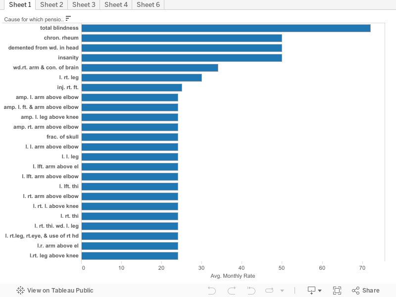
My initial goal entering this project with this data set was to create a visual that would show how pensions progressed over the century (1806-1883). While I was unable to accomplish this for my initial “rough draft,” I do believe it is possible. I encountered issues immediately as the dates are not in chronological order within the spreadsheet. Instead, the data had been entered in alphabetical order based on the recipient’s name. While this is the correct way to do this for official documentation, it poses an issue for someone like me that hopes to find trends in the data. Another problem that was readily apparent was the lack of explanation describing the wound or reason for receiving a pension. While most of the descriptions are easy to interpret, some are difficult to discern and makes analysis a bit more troublesome.
For my first visualization, I decided to keep things simple. On the left hand side you will find the various wounds and reasons for receiving a pension. The columns represent the average amount that was paid out on a monthly basis. I also sorted the data from the highest monthly payment through the lowest. By looking at the data this way we can see that a soldier who, as a result of either a combat injury or other military related accident, came to become fully blind. He received, on average, $72. This of course fluctuates when looking at each individual case but what I am interested in is the average. To put this into perspective, using an inflation calculator, we can see that in 1845 (using this as a mid-point), $72 would have the same buying power today as $1849.28. It is important to take this with a grain of salt as statistics are not readily available pre-1913.
By looking at the various dates of allowance, we can conclude that most of the injuries sustained were a direct result of the Civil War (1861-1865). The many different gunshot wounds received shows that not only were African-Americans involved in the war in some capacity, but that they were actively involved in harsh fighting on the front lines. The people listed in this census are only ones that live in the Albany, NY region and who actually submitted a formal request for a government pension for their injuries. 921 names are represented on this census. Imagine the number of African Americans that did not sustain injuries and are from other locations scattered across the many states. Just by thinking of this, we can conclude that not only did African Americans fight in the war, but they made a large contribution to it as well.
As a final note, in my final project I hope to have my copy of the census worked out to be organized in chronological order rather than alphabetical. I believe this will help paint an interesting picture that will help show how one injury may receive less, or more, compensation than that of one reported decades later.
Final Project Story Draft Due 4/14
The visual data that I chose to use to describe the slave sales data set is a graph. Graphs with entities separated by color are more appealing to a person’s eye in general, and their mind automatically notices the difference in volume of each color, or lack thereof. For example, if a person sees a pie chart that is 75 percent red and the remainder is green, they’ll automatically wonder what the red area represents and why it’s so plentiful. On the other hand, colors in bar graphs create distinctions, but the length of the bars is what tells all. Where the z-axis is placed (on the bottom, side, or top of the graph) also has an impact on what viewers’ perception. An x-axis that’s on top as oppose to on the bottom typically has an adverse effect at the first glance compared to if it was on the bottom because it looks as if numbers are decreasing as the bars decrease in length.
I chose the bar graph lay out because it makes it seem as if certain states were forging ahead of others. Essentially, leaving them in the dust of the money they spent on slaves. This scale isn’t the typical graph, but I do think that it gets the point across visually without having to see the prior spread sheet to analyze the data. I chose the deep burgundy color because it wasn’t alarmingly red, but the burgundy resembles blood and this tugs on views heart-strings –especially in the context of slave sales.
The context surrounding the slave sales data set is the rise of the cotton kingdom. The spike in Louisiana slave purchases may be due to the expansion of slavery and cotton production, which makes sense. The raw data set itself shows that men in their prime are bought for higher prices (keep in mind that man’s prime is longer than a woman’s). Women, on the other hand, are of more value when they are of age to bear children and their value probably deprecates so in a time when the goal is to increase production, men are probably the more ideal choice. Though child-bearing and reproduction is important, this timeline probably seems longer to a person that wants to capitalize off of cotton production high while it’s hot –wait nine to ten months for a mother to give birth and a few more years for that baby to be mature enough to pick cotton themselves. Women were still being bought at an increasing rate, while men, as we see in Louisiana, were in higher demand.
In terms of sequence, the range of the slave sales data set covers the rise of the cotton kingdom which was vaguely 1830-1861. Therefore, the increase in millions spent by the states is associated with the rise in cotton demand. Aside from natural reasons, the cotton revolution is the main reason that states in that time period spent hundred off dollars to buy quality slaves because they’d prove vital in capitalizing off of the cotton kingdom.
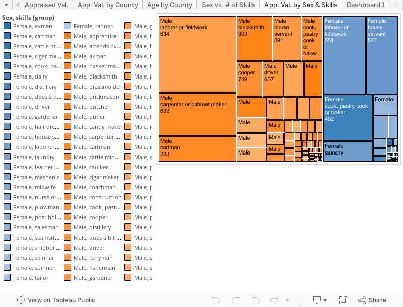
Story Draft
The data set that includes information on the slave sales from 1775 to 1865 contains valuable insight into the slave trade in the United States that many people may not immediately think of when they think of the history of slavery in America. It provides insights into information such as how much slaves would be sold for when they possess a particular skill set compared to slaves that possess other skills as well as no skills at all. It also allows you to compare the types of skills that female slaves possessed as opposed to the skills that were possessed by male slaves. In the visualization shown for example, you can see that female slaves that were sold possessed more domestic based skills such as “hair dresser, house servant, pastry cook, laundry, etc.”. In terms of these skills women that possessed hair dressing skills were appraised to have the highest value, being appraised at around $1,000, as compared to a female spinner that was given an average appraised value of $203. The skills that are possessed by the male slaves appear to be more skilled labor types of jobs. These jobs include skill sets such as “mechanic, brass molder, painter, cigar maker, blacksmith, construction, etc.”. By looking at the visualization we are able to see that the mechanic skill is valued the highest among the male slaves with the average slaves with skills as a mechanic were appraised to be worth around $1,258. This would be compared to a male slave possessing the skills of a pusher which is appraised at a value of $150. The visualization also allows us to compare the appraisal values of male slaves compared to the value of female slaves during the slave trade in the United States. By looking at the graph we are able to see that on average, male slaves were valued at a higher rate than female slaves. This included times when they possessed the same set of skills. For example, a male mechanic was valued at an average rate of $1,258, while a female mechanic was on average appraised at a value of $600. We are also able to see that more males possessed skills than females did.