Data Description:
In this visualization I decided to research the differences in the payment of pensions for people that had the same injuries but started receiving pensions at different time. From this visualization I organized the data into years and injuries and then went from there. My original question for this visualization was to find the differences in amounts of pay for each individual. As you would guess many of the payments are equal, however I had also thought about how there would be differences in pay, and I was right about that as well. When you look at this data the person who created it did not include how severe certain injuries were, like there are labels for various gunshot wounds but the severity is not specified. This was the basis of my question. Why was there discrepancies? If there wasn’t a reason for there to be a difference in classification why is there different pay? The amounts also fluctuated by time of issuance. It wasn’t like there was a correlation going up or down the numbers were just random, again, a reason to include the severity of the injury that each person had received. This could’ve all been cleared up by a couple extra words on the sheet.
There are some very different stories that come from this chart as well. Like the many people who are affected by gunshot wounds, presumably from the Civil War. This shows the variety of injury that come from having such a bloody war. There appears to be a a gunshot would for every appendage possible. I suppose that there is the possibility that the injury happen during some incident outside of the war but I think it’s reasonable to say that the most of injuries occurred as a result of the war. When you look at some of the other ailments You see some injuries like an axe to a particular appendage and see that they only see that they receive like $4 a month. That number is very surprising to me,even in those days where four dollars was a nice amount to have for some income but I feel like that wouldn’t be enough to support someone who was severely hobbled by an injury. There were some cases like a dependent mother who might have multiple kids and use that as their only income and the pension was eight dollars Again that seems incredibly low. The pension for women, especially in those times would most likely be the only opportunity for women to make money so this seems low in the sense that these women could have multiple kids. Conversely, there were a couple people who were blind who received $70, this was interesting to me because that seems like it would be a reasonable amount for people who probably don’t have a lot of expenses.
Overall I feel like that given these circumstances, in my opinion people could’ve been paid more, but I don’t know what a good salary per month was for the time, so this could’ve been fair.
Data Visualizations:
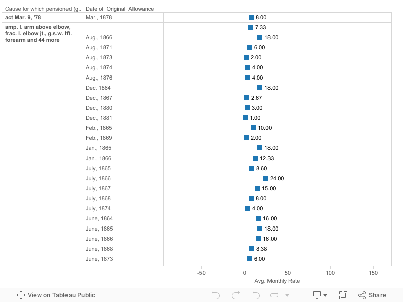
The first of my data visualizations is actually meant to be a pair. The two charts being used are titled “Box and Whisker” and “Changes”. With these two visualizations you are able to see the differences in pay for the same or similar injury or other reason for pension. The question that I thought that these graphs could answer were why were there differences in pay grade. In the box and whisker chart the idea was to a more statistic approach to the data. You look at the raw data and notice some differences right from the start. In this chart you see various statistical points such as median, quartiles, the whiskers. For this the larger the box is the larger the disparity between people with the same reason for being pensioned. From a quick glance you can see that it is about fifty-fifty on reasons that have no difference and reason that have some difference. And then when you look only at the reasons that a difference, and you once again realize a fifty-fifty split with small difference and a large difference. The differences were what were driving me to dig deeper and deeper. Then I decided to create an accompanying chart. This chart shows the differences again, however the data is grouped. I grouped the data based on similar reason for pensioning. Some examples include by right arm or leg, or being a dependent mother. This further shows the differences in pay for a certain reason. In creating these graphs, I set out to find why there were these differences. One would assume that if you have the same reason for receiving a pension as someone else you would get the same amount as them. And even without the visualizations you can see this is not the case. And then you think it must be because it must be one person has a worse injury or other reason than another person, wrong again. After some light digging I found out that it wasn’t that simple. It turns out it was completely out of the hands of the pensioners. In those days you got what you got, forever. Then, as time went on and pension laws evolved, the government adjusted for inflation and also changed who could get a pension in the first place. The second part makes sense, the first part is where it gets tricky. As I said before pay rates were adjusted, and you got what forever, so in essence on one day you could not be eligible for a pension, and the next you could receive a pension and also at a higher rate than a person who came before you with the same injury. This is something you can see in the visualization, with the later dates generally being the higher of the pays where there is a difference. Overall, for this set it took some digging to find out why the data had such weird breakdowns. (ElderWeb)
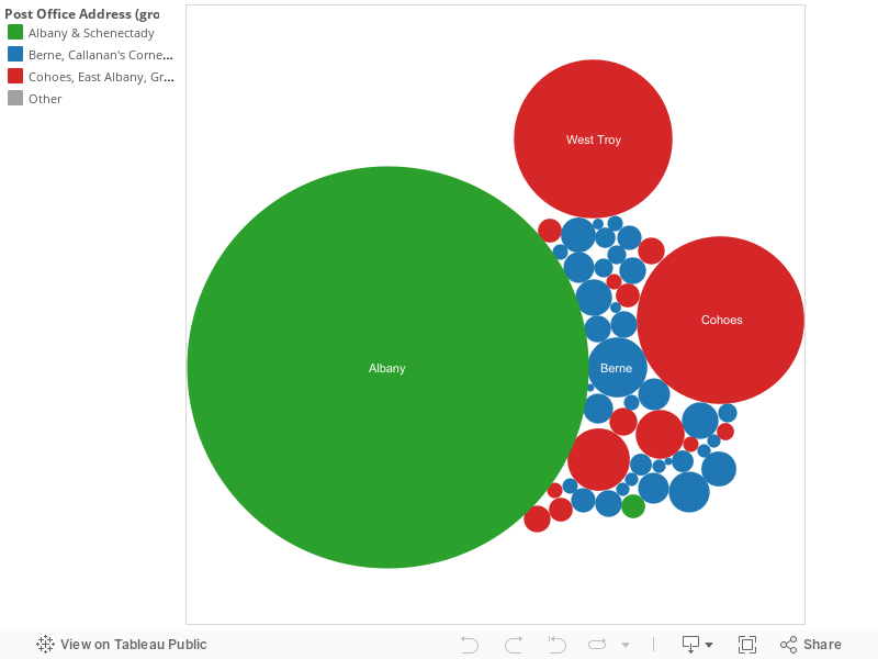
For my second visualization I decided to use a packed bubble chart. The story for this chart is literally nothing like what the first was. With this chart I set out to find demographic data about Albany pensioners. The process for this visualization was a little more tedious, because with this you can only do so much. When I first chose the packed bubble I knew by the way that I formatted that the largest bubble that I was going to have was Albany, that was a given. I knew that by sheer volume Albany would vastly out number the smaller neighboring towns. I then grouped the towns by type. If you look at the chart, the green bubbles are urban, the suburban red, and the rural blue. You see that while larger, the green circles are far outnumbered by the blue circles. You understand that in cities there is significantly more people so there’s going to be a good number of pensioners. My question came from the lack of pensioners in the smaller towns. Small towns are generally older people so how is there often times one or two people receiving pensions in a town. In this time shortly after the Civil War everybody that was able bodied would’ve fought in the war and by the law of averages people are going to get hurt. From that fact alone you’d guess that there would be at least two people per town to receive a pension. Add that to your everyday ailments and you’d suspect at least a handful of people per town regardless of size. Some of the reasons were not even bad reasons to get some money to live on either.Looking at the amount of people in Albany get pensions I wouldn’t say that it was particularly difficult to obtain a pension. Perhaps it was just the proximity to an office or something that was stopping the outer towns from receiving a pension. This is the interesting part of this chart because these questions can never really be answered. You can think of a million different reasons for why this would happen and you may never be able to guess right. So while I was not able to find any concrete results for this visualization, it opens up some of the fun parts of history that are unwritten, where you can speculate and think about what might have happened and maybe if you find a good enough theory or dig deep enough you may some day find out.
Process Documentation:
Doing this part of the assignment is completely new to me so I don’t really know how to start. I’ve never worked with Tableau either, so in all aspect this process is completely new. I’ll start at the beginning I guess. When I first looked at all the choices for possible data this was the only one that really stood out to me. I always like to work with things that I know how to use so when I saw that there was a choice for monetary data to be used and the fact that I’m a business admin. major the choice was almost automatic. So after the choosing process, I started to look at the data and look for any type of difference in similar data and went from there, this first reaction eventually became the main ideas for visualization. Like I said before, I really had no idea how to use any of the programs so I again with what I know how to use and worked on graphs that I knew could show the story I was trying to tell. First, I went with the box and whisker. I knew this would show exactly wanted to show so I went with it. This type of visualization draws the eye to the differences in value, similar to what happens when you use different color or size, so this worked. I also thought that this wouldn’t make the visualization too simple. Meaning that it takes a little investigating to fully understand what was being said. This visualization is meant to be paired with the graph titled “Changes” where I grouped similar ailments based on body part or otherwise. On that graph it is easy to see the varied pay rates, the main story of this project. By doing this it was easier to see the correlation of the data then trying to remember what the rates of similar injuries were. Another visualization that I created had a little more of real process to it. I chose the packed bubble chart to show the distribution of payments in two different ways. Showing the differences in payments per town and where the money was all going. I’d be lying if I had a reason about the color choice, but I do know why I wanted them to be grouped. The green bubbles are urban areas, and the red and blue are suburban and rural respectively. By grouping them like this I was able to show that most of the money was being given to those in the City of Albany but rural areas there are more suburban and rural towns receiving money. Overall I found this to be an interesting task. The fact that I really had no idea what I was doing probably added to that but I look forward to using this program in the future.
Argumentation:
When doing research for my data I was intrigued to find many different connections for all aspects of the data. When looking I found that many of my question were answered to a certain extent. Within minutes of searching for how pensions were paid out I found a few fast facts that really applied across the board for this data set. The main idea of the first article that I came across was specifically how Civil War pensions were paid. In this data set many of the pensioners were likely receiving such pensions from injuries suffered from the Civil War so I thought this would be a good place to start. The main question that I had from the first visualization was how there were so many differences in pensions paid and this article was very helpful. Almost instantly my question was answered, it turns out that those who applied for pensions earlier were likely to receive lower pensions. Using today’s logic that seems like it would be really unfair and it was, and it only got worse. Due to pension laws evolving over time a person would receive more for the same injuries on different types of technicalities. So, if someone who was certain about their ailments significantly effecting their lives to receive a pension would in fact be paid lower than someone who would try to work or survive without a pension. And the pay wouldn’t change over time for those earlier applicants either, someone would just get paid more based on whichever technicality was passed before they applied. I found this to be particularly disturbing because as I said before, people who were certain that they would need a pension to keep going who benefit less by applying than someone who thought that they could at least make ends meet for a while without a pension. Similarly, in regards to different pieces of pension qualifications being passed your ability to be pensioned changed as well. So if you weren’t eligible to be pensioned one day the next day you could be eligible. So overall, one day you would not be eligible to receive a pension and then the next day, you could not only receive a pension but have a higher monthly payout that someone who has been receiving one for years. From these two statements alone my data started to make so much sense. Perhaps it was that people knew that they could receive more if they waited, but for those who really needed the pensions, who couldn’t wait, were not to benefit. This is kind of disappointing, how most of these people, veterans, or widows from the war, had a portion of there income governed by dates on a page possibly missing a potential meal by a day or two. (ElderWeb)
I’ve also learned that the whole pensions system was kind of weird. Just for the sake of taking a look I Googled the 1886 census and looked at some data from a county in Illinois, and shockingly the data was almost exactly the same. Many of the pensions were in the same area and some were exactly the same for a certain field. In the mother category most people received $8, this was the same in this county in Illinois as we’ll as Albany. Also many of the abbreviations for the certain injuries. So somewhere along the way they made some sort of rigid system that was adopted by every census taker in the country. If this kind of communication was out there why couldn’t as system be to create some sort of uniformity for the payments? It was like they made all these new rules, let new people in, adjusted a little for inflation but forgot about the people who filed for pension earlier on. The weirdest part of all of this was that there was no federal government action at this time. Civil War veterans did not start receiving pensions from the federal government until 1930. After all this I look at the relative similarities as nothing short of a miracle. Especially in those times where there was no form of really efficient communication, this would’ve been ridiculously hard. So since there was no federal structure the whole payment of pensions was based on state or county rules. It would’ve been up to the counties that the people lived in to keep track and maintain the records for the pensioners, another tall task, so I can see where the temptation to cut corners comes in. One thing I thought that was interesting about how states and counties paid pensions was that some counties would have a competitive rate compared to another county that could have a greater ability to pay a higher pension. I would think a county like Albany who at that time was fairly prosperous would presumably have higher pensions then say a smaller county in a lesser state or especially the South. The fact that almost across the board pension rates are similar is simply astounding.
Overall I find that the this dataset’s true story is lost in history somewhere. It’s not one of the more glorious parts of history but it’s in there. For this set the main factor that drove the pay scale was when you applied to be pensioned. This is something that you wouldn’t guess from first glance. And that is something that I experienced first hand. At first I looked at this data and thought why would there be a difference at all? Even though injuries ranged from challenging to life altering it was basically all left up to a date. That is something in today’s times could never happen. To think of something that could change the ability to feed your family left up to a chance date, especially set by the government would not fly. By today’s standard that is borderline unfathomable.Though most logic would go against the actual truth of how the pension was paid it’s still interesting to find it.
Further Questions:
For further research questions I will be basing them off of some of the questions that I had coming into the assignment and then had answered throughout the project. Many of the questions that I had coming in were due to the idea of being fair in pensions paid. When I went into further investigation with the project I found that the pensions were originally based on need, severity of injury, etc. but as time went on it became that pensions were paid based on time, and were adjusted for rate of inflation or other unknown reasons. After doing all this research and still considering the fairness of all of this, this issue particularly struck me. I always thought that everything would just work because everything would be considered. Then to have all this unravel basically because of carelessness or laziness, that bothered me. So from this fact my first question is how this kind of carelessness just be allowed to happen. I understand that certain things just kind of get forgotten about. But those are little laws that don’t really matter anymore or something to that effect. After all, these laws were constantly being adjusted, and frequently at that. In a time immediately following the Civil War new pensioners were being added every day. So in this case it wasn’t a matter of neglect. The government just didn’t update the records of the people that were already enrolled in the pension program. I guess that this wouldn’t happen today thanks to advancements in technology. Also, this isn’t something that could really be checked either. Unless you knew someone with all the same ailments you would have no idea that you would be shorted. For my second question, I looked at the where the pensions were actually being allocated. For the most part it was people in the areas further away from Albany that were being paid. Though most of the money was going to the people living in Albany, there were far more small towns receiving pensions. This was the visualization that yielded more questions than answers. What was intriguing was the fact that in these towns or postal areas that there would only be one or two people that would get pensions in this specific town. That of all the crazy ailment that people had in this data set there would only be one person that could possibly receive a pension. There are some ailments that just affect the average person like arthritis or back problems and only one person qualified? Also, many of the people that live in those periphery towns are older, I just know that from living in the country growing up. So it would be a good guess that a few people in each community would have general ailments. Overall, I found that the start of this project had questions and that the answers gave me more questions to answer at the end of the project. I don’t know if I’ll ever figure them out but it’ll be interesting to see if I do.
“1890: Civil War Veterans Pensions.” ElderWeb. Accessed May 12, 2016. http://www.elderweb.com/book/appendix/1890-civil-war-veterans-pensions.


