Each of the articles that I’ll be discussing are all connected by one thing –visual data. Since we’re in a digital history and class and most of us don’t have the longest attention spans –visualizing data can be an easy way out as oppose to looking at spreadsheets. However, is the grass really greener on the other side?
The main point in “How to Lie with Data Visualization” was that regardless of what the cold, hard numbers are, people and corporations can lie through the visuals associated with statistics –as its title insinuates. Though people are obligated to post the true statistics, they make negative statistics work in their favor through the way it is presented visually. For example, turning the y-axis on a graph upside down, making it seems as if numbers are decreasing while they’re doing no such thing –as in the gun control example. As a result of this tactic, it would seem that at a glance after Florida’s ’Stand Your Ground Law’, the amount of gun deaths plummeted dramatically. However, the exact opposite happened but in moving the y-axis the creators of this graph succeeded in deceiving viewers.
Ben Jones’ article (based on William Zinsser’s book) touches on 7 different points that concern non-fiction writing tips, as well as those regarding visual data. The first point that he makes regarding “The Transaction”. In other words, this is the reflection of how a creator of a visualization feels about the set of data onto the set of data itself. This was illustrated very vividly in the video included in the article. I found that the creator of this visualization is very focused on the impact of deaths as a result of guns. The creator didn’t use a conventional graph, but single, slim straw like curves so that the impact of the amount of gun deaths will truly be seen by its viewers. Not only are the amounts of gun deaths and age ranges made visual, but the years of those lives that were lost as well. This provides a different perspective as oppose to the conventional bar graph. That wouldn’t show how many years are lost in such deaths.
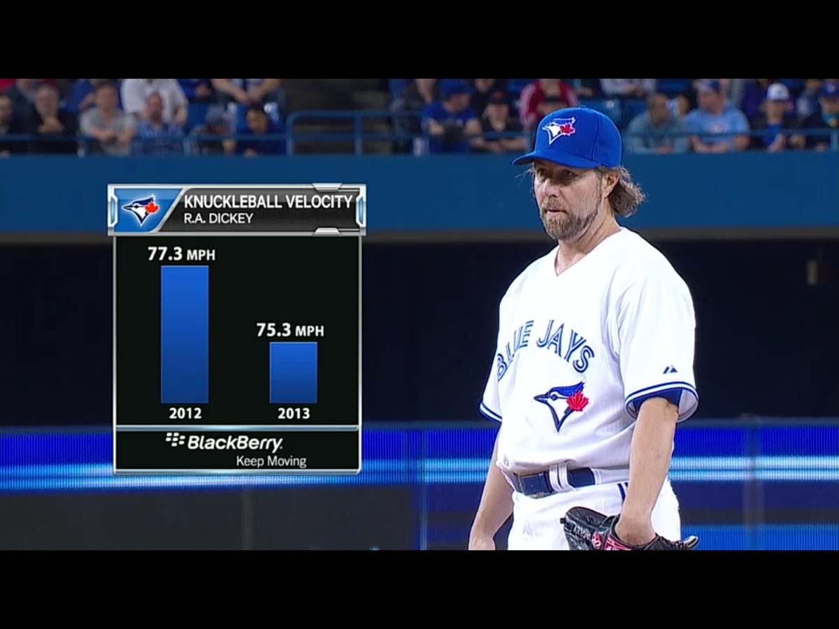
One of the most profound points made in the “On Visualizing Data Well” was exhibited in “How to Lie with Data Visualization”. According to Ben Jones, the humanity of the visualizer and their views are reflected in what they create. For example, in Ravi Parikh’s article, one of his examples included how people are deceived by bar graphs –such as the one attached displaying baseball stats. In this case, what John Theibault was saying regarding visualization is proven true: it’s used to quickly identify patterns in large datasets during the research process. However, what happens when data visualization is deceitful? According to Parikh, “We’re wired to misinterpret the data”. For example, in a deceitful pie chart with slices of 60%, 63% and 70%, clearly the person behind this data set used the wrong graph because these three amounts do not amount to 100% collectively. This makes viewers think that candidates (in this example) are closer or further in the race than they appear.
Why do you think some people/companies use deceitful visual data?
Would you rather to simply see statistics as oppose to visual data?
What are some examples of visual data that we see in every day culture? (Commercials, for example)