19th century African American war pensions in Albany, NY

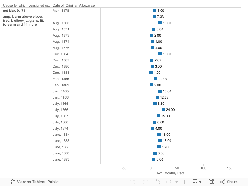
My initial goal entering this project with this data set was to create a visual that would show how pensions progressed over the century (1806-1883). While I was unable to accomplish this for my initial “rough draft,” I do believe it is possible. I encountered issues immediately as the dates are not in chronological order within the spreadsheet. Instead, the data had been entered in alphabetical order based on the recipient’s name. While this is the correct way to do this for official documentation, it poses an issue for someone like me that hopes to find trends in the data. Another problem that was readily apparent was the lack of explanation describing the wound or reason for receiving a pension. While most of the descriptions are easy to interpret, some are difficult to discern and makes analysis a bit more troublesome.


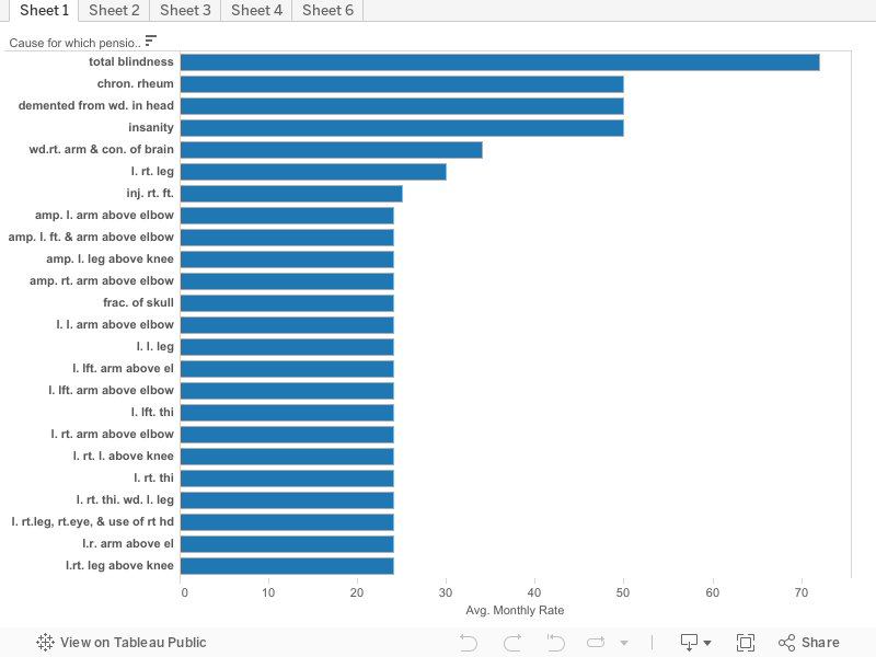
For my first visualization, I decided to keep things simple. On the left hand side you will find the various wounds and reasons for receiving a pension. The columns represent the average amount that was paid out on a monthly basis. I also sorted the data from the highest monthly payment through the lowest. By looking at the data this way we can see that a soldier who, as a result of either a combat injury or other military related accident, came to become fully blind. He received, on average, $72. This of course fluctuates when looking at each individual case but what I am interested in is the average. To put this into perspective, using an inflation calculator, we can see that in 1845 (using this as a mid-point), $72 would have the same buying power today as $1849.28. It is important to take this with a grain of salt as statistics are not readily available pre-1913.


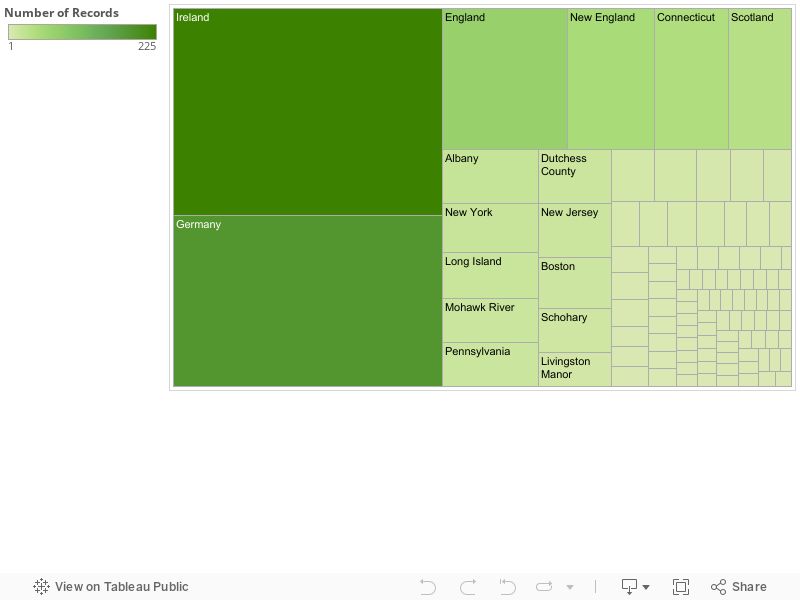
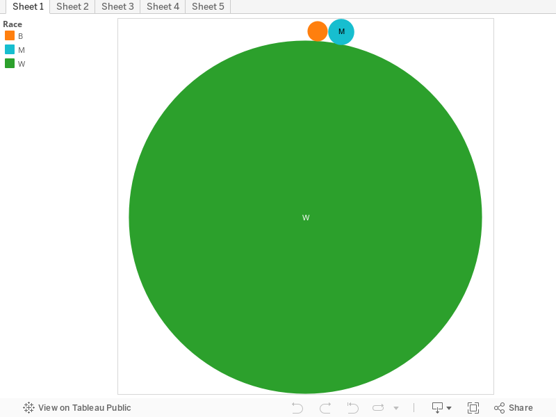
By looking at the various dates of allowance, we can conclude that most of the injuries sustained were a direct result of the Civil War (1861-1865). The many different gunshot wounds received shows that not only were African-Americans involved in the war in some capacity, but that they were actively involved in harsh fighting on the front lines. The people listed in this census are only ones that live in the Albany, NY region and who actually submitted a formal request for a government pension for their injuries. 921 names are represented on this census. Imagine the number of African Americans that did not sustain injuries and are from other locations scattered across the many states. Just by thinking of this, we can conclude that not only did African Americans fight in the war, but they made a large contribution to it as well.


As a final note, in my final project I hope to have my copy of the census worked out to be organized in chronological order rather than alphabetical. I believe this will help paint an interesting picture that will help show how one injury may receive less, or more, compensation than that of one reported decades later.

Final Project Story Draft Due 4/14

The visual data that I chose to use to describe the slave sales data set is a graph. Graphs with entities separated by color are more appealing to a person’s eye in general, and their mind automatically notices the difference in volume of each color, or lack thereof. For example, if a person sees a pie chart that is 75 percent red and the remainder is green, they’ll automatically wonder what the red area represents and why it’s so plentiful. On the other hand, colors in bar graphs create distinctions, but the length of the bars is what tells all. Where the z-axis is placed (on the bottom, side, or top of the graph) also has an impact on what viewers’ perception. An x-axis that’s on top as oppose to on the bottom typically has an adverse effect at the first glance compared to if it was on the bottom because it looks as if numbers are decreasing as the bars decrease in length.
I chose the bar graph lay out because it makes it seem as if certain states were forging ahead of others. Essentially, leaving them in the dust of the money they spent on slaves. This scale isn’t the typical graph, but I do think that it gets the point across visually without having to see the prior spread sheet to analyze the data. I chose the deep burgundy color because it wasn’t alarmingly red, but the burgundy resembles blood and this tugs on views heart-strings –especially in the context of slave sales.
The context surrounding the slave sales data set is the rise of the cotton kingdom. The spike in Louisiana slave purchases may be due to the expansion of slavery and cotton production, which makes sense. The raw data set itself shows that men in their prime are bought for higher prices (keep in mind that man’s prime is longer than a woman’s). Women, on the other hand, are of more value when they are of age to bear children and their value probably deprecates so in a time when the goal is to increase production, men are probably the more ideal choice. Though child-bearing and reproduction is important, this timeline probably seems longer to a person that wants to capitalize off of cotton production high while it’s hot –wait nine to ten months for a mother to give birth and a few more years for that baby to be mature enough to pick cotton themselves. Women were still being bought at an increasing rate, while men, as we see in Louisiana, were in higher demand.
In terms of sequence, the range of the slave sales data set covers the rise of the cotton kingdom which was vaguely 1830-1861. Therefore, the increase in millions spent by the states is associated with the rise in cotton demand. Aside from natural reasons, the cotton revolution is the main reason that states in that time period spent hundred off dollars to buy quality slaves because they’d prove vital in capitalizing off of the cotton kingdom.

Story Draft

The data set that includes information on the slave sales from 1775 to 1865 contains valuable insight into the slave trade in the United States that many people may not immediately think of when they think of the history of slavery in America. It provides insights into information such as how much slaves would be sold for when they possess a particular skill set compared to slaves that possess other skills as well as no skills at all. It also allows you to compare the types of skills that female slaves possessed as opposed to the skills that were possessed by male slaves. In the visualization shown for example, you can see that female slaves that were sold possessed more domestic based skills such as “hair dresser, house servant, pastry cook, laundry, etc.”. In terms of these skills women that possessed hair dressing skills were appraised to have the highest value, being appraised at around $1,000, as compared to a female spinner that was given an average appraised value of $203. The skills that are possessed by the male slaves appear to be more skilled labor types of jobs. These jobs include skill sets such as “mechanic, brass molder, painter, cigar maker, blacksmith, construction, etc.”. By looking at the visualization we are able to see that the mechanic skill is valued the highest among the male slaves with the average slaves with skills as a mechanic were appraised to be worth around $1,258. This would be compared to a male slave possessing the skills of a pusher which is appraised at a value of $150. The visualization also allows us to compare the appraisal values of male slaves compared to the value of female slaves during the slave trade in the United States. By looking at the graph we are able to see that on average, male slaves were valued at a higher rate than female slaves. This included times when they possessed the same set of skills. For example, a male mechanic was valued at an average rate of $1,258, while a female mechanic was on average appraised at a value of $600. We are also able to see that more males possessed skills than females did. 

Final Project Story

In this visualization I decided to research the differences in the payment of pensions for people that had the same injuries but started receiving pensions at different time. From this visualization I organized the data into years and injuries and then went from there. My original question for this visualization was to find the differences in amounts of pay for each individual. As you would guess many of the payments are equal, however I had also thought about how there would be differences in pay, and I was right about that as well. When you look at this data the person who created it did not include how severe certain injuries were, like there are labels for various gunshot wounds but the severity is not specified. This was the basis of my question. Why was there discrepancies? If there wasn’t a reason for there to be a difference in classification why is there different pay? The amounts also fluctuated by time of issuance. It wasn’t like there was a correlation going up or down the numbers were just random, again, a reason to include the severity of the injury that each person had received. This could’ve all been cleared up by a couple extra words on the sheet.

There are some very different stories that come from this chart as well. Like the many people who are affected by gunshot wounds, presumably from the Civil War. This shows the variety of injury that come from having such a bloody war. There appears to be a a gunshot would for every appendage possible. I suppose that there is the possibility that the injury happen during some incident outside of the war but I think it’s reasonable to say that the most of injuries occurred as a result of the war. When you look at some of the other ailments You see some injuries like an axe to a particular appendage and see that they only see that they receive like $4 a month. That number is very surprising to me,even in those days where four dollars was a nice amount to have for some income but I feel like that wouldn’t be enough to support someone who was severely hobbled by an injury. There were some cases like a dependent mother who might have multiple kids and use that as their only income and the pension was eight dollars Again that seems incredibly low. The pension for women, especially in those times would most likely be the only opportunity for women to make money so this seems low in the sense that these women could have multiple kids. Conversely, there were a couple people who were blind who received $70, this was interesting to me because that seems like it would be a reasonable amount for people who probably don’t have a lot of expenses.

Overall I feel like that given these circumstances, in my opinion people could’ve been paid more, but I don’t know what a good salary per month was for the time, so this could’ve been fair.

Draft

The date set of the Slave Sales between 1775 and 1865 contains information that can provide insight on how the slave trade operated. By simply looking at the information presented, you can see that some of the information correlates with one another to tell a story. The story that my first visualization focuses on is the appraisal value between gender and the states they were sold in. Before I could start my story I needed to accurately identify if there was a relationship between value and gender. The data showed that male slaves were significantly valued at a higher price point than female slaves. The average male slave would be sold between the average price of $172 and $777, depending on the state. Women average price was  between $113 and $639. Although the data does not directly state why males valued more, we can infer that males would be of more use on plantations. If a master was looking for someone who was physically capable, could withstand long tired-some hours, work fast and carrying heavy loads, he would obviously go for a male slave. However, this does not mean that women slaves were disregard. Women slaves were still valued because they were capable of bearing children, being house servant, and possessing skills that made them useful.When age played a  factor, my data showed a relationship between the age and value of the slave. The data showed that whether it was  male or female slave, the average slave sold would be about 18 to late 20’s (prime age) and would be valued high than someone of a later age. The last aspect is how the different states play a role in my visual story. Incorporating the state gives a different perspective of how the selling of slaves differed in the territories. For example state, state such as North/South Carolina, Tennessee, Virginia, and Maryland showed their average age of slaves being between the ages of 4 and 12, rather than 18 to 27 like other states. It is possible that theses states were more interested in selling children or they didn’t keep a better records of the ages of slaves and therefore some slaves would be unaccounted for. Another example is how states played a role in the value of slaves. For states such as Georgia, Louisiana and especially Mississippi both women and male valued significantly higher than the other states. It is possible that these states were more popular plantations. Therefore, more slaves were migrated into these states and migrated out of the states with fewer slaves.

Final Story Rough Draft

The nineteen forty Albany census provides us with resident’s basic personal information, but it contains a much deeper story in between the lines. When simplifying the information and the numbers, many judgments can be made about the circumstances of this time period. The unemployment and employment rate of each gender, income of specific households and citizenship based on birthplace are just a few of the pieces of data that can be discovered within the census. My data visualization displays the average age of employed persons based on gender. On the female side, the average age of unemployed women was over forty years old, just about forty-two, and the average age of employed women was just over thirty-five years old. This tells me that the average women in the nineteen forty’s worked for pay for a shorter span of their lives than males did. With that being said, Men in the nineteen forty’s saw an average age of unemployment of just under forty years old, only a few years younger than their female counterparts. The average age of males who were employed for pay is greater than the average of those who are unemployed, being just over forty. This represents that males may have been struggling to find jobs when they were younger, but as they aged and gained experience then they were able to find a job and work there until they retire. Persons whose gender is nullified on the census demonstrates a higher average age of unemployed persons than employed persons. This relationship is similar to that of females so this leads me to believe that most of the persons whose gender is nullified on the census are women. For those whose employment status was nullified in the census they saw a very low average age for both females and males, about 15 and 18 respectively. These persons were most likely nullified when it comes to employment status because they are so young and may not have been expected to work just yet because of academic reasons.

Yo this is a story all about how Albany’s 1915 census got fliiped-turned upside down

I think there’s a few interesting points to take away from the graphic and data behind occupations in Albany in 1915. There’s a few jobs that no loner exist or are called different names now, plus a surprising difference in the number of women and men who worked (or at the very least, were listed as working) at the time. I purposely chose “gendered” colors for the bar graph, but I think the story behind that has to go in a separate part of the final post. But there are a few interesting stories behind the data itself.
I’m assuming no one here really knows what a “teamster” is (or maybe you do, being history buffs and all). Today we’d use the plebeian term “truck driver.” But it’s hard to imagine an 18-wheeler peeling down the dirt roads of Albany a hundred years ago; a little more research shows that these were the men who delivered goods to stores, usually on an animal-driven vehicle. A whopping 12 men in the city of Albany were blessed with sitting behind the back-end of an ox or horse for a living, twice the number of the next most popular listed job in the city. But I’m sure they weren’t only delivering groceries to the whopping 2 grocers in Albany at the time; out of 64 employed males at the time, about 5 of them weren’t directly related to selling or handling delivered goods (and that’s taking a good guess at what some of these other jobs are). So I’m sure these 12 men were nice and busy staring at these animals’ backsides all day as they delivered books, ice, and masonry tools.
Of course, when you first look at the graph the first thing you probably notice is the big pink bar shooting up highest. With only a dozen less listed workers than men, more than half of the women listed as employed are employed in “Housework.” What sort of housework? Not homeschooling, as school teachers are listed in another category, nor seamstressing, as dress and shirtmakers are categories unto themselves. Perhaps, even though it was work that was expected of them as women, house work within their own homes was considered an occupation? No, I think that since it was listed as an occupation, it was something that they were paid for, and not something they did in their own homes. Or rather, it wasn’t something they were acknowledged for doing in their own homes. They just had to come home from cleaning someone else’s home all day, and then clean their own.
There are some jobs which are surprisingly gendered (as there is not one single listed occupation that has both men and women working in it) occupations, ones that might expect from the other sex. The only listed gardener in the census is a male, while the only person in charge of manufacturing boxes in all of Albany is a woman (at least, according to the census). Weren’t they afraid that her wandering uterus would make her unable to deal with such a heavy workload?
All in all, I think the most important and interesting piece of information to take away from the graphic is that there were an almost-equal amount of men and women listed as being employed in Albany a hundred years ago, when we usually imagine that the men went out to make the money for the family while the women sat at home and either tended to their children or made sure the house was comfortable for their husbands, fathers, and brothers to come home to.

Final Story Rough Draft

There are several stories that can be told from the Albany Militia Muster Roster. From how the small militia looked, to the jobs that they had in their normal lives. It’s very interesting to see where the individuals come from and how old they were when they originally enlisted. There is certainly a lot of personal information provided in the roster that paints a very descriptive story. The story that one of my visual focuses on are the racial backgrounds where these soldiers come from. I sorted and grouped the different complexions provided and assumed the description of the competition is correlated with their race. For example I grouped “Black, Brown, Negro, Dark and Swarthy” assuming that they are all African Americans. A also grouped “Fair, Pale, Ready, Reddy, Ruddy, and Sandy” with the assumption that they all are Caucasian. And then I left Indians alone because they are Native to the land. I also excluded “Freckled” and “Pockpitted” because they both can be used to describe Indians, Blacks and Whites. I thought that this would be an interesting way to sort this data because all of these individuals made the voluntary decision to sign up for this Militia, and they come from all walks of life. Especially during this time period, there was a very large gap in social equality between blacks, whites and Indians. One would assume that a majority of the soldiers on this muster roster would be White because they have a whole lot more to lose and they were treated a whole lot better by society. I would have thought that since society has been so oppressive towards African Americans, there would be a tremendous dividend between the two with the Whites in the majority. Much to my surprise, the African Americans were in the majority leading by well over 100. I found this very interesting and once I saw this, I had to ask myself was this all voluntary? Maybe it was and they just had a love for the country and a desire to defend it. Another interesting fact is that there was only individuals that fell under the category of “Indian”. However I will admit that I was not entirely surprised. Foreign powers were coming into their land and trying to control it. Why would they want to sign up for a fight that really has nothing to do with them because either way, there will be a foreign country controlling their way of life.

Final Story Rough Draft

When looking at all of the data from the Albany census of 1860 a few stories begin to emerge. I think the most immediate story that jumps out is the racial diversity of Albany in 1860 according to this census. The race column uses a one-letter label and when scrolling through the hundreds of names you see the letter W, for white, almost exclusively. When you take a magnifying glass to the census and search for more you are able to find some small diversity. The letter B, as in black, and M, as in mulatto, are also listed on this census, but only for a total of eight records between the two races. There are three recorded black members of the community and eight-recorded mulatto members of the community. Due to the time period we are looking at this may not sound too surprising, but when you consider that all slaves living in New York were freed in 1827 it becomes slightly more surprising. When removing the scope of Albany, New York from our data you can see that the number of white persons in the United States still greatly outweighs the number of free persons of color. Slaves make up thirteen percent of the population while freed persons of color make up only one percent of the population. So while it is not surprising that only a few persons of color lived in Albany in the grand scheme of America in 1860 it is slightly interesting due to New York’s dense population of almost four million and the abolition of slavery years earlier. When comparing the totals of the United States to New York’s totals in population, New York has about one percent of freed persons making up their population similarly to the entire country. Out of all of the free persons in the United States about ten percent were living in New York during 1860. That is a lot considering many states still were under slavery during this time. Out of all of these free people living in New York at this time only 0.01 percent of them were living in Albany. A majority that were had presumably been here for a long time because the average age of a black person living in Albany in 1860 was seventy years old. Presuming that not many people would travel to a new location after being freed at seventy years old and I would also take into account that both black males living in Albany during this time both were working jobs that were both also worked by white males during this time, one as a preacher and one as a waiter. When you consider that Albany is the capital of New York I might have guessed that more freed persons would be living there, but you have to take New York City into account. Out of the forty-nine thousand free persons of color in New York during this time period twelve thousand people, or twenty four percent, were living in New York City during this time. These numbers had been on the decline though and continued through the 1863 Draft Riots in New York. From 1870 on the numbers showed a steady increase.

Final Proposal

For my final project I would like to focus on the data set of Slave Sales between 1775 and 1865. This data set includes numeric,text,and geographic information on slaves up for sale. This data set features a couple of numeric columns, one regarding a slaves age from infant to as old as 99, another appraised value of that slave, and another was the year listed for sale ranging from 1742-1865. As for the geography of this dataset, a column is included for the state the slave was sold. Ironically the only states mentioned are in the south including Georgia,Louisiana, and Mississippi. The other geographic column of counties is used to narrow in on a certain location a slave was sold at. This dataset also has columns for the sex of slave, defects of a slave and skills a slave possesses. For a column like the sex of a slave there are only 2 options male of female, while the defects and skills of slaves can hoist a bunch of options ranging from old to lame. I did notice that for the defect and skills columns both had significantly more blank spaces then all other columns.

As for relationships between the different columns and rows in the slave sales dataset there are several. I noticed their is a correlation between the defects, age,and sex of a slave and the appraised value. Old and disobedient slaves were sold for way less than a young male “prime” slave. Young slaves were often valued very low as well. Also most of the skills types are connected to just one race. Women were seen as child bearers and caretakers, while men were seen more as laborers.