1883 Pensioners Final Project

Data Description

For this project I chose to look at the 1883 Pensioners. I wanted to explore a data set that involved some aspect of war but with a different twist. When we look at war data it is usually casualty figures that are the main topic of discussion. People forget that for those that are wounded and the families of those killed in action, some sort compensation, a pension, is given as a way of saying thank you for your service and to help alleviate the difficulties that may result from their time in the service. The reasons for the pension can be anything from visible wounds, to psychological trauma, to the loss of the head of household—the breadwinner.

When looking at any given data set, you are almost certainly going to be given numeric data, textual data, and/or geographic data in some quantity. In regards to the 1883 Pensioners data set we are given all three. But, each is represented in a different amount. The textual data is on a very large-scale, as is the numeric figures. There are dozens and dozens of different categories for wounds. From gunshot wounds, to diseases and illnesses, to amputations, to being widowed, the list is extensive. We are also given the names of each person and the month and year of the first pension claim.

For each category that is listed, a number of sub-categories of numeric data is also given. The most interesting of which comes in the form of the monthly rate of payment received by the individual. With this number you can then twist it around to see the average monthly rate, the median monthly rate or the monthly sum. What this allows someone reading this data to do is to compare and contrast the various pension claims to see how they stack up in severity, in terms of monetary compensation. Another aspect of numeric data is seen in the number of records of each pension claim. This too allows us to see what the largest pension claim was.

Geographical data is present in this data set. However, an address is not given. Instead, it is referred to as “Post Office.” This is the city or town that the individual is currently living in at the time of pension submission. This does not provide much in terms of useful information as this list includes individuals strictly in the Capital region. If an address had been provided, we could then create a map of the city of Albany along with the various outskirts and examine just where these veterans or their families are living. Are they generally in poorer neighborhoods as is the general trend with war enlistees? Is it an area that is higher concentration African-American or Caucasian? Unfortunately, when this list was compiled they were not expecting someone to look at it decades later and attempt to create patterns and trends from it. No, it was instead meant to organize those that were receiving government pensions for their role in the Civil War.

Data Visualization 1

For my first visualization, I wanted to take a look at the number of records for claiming a pension. In this visual we will be looking at the “Number of Records” tab.

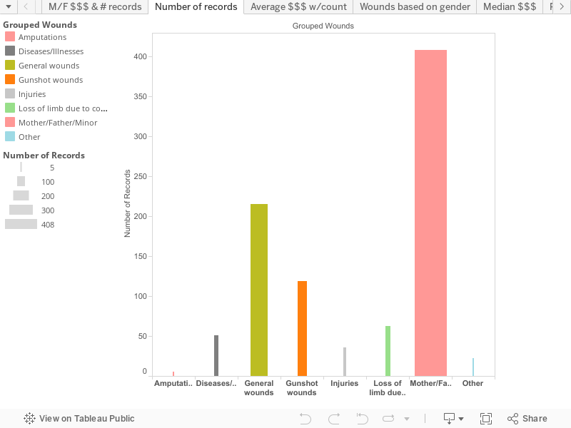
At first glance it does not look like much. I wanted to create a story that correlated with the figures that show that most of the deaths associated with the Civil War were in fact, not combat related. When I say combat related I am talking about gunshot wounds, hand-to-hand combat and artillery barrages. Instead, the number one killer of soldiers, on both sides, was dysentery (www.civilwar.org). Most of the soldiers that fought during the Civil War were from the rural countryside. They lived their lives on small mom and pop farms and interacted with only a handful of other people outside their community. When you do not have much contact with significantly larger groups of people, your immune system becomes more susceptible to contracting diseases and illnesses that others, from a city for example, would not come down with. For this reason, a substantial number of the deaths during the war were from disease as these farmers interacted with hundreds and thousands of other men for the first time. Other illnesses include smallpox, malaria and chicken pox. Because the medical field had not advanced to the point of having proper medicine to treat this diseases and viruses, large outbreaks were not uncommon with both the Union and Confederates.

While it was my initial goal to show this pattern in my data set, the opposite, in fact, developed. Now before going any further I need to emphasize something about this data set. This data is not an accurate representation of the makeup of soldiers in the Civil War, on either side. It is a rather small sample size of just under 1,000 claims. A claim does not necessary entail that they played a direct role in the Civil War, rather it could be the family applying for a pension for a deceased family member. In looking at the data in the “Number of Records” tab, we see that the largest number of claims fall under the category of Mother/Father/Minor, followed by General Wounds, Gunshot Wounds, Loss of Limb due to Combat, Disease, Injuries, Other, and lastly Amputations. According to this graph, there were a total of 918 records. 408 of these fall under the category of Mother/Father/Minor and only 51 falling under Disease. This data set is telling a different story than what the national story is. Instead of having most of the cases be relegated to be disease related, they are instead a second-party claiming the pension, for example a widow. The General Wounds are second with 215 respective cases, these being injuries as a result of chopping wood or breaking a bone. While there is a significantly large difference between claims as a result of disease or illness and being widowed, it can be safely assumed that a portion of the widowed claims are a result of their loved one dying from some sort of disease.

Process Documentation 1:

All of the groups that are represented in all my visualizations have numerous sub-categories within. For example, if you look at the Gunshot wounds bar, what you have is different types of gunshot wounds making up the 119 total claims. There are gunshot wounds to the head, face, jaw, left leg, right foot, etc. This visual is fairly new. When I first set out on this journey, this particular example was not composed of a neatly grouped list. Instead, I had every single different type of gunshot wound, disease, illness; you think of it and I probably had it listed. Now you would think that the process to create categories to house all the various wounds would be fairly simple. Well, you would be dead wrong. You see, when each reason for filing a pension claim was originally listed, there was no universal language or code to organize things. It was all dependent on the person writing at that moment. Each person had their own unique abbreviations and wordings for various items. This meant that some reasons could be grouped under more than one category. After I was able to discern what should be placed where, I chose to use the default colors that were given to me each time I dragged the “Grouped Wounds” Dimension into the table. These colored groups represented my columns. Next, for my rows, I decided to utilize the “Number of records” measure to show the amount of claims filed in each bar. It was not complete but to further show the differences between each column, I chose to show bars with higher amounts of pension claims as larger in width than those with much smaller amounts. While this makes sense, in practice it can create a problem in viewing such thin bars.

Argument 1:

As I mentioned earlier, the main argument for this particular visualization is that disease and illness were not a particularly large contributor to pension claims, in terms of this data set on the Capital region. Poor hygiene along with interacting with large groups of other soldiers resulted in numerous cases of malaria, dysentery, etc. Outbreaks within regiments were not uncommon and men would often be forced to leave the service to due being sick. This is backed up the need to apply for a pension. Because the people listed in this census are from a highly populated region in the northeast, for the most part at least, their immune systems have been able to build up some sort of tolerance to the various illnesses out there. I would argue that this is the main reason for the low numbers of disease and illness claims filed by these men and their families. This assumption is supported by looking at other pension records that are available (Google Books: 291-303). For example, if we were to look at the city of Utica in Oneida county, we would see a rather large list of wounds that pertain to injuries sustained in battle or by other means. While there are cases of diseases and illnesses, they are trumped by the various wounds. We can also look at the town in which I grew up in, Clinton, also in Oneida County. By today’s standards, Clinton is a very small village. At last check, the population was just under 2,000 so we can only imagine how much smaller it was over 150 years ago. Out of the list of pensions for Clinton, there is only one entry that claims an illness: dysentery which was the number one killer during the Civil War. But the remaining entries are either combat related or because a widow or family member is claiming the pension because they lost a family member in the war. The north was much more populated than the south during the war, same goes today as well, so it makes sense that most of the pensions were in response to wounds other than disease and illness. If you look at South Carolina, (Google Books: 184-189) a startling trend emerges. Here we see the opposite of the north. Instead of mostly gunshot wounds, we see an overwhelming number of widows and illnesses. This can be explained by the sheer number of southern males that were lost during the war as a majority of the fighting took place in the south. The south is also nearly exclusively rural, hence the hundreds of plantations, so the increase in illness cases can be explained by the weaker immune systems of the Confederate Army.

Data Visualization 2:

For my second visualization I chose to examine the role of women during the Civil War. While women have always played key roles in every conflict the United States has fought in, the exact extent to how much they can be involved has always been controversial. Only in the past few years has combat roles been opened up for women to be involved in though they are required to pass the same physical requirements as their male counterparts. But during the Civil War women played a much more behind-the-scenes type of role. Most often referred to as Camp Followers, these women did exactly as their title suggests: they followed the train of soldiers. These were women who, generally, did not have much at home after their husband, brother, father, etc., went off to war. If they had no means to sustain themselves and make money, they often followed their loved ones as they went off to war. They acted as cooks, nurses, cleaners, and prostitutes. Some even went as far as dressing up as a man (Sam Smith) and fighting on the front lines, some even died (www.civilwar.org). While they no where were close in numbers as the men, it is believed that around 500 women secretly fought in the war. Probably the most famous woman fighter is that of Jennie Hodgers, better known as “Albert Cashier” (Civil War Trust). She enlisted in the 95th Illinois Infantry on August 6, 1862 and would go to fight in over 40 different engagements. It is also believed that at one point she was captured by the Confederates but she broke out of prison and returned to duty. She served three years before her unit was discharged for heavy losses due to combat and illnesses. But her story does not end here. She went on to continue living under the guise of a man, collecting a pension, and would only be discovered in 1910 when she was hit by a car, though the hospital kept her secret quiet. However, 3 years later, as dementia set on she was discovered and forced to live the remainder of her life as a female. She would die 2 years later and be buried in her uniform with full military honor.

Process Documentation 2:

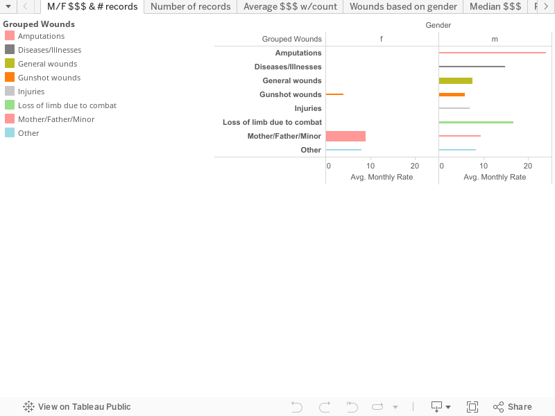
The creation process for this visual is nearly identical to the first. The main differences here are the different dimensions and measures that were used. I chose to have a horizontal graph for this one in order to break the data up into male vs. female. In terms of data, I included type of injury sustained, the average monthly payout and the number of cases for each category. As with the first visual, I created larger bars for the categories that included larger number of records and smaller bars for the categories that included a small number of records.

Argumentation 2:

As I have mentioned earlier in the first visual, this data set is a rather small sample size. To accurately create a significant argument, we would need to also be graphing other 1883 pensions from nearby counties. Luckily, Albany county seems to have had its fair share of females taking part in the fighting during the Civil War. Whether they were injured while fighting or were simply in the wrong place at the wrong time as a camp follower is impossible to know for they may have never been discovered. In any case, what we have in our data set is 2 records of females sustaining gunshot wounds and then gaining a pension as a result. In scouring the nearly 1,000 entries, I was unable to find their names which may have led to further research and possibly finding out if they had in fact disguised themselves. Nevertheless, these two women received an average pension of $4.00 a month compared to her male counterpart whom received an average of $5.93. The sample size is way too small and distorted in favor of the men with 117 records of gunshot wounds so it is difficult to say whether they received such a low amount because they were women or because their wounds were not as severe as some of the men. In any case, they did in fact receive a pension for gunshot wounds. Even if we take out the gunshot wounds from the data, historians know for a fact that women played a key role in the Civil War. Clara Barton herself, founder of the Red Cross, was a nurse during the war. Women took on every aspect of the war that the men did including fighting and performing dirty tasks such as amputating limbs. While historians acknowledge their contributions, I do not believe classes teach how much women played a direct role in the war. Up until the Fall of senior year in college, I was unaware of the camp followers. To show that they played this large role in the war, we should be teaching more about them.

Further research Questions:

  1. Were pension claims during the Civil War and claims 20 years after the end of the war greatly differ in terms of monthly payments for similar injuries?
    1. To figure this out I would rearrange the data set in chronological order. I attempted to do this but my efforts were futile as I could not figure out how to correctly get Tableau to do it. With a lot of time on my hands I suppose I could create an Excel spreadsheet that is in chronological order and could even uncover more patterns in the data that we are unable to see otherwise.
  2. Did the pensions differ based on whether you served as a Union soldier or a Confederate?
    1. In a preliminary scour of the Arkansas, Missouri, and South Carolina pension rolls, this would seem to not be the case. No matter the wound, you received nearly the same amount whether or not you were a northerner or a southerner.
  3. Were African-American veterans afforded the same treatment by the Pension Bureau?
    1. When I first chose this data set, I was under the belief that this was a list of African-American soldiers and their families that were receiving pensions. I quickly learned the opposite, that it was probably whites that represented the bulk of the data. That is not to say that African-Americans are not present on the list, however I would imagine if they were a significant contributor to the war effort (which they were), wouldn’t the Pension Bureau have a separate column for race? Every 1883 Pension roll uses the same layout with the name, record number, cause for pension, etc. None of them include the race of the individual. So this begs the question of if they just did not deem that important enough to distinguish in the records or did they just not offer any pensions to African-American veterans. This would, of course, violate the 14th Amendment. I would bet that with some more digging, one could uncover the records of African-Americans receiving pensions, I just do not know where to look for that.


Bibliography

“620,000 Soldiers Died during the Civil War, Two-thirds Died of Disease, Not Wounds: WHY?” Civil War Trust. Accessed May 11, 2016. http://www.civilwar.org/education/pdfs/civil-was-curriculum-medicine.pdf.

Council on Foreign Relations. Accessed May 12, 2016. http://www.civilwar.org/education/history/biographies/jennie-hodgers.html.

United States Pension Bureau. “List of Pensioners on the Roll January 1, 1883.” Google Books. January 1, 1883. Accessed May 11, 2016. https://books.google.com/books?id=aLkqAAAAMAAJ.

United States Pension Bureau. “List of Pensioners on the Roll January 1, 1883.” Google Books. January 1, 1883. Accessed May 12, 2016. https://books.google.com/books?id=t7oqAAAAMAAJ.

Smith, Sam. Council on Foreign Relations. Accessed May 12, 2016. http://www.civilwar.org/education/history/untold-stories/female-soldiers-in-the-civil.html.

Final

When most people think of a census, they think of it as a population marker. It is a mundane piece of mail with standard forms to fill out. The truth is that a census can tell you a lot. Trends found within censuses sometimes can show the bigger picture of the United States and beyond during the time period that they are taken. Each person on the census has a story and the census can be the beginning of piecing that story together. I looked at the 1860 Albany Census to attain some of this information.


Data Description:

The dataset for the 1860 Census in Albany, New York consists of a lot of basic information as well as a few more detailed pieces of information. In a row the information you get about someone is his or her first and last name, age, race, gender, birthplace, house number, family number, age and occupation. The data is numeric, textual, and geographic. The geographic data in this set is the birthplace of the person at hand. The textual data is first and last name, gender, race, and occupation. The numeric data is the age, page, house number and family number. It is majorly textual, but the other columns are just as important comparatively to the text only columns.

When looking at all of these columns and rows of data we should look at the ranges within each. The first column is page number. This column just contains what page number of the sample census the rest of the information in the row comes from. It is a numeric column ranging from one to twenty four. The next column is house number. I presume that the information in this column is like an address. There are multiple families within different numbers in the dataset. This column is numeric and ranges from one to one hundred and nineteen. The next column is family number. This column has each family listed under a different number on the census. This keeps all families organized. It is a numeric column ranging from one to one hundred and eighty-seven. The next column is the last name. This shows the last name of the person identified. It is a textual dataset and has a wide variety of last names. There are one hundred and eighty seven unique last names in the sample census. The next column is the first name of the person identified. This is also a textual column. This sample dataset contains nine hundred and twenty two people, but many first names overlap. The next column is gender. This is a textual dataset identifying which gender the person in question is. The options are either male or female. The next column is race. This is a textual column that identifies the race of each person. The options are white, black and mulatto. The census is predominantly white with about five persons identifying as either black or mulatto. The next column is age. It is a numeric dataset that consists of the age of each person. The ages contained within the dataset range from one month to ninety-five years. The next column is birthplace. It is a geographic column that depicts where each person was born. It contains states, countries and one continent.. The options are Canada, Connecticut, England, Germany, Ireland, Louisiana, Maine, Massachusetts, New Hampshire, New Jersey, New York, Rhode Island, Scotland, South America and Vermont. Finally the last column within the dataset is occupation. This is a textual column identifying the job of each person. There are seventy-four unique occupations in the dataset.

From this sample of the 1860 Albany Census we can garner a lot of information. You can begin to piece a story of a person together just by reading their row in the census. You can read about an elderly black preacher who was born in Pennsylvania and start to do more conclusive research and gather what his story may have been. You can find out a lot about Albany, as well as the rest of the world, during this time period with the little information from this sample census combined with a little research.


Data Visualizations:

When looking at the census some stories begin to emerge. When first digging through the census is just seems like it is standard information on a person from this time period. It does not really seem like there is anything you can do with this information. Once you start to do a little background research even one person’s row can start to emerge as more of a story in terms of the United States as a whole during this time period. You really begin to see stories of the area when you start to examine different columns and compare and contrast the information. That is what I began to do and I was able to come up with a few solid visual pieces of information based on the dataset.

This was not the first thing I began to dig into as far as making these visual pieces about the census, but it was one thing that jumped out early. This was the difference in occupation by gender. I was contrasting differences between occupation and columns like race or age to start. The only thing I really noticed was that there were many unique occupations. The filters of race and age were not really showing me anything besides standard facts. I moved on to gender. This is where I had my first finding. I realized that there was going to be a difference among the results, but I was surprised by some of the findings. Now there are over seventy unique jobs listed on the census and each of them has different information. Some show a lot more than others. When I began to look at the skilled versus unskilled argument that I assumed I was going to be making I was intrigued. I found that while it was true that most of the jobs that are considered skilled labor has mainly men I was finding a woman or two on many of these jobs.

Given the time period and my prior knowledge of history I did not think that many woman would have been in the workforce in 1860 in what was considered to be a skilled position during this time period. I researched the topic and found that it was actually starting to become common for women to join the workforce during this time (Banaszak, Shannon). I was surprised because to my knowledge women started joining the workforce in the United States either during wartime in the early twentieth century or during the 1920’s. Apparently starting in the mid 1800’s women began to enter the workforce commonly sometimes even in these positions that were normally reserved for men.

I thought that this was interesting so I made a filtered graph to show the differences between men and women in certain occupations during this time period. I chose a few jobs that were considered skilled positions that mainly consisted of men, but had a few women. These were the main piece of the argument that I was trying to display with this visual, but I also added a few jobs that were only occupied by men and a few only occupied by women. I also included a few that seemed to have a more even split just to show the diversity, but the main piece was the few women that were taking these skilled jobs during this time period. I felt like this was the best argument to make because I am pretty sure that I am not the only one who was taught all of this in my early education, but also up until a few years ago in high school. The teaching that always gets brought up is how women were not really a part of the workforce in the United States until World War I forced women to start taking roles that were formerly taken by men. I was taught some stayed in their positions, but a lot went back to their homes after the war only to re-enter years later. This information remains true, because many women did enter the workforce for the first time during this time period, but it is not exclusive to wartime or the early twentieth century. Women were actually joining the workforce, including positions like carpenter or laborer, dating back to the mid nineteenth century.

The first thing that really jumped out at me was the racial population. I was seeing so many more white people than any other race. There were only a total of five people that were not white so I wanted to do a little more digging. I was able to find some information, but in the end nothing seemed too off. I had a sample of the Albany population so there very well could have been more diversity, but either way this amount of diversity in the greater New York area for the time period was not really noteworthy. I made a few visualizations crossing the race column with others. I was saving my work as going, but ultimately moved on. I struggled to find another good visual piece after making a stacked bar graph of occupation by gender. I went back to the racial graphs I was making in the beginning of the project. I had one that crossed race with birthplace. Originally there was not much to go off, but when I was not just focusing on the racial aspects I noticed that besides New York the other birthplaces were considerably low except for Ireland.

Ireland had by far the next highest birthplace by over one hundred. I made a visual piece depicting this difference labeled Birthplace. This was interesting and showed the difference, but did not tell the whole story I was trying to depict with these visuals. It was just the beginning of the story. I did some background research and found that Irish people were immigrating to America a lot during this time (Irish and German Immigration). One of the main reasons for this immigration was due to lack of jobs in Ireland during this time period. It said that Irish people immigrating would take manual labor jobs mostly, but basically any job they could get would do. I decided to make a chart showing the occupations of Irish immigrants. It shows the difference between the types of jobs that Irish immigrants were taking. Laborer was by far the most popular job for these immigrants. A lot of general positions were the ones that I was seeing come into play. The story began to emerge. Irish immigrants were coming over to America due to lack of unemployment, among other things, and going to cities where jobs were available.

When looking at the information given to me in the sample of the 1860 Albany Census that I looked at, it was not clear what stories would emerge. I had to do a little digging and some background research on the United States and abroad to find the stories that were in this data. Once I began to compare and contrast with the information I had it was clear that these numbers and words within the dataset were really telling a larger story than they led on. There are many stories to unfold within a single sample census.


Process Documentation:

Many things started to jump out at me when I was looking through rows in the census. Each row consisted of a different person’s life and gave a short summary of what was going on with them during this time. I was trying to piece together some stories or general trends of the time period with these brief details I had.

I began to make many graphs on Tableau. Using different combinations of rows and columns sometimes I would make an interesting find between two pieces of data and sometimes it would amount to nothing. The first thing that jumped out at me was the race differential, but when realizing this was just a sample of the census and that the trends I was finding were nothing too crazy actually. Reading through the large sample of the census, I could not find a lot of other trends that really jumped out, but once I started to make a lot of findings. I was trying many different column options by gender to see any large differences or surprising finds between the genders.

Once I got to occupation I immediately noticed a few trends. I made the data into a stacked bar graph. I made this decision because I thought it would show any vast differences between the two genders by each occupation. I then sorted the genders by color to make any difference stick out slightly more. I used contrasting colors, naturally pink and blue. Once I had the graph made and was beginning to notice trends, I started to filter down the data because there was just too much. I wanted to keep the graph simple and there were over seventy occupations throughout the census. I knew that this might overwhelm any viewer and it is just a lot of data to process and some of it is really not necessary to any point that I was trying to get across with my graph. I filtered the occupations down to just eight occupations between the two genders. I chose the eight most essential that showed similarity, difference or just something surprising between the two genders within any given occupation.

Once I was done doing this I was lost for a little while. I had crossed many of the different datasets and was not really sure where to go. I tried to make a geographic graph, but after failing due to the data being very different (countries, continents and states mixed) I stopped using the birthplace dataset. After struggling to pick another graph due to some of their boring natures I decided to try the birthplace dataset without making it into a map. I first made a simple bar graph comparing birthplace by race. The few outliers from the white race in the dataset were almost exclusively from New York. I knew this was not much to work with, but I did notice that within the white population that so many people living in Albany during this time were from Ireland. New York was expectedly in first place, but Ireland was in second by far. I found this interesting.

I took the race element out of my graph and changed it to a TreeMap of birthplace. New York and Ireland were by and far the largest two squares and darkest colors on the TreeMap. The color choice is the standard of a TreeMap where the stronger the topic the darker the color, which in this case was green. After this I started to do some research on the topic of Irish immigration to the United States in general in 1860. I made a lot of discoveries. I found that there was a large influx of Irish immigrants to cities all over the United States during this time period and a major reason was for lack of employment in Ireland. I decided to make another graph to show to Irish occupation in Albany. They did a lot of jobs involving manual labor and I wanted to show the difference between the different jobs they held. I made a packed bubbles chart and filtered out any job with one or two Irish immigrants. I was left with eight bubbles. I filtered the bubbles by color by occupation. I was able to show that laborer was the largest occupation for Irish immigrants during this time.

My findings while looking through this dataset were all very interesting. Each thing I would find would get me to do some more research about general trends in the United States. This would result in me using any information I would find into another graph. My findings would open up more and more. I was able to pick the few most interesting and filter them down into simple graphs filtered down to get my point across.


Argumentation:

When I began to look at my dataset and saw things begin to connect and stories begin to emerge I was not sure what direction to take it at first. After experimenting with a lot of different ideas for visualization it started to help me filter out the weaker ideas that I had on the table at the time. Two big stories of the time period emerged for me. Doing some research on the topics I was able to compare them to the United States as a whole and I made some interesting finds that I pursued. My two main points within the three graphics I created both revolve around occupation. One is occupation by gender and one is occupation by Irish immigrants.

The first graph that I made for my dataset show the difference in occupation between genders. Many occupations at this time were exclusive, or nearly exclusive, to a single gender. Males usually had what are considered to be skilled jobs, such as laborers or blacksmiths. Some of these jobs still had a woman or two though and this surprised me when making these graphs. Women had other jobs that were exclusive to them. These jobs were sewing, servant or something relevant to homemaking. The only listed occupations that were about even were attending school and schoolteacher. Being a tailor or tailoress was one of the only occupations that had a healthy mix of genders. Attending school makes sense because it consists of mainly children who were attending school during the time of the census, but tailor and tailoress and schoolteacher were more of a surprise. I do not know which gender I would have assumed as taking the gender role for a tailor or schoolteacher, but I was surprised to see that it was evenly distributed.

When looking through the jobs filtered by gender I was not surprised to see men had what were known as skilled jobs during this period and women had more traditional female jobs in the sense of serving and sewing. When you look into the history of women you really begin to see them emerge in jobs outside of the norm during wartime when they are necessary to the workforce.

During the 1920’s you also begin to see more independent women start to join the workforce in job roles that were not totally normal at the time. My understanding was that this was when women began to come into their own in the workforce and even during this time it was still tough for women to get jobs. This is why I was surprised to see that some women in Albany in 1860 were already assuming some skilled position jobs. When looking through the graph you will see that, while dominated by men, women have a small population in occupations like laborer, carpenter and boilermaker.

In a paper by Shannon Banaszak titled “Women in the Workforce: Before 1900” it is stated that although economic historians agree that there is a steady influx of women into the workforce between 1800 and 1900 that there is a drop from twenty percent to fifteen percent between 1860 and 1870. Due to my prior knowledge of wartime and the roaring twenties being the time for women to shine in the workforce paired with this data from Banaszak I was very surprised to find women appearing in skilled jobs during this time period in Albany history. Banazsak does go on to state that women actually were beginning to become a big part of the workforce, really beginning to take off in 1840, which was surprising to me. She does state the jobs they had were normally sewing or domestic service. (Banaszak) This information correlates with my graph and census. In the grand scheme of the workforce women played a larger role than I would have expected, but apparently it was becoming a normal occurrence during this time for women to enter the workforce.

The next graph that I would like to point attention to is birthplace by race. There are few records outside of white people in the sample of the 1860 Albany Census that I was looking at, but I made this graph originally to see if there was a difference between the five other recorded races and white people. A huge percentage of the white population was coming from New York and I was curious if this was the case with the people listed as black and mulatto. Besides one black man coming from Pennsylvania, all other persons of color in the census come from New York, which keeps with the trend of the rest of the census. It made sense that New York would be the number one place that people were coming from considering that it is an Albany census, but what came as a surprise to me was the amount of people that were from Ireland in the census. It is second to New York by a lot, but it is the next highest percentage by far. Out of the one thousand people in the sample of the census I was looking at six hundred and twenty four people came from New York and two hundred and eleven came from Ireland. The next highest number is twenty-four from England. This made me wonder if this was unique to Albany or if Irish immigrants were this popular throughout America in 1860.

Upon further research I found that during the 1800s more than half of the Irish population came over to America. The article called Irish and German Immigration states that this was true in Ireland and Germany due to many hardships and unemployment. Immigration to America would total in over seven and a half million coming to the United States between 1820 and 1870. About a third of that was from Ireland. This rush of immigrants from Ireland and Germany had major effects on every city in America. (Irish and German Immigration) After reading about the influx of Irish immigrants into America during the time period that this census was taken it made a lot more sense why the Irish population in Albany was higher than any other by far. After doing this research and finding out that a major reason that they immigrated was trouble finding any work in their native land I decided to make a graph to look at the Irish population of Albany’s place in the workforce. I had read in the same article I referenced earlier that Irish immigrants would do a lot of jobs that labor-intensive all over the United States. This was true in Albany as well. The most popular job among Irish immigrants in Albany was a general laborer.

I read a letter while doing research about the Irish immigration that was written from an immigrant to an Irish national stating that he was happy in America and although he loved Ireland he recommended everyone move during these tough times and come over to America for a better chance at life (Irish and German Immigration). He spoke of the famine. I did some other research and found that the main source of income for Irish nationals was too farm potatoes. Even when this business was doing well it was low income (Irish and German Immigration). When there was a five-year famine in the late 1840’s it caused starvation and killed many, which played the largest factor in driving many to immigrate to America. (Great Famine [Ireland]) Even when the famine was over in the 1850’s immigrants would write their family to join them for a better life. This is what led to the huge immigration numbers to major cities all across America.

Due to the huge influx during this time period there are currently more Irish Americans in the United States than there are Irish Nationals in Ireland. Cities all over America served as refuge for Irish natives and Albany was a spot where Irish could come to get a job and live out their life.

This sample census of Albany in 1860 really has many different big pictures behind the spreadsheet. Rooted within the census are stories of over nine hundred people. They are all unique and interesting. Their stories can tell the story of the United States or the world during the 1860’s. In 1860 we see a large influx of Irish immigrants to America looking for job opportunity. We also see women begin to enter the workforce in predominantly male positions. You can use a piece of information like this census to show the greater story of history during the time period.


Further Research Questions:

The census that I looked at has a lot of information stored within it. There are nine hundred and twenty two unique people and they all have a story behind them. While I was making my findings and visual depictions I ended up having to do some research. I would make finding such as Irish immigrants being by and far the largest amount of the population next to native New Yorkers. It sparked my interest about the United States and Irish immigrants as a whole during this time period. I would make a visual for the finding and do some research which would spark more findings or another visual. Research was a big part of my findings and relating them to the time period as a whole and there are many other research questions that I did not pursue within this census.

When looking at my first visual, which is occupation by gender, there are some other areas that can be pursued. I did some background research about women entering the workforce in the 1800’s and was able to find some good writings about my specific time period and women entering the workforce in the United States during this time period. I got information about women and their occupations, but it did not really give me any reasoning or specifics. This is something that would require further research. Researching why women began entering the workforce during this time period. There is likely reasoning behind it and I would be curious to what it is. When you look at wartime in the early 1900’s it makes sense that men had to leave for war so women would take over some of their occupations during this time period, but why were women beginning to enter in the mid 1800’s? I would have to dive into some more conclusive and extensive research on women in the workforce to find the answers I am looking for.

My other main visualization is Irish immigration to Albany and the occupations that they took. Getting to this point had taken some research. I was able to find that a large influx of Irish immigrants came over the United States during the mid 1800s for many reasons, but a large one was lack of employment opportunity in Ireland during this time. In my findings it was stated that Irish immigrants mainly were taking manual labor jobs (Irish and German Immigration). This prompted my visualization of Irish immigrant occupation. A question that I would say this brings up is, why were these immigrants taking mostly manual labor jobs? Is it because people did not want manual labor jobs during this time and these immigrants were desperate for jobs so they would take them? Was the reasoning that they had any past experience in manual labor? I would need to do further research on this topic to get these answers.

Overall research was a large part of this entire process for me. My visuals would not have been entirely possible without the background research I did about the topics. I would not have thought to make a graph about Irish immigrant occupations without doing some prior research and finding out that Irish immigrants were coming here for employment. There are even further topics within the census that I did not focus on in my project that I could have gone into. The census has many stories within it that begin to emerge with some background information.


Working for the past few weeks with this dataset has really opened my eyes to the use of working with datasets like censuses. Something as basic as a standard census can really tell you many different things. When you compare trends and patterns within your census to trends within the United States and abroad you begin to see the words on the page as people. Each person in this census had a life and story that went along with it. They were shaping the history of the time period.


Works Cited:

Banaszak, Shannon. “Women in the Workforce: Before 1900.” Oswego. December 6, 2012. Accessed May 3, 2016. http://www.oswego.edu/Documents/wac/Dens’ Awards, 2013/Banaszak, Shannon.pdf.


“Irish and German Immigration.” US History. Accessed May 3, 2016. http://www.ushistory.org/us/25f.asp.


“Great Famine (Ireland).” Wikipedia. May 14, 2001. Accessed May 3, 2016. https://en.wikipedia.org/wiki/Great_Famine_(Ireland).


Northern Free Black Occupational Patterns and Housing Patterns

The reading for this week was The Northern Free Black Occupational and Housing Patterns. There were two sections of the reading, the employment and the housing of free African-Americans in urban cities.  The overall goal of the reading was to highlight the injustice and the segregation that free blacks faced both economically and socially during the 19th century.

The first section of the reading focuses on the role urban cities played in the life of African-Americans. Urban cities represented the heart of economic activity and during the 19th century if anyone was seeking work opportunities there best chances were in the cities, but that was not the case for many free African-Americans. The difficulties the black community faced when seeking work opportunities were due to the legal segregation between whites and blacks. For instance, the reading  gave us examples of how states would pass legislators that would hinder an African-Americans economic enterprise. One example was prohibiting free blacks from obtaining a liquor licence. As a result, blacks could not own grocery stores because a grocery was usually considered the source of selling liquor. This shows how one law could affect the black community in multiple ways. Another goal of the reading was to show the devaluing of many blacks. For example, blacks whose occupation were doctors or dentists were not recorded in the census as having professional careers but rather as cabinet makers or barbers. Unfortunately, this shows that many free blacks were neither recognized for their hard work nor successful at always getting the jobs they wanted. However, in many southern cities at least more than one half of blacks were finding occupation in jobs that were promising economic advances than in northern cities like Albany, where less than one-half of blacks were finding the same type of jobs.

The second half of the reading was about the housing condition of African-Americans.  Two reasons for their  living condition were landlords would rather rent to a white family or they would refuse to have black tenants. Many of this type of discriminatory attitude were often seen outside of the designated black districts. The reading states that some  African-American had to live in alleys, courts or in the back of buildings and they struggled to keep a clean/healthy home. In places such as Albany in the 1830’s the worst location had the cheapest building and was near the Capitol, it was home to both the blacks and the poor whites. Another point the reading makes is the difference  between the amount of blacks in a home vs. the amount listed in the directory. For example, in Albany four or more blacks who shared the same address would be recorded as one. These incomplete data would present a disadvantage when trying to look at black residential patterns in antebellum cities, but could also be an advantage when looking at head of households rather than the whole population.

The reading shows the obstacles African-Americans faced when trying to gain economic prosperity and the ways in which different cities would enact legislation to hinder blacks. Ultimately, resulted in the limiting of black employment and  benefiting gained by their white competitors. The reading also discusses the living condition of the black districts which often varied from city to city, but either way the bigger the city the more likely African-Americans were confined to smaller badly maintained homes.

Questions

  1. Why were their more job opportunity in southern cities than in northern cities?
  2. Why was there a disproportion in the number of African-American in a home vs. the number listed in the directory?
  3. How might living in only black districts affect African-Americans?


The Historical Brewery Tour of Albany (Proposal)

The Historical Brewery Tour of Albany (Proposal)

1st Location – The Amsdell Brothers Brewing & Malting Co – 135 Jay Street

Workers at George I. Amsdell Brewery, Albany c.1910 toned gelatin silver print Albany Institute of History & Art Library, P2657.84

The Amsdell Brothers Brewing & Malting Company was one of the most prominent breweries within the city of Albany during the mid to late 1800s. A man named William Amsdell learned the tools of the trade from John Taylor, a bold Albany businessman who pioneered the industry during this time. Amsdell parted ways with Taylor in 1840 to open his own brewery with his sons in what is now Guilderland, NY. Sixteen years later, the Amsdell family moved operations to Jay street to establish The Amsdell Brothers Brewery. The family run company would develop into one of the most prominent breweries on the east coast; it shipped over 100,000 barrels of various brews per year at its peak. The brewery holds the recognition for being the final business to manufacture the Albany XX Ale.

Gravina, Craig. “Drinkdrank: Albany Ale: The Brothers Amsdell.” Drinkdrank: Albany Ale: The Brothers Amsdell. Accessed March 02, 2016. http://www.drinkdrank1.com/2013/10/albany-ale-brothers-amsdell.html.

2nd Location – The Dobler Brewing Co. – Corner of Swan & Myrtle

Looking northeast on Swan Street bween Elm Street and Myrtle Ave., about 1912. Photo from AlbanyGroup Archive

The John S. Dobler Brewing Company, founded in 1865, was a very unique brewery in Albany. During this time period nearly all of the local beer companies were solely brewing ales. Ales are brewed from wheat, an abundant resource in New York’s climate, and do not require refrigeration. The Dobler Brewing Co however, was one of few Albany breweries to brew both ales and lagers. While this fact may seem inconsequential, it is actually historically substantial.

Since The Dobler Brewing Company had refrigeration systems in its warehouse, when prohibition was enacted the company was easily converted to refrigerate foods and sodas. Not only that, but once prohibition ended in 1932 it became one of only three Albany breweries to re-open, joining the Beverwyck and Hedrick Brewing Companies (which also brewed lagers).

Cotch, Mark A. “A Tour of Albany’s Breweries Yesterday & Today.” A Tour of Albany’s Breweries Yesterday & Today. Accessed March 02, 2016. http://www.moonbrew.com/muggz/cotchtour.html.

Dreimiller. “The John S. Dobler Brewing Company.” The John S. Dobler Brewing Company. Accessed March 02, 2016. http://dreimiller.com/genealogy/dobler/.

Gravena, Craig. “Drinkdrank: Albany Ale: With a Wimper.” Drinkdrank: Albany Ale: With a Wimper. Accessed March 02, 2016. http://www.drinkdrank1.com/2013/03/albany-ale-with-wimper.html.

3rd Location – The Hinckel Brewery – 201 Park Avenue

The former Hinckel Brewery still stands today as an apartment complex. Photo by Paula Lemire.

In 1855, businessmen Frederick Hinckel and A. Schimerer founded the Cataract Brewery on Park Avenue. Hinckel would eventually buy out his partner and rename the company, which produces mostly sparking lager, after himself. Hinckel experienced great success as the owner of The Hinckel Brewery. Reportedly, just in the year 1886 alone, the Hinckel Brewery “produced at least thirty-five thousand barrels of beer and employed seventy-five employees”. Upon Frederick’s death in 1916, which signaled the end of operations, the brewery was recognized as one of the highest end facilities of its time. After its closing, the site of the old brewery was converted into an apartment building. Today, the Hinckel Brewery Apartments still stand and are actively being rented out at 201 Park Avenue.

Cotch, Mark A. “A Tour of Albany’s Breweries Yesterday & Today.” A Tour of Albany’s Breweries Yesterday & Today. Accessed March 02, 2016. http://www.moonbrew.com/muggz/cotchtour.html.

“Hinckel Brewery.” Hinckel Brewery Apartments. Accessed March 02, 2016. http://hinckelbrewery.com/about-hinckel-brewery/.

White, Christopher. “Finding Your Past: Genealogical Gleanings with the Albany Grave Digger.” : Brief History of German Brewers in Albany. Accessed March 02, 2016. http://findingyourpast.blogspot.com/2013/11/brief-history-of-german-brewers-in.html.


4th Location – Albany Brewing Company – 60 South Ferry Street

Albany Brewing Company Lithographer, T. Bonar ht.21 1/2" x w.27 1/2" Albany Institute of History & Art, 1954.59.12
Albany Brewing Company Lithographer, T. Bonar ht.21 1/2″ x w.27 1/2″ Albany Institute of History & Art, 1954.59.12

In 1796, a man of Scottish descent by the name of James Boyd opened a brewery on South Ferry Street in Albany, New York. The “Arch Street Brewery”, as it was originally named, holds the honor of being the first modern brewery to open its doors within the city of Albany. The company would later be renamed the Albany Brewing Company, and within its factory walls is crafted a number of amber pale ales, India pale ales, and porters. James Boyd is also responsible for the construction of many of the brick buildings across the street from the site of the brewery.

Bielinski, Stefan. “James Boydcolor.” James Boyd. Accessed March 02, 2016. https://www.nysm.nysed.gov/albany/bios/b/jaboyd7389.html.

McLeod, Alan, and Craig Gravina. “Albany Ale Project.” Albany Ale Project. Accessed March 02, 2016. http://albanyaleproject.com/history/rise.html.

5th Location – John Taylor & Sons – 133 Broadway

An advertisement for John Taylor & Sons. Originally appeared in the 1866 City of Albany Directory.

The history of brewing in Albany, New York is decidedly incomplete without mentioning historical pioneer John Taylor. Taylor, a talented local businessman, opened his first brewery on Broadway facing the Hudson River in the early 1820s. Several years later, in 1825, the Erie Canal was completed and opened for transport. Seeing the massive potential to use the new water route to ship his products nationwide, John Taylor capitalized. By 1852, John Taylor was operating the largest brewery in the United States and shipping in excess of 200,000 barrels of beer per year. Taylor soon introduced his own in-house brew, the Albany XX Ale, which exploded in popularity due to its ‘XX strength’.

Gravina, Craig. “The History of Beer: Albany, New York, Once the Largest Brewing Hub in America.” – Hudson Valley Magazine. Accessed March 02, 2016. http://www.hvmag.com/Hudson-Valley-Magazine/August-2013/The-History-of-Beer-Albany-New-York-Once-the-Largest-Brewing-Hub-in-America/.

McLeod, Alan, and Craig Gravina. “Albany Ale Project.” Albany Ale Project. Accessed March 02, 2016. http://albanyaleproject.com/history/rise.html.


  • The Historical Brewery Tour of Albany is 1.4 miles in length and will take approximately 28 minutes to walk.
  • The tour takes participants on a scenic walk through the city of Albany, from Hudson Park to the glistening Hudson River, and introduces some of the rich local brewing history along the way.
  • This tour is perfect for any local residents, beer enthusiasts, or anyone who wishes to learn an interesting side of Albany history.
  • Each stop on the tour introduces a new location which heavily impacted the history, culture, and/or industry of ale and lager production in the state’s capital.
  • By the end of the tour, participants will have a better understanding of how brewing started in Albany, how Albany became the biggest exporter of beer in the United States, and how prohibition affected the area.


  1. What other information is out there on the Albany Brewing Company?
  2. Where exactly did the old Dobler Brewing Co building stand on Myrtle Avenue?
  3. What products were handled within the 3 breweries that were re purposed during prohibition?

Walking Tour Proposal

A) Locations on my Tour

  1. Henry Johnson Memorial – My walking tour starts off at this memorial for Sergeant Henry Johnson. Sergeant Johnson was active during World War I. He moved to Albany as a teenager. He enlisted for the Army and following World War I was considered a war hero. He died in 1929. Johnson was awarded the Purple Heart by President Clinton in 1996.
  2. Washington Ave Armory – The next stop on the tour is the Washington Avenue Armory. The Armory was built in 1890 for the 10th Battalion of the New York State National Guard. It eventually became home to several basketball teams before falling into disuse. In 2004 the Albany Basketball and Sports Corporation purchased the Armory and renovated it.
  3. George Washington Travels through Albany – My next stop is a marker on Washington Avenue. George Washington traveled down Washington Avenue during his tours of the the Mohawk Valley in 1782 and 1783. It is on Washington Avenue near Swan Street.
  4. USS Slater – The next stop is the USS Slater. The former USS Slater is now the Destroyer Escort Historical Museum. There are tours of the ship from April through November.
  5. Schuyler Mansion – Schuyler Mansion was home to Revolutionary War hero, Senator, and entrepreneur Phillip Schuyler. Him and his wife, Catherine Van Rensselaer, came from powerful Dutch Families. His daughter Elizabeth married Alexander Hamilton. The wedding took place in the mansion. There are tours of the mansion year round.

1. Ohlhous, Howard C. “The Battle of Henry Johnson Marker.” The Historical Marker Database. May 18, 2011. Accessed February 29, 2016. http://www.hmdb.org/marker.asp?marker=42675.

2. “About the Armory.” The Armory. 2014. Accessed February 29, 2016. http://www.albanyarmory.com/about/.

3. “Historic Markers.” NYS Museum: Historic Markers. May 5, 2005. Accessed February 29, 2016. http://www.nysm.nysed.gov/historicmarkers/hisaction.cfm.

4. “Destroyer Escort Historical Museum.” USS Slater. Accessed February 29, 2016. http://www.ussslater.org.

5. “Schuyler Mansion Historic Site.” New York State Parks. 2016. Accessed February 29, 2016. http://nysparks.com/historic-sites/33/details.aspx.

B) Google estimates my tour will take a total of 48 minutes.

C) The organizing theme of my tour is Albany history, specifically Albany’s military history. I am looking for places that can show Albany’s military history as well as how it can connect to American history in general. The audience for my tour is probably a slightly older audience. I would not say it is exclusive to older people, but I would say that an older person would probably be the average member of my audience. I could also see this being an elementary school field trip, but as a general audience member I would stick with males who are out of school. I would say my average audience member would be a 25+ male. I feel that teenagers may be bored by some things on this tour, although that is not definite. I feel males would enjoy the war elements of the tour more than females. The big takeaway I am hoping would come from going on my walking tour is a better sense of Albany’s history overall. I feel like after going on my walking tour you would not only learn a lot more about Albany’s own history, but you would also learn about Albany’s spot in the history of the United States. The overarching theme of my tour is the militaristic hot spots of downtown Albany. There are many important spots in Albany that have a lot of value historically. George Washington rode down these streets and Alexander Hamilton was married downtown. Early America and Albany’s history are intertwined in many ways and that is a main point I want to come out during my walking tour. Each of my locations is a piece of Albany history, but also plays some sort of role in American History and that is how each of my locations is connected to each other. They are not all specifically related time wise or subject wise, but overall the theme of Albany and American history intertwining connects every piece of my map.

D) USS Slater

The first image is a photo of the USS Slater from Flickr. This photo has a copyright attached to it and is not in the public domain. The USS Slater is one of the stops on my walking tour of Albany.

Schuyler Mansion

The second image is a photo of the Schuyler Mansion in downtown Albany. It was also found on Flickr. This photo falls into the category of Creative Commons.

E) Three additional questions I need to research to finish my project:

  1. Who was Phillip Schuyler and what role did he play in the Revolutionary War?
  2. What role did Henry Johnson play in World War I and why was he awarded the Purple Heart by Bill Clinton?
  3. What exactly did the USS Slater do and when was it active?

Riots and Protests in Albany, NY

All of my links relate to riots and protesting in the Albany area. The first link, from 1951, is a newspaper clipping about juniors girls at Vincentian Institute protesting off-shoulder dresses. They believed that girls should look more wholesome during their school dances, and chose to protest by wearing their school uniforms to their Prom.

To contrast that, my second post (from 1957) is a newspaper article concerning teenagers (mainly girls) throwing rocks at members of a band at a free concert in Albany. They were upset because the music was too slow for their taste. Many officials were upset that these young girls were so invested in rock ‘n’ roll, and that they would do something so barbaric at a concert which “doesn’t cost them a nickel…and it’s all for their own benefit”.

I found my last source amusing. It is an advertisement (appearing to be from the newspaper) urging people to get riot coverage. I found this most amusing because it was from 1921, whereas my other sources for protests or riots were from the 50s. I hope to be able to explore and see what kind of riots were present in the 1920s, and the extent of these riots. What was going on in the 1920’s that made people riot, and riot insurance relevant.