Draft Story

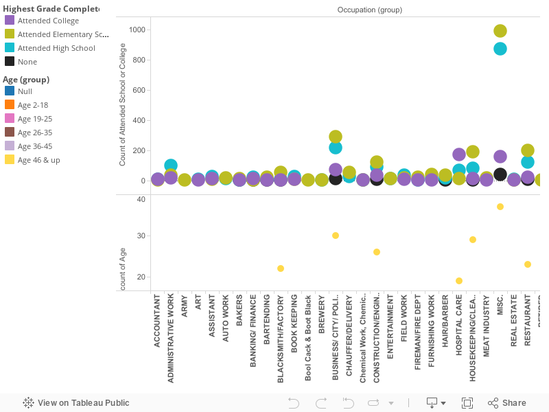
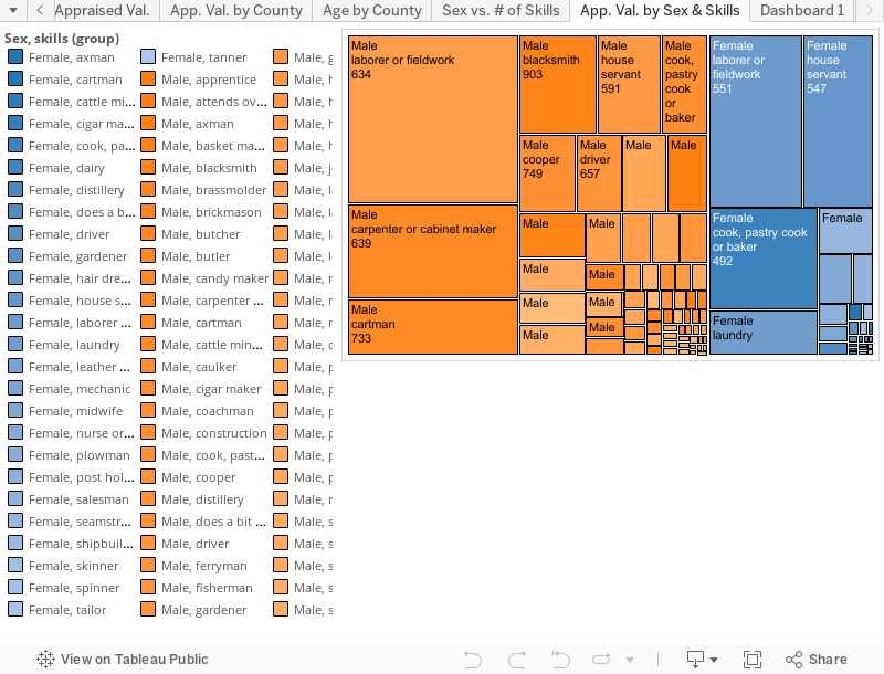
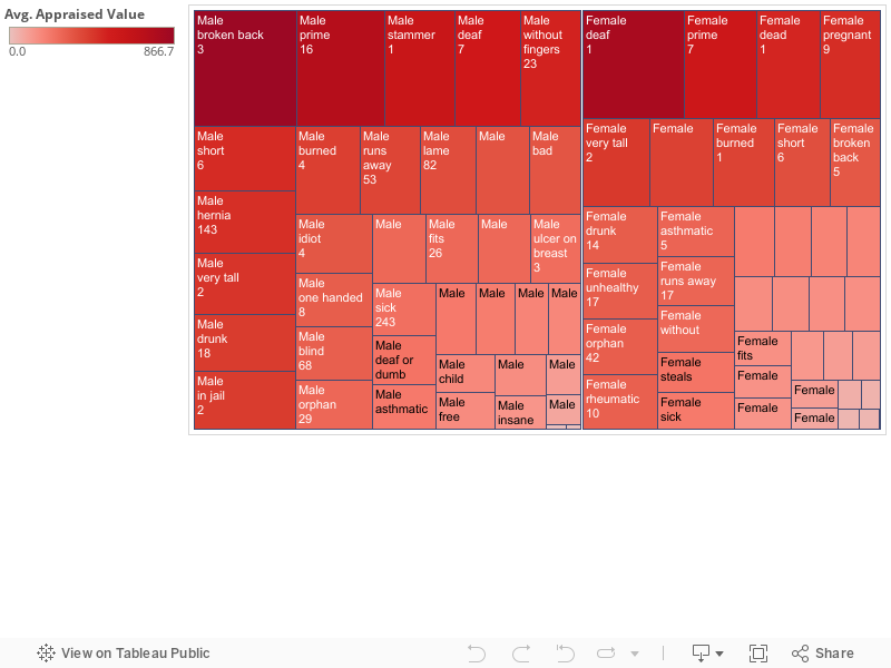
For my final project I will taking a look at the Slave Sales from 1775 to 1865 data set. Specifically the values of slaves in regards to a skill they possess or a defect they might have. When looking closely at the data set it contains information detailing what you’d expect to find; like age, gender and appraised value of a slave. What I find to be interesting about the data set is it includes skills and defects something I would not have considered. With this information there are more factors that are incorporated into the sale of a particular slave. I believe there are connections regarding the prices of slaves within a particular state possessing a particular skill and which gender the slave happens to be. The females and males tend to have gender specific roles in terms of skills they were labeled with. The men have skills like mechanic, and field laborer and with that their appraised value shows, women have skills such as cooking and baking as well as housework and hairdressing and their appraised value shows as well. While some of the men and women have share skills there are differences that find it harder to compare value based on the skill. However, the defects tend to run along more similar lines. Both men and women share similar defects like, height whether it is too short or too tall, loss of hearing, loss of sight, and any type of sickness including hernias, cancer or just a general label of “sick”. There is also common trends of labeling defects as run away, drunk or fits meaning they are difficult to deal with. From these defective labels you see a shift in appraised value. A drunk man is appraised around $425 where an appraised drunk female has and average value of $300. Maybe not such a shocking revelation seeing as today there is a gender wage gap, however, it became interesting with such defects like, without fingers, a male without fingers is appraised nearly twice as much as woman without fingers, same as a man with cancer compared to a female with cancer.
What I found most interesting or should I say troubling with this data set is the way I read it. At first glance it was troubling to see. These are people and these are children given a price and given a skill or defect and then sold. We all know the horrors of slavery but when you are asked to put it in a bar graph or pie chart you become removed from the fact that these were people and not just numbers on a page. That’s why it’s so important to remember what the numbers really are, and tell the stories of what the numbers are telling us.

1940s Story Draft

The 1940s was a time where the U.S slowly recovered from the Great Depression. New York specifically since then has maintained the number one spot for highest population since the early 1900s. Looking at demographic information of residents in Albany, New York in 1940 can tell various stories. The addresses, marital status, race, and education are the few parts of the census that raise questions regarding the lifestyles of people in this particular year. Was the residential area rural or urban? Were people financially stable? How did levels of education effect future endeavors? This visualization focuses on how education levels effect occupation decisions.

Initially looking at the data, it is unclear in figuring out who was enrolled in school for that year, and the kinds of occupations at the time. You must take into consideration age, and filter which jobs have different spelling, but are the same title. After making those changes, the visualization shows the variations in occupations and the education background one possessed in that field. The information is represented through a bar graph with a colored key to indicate whether the person attended college, high school, or elementary school. For each occupation there are numerical distinctions for how many people in 1940 worked in the same occupation.

Before looking at the occupations, the census does provide addresses of people in Albany. With some research, I found that Fleetwood Avenue and Cardinal Avenue were in the Whitehall area of Albany. This shows that these residents lived in close proximity of each other, yet obtained various jobs. For example, two people that live on Fleetwood Avenue both in their late 30s/ early 40s white, male, and highest education level is high school. One has a career in sales, while the other is an electrician. You can then compare those two people to a woman in her early 40s, married, with the highest education received in elementary school. Her occupation is not listed in the census.

The comparisons stated show us that creating one story can then lead to others. Were women still suggested to stay in the home in 1940? If she obtained higher education, would she be working?

Looking back at the visualization, something interesting within the story is the placement for those with no educational background. Most work in the same field as those that have went to high school and/or college (housekeeping, inspector, etc..). The highest number of jobs with varying educations obtained were wage/salary workers in government and private businesses, proprietors, owners, laborers, and inspectors. These occupations are closely related to either working for the government or working for themselves. We can build the assumption that this area of Albany is more suburban with many small businesses. Albany today is assumed to be very government orientated because it is the capital, yet many parts in the downtown region do support this assumption created from the data. A final observation following the census is the wide range of jobs that were surprisingly held at the time, especially following the economic downtown a few years before.

Visualization due 4/14

The dataset that I chose was Slave Sales from 1775 to 1865. I decided to focus more on the sale of children during that time period. I decided to do so because I want to learn more about what it was like being a child growing up during slavery, or being born into slavery. It is estimated that approximately 1/4 of slaves that crossed the Atlantic into slavery were children. Many were forced to move, unwillingly, from plantation to plantation, never truly having a home after being taken from their mothers at a very young age. When learning about slavery in many classes that I have taken, there has never been an emphasis on the children that were involved. My objective is to use this dataset, as well as research, to put an emphasis on children and their experiences during this time period. I took the dataset and condensed it to what I’m more interested in and found some very interesting facts. The first thing I found was that while many children of different ages came from the same states, each individual age tends to come from a specific county in that state. For example, 8, 9, and 10 year olds in this dataset all originate from the county of Anne Arundel, Louisiana. Meanwhile, most of the 15 year olds on the dataset come specifically from the county of Edgecombe, North Carolina. I’m not sure as to why this is, but am interested in finding out more. I would think that every age would originate  from every county.

The second interesting finding was that from the ages of 2 years old to 17 years old the prices vary. I thought that the older that the child was, the more valuable that the child would be, and therefor buyers would pay more money. You would believe that the more work that can be done by the child, the more expensive they would be and have more value. Matter of fact, the children that were valued the most were from the ages of 2 years old to 7 years old. After that, 14 and 15 year olds were valued the highest. At the age of 14 many of the children  had picked up useful skills, like being a laborer or fieldworker. With skills that were useful to buyers, the age group of 14yrs old was the highest valued, at an average rate of being sold for $540.23. By the age of 16, the average value of children went back down to $199 based on the dataset. The county of Charlestown, South Carolina doesn’t have any listed prices, so that may add to why the average is so low. The visualization below shows all of the average values of different ages of children from the age of 1 to 17 years of age.

All of this information came from the dataset alone. What’s very sad is that many children are at risk for becoming very ill when they’re made to work in terrible conditions. At first, many people avoided having children slaves because they felt at risk because they didn’t want them to become ill. When the demand for more slaves in the Unites States increased, so the beginning of child slavery. The dramatic increase in the need for children slaves didn’t happen until the late 17th/ early 18th century.

Story Draft

The data set that includes information on the slave sales from 1775 to 1865 contains valuable insight into the slave trade in the United States that many people may not immediately think of when they think of the history of slavery in America. It provides insights into information such as how much slaves would be sold for when they possess a particular skill set compared to slaves that possess other skills as well as no skills at all. It also allows you to compare the types of skills that female slaves possessed as opposed to the skills that were possessed by male slaves. In the visualization shown for example, you can see that female slaves that were sold possessed more domestic based skills such as “hair dresser, house servant, pastry cook, laundry, etc.”. In terms of these skills women that possessed hair dressing skills were appraised to have the highest value, being appraised at around $1,000, as compared to a female spinner that was given an average appraised value of $203. The skills that are possessed by the male slaves appear to be more skilled labor types of jobs. These jobs include skill sets such as “mechanic, brass molder, painter, cigar maker, blacksmith, construction, etc.”. By looking at the visualization we are able to see that the mechanic skill is valued the highest among the male slaves with the average slaves with skills as a mechanic were appraised to be worth around $1,258. This would be compared to a male slave possessing the skills of a pusher which is appraised at a value of $150. The visualization also allows us to compare the appraisal values of male slaves compared to the value of female slaves during the slave trade in the United States. By looking at the graph we are able to see that on average, male slaves were valued at a higher rate than female slaves. This included times when they possessed the same set of skills. For example, a male mechanic was valued at an average rate of $1,258, while a female mechanic was on average appraised at a value of $600. We are also able to see that more males possessed skills than females did. 

Final Project Story

In this visualization I decided to research the differences in the payment of pensions for people that had the same injuries but started receiving pensions at different time. From this visualization I organized the data into years and injuries and then went from there. My original question for this visualization was to find the differences in amounts of pay for each individual. As you would guess many of the payments are equal, however I had also thought about how there would be differences in pay, and I was right about that as well. When you look at this data the person who created it did not include how severe certain injuries were, like there are labels for various gunshot wounds but the severity is not specified. This was the basis of my question. Why was there discrepancies? If there wasn’t a reason for there to be a difference in classification why is there different pay? The amounts also fluctuated by time of issuance. It wasn’t like there was a correlation going up or down the numbers were just random, again, a reason to include the severity of the injury that each person had received. This could’ve all been cleared up by a couple extra words on the sheet.

There are some very different stories that come from this chart as well. Like the many people who are affected by gunshot wounds, presumably from the Civil War. This shows the variety of injury that come from having such a bloody war. There appears to be a a gunshot would for every appendage possible. I suppose that there is the possibility that the injury happen during some incident outside of the war but I think it’s reasonable to say that the most of injuries occurred as a result of the war. When you look at some of the other ailments You see some injuries like an axe to a particular appendage and see that they only see that they receive like $4 a month. That number is very surprising to me,even in those days where four dollars was a nice amount to have for some income but I feel like that wouldn’t be enough to support someone who was severely hobbled by an injury. There were some cases like a dependent mother who might have multiple kids and use that as their only income and the pension was eight dollars Again that seems incredibly low. The pension for women, especially in those times would most likely be the only opportunity for women to make money so this seems low in the sense that these women could have multiple kids. Conversely, there were a couple people who were blind who received $70, this was interesting to me because that seems like it would be a reasonable amount for people who probably don’t have a lot of expenses.

Overall I feel like that given these circumstances, in my opinion people could’ve been paid more, but I don’t know what a good salary per month was for the time, so this could’ve been fair.

Draft

The date set of the Slave Sales between 1775 and 1865 contains information that can provide insight on how the slave trade operated. By simply looking at the information presented, you can see that some of the information correlates with one another to tell a story. The story that my first visualization focuses on is the appraisal value between gender and the states they were sold in. Before I could start my story I needed to accurately identify if there was a relationship between value and gender. The data showed that male slaves were significantly valued at a higher price point than female slaves. The average male slave would be sold between the average price of $172 and $777, depending on the state. Women average price was  between $113 and $639. Although the data does not directly state why males valued more, we can infer that males would be of more use on plantations. If a master was looking for someone who was physically capable, could withstand long tired-some hours, work fast and carrying heavy loads, he would obviously go for a male slave. However, this does not mean that women slaves were disregard. Women slaves were still valued because they were capable of bearing children, being house servant, and possessing skills that made them useful.When age played a  factor, my data showed a relationship between the age and value of the slave. The data showed that whether it was  male or female slave, the average slave sold would be about 18 to late 20’s (prime age) and would be valued high than someone of a later age. The last aspect is how the different states play a role in my visual story. Incorporating the state gives a different perspective of how the selling of slaves differed in the territories. For example state, state such as North/South Carolina, Tennessee, Virginia, and Maryland showed their average age of slaves being between the ages of 4 and 12, rather than 18 to 27 like other states. It is possible that theses states were more interested in selling children or they didn’t keep a better records of the ages of slaves and therefore some slaves would be unaccounted for. Another example is how states played a role in the value of slaves. For states such as Georgia, Louisiana and especially Mississippi both women and male valued significantly higher than the other states. It is possible that these states were more popular plantations. Therefore, more slaves were migrated into these states and migrated out of the states with fewer slaves.

Yo this is a story all about how Albany’s 1915 census got fliiped-turned upside down

I think there’s a few interesting points to take away from the graphic and data behind occupations in Albany in 1915. There’s a few jobs that no loner exist or are called different names now, plus a surprising difference in the number of women and men who worked (or at the very least, were listed as working) at the time. I purposely chose “gendered” colors for the bar graph, but I think the story behind that has to go in a separate part of the final post. But there are a few interesting stories behind the data itself.
I’m assuming no one here really knows what a “teamster” is (or maybe you do, being history buffs and all). Today we’d use the plebeian term “truck driver.” But it’s hard to imagine an 18-wheeler peeling down the dirt roads of Albany a hundred years ago; a little more research shows that these were the men who delivered goods to stores, usually on an animal-driven vehicle. A whopping 12 men in the city of Albany were blessed with sitting behind the back-end of an ox or horse for a living, twice the number of the next most popular listed job in the city. But I’m sure they weren’t only delivering groceries to the whopping 2 grocers in Albany at the time; out of 64 employed males at the time, about 5 of them weren’t directly related to selling or handling delivered goods (and that’s taking a good guess at what some of these other jobs are). So I’m sure these 12 men were nice and busy staring at these animals’ backsides all day as they delivered books, ice, and masonry tools.
Of course, when you first look at the graph the first thing you probably notice is the big pink bar shooting up highest. With only a dozen less listed workers than men, more than half of the women listed as employed are employed in “Housework.” What sort of housework? Not homeschooling, as school teachers are listed in another category, nor seamstressing, as dress and shirtmakers are categories unto themselves. Perhaps, even though it was work that was expected of them as women, house work within their own homes was considered an occupation? No, I think that since it was listed as an occupation, it was something that they were paid for, and not something they did in their own homes. Or rather, it wasn’t something they were acknowledged for doing in their own homes. They just had to come home from cleaning someone else’s home all day, and then clean their own.
There are some jobs which are surprisingly gendered (as there is not one single listed occupation that has both men and women working in it) occupations, ones that might expect from the other sex. The only listed gardener in the census is a male, while the only person in charge of manufacturing boxes in all of Albany is a woman (at least, according to the census). Weren’t they afraid that her wandering uterus would make her unable to deal with such a heavy workload?
All in all, I think the most important and interesting piece of information to take away from the graphic is that there were an almost-equal amount of men and women listed as being employed in Albany a hundred years ago, when we usually imagine that the men went out to make the money for the family while the women sat at home and either tended to their children or made sure the house was comfortable for their husbands, fathers, and brothers to come home to.

Final Story Rough Draft

There are several stories that can be told from the Albany Militia Muster Roster. From how the small militia looked, to the jobs that they had in their normal lives. It’s very interesting to see where the individuals come from and how old they were when they originally enlisted. There is certainly a lot of personal information provided in the roster that paints a very descriptive story. The story that one of my visual focuses on are the racial backgrounds where these soldiers come from. I sorted and grouped the different complexions provided and assumed the description of the competition is correlated with their race. For example I grouped “Black, Brown, Negro, Dark and Swarthy” assuming that they are all African Americans. A also grouped “Fair, Pale, Ready, Reddy, Ruddy, and Sandy” with the assumption that they all are Caucasian. And then I left Indians alone because they are Native to the land. I also excluded “Freckled” and “Pockpitted” because they both can be used to describe Indians, Blacks and Whites. I thought that this would be an interesting way to sort this data because all of these individuals made the voluntary decision to sign up for this Militia, and they come from all walks of life. Especially during this time period, there was a very large gap in social equality between blacks, whites and Indians. One would assume that a majority of the soldiers on this muster roster would be White because they have a whole lot more to lose and they were treated a whole lot better by society. I would have thought that since society has been so oppressive towards African Americans, there would be a tremendous dividend between the two with the Whites in the majority. Much to my surprise, the African Americans were in the majority leading by well over 100. I found this very interesting and once I saw this, I had to ask myself was this all voluntary? Maybe it was and they just had a love for the country and a desire to defend it. Another interesting fact is that there was only individuals that fell under the category of “Indian”. However I will admit that I was not entirely surprised. Foreign powers were coming into their land and trying to control it. Why would they want to sign up for a fight that really has nothing to do with them because either way, there will be a foreign country controlling their way of life.

Final Proposal

For my final project I would like to focus on the data set of Slave Sales between 1775 and 1865. This data set includes numeric,text,and geographic information on slaves up for sale. This data set features a couple of numeric columns, one regarding a slaves age from infant to as old as 99, another appraised value of that slave, and another was the year listed for sale ranging from 1742-1865. As for the geography of this dataset, a column is included for the state the slave was sold. Ironically the only states mentioned are in the south including Georgia,Louisiana, and Mississippi. The other geographic column of counties is used to narrow in on a certain location a slave was sold at. This dataset also has columns for the sex of slave, defects of a slave and skills a slave possesses. For a column like the sex of a slave there are only 2 options male of female, while the defects and skills of slaves can hoist a bunch of options ranging from old to lame. I did notice that for the defect and skills columns both had significantly more blank spaces then all other columns.

As for relationships between the different columns and rows in the slave sales dataset there are several. I noticed their is a correlation between the defects, age,and sex of a slave and the appraised value. Old and disobedient slaves were sold for way less than a young male “prime” slave. Young slaves were often valued very low as well. Also most of the skills types are connected to just one race. Women were seen as child bearers and caretakers, while men were seen more as laborers.

1940- Visual 1

Education and the type of occupation one holds are often correlated with one another. From the time a child is put in school until the time they finish, it is drilled in the head of the individual that a good education is needed in order to obtain a well-paying job. It is taught that hard work breeds success and young men especially are taught to be providers for their families which comes into play with the types of jobs they seek and level of education they want to achieve. This proved true for those living in Albany in the 1940s; the 1940 census helps to show that those that received a decent education held jobs that not only benefitted them but their families as well.
The census provides a wide range of information including the types of jobs that were held, the gender of those that held these jobs and their level of education. It seems as though many women did not work and often stayed at home to care for their children and other household duties. Although many of the women did not work, some did and they held quite prestigious jobs. The women that worked seems to not begin work until they are well in their late teens if that but most are in their very late twenties, early thirties and older. The census does show that a greater amount of men worked in comparison to women and they began to work quite early. As previously stated, although mostly men worked, some of the women that did had higher education levels then that way which made it possible for them to work higher paying jobs. The census shows that a few of the women received college degrees or higher and began lawyers and doctors whereas that was not quite the case for the men.
There are numerous jobs held by the people in the 1940 census; some of the jobs include accounting, barber, bartender, book keeper, lawyer, carpenter, cook and much more. The different jobs shows the level of education that the people that held these jobs had and how many people the criteria applied to. For example, one of the jobs held is a file clerk. Some of the people that were file clerks had different backgrounds in education. The census shows that twenty-four people completed high school and eleven completed elementary school and this shows that being a file clerk is not a job that may qualify as being of high standing or one that a person needed to have much experience in. In comparison to those that are lawyers, three people completed college and nine people went beyond a college degree and that shows that being a lawyer was a great accomplishment, one that not many could achieve for one reason or another. This pattern could be seen throughout the entire census; there are jobs that people hold which require little to no education and then there are the few jobs that require a higher education level. This comparison between the education level and occupation is an interesting one because it is evident that a good education gets you a better job but it is clearer on paper.