Tour Proposal

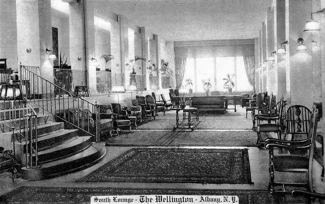
1) The first location on my tour is the Suny Administration Building formerly know as the Delaware and Hudson Building (D&H). During the twentieth century, the D&H Building was the centerpiece of Albany. Albany city was the heart of major river ports as well as a major railroad center. The D&H building played a significant role to the history of railroads because it was one of the largest railroad headquarter. The building was also home to two of the most important railroad tracks, the New York Central and the Delaware&Hudson. My second location is the Key Bank formerly known as the National Commercial Bank. The bank was first founded in 1825 as the Commercial Bank of Albany and its main function was to issue and circulate bank bills. In 1865 the bank became organized as a national bank and renamed to the National Commercial Bank. The bank is significant because it became the financial stronghold of Albany and was a determining factor for many of Albany’s businesses to prosper. The third location is Old Elm Tree, although the tree no longer exits it’s a significant landmark  of Albany’s history. The Old Elm Tree once stood in-front the home of Philip Livingston, a signer of the Declaration of Independence. After the removal of the tree in 1877 the corner became home to many different establishments. The fourth location is the Wellington Hotel. This hotel was a symbol for respectable guest such legislatures and officialdom. Today, the hotel is an abandon building that is in the process of being demolished. My last location is the Albany Law school. Although the school no longer exist at this location during the early 1900’s this was the home to many Albany law students and is considered one of the oldest independent law school

  • “Albany Law School.” The History of. Accessed February 28, 2016. http://www.albanylaw.edu/about/history/Pages/default.aspx.
  • Belinski, Stefan. “Elm Tree Corner.” Elm Tree Corner. 2001. Accessed February 28, 2016.  https://www.nysm.nysed.gov/albany/loc/elmtreecorner.html.
  • Prescott, Herbert F. “The National Commercial Bank of Albany: A Brief History of Three-quarters of a Century, Its Officers and  Directors”. Albany, NY: Weed, Parsons, 1901. Accessed February 29, 2015. https://play.google.com/books/reader?    id=VnkpAAAAYAAJ&printsec=frontcover&output=reader&hl=en&pg=GBS.PA34.
  • “The D&H Building.” The D&H Building. 1993. Accessed February 28, 2016.  http://www.albany.edu/museum/wwwmuseum/statestreet/dhbuild.html.
  • “Wellington Hotel-State Street, Albany, NY.” Wellington Hotel-State Street, Albany, NY. Accessed February 28, 2016.  http://lostlandmarks.org/wellingtonmain.html.

2) Google estimates my tour to take 17 minutes

3) For my tour I decided to focus on a specific area of downtown Albany. I chose State Street as my topic because it was a familiar area to me. Although I am not personally from Albany I felt that State Street was a common location and therefore my tour would attract more audiences. The theme of my tour is “What Are They Now” aside from each location being on the same street, they all were locations that once represented something different from what they do now. For example, the B&H building initial purpose was for railroads, but today it’s know as the Suny Administration Building. As for my intended audience, I feel as though my tour can entertain and educate any age group and gender. In addition, the short length of my tour also attracts more audience. My audience can range from a person whose on their lunch break, or just someone who has free time and wants to learn more about Albany. Although there are few limitations on who my intended audience is, I do feel as though local residents who are familiar with the State Street area can benefit more than none local residents. I believe this because being familiar with the area makes a person curious to learn more about the history of their own neighborhood. After my tour I want my audience to feel as though they physically have went back in time. The whole point of not having a specific topic, but a specific area to focus on is so that my audience can feel as though they have learned a little bit more of Albany’s overall history. My idea to show a then and now of my five location is to show my audience the evolution and progress Albany has made from the eighteenth/nineteenth century to present day. I hope my audience not, only take away historical facts, but also leave my tour feeling a sense of pride for being a part of a city filled with so much history.

4) D & H Building
Wellington Hotel

5)   What happen to the once prosperous Wellington Hotel that made it become an abandoned building?

Why did the Albany Law school move from its initial building?

Why did the National Commercial Bank stop printing money?


Entertainment in Albany

The map presented shows a walking tour of the following locations:
1)The New York State Capitol : National Historic Landmark located in Capitol Park
2)Washington Park: Well-known and well-maintained park and home of Albany’s annual Tulip Fest
3)Albany Institute of History & Art: New York’s oldest museum and one of the oldest art institutions in the United States
4)The Armory: Located in the downtown area of Albany, place for sporting and entertainment events.
5)The Palace Theater: Largest theater in Albany, place for growing downtown entertainment

“Info on Palace Performing Arts Center, Inc. in Albany.” Albany.com. Accessed February 29, 2016. http://www.albany.com/business/palace-performing-arts-center-inc-93/.

“Tour of Empire State Plaza In Albany New York.” Discover Albany New York & The NY Capital Region At Albany .com! Albany Hotels, Motels, Real Estate in Albany & More! Accessed February 29, 2016. http://www.albany.com/tours/empirestate/.

“About AIHA.” Nationally Significant Collections – New York Museums. Accessed February 29, 2016. http://www.albanyinstitute.org/about-the-albany-institute.html.

“About the Armory.” The Armory Sports and Convention Area. http://www.albanyarmory.com/about/.

“Hot Spots Washington Park, Albany NY.” Washington Park. Accessed February 29, 2016. http://www.albany.com/hotspot_washington-park.cfm.

-The full tour takes about 55 minutes to walk all 5 locations

The sites for the walking tour fall under an entertainment theme based on their purposes. Each location has some historical context, serve as places for events, and brings together the many cultures within Albany. The New York State Capitol and The Armory both have distinct architectural features that make it appealing to the eye. The Albany Institute of History and Art is unique in that it is the oldest museum in New York, with one of the best collections of objects, manuscripts, and photographs in the U.S. Washington Park hosts the annual Tulip Fest, an event that has been in Albany for over 60 years.

The audience for this entertainment tour is young adults, potentially in a group of recently graduated students seeking better opportunities in Albany. They’re looking for what makes the capital of New York unique. The biggest walkaway from the tour is that Albany is more than important state buildings. When discussing the capital, one would assume that there is a strong business and political atmosphere. There are several areas within Albany that can cater to need for excitement. Each location has a historical background, such a The Palace Theater for example. It was built during the Depression, showing that the need for entertainment to distract residents from their economic strain. The Armory also is a popular arena where shows and sport events have taken place over the years. In the midst of being in Albany for better job opportunities, change of scenery, or living arrangements, you are able to find something to do that fits your interests. Outside of these five locations, there are other neighboring sites that cater to night life, food, education, and more.

Questions: (1) In what way can I shorten the tour and target different neighborhoods of Albany in the process?

(2) Where can I find more informative sources on the location?

(3) Can I find more entertaining sites to increase the audiences’ attention?

The Palace Theater

The New York State Capitol


Tell Me A Story

1) The first location the map is Stephen and Harriet Myers House. This house is important because it held significant value during the time of the Underground Railroad. In the 1850s, Stephen Myers was a chairman of a group whom was charged with helping African slaves on their way to Canada. The second location is Lark street. Lark street leads to many other streets and avenue which makes a route easier to follow, it is also home to a great amount of the Albany night life. The third location is the Walter Merchant House. The style of this home stands out to me because it is of Italiante architecture which is a style that was prominent during the 19th century; although more noticed in the 19th century, it has its beginnings during the 16th century Italian Renaissance. This home is one of few in an urban setting and was owned buy one of Albany’s wealthy merchants. The fourth location is the New York State Executive Mansion. It was first built as a private residence but was later purchased by the state to become the state’s executive mansion. It became the first state owned building with the sole purpose of housing the governor. The last location is the Mansion Historic District. It was Albany’s first suburban district right below the governor’s mansion. This area housed many of Albany’s immigrants in the 19th century.

“National Register of Historic Places Listings in Albany, New York.” Wikipedia. Accessed February 27, 2016. https://en.wikipedia.org/wiki/National_Register_of_Historic_Places_listings_in_Albany,_New_York.
2) The tour is 39 minutes.

3)Places all over the world tell a story. Whether it is the deli around the corner or the park down the street, there is something significant about these places. The story that my tour tells is about a small town that many people over look but holds beautiful sights and buildings that have meant something to someone in the past. I chose homes that may have made an impact on the past people of Albany. All of these places relate to one another in the sense that at one point in time people sought refuge in these places. People either lived in these homes or passed by on their way to find a better place to be. The Stephen and Harriet Myers home was a place of temporary refuge for the salves that were escaping, and the Walter Merchant house with its exquisite style was a place of comfort and a show of wealth for one of Albany’s richest merchants; the New York State Executive Mansion was a place for a family to lay their head at night and find peace and comfort in the home and one another and then it became a place for the governor to do the same and the Mansion Historic District held homes for Albany’s immigrants. It was a place full of different cultures and became a melting pot over the years; the area was filled with people from all over hoping to find something in Albany that they felt they were missing back home.

The audience of my tour is school children, tourists and locals. The idea is to educate these groups of people on the significance of buildings in Albany. There are some homes and state buildings that are well known by almost everyone but then there are homes such as the Walter Merchant house or the Stephen and Harriet Myers home that people may not know about. I feel as though when you live, visit and even just pass by a place, you should learn something about it, especially the buildings you walk into while there. The big takeaway point the visitor will get from the tour is that, if something is there, it is there for a reason. One may not know why a particular church, house, or school is located where it is located but there is a reason and it should be of interest to find out what that reason is.

4) The New York State Executive Mansion

The Stephen and Harriet Myers Home

5) A. Have any of these buildings been turned into a museum or a place that people can visit?

B. What race of immigrants predominantly lived at the Mansion Historic District?

C. What are some other places along this route that seem to hold significance or tell a story about Albany?

Data Visualization

Data Visualization is the communication of data or information in the form of an image where a person interested in the data can see with their own eyes. Data visualization can come on a variety of forms. For example, the countless different types of graphs like bar graphs, line graphs and a pie chart just to name a few.

It is extremely beneficial to have data visualization in ones project. Not only does it make everything much more appealing to the audience, it also stimulates the brain and allows the reader to understand it better. As seen here, data visualization can be beneficial first hand in the business world. On top of that, they are also a great tool because they summarize a ton of information into one piece of data. This text touches on just a few different kinds of graphs that one will encounter. As you can see, they have potential to contain several pieces of information into one visualization piece.

Another reason why data visualization is key is because it helps with education, especially in the youth. In this article, the author quotes Francis “Skip” Fennell, the president of the National Council of Teaching Mathematics. In short, he emphasizes the importance of bar graphs because it gives Pre-k to 2nd graders an opportunity to count and compare objects, which is very important in education.

1) How as Data Visualization impacted you?
2) Has anyone ever used Data visualization in the real word?
3) How do we plan on including data visualization in our walking tour project?

Various types of Visualization methods

Remember the good ‘ole days of sitting in your third grade classroom and drawing bar graphs and pie chart? The information that we were recording were fun things such as the number of boys versus girls in the class or the various hair colors. Since then, the amount of information we have learned to work with and analyze has expanded exponentially. We literally have a world of information available with a simple Google search. But with all this wild and crazy information that we are so fortunate to look at, a problem arises when there is simply too much. Who wants to sift through pages and pages of surveys to find relationships when you could simply graph them. Maybe a pie chart or a bar graph will be sufficient enough. What if I was to tell you that there are hundreds and thousands of various graphing models available, each specializing in certain fields?

First thing’s first, why do we like to graph information? Research has shown that humans are more keen to identify patterns and relationships visually through color, shape and style, to name a few. This is why graphs play such an important function of data analysis. Unfortunately, not all graphing techniques are ideal for every field of study. While a pie chart and bar graph work great for finding relationships between the population of Albany, a stem-and-leaf plot might not be a good choice. Jeffrey Heer, Michael Bostock, and Vadim Ogievetsky of Stanford University conveniently compiled a list of the more interesting and complex graphing styles. I won’t explore each graph but will instead discuss the few we are all familiar with and a couple of the wild ones.

let us first look at the stock market! We can all recognize that iconic rising and plunging chart that displays the growth and decline of various stocks. This particular chart allows the user to scroll through time and watch how various stocks saw immense growth or loss periods. For example we can see that Apple, in a single month, from June to July in 2006 had a loss factor of over one hundred percent. Protovis is one such program that allows a user to create an interactive, “live”, graph. Unfortunately, it is no longer in development as of 2011, shortly after this article was written.

Out of all the various types of graphs and charts, maps are probably what most of us feel the most comfortable with. If you have ever watched your local six o’clock news you probably have seen Choropleth Maps. These are useful to display the various temperatures across a country using light and dark colors. In this particular map we can look at the obesity rates in the United States. Flow Maps are useful in visualizing a number of important statistics on a map. In this case we are looking at Napoleon’s march on Moscow in 1812. Not only can a large visual be created to overlap the map to depict the route used to travel, but also troop sizes, temperatures, latitudes and longitudes and recurring lesson of never to invade Russia during the winter.

I would like to pose the following questions for us to consider:

1.) Which type of visualization represented in this article, or others not mentioned, do you feel is ideal for historians?

2.) How can we effectively use any of the visualizations mentioned to expand our Walking Tour projects?

3.) As a follow-up question to the previous one: Thinking of our intended audience, how would one particular graph be clearer than another?

Example map embed

To create a map with Google Maps:

  • Include five potential locations for your walking tour. Make sure your locations are arranged in a logical order so that your visitor doesn’t need to double back or walk over highways (hint: use the “Walking” option instead of “Driving”!)
  • Your tour must be walkable in an hour or less according to Google’s estimate
  • Once you have a route, click Details and look for an icon of three connected dots in the upper right (the Share icon)
  • In the popup, select Embed Map and copy the iframe code in the box.
  • On the course website, create a new Post (you’ll need to log in to the course site and find “Add new post” on the right side of the dashboard)
  • In the editor for your post, select the Text option on the upper right
  • Paste in your iframe text
  • Switch back into the Visual side—your map is a gray box, this is ok! It will display properly after you publish.

State Street Albany, NY

Wellington Hotel Interior  State St.  Albany NY 1920s

https://www.flickr.com/photos/albanygroup/11864829834/in/album-72157634720565585/

https://www.flickr.com/photos/albanygroup/14168645351/in/photolist-nA31CP-on3cap-bvXbg9-9wUYKZ-iy9ych-ou2NE8-owmPsm-ftqsy3-owtTzZ-ot1aQE-ouUwoj-odffya-owidzU-sVekii-ujmibm-uP9FNz-DkZhKD-tmyfbA-xgxaHn-oewKJP-sGmaMm-owgPRj-osuZ11-ov6huP-osuPU5-osUpPd-odyMTR-ouugJu-u56vTm-wLRAGT-ovdHDR-ojVhD-ovVDQe-xGf6wh-ouaLkY-ovTjQD-tDubEz-oenLKH-oxAzh4-owoLhx-otNR6m-oeFUL7-ow5i9Q-wAKP28-ovPP3D-oxAun4-ouq6bk-ovFHPA-ovrihX-oeLkc2

For my potential project idea, I chose to focus on a specific area in Albany.  My initial project idea was focusing on the education in Albany, but I found it hard to narrow down the type of schools I wanted to do. As a result of my indecision, I began thinking of other directions to take my project. Instead of focusing on a specific topic, I chose an area (State Street) that was familiar to most local Albany Residents and identified three locations within that area that I felt could capture a part of Albany’s history. The first picture is the inside of the Wellington Hotel which was home to many visiting legislatures and officialdom. The next picture is the National Commercial Bank which opened in the 1865 and stopped printing money in the 1935. The last picture is the Albany Law, founded in 1851 and considered as the nation’s oldest independent school of law.

Similar Tour: Tremont: Lincoln Park Area

The Benefits of Data Visualization

Data visualization is a way that allows us to present an abundance of information to a reader in a way that does not slow down the pace at which we are informing our audience, as well as organizing the information that we are presenting in a way that is easier for the reader to grasp onto quickly. Len De Groot explains how you can quickly and easily process your data and information and transform it into a simple information graphic that can streamline the information processing that the reader will experience. By doing this you make it easier for the reader to stay interested and read all the way through your piece rather than bogging them down with loads of information that causes them to lose interest and stop reading your article. Not only is this a very quick process, De Groot also explains how this can often be done for free by using the many tools that are provided by Google. All that is required is that the user creates an account with Google and all of the tools will become available to them. The first step to the data visualization process is the creation of a database. A database is essentially information that is organized into columns and rows, such as you would find in a spreadsheet. You can easily create your own database for the information that you are trying to present by using a google spreadsheet. The first step is to put all of your information into your database.

Paul Grabowicz describes how some websites provide downloadable spreadsheets that you can import into your google spreadsheet to streamline the data entering process. After you have entered all of the information that you need to enter for your infographic (a shorter term for data visualization) all that you have to do is click on the “insert” tab, then select the “gadget” option and then simply select which type of graphic you would like to use to present your information. You will first be asked to title your graphic. You must then select which cells you would like the graphic to represent. (If you are making a graph for your data visualization you will also need to label both the X and Y-axis’) In order to embed the graphic into a post or website, you have to select the drop down arrow in the top right corner of the chart and select “publish gadget”. This will then open a separate window with the embed code that you can use to add the graphic to your post and/or website. If you are making a graph for your data visualization you will also need to label both the X and Y-axis’. Grabowicz has provided a link to a sample data set that is accompanied by a downloadable excel spreadsheet with a sample database that you can use to practice making graphics. To access that downloadable spreadsheet, click here.

How can data visualization be used to help readers understand complicated data sets?

How can we use information graphics in our walking tour to help keep our audience as interested as possible?

Which types of information can we provide that will reach out to the largest amount of people to achieve interest in our walking tour?

HW: Intro to working with Data

This will be easier if you read the two assigned readings first!

Edited to add: #ERR and #REF errors are errors–they mean that your function is mistyped or your range is incorrect.  #NUM errors are ok in median cells–it just means you’re trying to find the median of zero, which is nothing.

  1. Copy the original” spreadsheet into a new sheet in drive.google.com. Call your first sheet original
  2. (if you need to stop and come back to it later, you can access your sheet by logging into your google account and finding it in drive.google.com)
  3. Create 7 new sheets in your workbook and title them white-only households, only white men, only white women, households with slaves, only “other free persons”, only non-slaves
  4. Use the filter function to display only the households in each category (hint: use the empty/not-empty/none options). For example, to select only households with slaves, you would need to filter “slaves” to not-empty. To select only households of “other free persons,” you would need to filter all other categories to empty and “other free persons” to NONE.
  5. When you have each category filtered, click the intersection of the column and row labels to select all, or use CTRL+A to select all. Copy and paste your filtered households into the relevant sheet.
  6. Repeat for other categories
  7. On your original sheet, SUM the number of people in each household in the blue column to the far right. You MUST do this with a function—don’t enter the number by hand! Remember that when you type your function you can select your range by dragging, or you can type in your range: ie, SUM(A2:G2) will add up all numbers from column A cell 2 to column G cell 2.
  8. Copy your functions by selecting and dragging where you want them to copy.
  9. Don’t forget to SUM all households and find the MEDIAN household size at the bottom of the column!
  10. At the bottom of the original sheet, do the same for each category of people: find the SUM, the MEDIAN, and the COUNT.
  11. Do steps 6-9 on each of your filtered category sheets – make sure to make row and column labels for each since you didn’t copy and paste those!
  12. Create one more sheet and name it medians. Copy the template in the example workbook here
  13. The blue cells should be filled with functions. DO NOT HAND ENTER NUMBERS. For each household type and category, write a function to find the median of each person-type in each household type. For example, to find the median of “free white males under 16” in all households, you would write =median(total!B2:D761). B2:D761 is your range of cells, and your sheet name is separated from your cells by an exclamation mark. You can also type your function, ie, =median(, and after you type the parenthases, click on the sheet you wish to select from and select your range of cells by dragging.
  14. Note that the medians for the free white categories male and female should include more than one column from the original sheet! Be careful with your ranges!
  15. Once you have all your medians written in the median sheet, select all on your median sheet, and go to insert>chart
  16. In the Chart Types tab, make sure that “Aggregate Column A,” “Use row 1 as headers” and “Use column A as labels” are selected.
  17. Hit Insert chart, send Dr. Kane the workbook using the Share link in the upper right (mkane2@email.com)